위코드 사전스터디 과제로 자기소개 페이지를 만들며 정리한 내용입니다.
flex 와 media query 를 활용한 반응형 다단구조를 만드는 연습을 하였고, 들어가는 이미지는 서버에서 불러오는 것을 고려해 html 태그에 스타일 속성으로 넣었습니다.
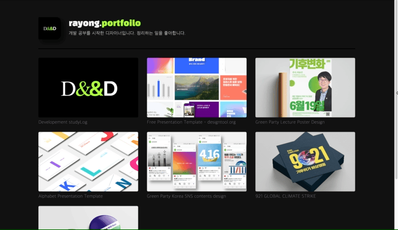
나열되는 카드리스트는 ul li 태그를 사용해 구조를 잡았고, 그 안의 콘텐츠를 a 태그로 묶고 figure 로 사진을 div 태그로 텍스트를 넣었습니다.
<ul class="card-list">
	<li class="card-item">
    	<a href="#">
        	<figure class="card-image"></figure>
          	<div class="card-desc"></div>
        </a>
	</li>
</ul>
카드리스트 이미지는 일반적으로 DB에서 불러오기 때문에 인라인 속성으로 사진을 넣었고, 반응형에 맞게 사진 크기가 조절 되도록 background-image 를 사용했습니다.
<figure class="card-image" style="background-image:url()"></figure>css 파일에서는 별도 리셋 파일을 연결하지 않고 최소 요소만 초기화를 진행했습니다.
/* UA resets */

html, body, h1, h2, p, ul, li, figure {
    margin: 0;
    padding: 0;
    border: 0;
}
div, ul, li {
    box-sizing: border-box; // 이 부분을 놓쳐서 오류가 났었음
}
li {
    list-style-type: none;
}
a {
    text-decoration: none;
}

/* Typography */

h1, h2 {
    font-size: inherit;
    font-weight: inherit;
}
전체 콘텐츠는 div 로 감싸서 큰 레이아웃을 잡았습니다.
/* Layouts */

.wrapper {
    max-width: 1200px; // 크기에 따라 반응하도록 max-width 사용
    margin: 0 auto;
    padding: 0 2rem;
}
카드 리스트에 flex 속성을 적용하고 카드 아이템에 width 를 적용해 가로 배치, 다단구조를 만들었습니다.
.card-list {
    padding: 2rem 0;
    display: flex;
    flex-wrap: wrap; // 길이에 맞게 아래로 넘어가는,
    margin: 0 -1rem;
}
.card-item {
    width: 33.33333%; // 3단 구조
    padding: 0 1rem;
    margin-bottom: 1rem;
}
figure 태그에 적용한 배경 이미지 요소가 잘 보이도록 height 와 padding-bottom 을 적용하고 그 외 속성을 적용했습니다.
.card-image {
    height: 0;
    border-radius: 4px;
    padding-bottom: 60%;
    background-repeat: no-repeat;
    background-position: center;
    background-size: cover;
}
미디어 쿼리를 사용하고 카드 아이템에 width 를 조절해 반응형 다단 구조를 만들었습니다.
@media(max-width: 900px){
    .card-item {
        width: 50%; // 2단 구조
    }
}

@media(max-width: 500px){
    .card-item {
        width: 100%; // 1단 구조
    }
    .card-desc {
        text-align: center;
    }
}
전체 코드를 아래 남깁니다.
html
<!DOCTYPE html>
<html lang="en">
<head>
    <meta charset="UTF-8">
    <meta http-equiv="X-UA-Compatible" content="IE=edge">
    <meta name="viewport" content="width=device-width, initial-scale=1.0">
    <title>personal_page</title>
    <!-- <link rel="stylesheet" href="default.css"> -->
    <link rel="stylesheet" href="style.css">
    <link rel="preconnect" href="https://fonts.googleapis.com">
    <link rel="preconnect" href="https://fonts.gstatic.com" crossorigin>
    <link href="https://fonts.googleapis.com/css2?family=Black+Han+Sans&display=swap" rel="stylesheet">
</head>
<body>
    <div class="wrapper">
        <div class="header">
            <img class="header-profile" src="profile.png" alt="profile-img">
            <div class="header-meta">
                <h1>rayong.<span>portfoilo</span></h1>
                <p>개발 공부를 시작한 디자이너입니다. <span>정리하는 일을 좋아합니다.</span>
                </p>
            </div>
        </div>
        <div class="contents">
            <ul class="card-list">
                <li class="card-item">
                    <a href="https://velog.io/@rayong" target="_blank">
                        <figure class="card-image" style="background-image:url(https://velog.velcdn.com/images/rayong/profile/df592861-ea43-432c-aea2-a1f79730300b/image.png)" ></figure>
                        <div class="card-desc">
                            Developement studyLog
                        </div>
                    </a>
                </li>
                <li class="card-item">
                    <a href="https://www.behance.net/gallery/146940837/Free-Presentation-Template-designtoolorg" target="_blank">
                        <figure class="card-image" style="background-image:url(https://mir-s3-cdn-cf.behance.net/projects/max_808/dcc810146940837.Y3JvcCwxMzgwLDEwODAsMjcwLDA.png)" ></figure>
                        <div class="card-desc">
                            Free Presentation Template - designtool.org
                        </div>
                    </a>
                </li>
                <li class="card-item">
                    <a href="https://www.behance.net/gallery/101788637/Green-Party-Lecture-Poster-Design" target="_blank">
                        <figure class="card-image" style="background-image:url(https://mir-s3-cdn-cf.behance.net/projects/max_808/df8bed101788637.Y3JvcCwyNDMwLDE5MDAsMzYwLDE3NA.jpg)" ></figure>
                        <div class="card-desc">
                            Green Party Lecture Poster Design
                        </div>
                    </a>
                </li>
                <li class="card-item">
                    <a href="https://www.behance.net/gallery/98238785/Alphabet-Presentation-Template" target="_blank">
                        <figure class="card-image" style="background-image:url(https://mir-s3-cdn-cf.behance.net/projects/max_808/e97da698238785.Y3JvcCw5MjAsNzIwLDIwLDA.png)" ></figure>
                        <div class="card-desc">
                            Alphabet Presentation Template
                        </div>
                    </a>
                </li>
                <li class="card-item">
                    <a href="https://www.behance.net/gallery/101402019/Green-Party-Korea-SNS-contents-design" target="_blank">
                        <figure class="card-image" style="background-image:url(https://mir-s3-cdn-cf.behance.net/projects/max_808/ebee5f101402019.Y3JvcCwxNDM4LDExMjUsOTIsMA.png)" ></figure>
                        <div class="card-desc">
                            Green Party Korea SNS contents design
                        </div>
                    </a>
                </li>
                <li class="card-item">
                    <a href="https://www.behance.net/gallery/138731157/921-GLOBAL-CLIMATE-STRIKE" target="_blank">
                        <figure class="card-image" style="background-image:url(https://mir-s3-cdn-cf.behance.net/projects/max_808/380d93138731157.Y3JvcCwxMTU2LDkwNCwzODAsODg.png)" ></figure>
                        <div class="card-desc">
                            921 GLOBAL CLIMATE STRIKE
                        </div>
                    </a>
                </li>
                <li class="card-item">
                    <a href="https://www.behance.net/gallery/101467341/Pin-Button-Design-for-2020-She-Will-Run" target="_blank">
                        <figure class="card-image" style="background-image:url(https://mir-s3-cdn-cf.behance.net/projects/max_808/b37451101467341.Y3JvcCwyODc2LDIyNTAsNjQsMA.jpg)" ></figure>
                        <div class="card-desc">
                            Pin Button Design for 2020 She Will Run
                        </div>
                    </a>
                </li>
            </ul>
        </div>
        <div class="footer">
            flex를 활용한 1단, 2단, 3단 그리드 연습
        </div>
    </div>
</body>
</html>
css
/* UA resets */

html, body, h1, h2, p, ul, li, figure {
    margin: 0;
    padding: 0;
    border: 0;
}

div, ul, li {
    box-sizing: border-box;
}

li {
    list-style-type: none;
}

a {
    text-decoration: none;
}

/* Typography */

h1, h2 {
    font-size: inherit;
    font-weight: inherit;
}

/* Layouts */

.wrapper {
    max-width: 1200px;
    margin: 0 auto;
    padding: 0 2rem;
}

/* Components */

body {
    background: #111;
    color: white;
}

.header {
    display: flex;
    align-items: center;
    padding: 4rem 0 2rem;
    border-bottom: 3px solid #000;
}

.header-profile {
    width: 5rem;
    height: 5rem;
    border-radius: 4px 20% 20% 4px;
    box-shadow: 10px 10px 20px rgba(0, 0, 0, 0.5);
}

.header-meta {
    padding: 0 1.8em;
}

.header-meta h1 {
    font-size: 1.8rem;
    font-family: 'Black Han Sans', sans-serif;
    margin-bottom: 0.3em;
    line-height: 1;
}

.header-meta h1 span {
    color: #ADFF2E;
}

.header-meta p {
    font-weight: 300;
    letter-spacing: 0.05em;
    line-height: 1.5;
}

.contents {
    border-bottom: 3px solid #000;
}

.card-list {
    padding: 2rem 0;
    display: flex;
    flex-wrap: wrap;
    margin: 0 -1rem;
}

.card-item {
    width: 33.33333%;
    padding: 0 1rem;
    margin-bottom: 1rem;
}

.card-item:hover {
    transform:translateY(-5px);
    transition: 1s;
}

.card-image {
    height: 0;
    border-radius: 4px;
    padding-bottom: 60%;
    background-repeat: no-repeat;
    background-position: center;
    background-size: cover;
}

.card-desc {
    font-size: 1.05rem;
    font-weight: 300;
    letter-spacing: 0.03em;
    color: gray;
    padding: 0.5em 0;
}

.footer {
    color: gray;
    text-align: center;
    padding: 2rem;
}

@media(max-width: 900px){

    .card-item {
        width: 50%;
    }

}

@media(max-width: 500px){

    .card-item {
        width: 100%;
    }

    .card-desc {
        text-align: center;
    }

}

@media(max-width: 412px){

    .header-profile {
        display: none;
    }

    .header-meta {
        padding: 0;
        text-align: center;
    }

    .header-meta h1 span {
        display: block;
        line-height: 1.2;
    }

    .header-meta p span {
        display: inline-block;
    }

    .header {
        padding: 3rem 0 2rem;
    }

    .wrapper {
        padding: 0 1rem;
    }

}
Today I Learned