1분 코딩 Flex, Grid 인프런 강의를 듣고 만들어 봤습니다. 강의에서는 더 멋진 3D 보드판을 만드니, 관심있으신 분은 강의 영상(유료)을 참고하세요.
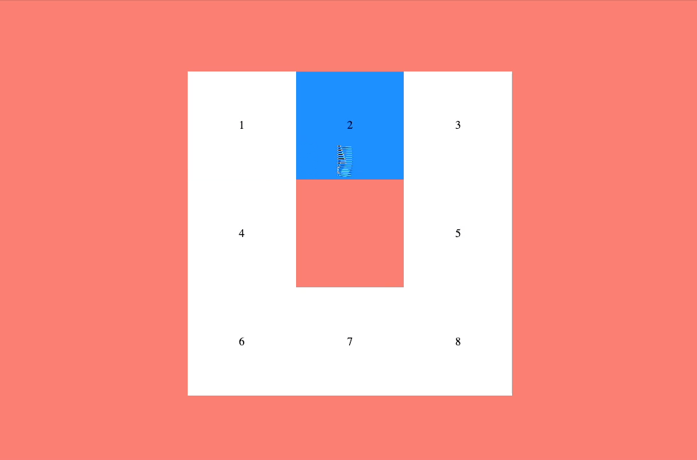
그리드를 이용해 레이아웃을 만든 후 input, label 태그를 사용해 해당칸을 클릭할 수 있게 했습니다. 이후 가상요소를 추가하고 keyframes 를 사용해 애니메이션 효과를 주었습니다.
html
전체를 감싸는 div 태그의 클래스 이름은 grid 이고 8개의 div 태그를 가집니다. 클래스 명은 box 로 같고 각 요소의 선택은 nth-child() 로 합니다. box 안에는 Input 태그와 label 태그가 있습니다. input 태그 type 은 radio(체크할 수 있는) 이고 id 값을 label 태그의 for 속성에 넣어서 두 태그를 연결할 수 있습니다.
<div class="grid">
  <div class="box">
    <input type="radio" name="box" id="box1" />
    <label for="box1">1</label>
  </div>
  <div class="box">
    <input type="radio" name="box" id="box2" />
    <label for="box2">2</label>
  </div>
  <div class="box">
    <input type="radio" name="box" id="box3" />
    <label for="box3">3</label>
  </div>
  <div class="box">
    <input type="radio" name="box" id="box4" />
    <label for="box4">4</label>
  </div>
  <div class="box">
    <input type="radio" name="box" id="box5" />
    <label for="box5">5</label>
  </div>
  <div class="box">
    <input type="radio" name="box" id="box6" />
    <label for="box6">6</label>
  </div>
  <div class="box">
    <input type="radio" name="box" id="box7" />
    <label for="box7">7</label>
  </div>
  <div class="box">
    <input type="radio" name="box" id="box8" />
    <label for="box8">8</label>
  </div>
</div>
CSS
가운데 정렬
해당 보드판을 화면의 가운데 정렬하기 위해 body 태그에 아래와 같은 속성을 적용했습니다. positon 으로 전체 화면 영역을 지정해야 flex 의 align-item: center 가 적용됩니다.
body {
  display: flex;
  justify-content: center;
  align-items: center;
  position: fixed;
  top: 0;
  left: 0;
  right: 0;
  bottom: 0;
  background: salmon;
}
3단 그리드 적용
보드판에 display : grid 를 적용해 가로 3 세로 3 단의 그리드를 만습니다. vmin 은 브라우저 폭이나 높에서 가장 작은 수치를 기준으로 적용됩니다. (vmax 는 반대)
.grid {
  display: grid;
  grid-template-rows: repeat(3, 20vmin);
  grid-template-columns: repeat(3, 20vmin);
}
이제 각 box 요소를 선택하고 그리드 상의 위치를 잡아줍니다. column 과 row 번호는 브라우저 개발자 도구를 활용하면 확인하기 쉽습니다.
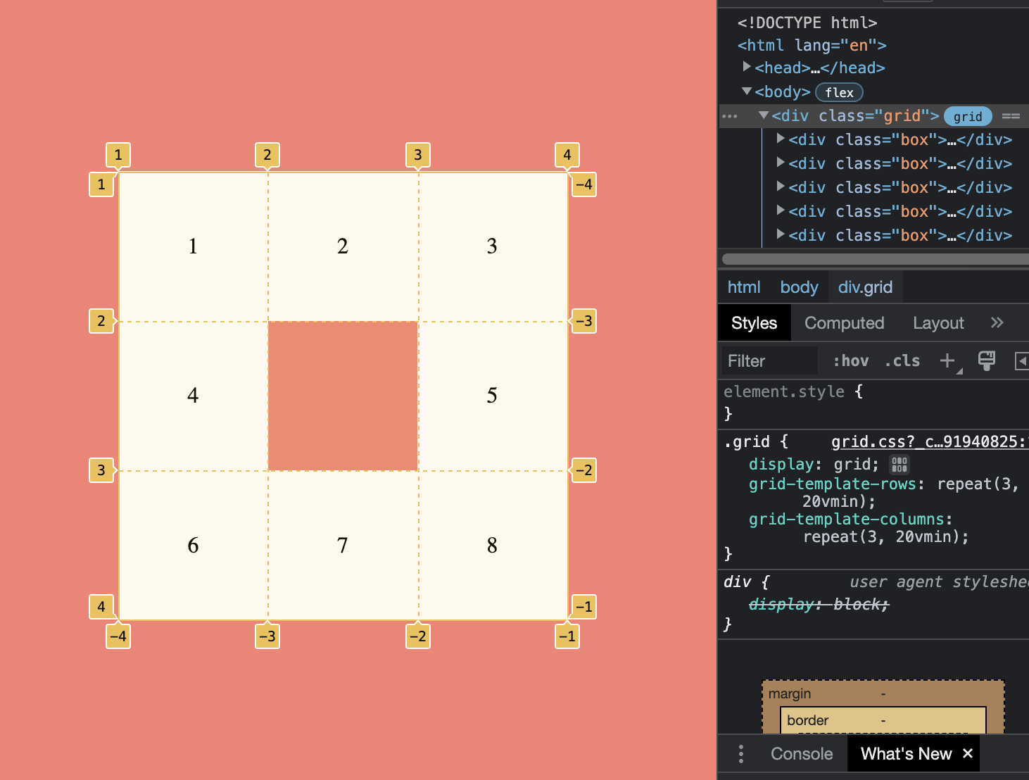
.box:nth-child(5) {
  grid-row: 2;
  grid-column: 3;
}
.box:nth-child(6) {
  grid-row: 3;
  grid-column: 1;
}
.box:nth-child(7) {
  grid-row: 3;
  grid-column: 2;
}
.box:nth-child(8) {
  grid-row: 3;
  grid-column: 3;
}
lebel 과 input 설정
라디오 타입 버튼으로 처리한 Input 태그는 화면에서 보이지 않게 했지만 label 태그와 연결된 상태라 체크시 label 태그를 통해 스타일을 적용할 수 있습니다.
.box label {
  display: flex;
  align-items: center;
  justify-content: center;
  width: 100%;
  height: 100%;
  cursor: wait;
  background: white;
}
.box label:hover {
  background: dodgerblue;
}
.box input {
  position: absolute; // 공간을 차지 하지 않게 띄워줌
  opacity: 0;
}
.box input:checked + label { // 라디오 버튼이 체크됬을 때 라벨 태그에 스타일 적용
  background: yellow;
}
.box input:checked + label:before { // 가상 요초 추가
  content: "";
  position: absolute;
  display: block;
  width: 50px;
  height: 50px;
  background: dodgerblue;
  border-radius: 50%;
  animation: bounce 0.25s infinite alternate; // 키프레임으로 만든 애니메이션 적용
}
keyframes 애니메이션
bounce 라는 이름의 키프레임을 만들어서 위에 적용했습니다. Y 축을 기준으로 움직으며 아래에 위치했을 때 y 축 기준으로 크기가 줄어들게 설정 했습니다.
@keyframes bounce {
  from {
    transform: translateY(10px) scaleY(0.7);
  }
  to {
    transform: translateY(-50px);
  }
}