🚩 loading 응용
loading
📝 설명
- 어제 했던 css 백그라운드 배경 애니메이션에 로딩 효과를 응용하였다.
✒️ 사용법
입력
	<style>
      .bg {
        position: fixed;
        top: 0; left: 0; right: 0; bottom: 0;
        background: linear-gradient(45deg, #df93dc, #5180d6);
        animation: bgChange 3s infinite alternate;
      }

      @keyframes bgChange {
        0% { filter: hue-rotate(0deg); }
        100% { filter: hue-rotate(180deg); }
        /* alternate에 180deg을 사용하지 않아도 360deg를 사용하면 계속 변함 */
      }

      .load {
        position: absolute;
        left: 50%; top: 50%;
        transform: translate(-50%, -50%);
        text-align: center;
        height: 150px;
      }
      .load h1 {
        margin: 0; padding: 0 0 10px 0;
        color: #fff;
        letter-spacing: 10px;
        animation: h1_opacity .7s alternate infinite;
      }
      .load span {
        width: 10px; height: 50px;
        background-color: rgba(255, 255, 255, .7);
        display: inline-block;
        border-radius: 5px;
        margin: 0 2px;
        animation: barMove 2s infinite;
      }

      .load span.bar1 { animation-delay: -0.1s; }
      .load span.bar2 { animation-delay: 0; }
      .load span.bar3 { animation-delay: 0.1s; }
      .load span.bar4 { animation-delay: 0.2s; }
      .load span.bar5 { animation-delay: .3s; }

      @keyframes h1_opacity {
        0% { opacity: 1; }
        70% { opacity: 0.5; }
        100% { opacity: .1; }
      }
      @keyframes barMove {
        0%, 90% { transform: translateY(0); }
        33% { transform: translateY(40px); height: 30px }
        50% { transform: translateY(-15px); height: 60px; }
        75% { transform: translateY(15px); height: 40px; }
      }

    </style>
  </head>
  <body>
    <div class="bg">
      <div class="load">
        <h1>LOADING</h1>
          <span class="bar1"></span>
          <span class="bar2"></span>
          <span class="bar3"></span>
          <span class="bar4"></span>
          <span class="bar5"></span>
      </div>
    </div>
  </body>
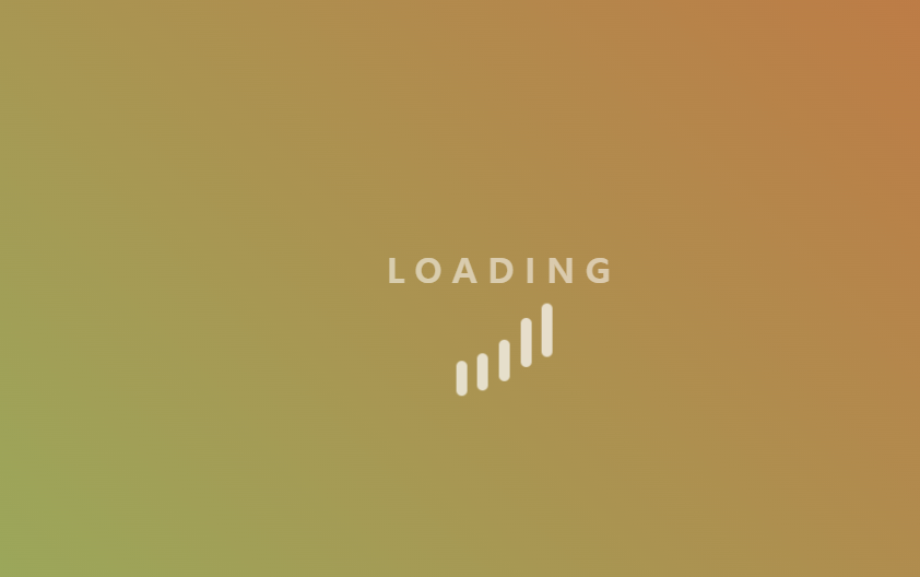
출력
- 이미지로 대체
🔗 참고 링크 & 도움이 되는 링크
🚩 button 응용
button
📝 설명
- 지금까지 배운 css를 응용하여 애니메이션이 들어간 button을 만듦
✒️ 사용법
입력
<style>
* { margin: 0; padding: 0; }
body { font-family: sans-serif; }
body > div {
padding: 30px 0 0 100px;
border-bottom: 1px solid gray;
height: 100px;
box-sizing: border-box;
}
h3 { display: inline-block; width: 120px; }
label { cursor: pointer; }
input[type="checkbox"] { display: none; }
</style>
</head>
<body>
<!-- 햄버거 버튼 1 START -->
<div id="hamburgBtn1">
<h3>open/close</h3>
<input type="checkbox" id="ham_input1">
<label for="ham_input1">
<span></span>
<span></span>
<span></span>
</label>
<style>
#hamburgBtn1 { }
#hamburgBtn1 label {
position: relative;
/* border: 1px solid red; */
width: 24px; height: 24px;
display: inline-block;
vertical-align: middle;
}
#hamburgBtn1 span {
/* display: inline-block; */
width: 24px; height: 2px;
background: #000;
position: absolute;
/* position: absolute를 사용하면 inline은 아니기 때문에 display: inline-block 삭제 */
/* transform-origin: 2px 1px; */
transition: all 0.3s ease-in;
}
#hamburgBtn1 span:nth-child(1) { /*top: 0;*/ top: 4px; }
#hamburgBtn1 span:nth-child(2) { top: 50%; transform: translateY(-50%);}
/* transform: translateY() 사용은 좋지 않은 방법 */
#hamburgBtn1 span:nth-child(3) { /*top: 100%; transform: translateY(-100%)*/ bottom: 4px; }
/* 체크박스가 체크되어있을때 */
#ham_input1:checked + label > span:nth-child(1) { /* + : 바로 뒤에 있는 형제관계 */
transform: rotate(45deg);
margin: 7px 7px 0 0;
}
#ham_input1:checked + label > span:nth-child(2) { opacity: 0; }
#ham_input1:checked + label > span:nth-child(3) {
transform: rotate(-45deg);
margin: 0 7px 7px 0;
}
</style>
</div>
<!-- 햄버거 버튼 1 END -->
<!-- 햄버거 버튼 2 START -->
<div id="hamburgBtn2">
<h3>open/close</h3>
<input type="checkbox" id="ham_input2">
<label for="ham_input2">
<span></span>
</label>
<style>
#hamburgBtn2 { }
#hamburgBtn2 label {
position: relative;
/* border: 1px solid red; */
width: 20px; height: 20px;
display: inline-block;
vertical-align: middle;
}
#hamburgBtn2 span {
position: absolute;
top: calc(50% - 1px);
width: 20px; height: 2px;
background: #000;
transition: all 0.3s ease-out;
}
#hamburgBtn2 span::before, #hamburgBtn2 span::after {
position: absolute;
/* display: block; */
content: "";
width: 20px; height: 2px;
background: #000;
transition: all 0.3s ease-out;
}
#hamburgBtn2 span::before {
top: -5px;
}
#hamburgBtn2 span::after {
top: 5px;
}
/* 체크박스가 체크되어있을때 */
#ham_input2:checked + label span::before {
background: slateblue;
top: 0;
transform: rotate(45deg);
}
#ham_input2:checked + label span { background: transparent; }
#ham_input2:checked + label span::after {
background: slateblue;
top: 0;
transform: rotate(-45deg);
}
</style>
</div>
<!-- 햄버거 버튼 2 END -->
<!-- 입체 버튼 START -->
<div id="upDownBtn">
<h3>up/down</h3>
<input type="checkbox" id="upDown_input">
<label for="upDown_input">BUTTON</label>
<style>
#upDownBtn {}
#upDownBtn label {
display: inline-block;
background: thistle;
color: #fff;
padding: 10px 20px;
border-radius: 8px;
border-bottom: 7px solid #9966CC;
transition: .3s;
}
#upDown_input:checked + label {
border-bottom-width: 1px;
transform: translateY(5px);
}
</style>
</div>
<!-- 입체 버튼 END -->
<!-- on/off 버튼 START -->
<div id="onOffBtn">
<h3>on/off</h3>
<input type="checkbox" id="onOff_input">
<label for="onOff_input">
<span>ON</span>
<span>OFF</span>
<span class="circleBtn"></span>
</label>
<style>
#onOffBtn label {
background: Gainsboro;
display: inline-block;
width: 100px; height: 40px;
border-radius: 20px;
position: relative;
vertical-align: middle;
transition: .3s;
overflow: hidden; /* 글씨가 버튼 밖에서 보이지 않도록 함 */
}
#onOffBtn label span {
position: absolute;
top: 50%;
transform: translateY(-50%);
transition: .3s;
}
#onOffBtn label span:nth-child(1) { left: -30px; }
#onOffBtn label span:nth-child(2) { right: 25px; }
#onOffBtn label span.circleBtn {
/* position: absolute; */ /* - #onOffBtn label span {}에 옮김*/
/* display: inline-block; */
width: 32px; height: 32px;
background-color: lightslategray;
border-radius: 50%;
border: 1px solid #fff;
margin: 0 2px;
transition: .3s;
}
#onOff_input:checked + label { background-color: #c098c0 }
#onOff_input:checked + label span.circleBtn {
background: #9966CC;
margin-left: 64px;
}
#onOff_input:checked + label span:nth-child(1) { left: 25px; }
#onOff_input:checked + label span:nth-child(2) { right: -35px; }
</style>
</div>
<!-- on/off 버튼 END -->
<!-- close/open 버튼 START -->
<div id="openBtn">
<h3>close/open</h3>
<input type="checkbox" id="open_input">
<label for="open_input">
<svg viewBox="0 0 512 512"><path d="M459.37 151.716c.325 4.548.325 9.097.325 13.645 0 138.72-105.583 298.558-298.558 298.558-59.452 0-114.68-17.219-161.137-47.106 8.447.974 16.568 1.299 25.34 1.299 49.055 0 94.213-16.568 130.274-44.832-46.132-.975-84.792-31.188-98.112-72.772 6.498.974 12.995 1.624 19.818 1.624 9.421 0 18.843-1.3 27.614-3.573-48.081-9.747-84.143-51.98-84.143-102.985v-1.299c13.969 7.797 30.214 12.67 47.431 13.319-28.264-18.843-46.781-51.005-46.781-87.391 0-19.492 5.197-37.36 14.294-52.954 51.655 63.675 129.3 105.258 216.365 109.807-1.624-7.797-2.599-15.918-2.599-24.04 0-57.828 46.782-104.934 104.934-104.934 30.213 0 57.502 12.67 76.67 33.137 23.715-4.548 46.456-13.32 66.599-25.34-7.798 24.366-24.366 44.833-46.132 57.827 21.117-2.273 41.584-8.122 60.426-16.243-14.292 20.791-32.161 39.308-52.628 54.253z"/></svg>
<span>내 트위터 바로가기</span>
</label>
<style>
#openBtn label {
display: inline-block;
width: 36px; height: 36px;
background-color: #76A9EA;
border-radius: 5px;
padding: 5px 0 0 5px;
box-sizing: border-box; /* padding 영향x */
vertical-align: middle ;
transition: .3s;
}
#openBtn span {
position: absolute;
font-size: 14px;
padding: 4px 0 0 15px;
color: #fff;
}
#openBtn svg { width: 26px; fill: #fff; }
#open_input:checked + label { width: 180px; }
</style>
</div>
<!-- close/open 버튼 END -->
<!-- 3D 버튼 START -->
<div id="rotateBtn">
<h3>3D(rotate)</h3>
<input type="checkbox" id="rotate_input">
<label for="rotate_input">
<span>CLICK!
<svg viewBox="0 0 512 512" width="25px" height="25px" fill="#fff"><path d="M447.5 224H456c13.3 0 24-10.7 24-24V72c0-9.7-5.8-18.5-14.8-22.2s-19.3-1.7-26.2 5.2L397.4 96.6c-87.6-86.5-228.7-86.2-315.8 1c-87.5 87.5-87.5 229.3 0 316.8s229.3 87.5 316.8 0c12.5-12.5 12.5-32.8 0-45.3s-32.8-12.5-45.3 0c-62.5 62.5-163.8 62.5-226.3 0s-62.5-163.8 0-226.3c62.2-62.2 162.7-62.5 225.3-1L311 183c-6.9 6.9-8.9 17.2-5.2 26.2s12.5 14.8 22.2 14.8H447.5z"/></svg>
</span>
<span>BACK
<svg viewBox="0 0 448 512" width="25px" height="25px" fill="#fff"><path d="M9.4 233.4c-12.5 12.5-12.5 32.8 0 45.3l160 160c12.5 12.5 32.8 12.5 45.3 0s12.5-32.8 0-45.3L109.2 288 416 288c17.7 0 32-14.3 32-32s-14.3-32-32-32l-306.7 0L214.6 118.6c12.5-12.5 12.5-32.8 0-45.3s-32.8-12.5-45.3 0l-160 160z"/></svg>
</span>
</label>
<style>
#rotateBtn { border-bottom: none; }
#rotateBtn label {
display: inline-block;
width: 100px;
height: 60px;
border: 1px solid gray;
vertical-align: middle;
position: relative;
}
#rotateBtn label span {
position: absolute;
width: 100%;
height: 100%;
color: #fff;
text-align: center;
line-height: 60px;
backface-visibility: hidden; /* 3d로 회전한 요소의 뒷면 숨김 */
transition: .5s;
}
#rotateBtn label span:nth-child(1) {
background-color: Thistle;
transform: rotateX(0deg);
}
#rotateBtn label span:nth-child(2) {
background-color: LightSteelBlue;
transform: rotateX(180deg);
}
#rotateBtn label span svg { transform: translateY(6px); }
#rotate_input:checked + label span:nth-child(1) {transform: rotateX(180deg); }
#rotate_input:checked + label span:nth-child(2) { transform: rotateX(0deg); }
</style>
</div>
<!-- 3D 버튼 END -->
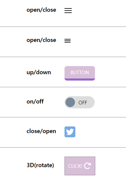
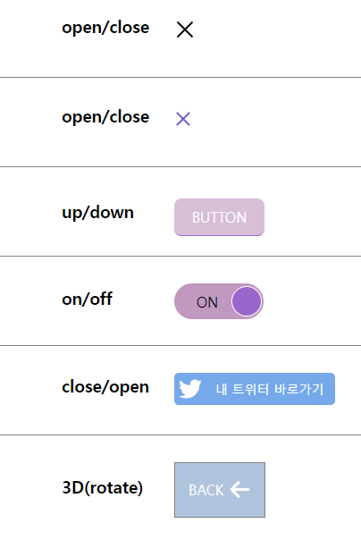
</body>출력
- 이미지로 대체
기본
checked
🔗 참고 링크 & 도움이 되는 링크

공부하는 벨로그