-
Age
-
Age feature살피기
-
생존에 따른 Age의 histogram 그려보기
-
생존자 중 나이가 어린 경우가 많다
-
Class가 높을수록 나이 많은 사람의 비중이 높다
-
나이대가 변하면서 생존률이 어떻게 되는지 보기
-
나이 범위를 넓혀가며 생존률 확인
-
나이가 어릴 수록 생존률이 확실히 높다
-
나이가 중요한 feature데이터
-
-
Pclass, Sex, Age
-
seaborn의 violinplot를 사용하여 나온 거 모두 그리기
-
x축은 우리가 나눠서 보고 싶어하는 case(Pclass, sex)
-
y축은 보고 싶어하는 distribution(Age)
-
Pclass별로 Age의 distribution어떻게 다른지와 생존여부에 따라 구분
-
Sex, 생존에 따른 distribution이 다른지 보여주는 그래프
-
생존만 보면 모들 클래스에 나이가 어릴 수록 생존율 높다
-
여자와 아이의 생존율이 높은 걸로 보아 먼저 챙기는 것을 알 수 있다.
-
-
Embarked
-
탑승한 항수
-
탑승한 곳에 따른 생존률
-
비슷한 생존률(C가 제일 높음)
-
모델에 큰 영향을 줄진 미지수 왜냐하면 feature가 두드러지지 않음
-
split를 사용하여 확인
-
Figure(1): 전체적으로 볼 때 S가 가장 많음
-
Figure(2): C와 Q는 남녀 비율이 비슷하고, s는 남자가 더 많다
-
Figure(3): 생존확률이 S의 경우 많이 낮다
-
Figure(4): Class로 split하니 C가 가장 높다(아마도 탑승객이 많아서 인 것 같습니다.)
-
3은 3rd class가 많아서 생존확률이 낮다
-
Age
#Age feature살펴보기
print('제일 나이 많은 탑승객 : {:.1f} Years'.format(df_train['Age'].max()))
print('제일 어린 탑승객 : {:.1f} Years'.format(df_train['Age'].min()))
print("탑승객 평균 나이 : {:.1f} Years".format(df_train['Age'].mean()))
#생존 Age의 historgram 그리기

fig, ax = plt.subplots(1, 1, figsize=(9,5))
sns.kdeplot(df_train[df_train['Survived'] == 1]['Age'], ax=ax)
sns.kdeplot(df_train[df_train['Survived'] == 0]['Age'], ax=ax)
plt.legend(['Survived == 1', 'Survived == 0'] )
plt.show()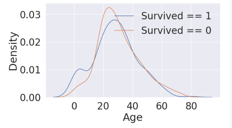
#Age distribution withing classes

plt.figure(figsize=(8,6))
df_train['Age'][df_train['Pclass'] == 1].plot(kind = 'kde')
df_train['Age'][df_train['Pclass'] == 2].plot(kind = 'kde')
df_train['Age'][df_train['Pclass'] == 3].plot(kind ='kde')

plt.xlabel('Age')
plt.title('Age Distribution within classes')
plt.legend(['1st Class', '2nd Class', '3nd Class'])
cummulate_survival_ratio = []
for i in range(1, 80):
    cummulate_survival_ratio.append(df_train[df_train['Age'] < i]['Survived'].sum() / len(df_train[df_train['Age'] < i]['Survived']))
plt.figure(figsize=(7,7))
plt.plot(cummulate_survival_ratio)
plt.title('Survival rate change dependings on range of Age', y=1.02)
plt.ylabel('Survival rate')
plt.xlabel('Range of Age(0~x)')
plt.show()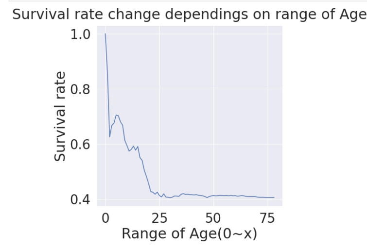
Pclass, Sex, Age
f, ax=plt.subplots(1,2,figsize=(18,8))
sns.violinplot("Pclass", "Age", hue = "Survived", data = df_train, scale = 'count', split=True, ax=ax[0])
ax[0].set_title('Pclass and Age vs Survived')
ax[0].set_yticks(range(0,110,10))
sns.violinplot("Sex","Age", hue="Survived", data=df_train, scale='count', split=True, ax=ax[1])
ax[1].set_title('Sex and Age vs Survived')
ax[1].set_yticks(range(0,110,10))
plt.show()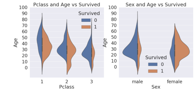
Embarked
f, ax = plt.subplots(1, 1, figsize=(7,7))
df_train[['Embarked', 'Survived']].groupby(['Embarked'], as_index=True).mean().sort_values(by='Survived', ascending=False).plot.bar(ax=ax)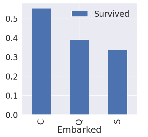
f,ax = plt.subplots(2, 2, figsize=(20,15))
sns.countplot('Embarked', data=df_train, ax=ax[0,0])
ax[0,0].set_title('(1) No. of Passengers Boarded')
sns.countplot('Embarked', hue='Sex', data = df_train, ax=ax[0,1])
ax[0,1].set_title('(2) Male-Female Split for Embarked')
sns.countplot('Embarked', hue = 'Survived', data = df_train, ax=ax[1,0])
ax[1,0].set_title('(3) Embarked vs Survived')
sns.countplot('Embarked', hue='Pclass', data= df_train, ax=ax[1,1])
ax[1,1].set_title('(4) Embarked vs Pclass')
plt.subplots_adjust(wspace=0.2, hspace=0.5)
plt.show()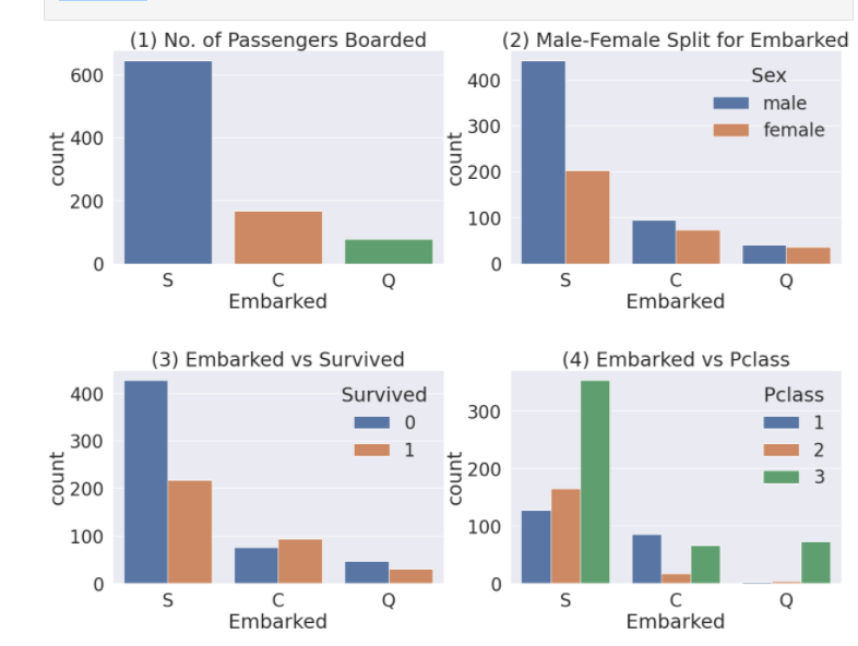

성장을 도울 아카이빙 블로그