Effect of Age on Repayment
나이에 따른 Repayment 현황을 체크하는 부분입니다.
# Check the effection
app_train['DAYS_BIRTH'] = abs(app_train['DAYS_BIRTH'])
app_train['DAYS_BIRTH'].corr(app_train['TARGET']) #-0.07823930830982694
#Set the style of plots
plt.style.use('fivethirtyeight')
#Plot the distribution of ages in years
plt.hist(app_train['DAYS_BIRTH'] / 365, edgecolor = 'k', bins=25)
plt.title('Age of Client');
plt.xlabel('Age (years)');
plt.ylabel('Count')
"""No outliers as all the ages are reasonable"""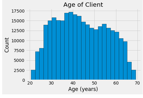
"""Check the effect of the age on the target Use KDE and seaborn kdeplot for this graph"""

plt.figure(figsize = (10, 8))

# KDE plot of loans that were repaid on time
sns.kdeplot(app_train.loc[app_train['TARGET'] == 0, 'DAYS_BIRTH'] / 365, label = 'target == 0')

# KDE plot of loans which were not repaid on time
sns.kdeplot(app_train.loc[app_train['TARGET'] == 1, 'DAYS_BIRTH'] / 365, label = 'target == 1')

# Labeling of plot
plt.xlabel('Age (years)'); plt.ylabel('Density'); plt.title('Distribution of Ages');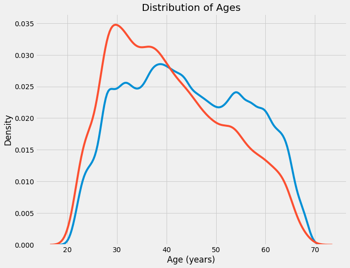
#age information into a separate dataframe

age_data = app_train[['TARGET', 'DAYS_BIRTH']]
age_data['YEARS_BIRTH'] = age_data['DAYS_BIRTH'] / 365

#Bin the age data

age_data['YEARS_BINNED'] = pd.cut(age_data['YEARS_BIRTH'], bins = np.linspace(20,70,num =11))
age_data.head(10)
#Group by the bin and calculate averages

age_groups = age_data.groupby('YEARS_BINNED').mean()
age_groups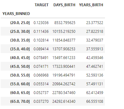
plt.figure(figsize = (8,8))

#Graph the age bins and the average of the target as a bar plot

plt.bar(age_groups.index.astype(str), 100 * age_groups['TARGET'])

#Plot labeling

plt.xticks(rotation = 75); plt.xlabel('Age Group (years)');
plt.ylabel('Failure to Repay (%)')
plt.title('Failure to Repay by Age Group')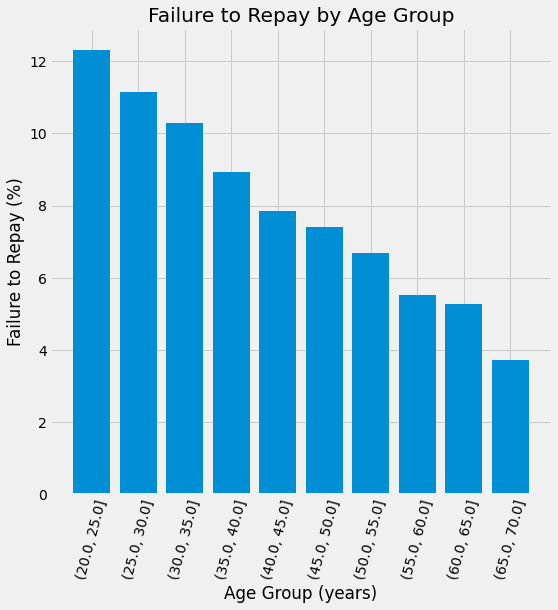
Exterior Sources
#Extract the EXT_SOURCE variables and show correlations

ext_data = app_train[['TARGET', 'EXT_SOURCE_1', 'EXT_SOURCE_2', 'EXT_SOURCE_3', 'DAYS_BIRTH']]
ext_data_corrs = ext_data.corr()
ext_data_corrs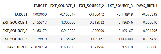
plt.figure(figsize = (8,6))

#Heatmap of correlationos

sns.heatmap(ext_data_corrs, cmap = plt.cm.RdYlBu_r, vmin = -0.25, annot=True, vmax=0.6)
plt.title('Correlation Heatmap')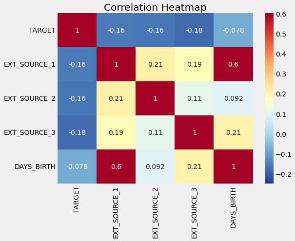
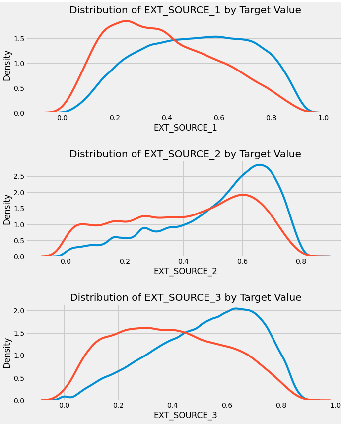
#various visualization

plt.figure(figsize = (10, 12))

# iterate through the sources
for i, source in enumerate(['EXT_SOURCE_1', 'EXT_SOURCE_2', 'EXT_SOURCE_3']):

    # create a new subplot for each source
    plt.subplot(3, 1, i + 1)
    # plot repaid loans
    sns.kdeplot(app_train.loc[app_train['TARGET'] == 0, source], label = 'target == 0')
    # plot loans that were not repaid
    sns.kdeplot(app_train.loc[app_train['TARGET'] == 1, source], label = 'target == 1')

    # Label the plots
    plt.title('Distribution of %s by Target Value' % source)
    plt.xlabel('%s' % source); plt.ylabel('Density');
Pairs plot
#Copy the data for plotting

plot_data = ext_data.drop(columns = ['DAYS_BIRTH']).copy()

#Add in the age of the client in years

plot_data['YEARS_BIRTH'] = age_data['YEARS_BIRTH']

#Drop na values and limit to first 100000 rows

plot_data = plot_data.dropna().loc[:100000, :]

#function to calculate correlation coefficient between tow columns

def corr_func(x,y, **kwargs):
    r = np.corrcoef(x,y)[0][1]
    ax = plt.gca()
    ax.annotate("r = {:.2f}".format(r),
                xy=(.2, .8), xycoords=ax.transAxes,
                size = 20)


#Create the pairgrid object

grid = sns.PairGrid(data = plot_data, size =3, diag_sharey=False,
                    hue = 'TARGET',
                    vars = [x for x in list(plot_data.columns)
if x != 'TARGET'])

#Upeer is a scatter plot

grid.map_upper(plt.scatter, alpha=0.2)

#Diaonal is a histogram

grid.map_diag(sns.kdeplot)

#Bottom is density plot

grid.map_lower(sns.kdeplot, cmap = plt.cm.OrRd_r);

plt.suptitle('Ext Source and Age Features Pairs Plot', size = 32, y = 1.05);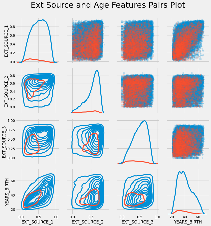

성장을 도울 아카이빙 블로그