
<!DOCTYPE html>
<html lang="en">
  <head>
    <meta charset="UTF-8" />
    <meta name="viewport" content="width=device-width, initial-scale=1.0" />
    <meta http-equiv="X-UA-Compatible" content="ie=edge" />
    <title>CSS Grid</title>
    <style>
      .father {
        display: grid;
        grid-auto-rows: 200px;
        grid-gap: 5px;
        grid-template-columns: minmax(400px, 2fr) repeat(3, 1fr);
      }
      .first {
        background-color: #f1c40f; /* yellow colour */
      }
      .second {
        background-color: #27ae60; /* green colour */
      }
      .third {
        background-color: #3498db; /* blue colour */
      }
      .fourth {
        background-color: #d35400; /* red colour */
      }
    </style>
  </head>
  <body>
    <div class="father">
      <div class="first"></div>
      <div class="second"></div>
      <div class="third"></div>
      <div class="fourth"></div>
    </div>
  </body>
</html>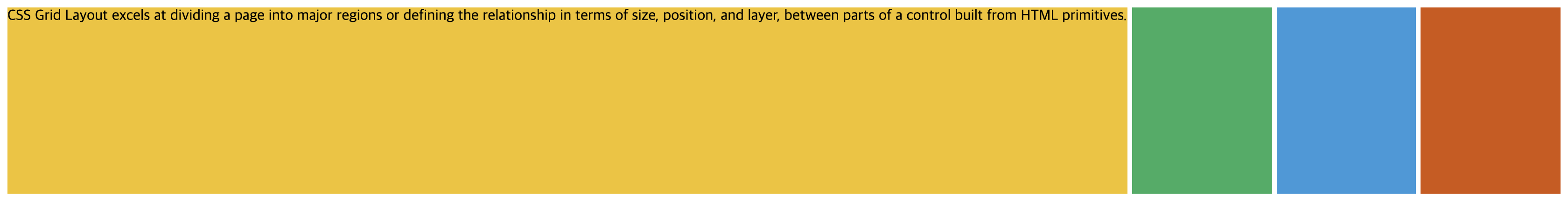
<!DOCTYPE html>
<html lang="en">
  <head>
    <meta charset="UTF-8" />
    <meta name="viewport" content="width=device-width, initial-scale=1.0" />
    <meta http-equiv="X-UA-Compatible" content="ie=edge" />
    <title>CSS Grid</title>
    <style>
      .father {
        display: grid;
        grid-auto-rows: 200px;
        grid-gap: 5px;
        grid-template-columns: max-content repeat(3, 1fr);
      }
      .first {
        background-color: #f1c40f; /* yellow colour */
      }
      .second {
        background-color: #27ae60; /* green colour */
      }
      .third {
        background-color: #3498db; /* blue colour */
      }
      .fourth {
        background-color: #d35400; /* red colour */
      }
    </style>
  </head>
  <body>
    <div class="father">
      <div class="first">
        CSS Grid Layout excels at dividing a page into major regions or defining
        the relationship in terms of size, position, and layer, between parts of
        a control built from HTML primitives.
      </div>
      <div class="second"></div>
      <div class="third"></div>
      <div class="fourth"></div>
    </div>
  </body>
</html>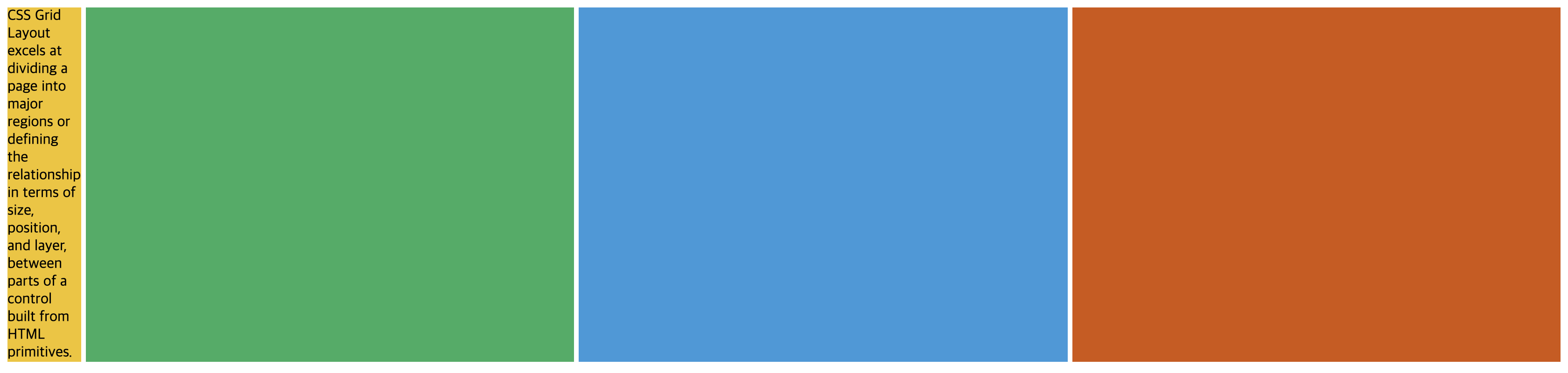
<!DOCTYPE html>
<html lang="en">
  <head>
    <meta charset="UTF-8" />
    <meta name="viewport" content="width=device-width, initial-scale=1.0" />
    <meta http-equiv="X-UA-Compatible" content="ie=edge" />
    <title>CSS Grid</title>
    <style>
      .father {
        display: grid;
        grid-gap: 5px;
        grid-template-columns: min-content repeat(3, 1fr);
      }
      .first {
        background-color: #f1c40f; /* yellow colour */
      }
      .second {
        background-color: #27ae60; /* green colour */
      }
      .third {
        background-color: #3498db; /* blue colour */
      }
      .fourth {
        background-color: #d35400; /* red colour */
      }
    </style>
  </head>
  <body>
    <div class="father">
      <div class="first">
        CSS Grid Layout excels at dividing a page into major regions or defining
        the relationship in terms of size, position, and layer, between parts of
        a control built from HTML primitives.
      </div>
      <div class="second"></div>
      <div class="third"></div>
      <div class="fourth"></div>
    </div>
  </body>
</html>
Blog by Chungsik Park