flex-container(father) & flex-item(box)
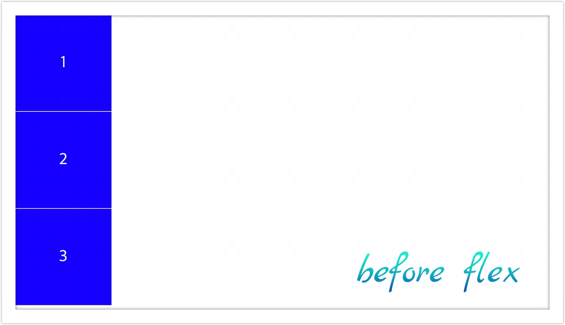
  <body>
    <div class="father">
      <div class="box">1</div>
      <div class="box">2</div>
      <div class="box">3</div>
    </div>
  </body>
위는 예시로 다룰 html 코드고 아래는 css 코드입니다.
.father {
  display: flex;
}

.box {
  width: 300px;
  height: 300px;
  background-color: blue;
  border: 1px solid white;
  display: flex;
  justify-content: center;
  align-items: center;
  color: white;
  font-size: 50px;
}- flex-item(box)은 flex-container(father)에 display: flex를 부여하는 즉시 효과가 적용됩니다.
- flex-item(요소)을 컨트롤하고 싶으면, flex-container(부모)에 속성을 주어야 합니다.
- flex-container(부모)는 width, height에 의해서 아이템을 정렬합니다.
- 수평 정렬을 주고 싶을 땐 충분한 width가 필요하고, 수직 정렬을 주고 싶을 땐 충분한 height가 필요합니다.
- 다양한 옵션들이 존재하고 이는 반응형이 적용됩니다.
.father {
  display: flex;
  flex-direction: row;
  justify-content: ...;
  align-items: ...;
  height: 100vh; // "충분한 height - vh(viewport height: 화면 높이)"
}
다양한 옵션들 밑바탕에 깔린 규칙을 axis(축)이라고 부릅니다. main axis는 justify-content가 영향을 주는 축이고, 반대로 cross axis는 align-items가 영향을 주는 축입니다. flex-direction이 row일 경우에 main axis는 수평축의 성질을 가지고, cross axis가 수직축의 성질을 가집니다. flex-direction이 column일 경우에는 상황이 달라집니다. 이 때 main axis는 수직축이의 성질을 가지고, cross axis는 수평축의 성질을 가집니다. display에 flex를 부여했을 때 자동생성되는 옵션인 flex-direction의 기본값은 row입니다.
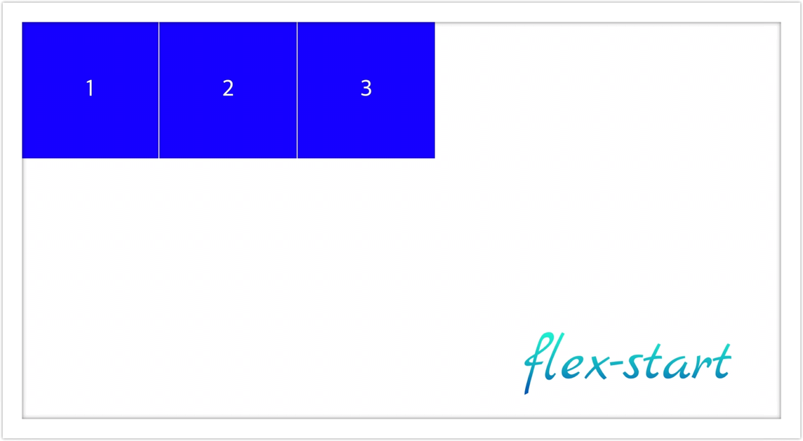
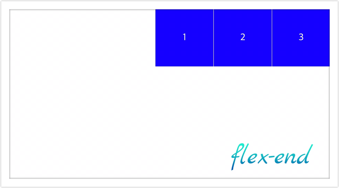
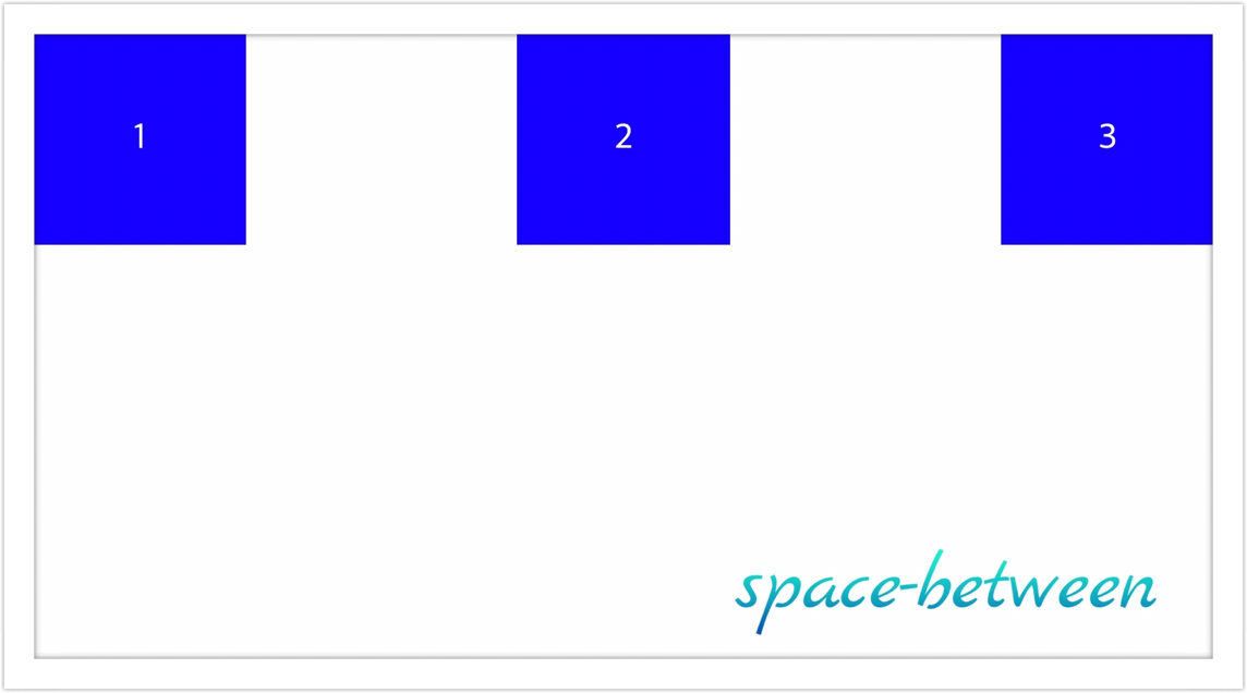
justify-content
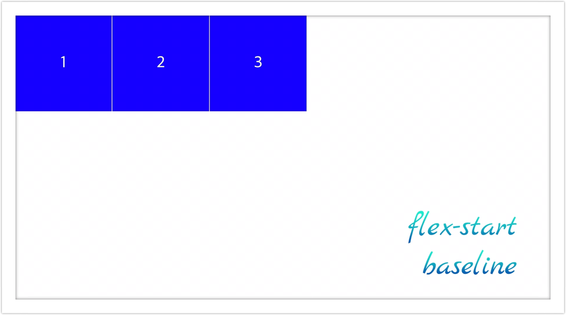
- flex-start: 요소들을 flex-container 시작점 끝으로 정렬 (default)
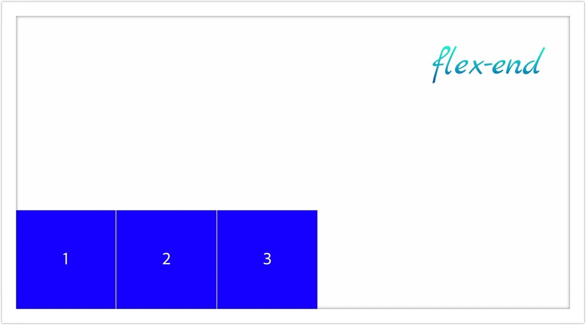
- flex-end: 요소들을 flex-container 종료점 끝으로 정렬
- space-between: 요소들 사이에 균등하게 분배하여 정렬
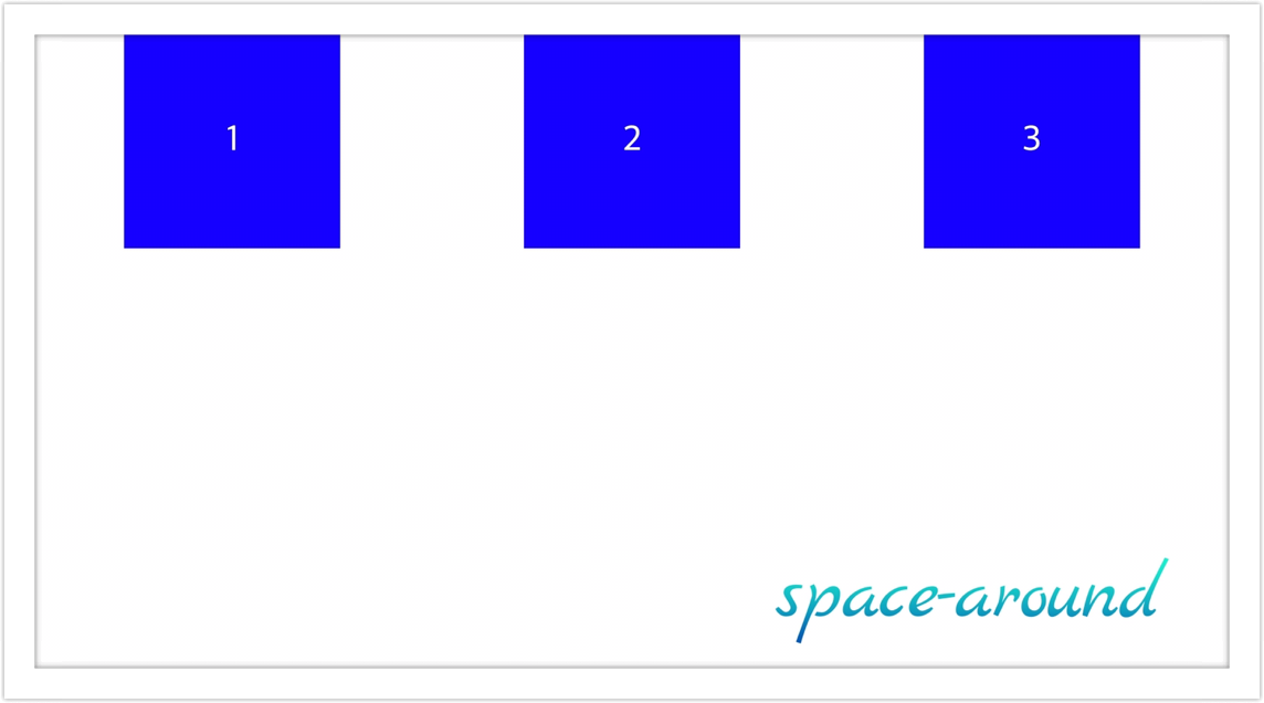
- space-around: 요소들이 양쪽 끝에 절반 크기의 공간이 있게하여 균등하게 분배 정렬
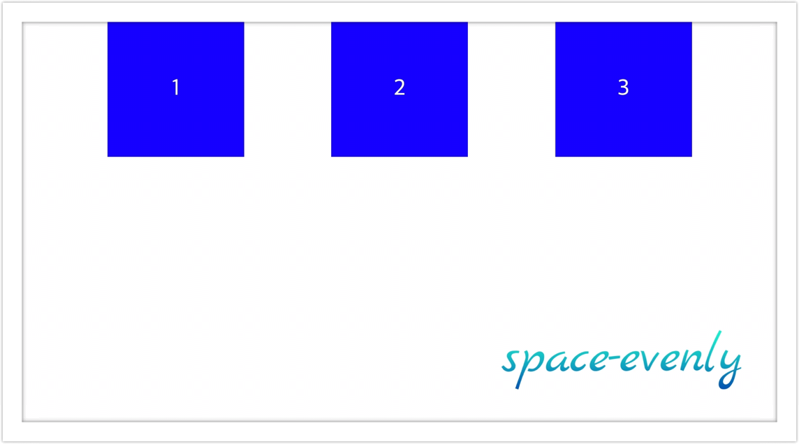
- space-evenly: 요소들이 main axis를 따라서 컨테이너 내에서 균등하게 분배 정렬
왜 시작점, 종료점이라는 단어를 썼는지는 flex-direction에 따라서 justify-content의 기준이 달라지기 때문입니다. 아래 예시를 확인해보세요.
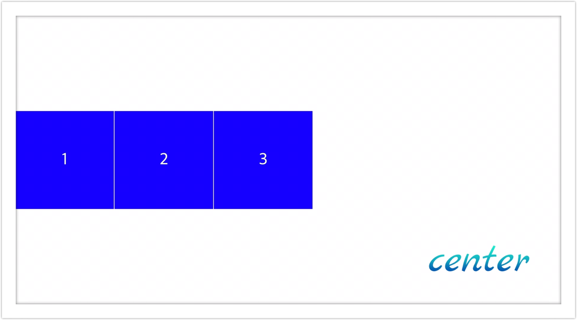
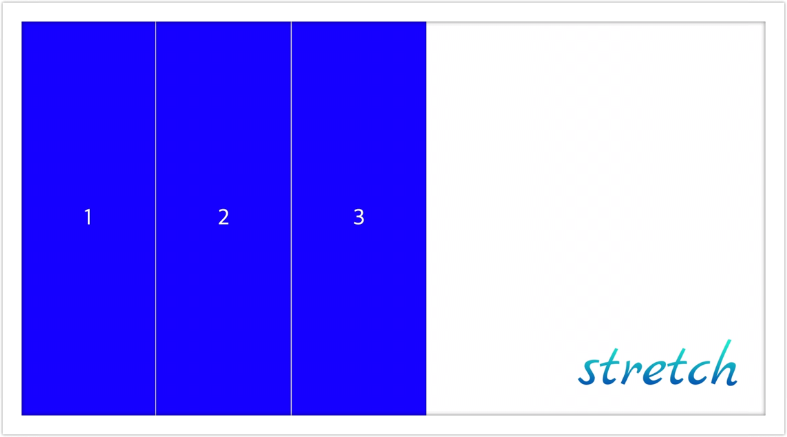
align-items
- baseline: 요소들을 flex-container의 시작 위치에 정렬
- flex-start: 요소들을 flex-container의 꼭대기로 정렬
- flex-end: 요소들을 flex-container의 바닥으로 정렬
- center: 요소들을 flex-container의 세로선 상의 가운대로 정렬
- stretch: 요소들을 flex-container에 맞게 늘려서 정렬 (default)
flex-direction
- row: 요소들을 왼쪽에서부터 배치 (default) // main axis: 수평축, cross axis: 수직축
- row-reverse: 요소들을 오른쪽에서부터 배치
- column: 요소들을 위에서부터 배치 // main axis: 수직축, cross axis: 수평축
- column-reverse: 요소들을 아래서부터 배치
.father {
  display: flex;
  flex-wrap: wrap;
  justify-content: space-between;
  height: 100vh;
}

.box {
  width: 300px;
  height: 300px;
}
display에 flex를 부여했을 때 자동생성되는 옵션인 flex-wrap의 기본값은 nowrap입니다. 이 때 임의로 지정한 width 또는 height는 무시하고 적용됩니다.
flex-wrap:
- nowrap: 요소들을 한 줄에 배치 (default)
- wrap: 요소들을 여러줄로 배치
- wrap-reverse: 요소들을 여러줄로 역방향 배치
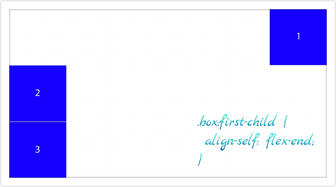
flex 관련 속성=을 부모 대신에 자식에게 직접 부여하여 컨트롤 가능한 경우도 있습니다. 바로 align-self입니다. 개별적으로 컨트롤이 필요할 경우에 유용하게 사용할 수 있습니다.
.father {
  display: flex;
  flex-direction: column;
  justify-content: center;
  height: 100vh;
}

.box {
  width: 300px;
  height: 300px;
  background-color: blue;
  border: 1px solid white;
  display: flex;
  justify-content: center;
  align-items: center;
  color: white;
  font-size: 50px;
}

.box.first-child {
  align-self: flex-end;
Blog by Chungsik Park