1. 참고사이트
https://codepen.io/ninecodes/pen/YjzLyy
2. 참고할 사이트 레이아웃 분석
HTML
<div class="back"></div>
<div class="heart"></div>
CSS
  .back {
    position: fixed;
    padding: 0;
    margin: 0;
    top: 0;
    left: 0;
    width: 100%;
    height: 100%;
    background: white;
    animation-name: backdiv;
    animation-duration: 1s;
    animation-iteration-count: infinite;
  }

  .heart {
    position: absolute;
    margin: auto;
    top: 0;
    right: 0;
    bottom: 0;
    left: 0;
    background-color: pink;
    height: 50px;
    width: 50px;
    transform: rotate(-45deg);
    animation-name: beat;
    animation-duration: 1s;
    animation-iteration-count: infinite;
  }
  .heart:after {
    background-color: pink;
    content: "";
    border-radius: 50%;
    position: absolute;
    width: 50px;
    height: 50px;
    top: 0px;
    left: 25px;
  }
  .heart:before {
    background-color: pink;
    content: "";
    border-radius: 50%;
    position: absolute;
    width: 50px;
    height: 50px;
    top: -25px;
    left: 0px;
  }

  @keyframes backdiv {
    50% {
      background: #ffe6f2;
    }
  }

  @keyframes beat {
    0% {
      transform: scale(1) rotate(-45deg);
    }
    50% {
      transform: scale(0.6) rotate(-45deg);
    }
  }
3.내가 서비스하고 채우고 싶은 내용 구성.
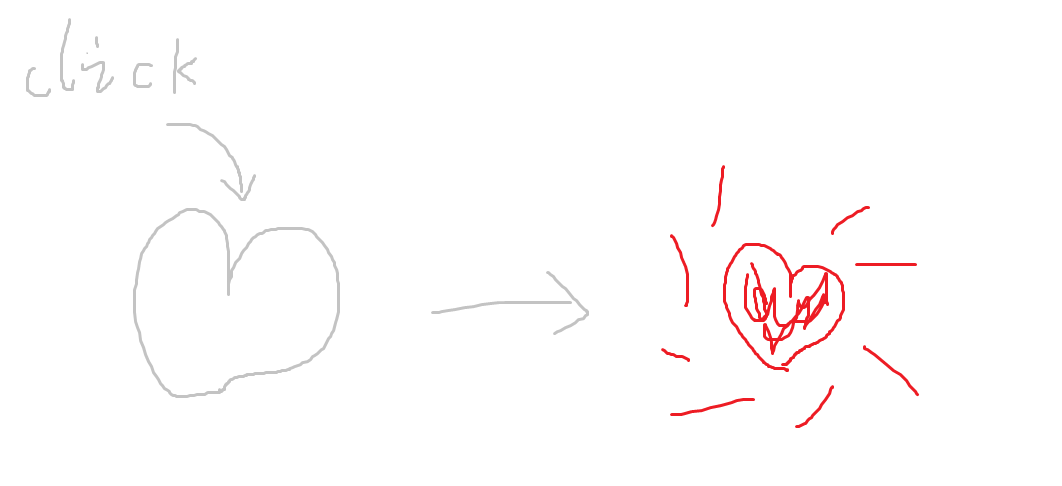
회색 heart를 클릭할 경우
(1) 점선 터지는 애니메이션 추가
(2) 두근두근 애니메이션 추가
(4) 하트에 컬러가 채워지는 애니메이션 추가
4.이를 토대로 html 파일을 하나 생성하여 html 태그를 이용해 작성
html
<!DOCTYPE html>
<html lang="en">
<head>
    <meta charset="UTF-8">
    <meta http-equiv="X-UA-Compatible" content="IE=edge">
    <meta name="viewport" content="width=device-width, initial-scale=1.0">
    <title>CSS좋아요버튼</title>
    <link rel="stylesheet" href="./css/heart.css">
</head>
<body>
    <label for="checkbox">
        <input type="checkbox" id="checkbox" hidden>
        <svg t="1689815540548" class="icon" viewBox="0 0 1024 1024" version="1.1" xmlns="http://www.w3.org/2000/svg" p-id="2271"><path d="M742.4 101.12A249.6 249.6 0 0 0 512 256a249.6 249.6 0 0 0-230.72-154.88C143.68 101.12 32 238.4 32 376.32c0 301.44 416 546.56 480 546.56s480-245.12 480-546.56c0-137.92-111.68-275.2-249.6-275.2z" fill="#231F20" p-id="2272" id="heart"></path></svg>
        <span></span>
    </label>
</body>
</html>
css
*{
    /*초기화*/
    margin: 0;
    padding: 0;
}

body{
    /*100% 창 높이*/
    height: 100vh;
    /*배치 center*/
    display: flex;
    justify-content: center;
    align-items: center;
    /*사용자정의: var 함수로 핸들링*/
    --c: #ff6b81;
}

svg{
    width: 200px;
    /*상대포지션*/
    position: relative;
    /*z-index: 10;*/
}

#heart{
    /*색 보충*/
    fill: #eee;

    /*stroke속성은 선, 문자, 원소등의 테두리에대해서 디자인 가능*/
    stroke: var(--c);
    /*선의 넓이*/
    stroke-width: 40px;
    /*선을 점선으로 설정, 점선의 길이 설정*/
    stroke-dasharray: 3000;
    /*displacement of line*/
    stroke-dashoffset: 3000;
    /*끝점은 둥글게*/
    stroke-linecap: round;


}

span{
    display: block;
    width: 24px;
    height: 24px;
    background-color: transparent;
    border-radius: 50%;
    /*절대적 포지션: center*/
    position: absolute;
    top: 50%;
    left: 50%;
    transform: translate(-50%, -50%) scale(0);
    /*각 방향의 쉐도우 설정*/
    /*var함수로 쉐도우 컬러 설정*/
    box-shadow: 0 -160px 0 var(--c),
    0 160px 0 var(--c),
    -160px 0 0 var(--c),
    160px 0 0 var(--c),
    -120px -120px 0 var(--c),
    120px -120px 0 var(--c),
    120px 120px 0 var(--c),
    -120px 120px 0 var(--c);
}

/*checkbox를 클릭할 경우 애니메이션 실행*/
#checkbox:checked + svg #heart{
    /*애니메이션실행: 애니메이션이름, 실행시간, 선형 마지막 정지한 프레임*/
    animation: drawHeart 1s linear forwards;
}

#checkbox:checked ~ span{
    /*애니메이션실행: 애니메이션이름, 실행시간, 선형 마지막 정지한 프레임*/
    animation: blink 0.5s ease-in-out forwards;
    /*애니메이션 딜레이*/
    animation-delay: 0.8s ;
}

#checkbox:checked + svg{
     /*애니메이션실행: 애니메이션이름, 실행시간, 선형 마지막 정지한 프레임*/
    animation: beat 1s linear forwards;;
}
label{
    /*마우스 heart로 이동시 마우스 커서변동*/
    cursor: pointer;
}

/*애니메이션 효과 설정*/
/*heart 애니메이션*/
@keyframes drawHeart{
    0%{
        stroke-dashoffset: 2600;
    }
    80%{
        fill: #eee;
        stroke-dashoffset: 0;
    }
    100%{
        fill: var(--c);
        stroke-dashoffset: 0;
    }

}
/*점 애니메이션*/
@keyframes blink{
    0%{
        transform: translate(-50%, -50%) scale(0.5);
        opacity: 0.8;
    }
    80%{
        transform: translate(-50%, -50%) scale(1);
        opacity: 1;
    }
    100%{
        transform: translate(-50%, -50%) scale(1.1);
        opacity: 0;
    }
}

/*두근두근 애니메이션*/
@keyframes beat {
    0%{
        transform: scale(1);
    }
    70%{
        transform: scale(1);
    }
    80%{
        transform: scale(1.2);
    }
    100%{
        transform: scale(1);
    }
}
테스트

나같은 경우 stroke-dasharray랑 stroke-dashoffset 잡을때 2600으로 잡았는데 우측 오른쪽 상단에 테두리가 툭 튀어나오는 경우가 있었다. 이유는 svg의 path가 stroke-dasharray보다 값이 커서 테두리의 선이 넘쳤던것이다.
stroke-dasharray: svg에 간격 주기
stroke-dashoffset: svg을 나타낼 지점 지정하기
dasharray, dashoffset 길이를 넉넉하게 잡아줌
stroke-dasharray: 3000;
stroke-dashoffset: 3000;
5. 전체코드

백엔드 개발 정리


정말 좋은 정보 감사합니다!