데이터를 한눈에! Visualization
- 학습 목표
- 파이썬 라이브러리(Pandas, Matplotlib, Seaborn)을 이용 - 그래프를 그리는 법을 학습합니다.
- 실전 데이터셋으로 직접 시각화해보며 데이터 분석에 필요한 탐색적 데이터 분석(EDA)을 하고 인사이트를 도출해 봅니다.
- 학습 목차
1, 파이썬으로 그래프를 그린다는 건?
2. 간단한 그래프 그리기
3. 그래프 4대 천왕: 막대그래프, 선그래프, 산점도, 히스토그램
4. 시계열 데이터 시각화하기
5. Heatmap
파이썬으로 그래프를 그린다는 건?
준비물
- Pandas, Matplotlib, Seaborn 등 : 시각화 라이브러리를 제공
Matplotlib와 Seaborn pip을 이용 설치
pip list | grep matplotlib
pip list | grep seaborn
그래프 그리기 개요
도화지를 펼치고 축을 그리고 그 안에 데이터를 그림
- 아래는 막대 그래프를 그리는 코드
import matplotlib.pyplot as plt
%matplotlib inline

# 그래프 데이터
subject = ['English', 'Math', 'Korean', 'Science', 'Computer']
points = [40, 90, 50, 60, 100]

# 축 그리기
fig = plt.figure()
ax1 = fig.add_subplot(1,1,1)

# 그래프 그리기
ax1.bar(subject, points)

# 라벨, 타이틀 달기
plt.xlabel('Subject')
plt.ylabel('Points')
plt.title("Yuna's Test Result")

# 보여주기
plt.savefig('./barplot.png')  # 그래프를 이미지로 출력
plt.show()                    # 그래프를 화면으로 출력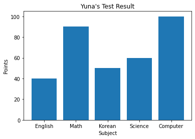

막대그래프 그리기
데이터 정의
import 하기
import matplotlib.pyplot as plt   #모듈을 불러오고
%matplotlib inline
# 매직 메서드
# 그래프 데이터
subject = ['English', 'Math', 'Korean', 'Science', 'Computer']
points = [40, 90, 50, 60, 100]
축그리기
# 축 그리기
fig = plt.figure()           #도화지(그래프) 객체 생성
ax1 = fig.add_subplot(1,1,1) #figure()객체에 add_subplot 메서드를 이용해 축을 그려준다. 

fig = plt.figure()<Figure size 432x288 with 0 Axes>fig = plt.figure(figsize=(5,2)) #figsize 인자 값을 주어 그래프의 크기를 정할 수 있음
ax1 = fig.add_subplot(1,1,1) # (nrows, ncols, index)

fig = plt.figure()
ax1 = fig.add_subplot(2,2,1)
ax2 = fig.add_subplot(2,2,2)
ax3 = fig.add_subplot(2,2,4)


그래프 그리기
# 그래프 데이터
subject = ['English', 'Math', 'Korean', 'Science', 'Computer']
points = [40, 90, 50, 60, 100]

# 축 그리기
fig = plt.figure()
ax1 = fig.add_subplot(1,1,1)

# 그래프 그리기
ax1.bar(subject,points)<BarContainer object of 5 artists> 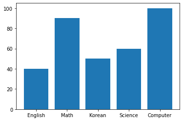

$ 플롯 테스트 $
fig = plt.figure()
ax1 = fig.add_subplot(3,3,1)
ax2 = fig.add_subplot(3,3,2)
ax3 = fig.add_subplot(3,3,3)
ax4 = fig.add_subplot(3,3,5) 

그래프 요소 추가
label, title
x라벨, y라벨, 제목을 추가하기 위해서는
xlabel() 메서드와 ylabel() 메서드 title() 메서드를 이용
plt.xlabel('Subject')
plt.ylabel('Points')
plt.title("Yuna's Test Result")
Text(0.5, 1.0, "Yuna's Test Result") 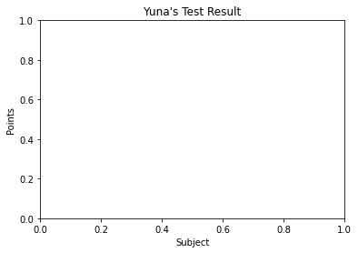

# 그래프 데이터
subject = ['English', 'Math', 'Korean', 'Science', 'Computer']
points = [40, 90, 50, 60, 100]

# 축 그리기
fig = plt.figure()
ax1 = fig.add_subplot(1,1,1)

# 그래프 그리기
ax1.bar(subject, points)

# 라벨, 타이틀 달기
plt.xlabel('Subject')
plt.ylabel('Points')
plt.title("Yuna's Test Result")
Text(0.5, 1.0, "Yuna's Test Result") 

선 그래프 그리기
데이터 정의
과거 아마존 주가 데이터
AMZN
from datetime import datetime
import pandas as pd
import os

# 그래프 데이터
csv_path = os.getenv("HOME") + "/aiffel/data_visualization/data/AMZN.csv"
data = pd.read_csv(csv_path ,index_col=0, parse_dates=True)
price = data['Close']

# 축 그리기 및 좌표축 설정
fig = plt.figure()
ax = fig.add_subplot(1,1,1)
price.plot(ax=ax, style='black')
plt.ylim([1600,2200])
plt.xlim(['2019-05-01','2020-03-01'])

# 주석달기
important_data = [(datetime(2019, 6, 3), "Low Price"),(datetime(2020, 2, 19), "Peak Price")]
for d, label in important_data:
    ax.annotate(label, xy=(d, price.asof(d)+10), # 주석을 달 좌표(x,y)
                xytext=(d,price.asof(d)+100), # 주석 텍스트가 위차할 좌표(x,y)
                arrowprops=dict(facecolor='red')) # 화살표 추가 및 색 설정

# 그리드, 타이틀 달기
plt.grid()
ax.set_title('StockPrice')

# 보여주기
plt.show() 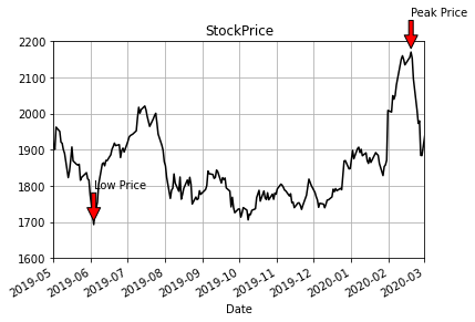

Pands Series 데이터 활용.
Pandas의 Series는 선 그래프 그리기 최적화
price = data['Close']가 바로 Pandas의 Series
price.plot(ax=ax, style='black')에서
Pandas의 plot을 사용하면서,
matplotlib에서 정의한 subplot 공간 ax를 사용
좌표축 설정
plt.xlim(), plt.ylim()을 통해 x, y 좌표축의 적당한 범위를 설정
주석
그래프 안에 추가적으로 글자나 화살표 등 주석을 그릴 때는 annotate() 메서드를 이용
그리드
grid() 메서드를 이용하면 그리드(격자눈금)를 추가
plot 사용법 상세
plt.plot()로 그래프 그리기
기본적으로
figure() 객체를 생성하고 add_subplot()으로 서브플롯을 생성하며 plot을 그림
- plt.plot() 명령으로 그래프를 그리면
matplotlib은 가장 최근의 figure 객체와 그 서브플롯을 그림
만약 서브플롯이 없으면 서브플롯 하나를 생성
plt.plot()의 인자로 x 데이터, y 데이터, 마커 옵션, 색상 등의 인자를 이용
import numpy as np
x = np.linspace(0, 10, 100) #0에서 10까지 균등한 간격으로  100개의 숫자를 만들라는 뜻입니다.
plt.plot(x, np.sin(x),'o')
plt.plot(x, np.cos(x),'--', color='black')
plt.show()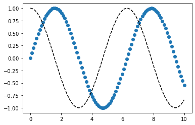

서브플롯도 plt.subplot을 이용해 추가
x = np.linspace(0, 10, 100)

plt.subplot(2,1,1)
plt.plot(x, np.sin(x),'orange','o')

plt.subplot(2,1,2)
plt.plot(x, np.cos(x), 'orange')
plt.show()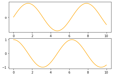

linestyle, marker 옵션
x = np.linspace(0, 10, 100)

plt.plot(x, x + 0, linestyle='solid')
plt.plot(x, x + 1, linestyle='dashed')
plt.plot(x, x + 2, linestyle='dashdot')
plt.plot(x, x + 3, linestyle='dotted')
plt.plot(x, x + 0, '-g') # solid green
plt.plot(x, x + 1, '--c') # dashed cyan
plt.plot(x, x + 2, '-.k') # dashdot black
plt.plot(x, x + 3, ':r'); # dotted red
plt.plot(x, x + 4, linestyle='-') # solid
plt.plot(x, x + 5, linestyle='--') # dashed
plt.plot(x, x + 6, linestyle='-.') # dashdot
plt.plot(x, x + 7, linestyle=':'); # dotted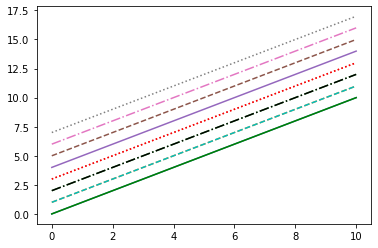

Pandas로 그래프 그리기
- plot()메서드 이용
Pandas.plot 메서드 인자
- label: 그래프의 범례 이름.
- ax: 그래프를 그릴 matplotlib의 서브플롯 객체.
- style: matplotlib에 전달할 'ko--'같은 스타일의 문자열
- alpha: 투명도 (0 ~1)
- kind: 그래프의 종류: line, bar, barh, kde
- logy: Y축에 대한 로그 스케일
- use_index: 객체의 색인을 눈금 이름으로 사용할지의 여부
- rot: 눈금 이름을 로테이션(0 ~ 360)
- xticks, yticks: x축, y축으로 사용할 값
- xlim, ylim: x축, y축 한계
- grid: 축의 그리드 표시할지 여부
pandas의 data가 DataFrame 일 때 plot 메서드 인자
- subplots: 각 DataFrame의 칼럼을 독립된 서브플롯에 그린다.
- sharex: subplots=True 면 같은 X 축을 공유하고 눈금과 한계를 연결한다.
- sharey: subplots=True 면 같은 Y 축을 공유한다.
- figsize: 그래프의 크기, 튜플로 지정
- title: 그래프의 제목을 문자열로 지정
- sort_columns: 칼럼을 알파벳 순서로 그린다.
막대 그리프 kind -> bar
fig, axes = plt.subplots(2, 1)
data = pd.Series(np.random.rand(5), index=list('abcde'))
data.plot(kind='bar', ax=axes[0], color='blue', alpha=1)
data.plot(kind='barh', ax=axes[1], color='red', alpha=0.3)<AxesSubplot:>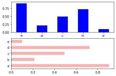

선 그래프 그리는 법
df = pd.DataFrame(np.random.rand(6,4), columns=pd.Index(['A','B','C','D']))
df.plot(kind='line')<AxesSubplot:>

정리하기
정리
- fig = plt.figure(): figure 객체를 선언해 '도화지를 펼쳐' 준다.
- ax1 = fig.add_subplot(1,1,1) : 축을 그린다.
- ax1.bar(x, y) 축안에 어떤 그래프를 그릴지 메서드를 선택한 다음, 인자로 데이터를 넣어준다.
- 그래프 타이틀 축의 레이블 등을 plt의 여러 메서드 grid, xlabel, ylabel 을 이용해서 추가한다
- plt.savefig 메서드를 이용해 저장한다.

그래프
데이터 준비
데이터 불러오기
seaborn의 load_dataset() 메서드를 이용
메서드를 실행하면 home directory에 seaborn-data가 자동 다운로드하여 저장됨
import pandas as pd
import seaborn as sns

tips = sns.load_dataset("tips")
Tips 데이터를 불러오자
tips.csv
데이터 살펴보기(EDA)
Pandas의 dataframe를 이용하여 데이터 구성 확인하기
df = pd.DataFrame(tips)
df.head()| total_bill | tip | sex | smoker | day | time | size | |
|---|---|---|---|---|---|---|---|
| 0 | 16.99 | 1.01 | Female | No | Sun | Dinner | 2 |
| 1 | 10.34 | 1.66 | Male | No | Sun | Dinner | 3 |
| 2 | 21.01 | 3.50 | Male | No | Sun | Dinner | 3 |
| 3 | 23.68 | 3.31 | Male | No | Sun | Dinner | 2 |
| 4 | 24.59 | 3.61 | Female | No | Sun | Dinner | 4 |
df.shape(244, 7)df.describe()| total_bill | tip | size | |
|---|---|---|---|
| count | 244.000000 | 244.000000 | 244.000000 |
| mean | 19.785943 | 2.998279 | 2.569672 |
| std | 8.902412 | 1.383638 | 0.951100 |
| min | 3.070000 | 1.000000 | 1.000000 |
| 25% | 13.347500 | 2.000000 | 2.000000 |
| 50% | 17.795000 | 2.900000 | 2.000000 |
| 75% | 24.127500 | 3.562500 | 3.000000 |
| max | 50.810000 | 10.000000 | 6.000000 |
df.info()<class 'pandas.core.frame.DataFrame'>
RangeIndex: 244 entries, 0 to 243
Data columns (total 7 columns):
# Column Non-Null Count Dtype
--- ------ -------------- -----
0 total_bill 244 non-null float64
1 tip 244 non-null float64
2 sex 244 non-null category
3 smoker 244 non-null category
4 day 244 non-null category
5 time 244 non-null category
6 size 244 non-null int64
dtypes: category(4), float64(2), int64(1)
memory usage: 7.4 KB결측값이 없어 결측값 처리 필요가 없다.
데이터 변수 중 sex,smoker, day, time은 범주형
tips, total_bill, size는 수치형 / size 범주형으로 (테이블 인원을 의미)
print(df['sex'].value_counts())
print("===========================")


print(df['time'].value_counts())
print("===========================")


print(df['smoker'].value_counts())
print("===========================")


print(df['day'].value_counts())
print("===========================")


print(df['size'].value_counts())
print("===========================")
Male 157
Female 87
Name: sex, dtype: int64
===========================
Dinner 176
Lunch 68
Name: time, dtype: int64
===========================
No 151
Yes 93
Name: smoker, dtype: int64
===========================
Sat 87
Sun 76
Thur 62
Fri 19
Name: day, dtype: int64
===========================
2 156
3 38
4 37
5 5
1 4
6 4
Name: size, dtype: int64
===========================범주형 데이터
범주형 데이터
막대그래프(bar graph)
Pandas와 Matplotlib를 활용한 방법
matplotlib에 데이터를 인자로 넣기 위해서
pandas 데이터 바로 이용 불가
데이터를 x series 또는 list,
y에 list 형태로 각각 나눠줌
#df의 첫 5행을 확인해봅시다.
df.head()| total_bill | tip | sex | smoker | day | time | size | |
|---|---|---|---|---|---|---|---|
| 0 | 16.99 | 1.01 | Female | No | Sun | Dinner | 2 |
| 1 | 10.34 | 1.66 | Male | No | Sun | Dinner | 3 |
| 2 | 21.01 | 3.50 | Male | No | Sun | Dinner | 3 |
| 3 | 23.68 | 3.31 | Male | No | Sun | Dinner | 2 |
| 4 | 24.59 | 3.61 | Female | No | Sun | Dinner | 4 |
# tip 컬럼을 성별에 대한 평균으로 나타내 보겠습니다.

# pandas의 groupby 메서드를 활용합니다.

grouped = df['tip'].groupby(df['sex']) # df['tip'] 컬럼을 groupby() 한다 -> 팁을 성별에 따라 그룹화한다.

# ->  각 성별 그룹에 대한 정보(총합, 평균, 데이터 량 등)가 grouped 객체에 저장
# 평균과 데이터량 확인
grouped.mean() # 성별에 따른 팁의 평균.sex
Male 3.089618
Female 2.833448
Name: tip, dtype: float64grouped.size() # 성별에 따른 데이터 량(팁 횟수)sex
Male 157
Female 87
Name: tip, dtype: int64# 성별에 따른 팁 액수의 평균을 막대그래프로 그리면
import numpy as np
sex = dict(grouped.mean()) #평균 데이터를 딕셔너리 형태로 바꿔줍니다.
sex{'Male': 3.0896178343949043, 'Female': 2.833448275862069}x = list(sex.keys()) # x축 리스트 형태로
x['Male', 'Female']y = list(sex.values()) # y축 리스트 형태로
y[3.0896178343949043, 2.833448275862069]import matplotlib.pyplot as plt # 막대 그래프 인포트해서
plt.bar(x = x, height = y) # x축 x, 높이는 y로
plt.ylabel('tip[$]') # y출 라벨은 팁으로
plt.title('Tip by Sex') # x축 라벨은 성별롴 ㅠㅍㅇㅇㅇㅇㅇㅇㅇ ㅊㅊㅊㅋ 4ㅊ ㄹㄹㄹㄹㄹㅍText(0.5, 1.0, 'Tip by Sex')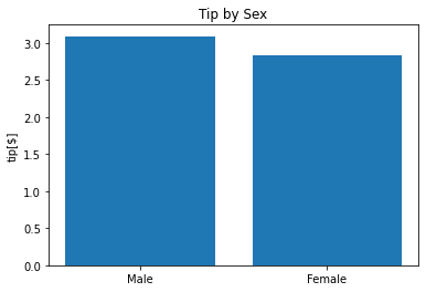

Seaborn과 Matplotlib을 활용한 간단한 방법
sns.barplot의 인자로 df를 넣고 원하는 컬럼을 지정.
sns.barplot(data=df, x='sex', y='tip')<AxesSubplot:xlabel='sex', ylabel='tip'>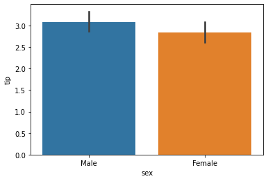

# Matplot과 함께 사용 figsize, title  등 그래프에 다양한 옵션
plt.figure(figsize=(10,6)) # 도화지 사이즈를 정합니다.
sns.barplot(data=df, x='sex', y='tip')
plt.ylim(0, 4) # y값의 범위를 정합니다..
plt.title('Tip by sex') # 그래프 제목을 정합니다.
Text(0.5, 1.0, 'Tip by sex') 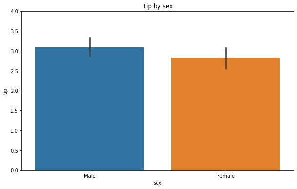

# 요일에 따른 tips
plt.figure(figsize=(10,6))
sns.barplot(data=df, x='day', y='tip')
plt.ylim(0, 4)
plt.title('Tip by day')
Text(0.5, 1.0, 'Tip by day')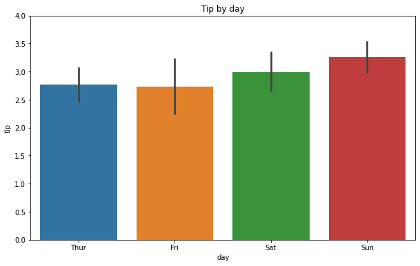

# Subplot을 활용, 범주형 그래프를 나타내기에 좋은 것 : violin plot 사용가능
# palette 옵셥 - 색상 사용.

fig = plt.figure(figsize=(10,7))

ax1 = fig.add_subplot(2,2,1)
sns.barplot(data=df, x='day', y='tip',palette="ch:.25")

ax2 = fig.add_subplot(2,2,2)
sns.barplot(data=df, x='sex', y='tip')

ax3 = fig.add_subplot(2,2,4)
sns.violinplot(data=df, x='sex', y='tip')

ax4 = fig.add_subplot(2,2,3)
sns.violinplot(data=df, x='day', y='tip',palette="ch:.25")
<AxesSubplot:xlabel='day', ylabel='tip'>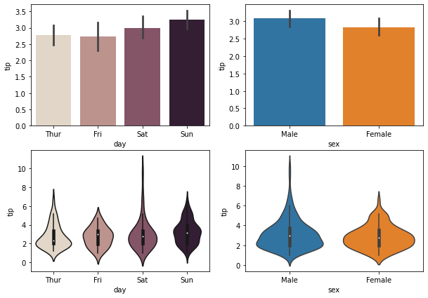

# catplot을 사용
sns.catplot(x="day", y="tip", jitter=False, data=tips)<seaborn.axisgrid.FacetGrid at 0x7fa90ef12190>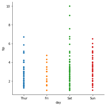

수치형 데이터.
산점도, 선 그래프 사용을 사용하는 것이 좋다.
전체 가격 total_bill에 따른 tip 데이터를 시각화
범주형 데이터
산점도(scatter plot)
# hue인자에 'day'를 주어 요일(day)에 따른 tip과 total_bill의 관계를 시각화
sns.scatterplot(data=df , x='total_bill', y='tip', palette="ch:r=-.2,d=.3_r")
<AxesSubplot:xlabel='total_bill', ylabel='tip'>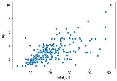

sns.scatterplot(data=df , x='total_bill', y='tip', hue='day')<AxesSubplot:xlabel='total_bill', ylabel='tip'>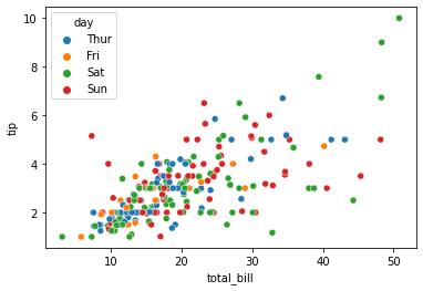

선 그래프 (line graph)
- plot의 기본
- numpy를 이용 데이터 생성
#np.random.randn 함수는 표준 정규분포에서 난수를 생성하는 함수입니다.
#cumsum()은 누적합을 구하는 함수입니다.
plt.plot(np.random.randn(50).cumsum())[<matplotlib.lines.Line2D at 0x7fa90c127130>]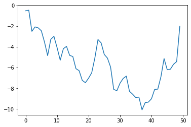

x = np.linspace(0, 10, 100)
plt.plot(x, np.sin(x), 'o')
plt.plot(x, np.cos(x))
plt.show()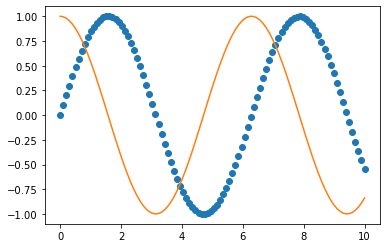

# Seaborn을 활용.
sns.lineplot(x=x, y=np.sin(x))
sns.lineplot(x=x, y=np.cos(x))<AxesSubplot:>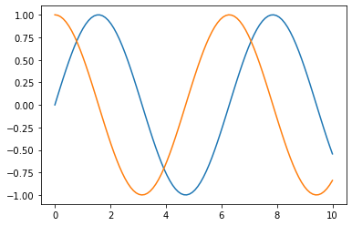

히스토그램
히스토그램 개념
↔가로축
계급: 변수의 구간, bin (or bucket)
↕세로축
도수: 빈도수, frequency
전체 총량: n
# x1은 평균은 100이고 표준편차는 15인 정규분포를 따릅니다.
# x2는 평균은 130이고 표준편차는 15인 정규분포를 따릅니다.
# 도수를 50개의 구간으로 표시하며, 확률 밀도가 아닌 빈도로 표기합니다.

#그래프 데이터
mu1, mu2, sigma = 100, 130, 15
x1 = mu1 + sigma*np.random.randn(10000)
x2 = mu2 + sigma*np.random.randn(10000)

# 축 그리기
fig = plt.figure()
ax1 = fig.add_subplot(1,1,1)

# 그래프 그리기
patches = ax1.hist(x1, bins=50, density=False) #bins는 x값을 총 50개 구간으로 나눈다는 뜻입니다.
patches = ax1.hist(x2, bins=50, density=False, alpha=0.5)
ax1.xaxis.set_ticks_position('bottom') # x축의 눈금을 아래 표시
ax1.yaxis.set_ticks_position('left') #y축의 눈금을 왼쪽에 표시

# 라벨, 타이틀 달기
plt.xlabel('Bins')
plt.ylabel('Number of Values in Bin')
ax1.set_title('Two Frequency Distributions')

# 보여주기
plt.show()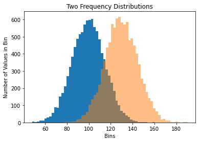

tips 데이터 확인
# tips의 total_bill과 tips에 대한 히스토그램 확인
sns.histplot(df['total_bill'], label = "total_bill")
sns.histplot(df['tip'], label = "tip").legend()# legend()를 이용하여 label을 표시해 줍니다.<matplotlib.legend.Legend at 0x7fa90be91700>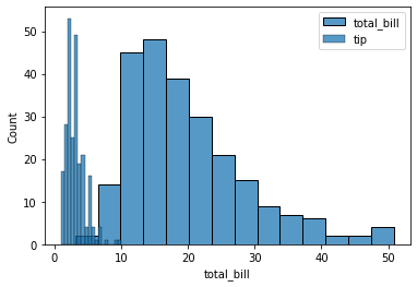

# 결제 금액 대비 팁의 비율
df['tip_pct'] = df['tip'] / df['total_bill']
df['tip_pct'].hist(bins=50)<AxesSubplot:> 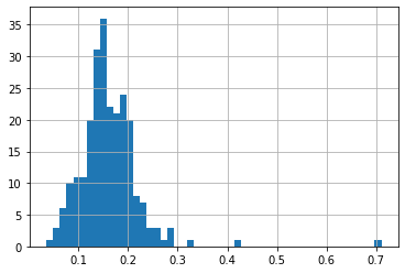

# kind='kde'로 확률 밀도 그래프
df['tip_pct'].plot(kind='kde')
<AxesSubplot:ylabel='Density'>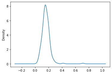

시계열 데이터 시각화
데이터 가져오기
csv_path = os.getenv("HOME") + "/aiffel/data_visualization/data/flights.csv"
data = pd.read_csv(csv_path)
flights = pd.DataFrame(data)
flights| year | month | passengers | |
|---|---|---|---|
| 0 | 1949 | January | 112 |
| 1 | 1949 | February | 118 |
| 2 | 1949 | March | 132 |
| 3 | 1949 | April | 129 |
| 4 | 1949 | May | 121 |
| ... | ... | ... | ... |
| 139 | 1960 | August | 606 |
| 140 | 1960 | September | 508 |
| 141 | 1960 | October | 461 |
| 142 | 1960 | November | 390 |
| 143 | 1960 | December | 432 |
144 rows × 3 columns
그래프 그리기
sns.barplot(data=flights, x='year', y='passengers')<AxesSubplot:xlabel='year', ylabel='passengers'>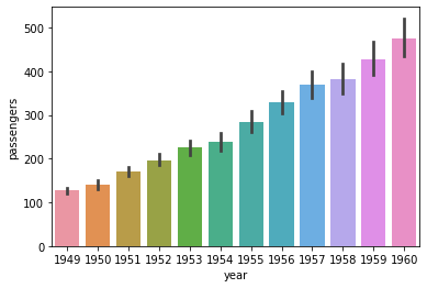

sns.pointplot(data=flights, x='year', y='passengers')<AxesSubplot:xlabel='year', ylabel='passengers'>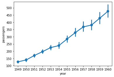

sns.lineplot(data=flights, x='year', y='passengers')<AxesSubplot:xlabel='year', ylabel='passengers'>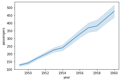

# 달별로 나누어 보기 위해 hue 인자에 'month'를 할당
sns.lineplot(data=flights, x='year', y='passengers', hue='month', palette='ch:.50')
plt.legend(bbox_to_anchor=(1.03, 1), loc=2) #legend 그래프 밖에 추가하기<matplotlib.legend.Legend at 0x7fa90bcc53d0> 

히스토그램
sns.histplot(flights['passengers'])<AxesSubplot:xlabel='passengers', ylabel='Count'>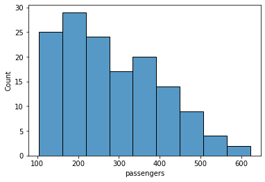

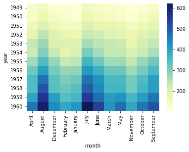
Heatmap
- 열지도 ㅋ 방대한 양의 데이터와 현상을 수치에 따라 색상으로 주로 2차원으로 표시
- pivot이 필요하기도 함.
- pandas의 dataframe 의 pivot() 메서도 사용
# flights(DataFrame)을 탑승객 수를 year과 month로 pivot
pivot = flights.pivot(index='year', columns='month', values='passengers')
pivot| month | April | August | December | February | January | July | June | March | May | November | October | September |
|---|---|---|---|---|---|---|---|---|---|---|---|---|
| year | ||||||||||||
| 1949 | 129 | 148 | 118 | 118 | 112 | 148 | 135 | 132 | 121 | 104 | 119 | 136 |
| 1950 | 135 | 170 | 140 | 126 | 115 | 170 | 149 | 141 | 125 | 114 | 133 | 158 |
| 1951 | 163 | 199 | 166 | 150 | 145 | 199 | 178 | 178 | 172 | 146 | 162 | 184 |
| 1952 | 181 | 242 | 194 | 180 | 171 | 230 | 218 | 193 | 183 | 172 | 191 | 209 |
| 1953 | 235 | 272 | 201 | 196 | 196 | 264 | 243 | 236 | 229 | 180 | 211 | 237 |
| 1954 | 227 | 293 | 229 | 188 | 204 | 302 | 264 | 235 | 234 | 203 | 229 | 259 |
| 1955 | 269 | 347 | 278 | 233 | 242 | 364 | 315 | 267 | 270 | 237 | 274 | 312 |
| 1956 | 313 | 405 | 306 | 277 | 284 | 413 | 374 | 317 | 318 | 271 | 306 | 355 |
| 1957 | 348 | 467 | 336 | 301 | 315 | 465 | 422 | 356 | 355 | 305 | 347 | 404 |
| 1958 | 348 | 505 | 337 | 318 | 340 | 491 | 435 | 362 | 363 | 310 | 359 | 404 |
| 1959 | 396 | 559 | 405 | 342 | 360 | 548 | 472 | 406 | 420 | 362 | 407 | 463 |
| 1960 | 461 | 606 | 432 | 391 | 417 | 622 | 535 | 419 | 472 | 390 | 461 | 508 |
sns.heatmap(pivot)<AxesSubplot:xlabel='month', ylabel='year'>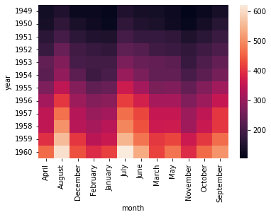

# 여기에 옵션 추가
sns.heatmap(pivot, linewidths=.2, annot=True, fmt="d")
<AxesSubplot:xlabel='month', ylabel='year'>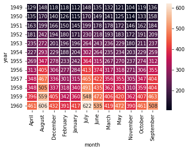

sns.heatmap(pivot, cmap="YlGnBu")<AxesSubplot:xlabel='month', ylabel='year'>