framer-motion을 활용하여 간단한 애니메이션을 직접 만들어보며 연습해보자!
Drag 애니메이션
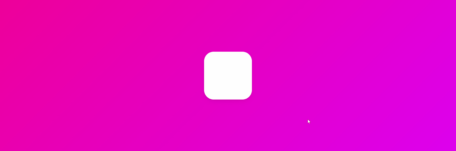
제한된 영역에서만 드래그가 가능한 애니메이션을 만들어보자
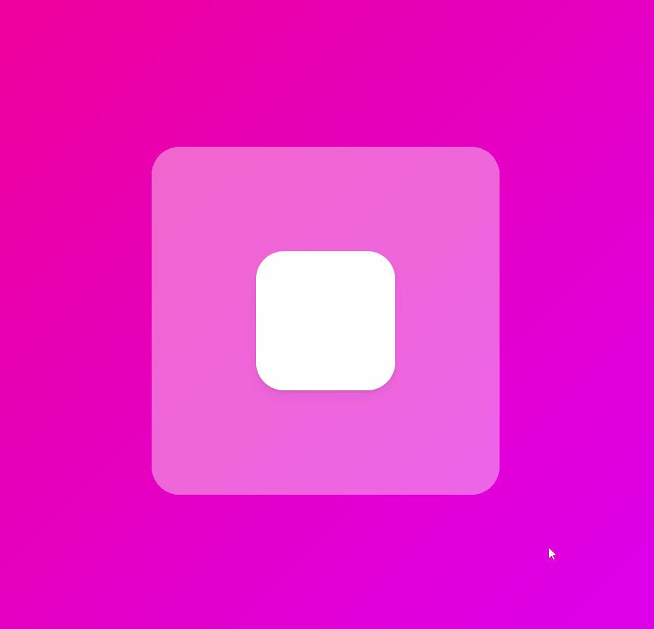
const BigBox = styled.div`
  width: 600px;
  height: 600px;
  background-color: rgba(255, 255, 255, 0.4);
  border-radius: 40px;
  display: flex;
  justify-content: center;
  align-items: center;
  overflow: hidden; // 이 부분을 추가하면 영역을 벗어났을 때 요소가 hidden된다.
`;

const Box = styled(motion.div)`
  width: 200px;
  height: 200px;
  background-color: rgba(255, 255, 255, 1);
  border-radius: 40px;
  box-shadow: 0 2px 3px rgba(0, 0, 0, 0.1), 0 10px 20px rgba(0, 0, 0, 0.06);
`;

// BixBox라는 div 요소에 대한 참조를 생성한다.
const bigBoxRef = useRef<HTMLDivElement>(null);

// BigBox 컴포넌트의 prop으로 bigBoxRef를 연결한다.
<BigBox ref={bigBoxRef}>
  <Box
    drag
    dragSnapToOrigin
    // bigBoxRef를 제약으로 설정함으로써, Box는 BigBox 영역 내에서만 drag된다.
    dragConstraints={bigBoxRef}
    />
</BigBox>drag: drag 적용하기
drag="x": x축에서만 drag 가능
drag="y": y축에서만 drag 가능
dragSnapToOrigin: drag 후 중앙으로 이동
dragConstraints: drag 가능한 영역 제약
Motion Value
useMotionValue는 애니메이션이 발생하는 동안 특정한 값을 추적할 수 있게 해준다. 또한 모션값이 바뀌어도 리렌더링이 일어나지 않아 높은 성능의 애니메이션을 만드는데 적합하다.
드래그에 따른 scale 변환
const x = useMotionValue(0);
  const scale = useTransform(x, [-800, 0, 800], [2, 1, 0]);
  return (
    <Wrapper>
      <Box style={{ x, scale }} drag="x" dragSnapToOrigin />
    </Wrapper>
  );
useTransForm(모션값, 입력값, 출력값)
x가 -800일 때, scale은 2가 되고, 0일 때, scale은 1, 800일 때 scale은 0이 된다.
드래그에 따른 rotate 및 gradient 변경
드래그에 따른 애니메이션을 조금 더 연습해보자

const x = useMotionValue(0);
  const rotateZ = useTransform(x, [-800, 800], [-360, 360]);
  const gradient = useTransform(
    x,
    [-800, 800],
    [
      "linear-gradient(135deg,rgb(116, 185, 255),rgb(9, 132, 227))",
      "linear-gradient(135deg,rgb(29, 209, 161),rgb(16, 172, 132))"
  ]
  );
  return (
    <Wrapper style={{ background: gradient }}>
      <Box style={{ x, rotateZ }} drag="x" dragSnapToOrigin />
    </Wrapper>
  );
x가 -800일 때, -360도로 회전, 800일 때, 360도로 회전, gradient값도 애니메이팅된다.
스크롤에 따른 scale 변환
여기까지 하면 스크롤에 따른 scale 애니메이팅은 완전 쉽고 간단하다!

const {scrollYProgress} = useScroll();
const scale = useTransform(scrollYProgress, [0, 1], [0, 2])
return (
  <Wrapper>
    <Box style={{ scale }} />
  </Wrapper>
);useScroll은 스크롤 위치를 감지하는 훅으로 scrollYProgress를 입력값, 0과 2(scale)를 출력값으로 설정해주면 끝이다.
scrollYProgress: 수직 스크롤 진행도를 나타내며, 0과 1사이의 값 (상단 0, 하단 1)
Svg Animation
뭔가 엄청 멋있는 효과같지만 구현은 아주 간단하다!
const Svg = styled.svg`
  width: 300px;
  height: 300px;
  stroke: white;
  stroke-width: 2;
`;

const svgVariants = {
  start: { pathLength: 0, fill: "rgba(255,255,255,0)" },
  end: {
    pathLength: 1,
    fill: "rgba(255,255,255,1)",
    transition: { duration: 5 },
  },
};

<Svg xmlns="http://www.w3.org/2000/svg" viewBox="0 0 448 512">
  <motion.path
	variants={svgVariants}
	initial="start"
    animate="end"
    d="생략"
  />
</Svg>variants를 쓰면 코드를 보다 클린하게 유지할 수 있다. svgVariants 오브젝트를 만들어주고 프로퍼티의 이름을 지정한다. motion.path에 svgVariants를 연결해주고, 각각의 프로퍼티를 연결해주면 된다.
pathLength: svg의 스트로크의 길이, 0과 1사이의 값 (0: 경로의 시작, 1: 경로의 끝)
fill: 내부 채우기 색상
initial: 애니메이션의 처음 상태
animate: 애니메이션의 최종 상태
transition: 애니메이션 전환 효과
duration: 애니메이션 지속 시간