Recoil을 이용해서 리액트 프로젝트에 다크모드를 적용해보려고 한다!🌙
Atom 생성
먼저, atom을 생성하여 테마모드를 저장하는 상태를 만든다.
// atom.ts
import { atom } from "recoil";

export const themeState = atom({
  key: "themeState",
  default: "light", // 기본값으로 라이트 모드 설정
});
RecoilRoot 설정
App 전체에서 Recoil을 사용할 수 있도록 RecoilRoot로 감싸준다.
// index.tsx
import { RecoilRoot } from "recoil";
.
.
.

root.render(
  <React.StrictMode>
    <RecoilRoot>
  	  <App />
    </RecoilRoot>
  </React.StrictMode>
);
theme 설정
darkTheme와 lightTheme에 대한 각각의 색상을 설정한다.
// theme.ts
import { DefaultTheme } from "styled-components";

export const darkTheme: DefaultTheme = {
  bgColor: "#2f3640",
  textColor: "#f5f6fa",
  accentColor: "#8c7ae6",
  itemColor: "rgba(0, 0, 0, 0.5)",
};

export const lightTheme: DefaultTheme = {
  bgColor: "#f5f6fa",
  textColor: "#2f3640",
  accentColor: "#8c7ae6",
  itemColor: "rgba(255, 255, 255, 0.5)",
};
색상은 아래 사이트의 색상을 이용했다. 예쁜 색상 찾기에 유용한 사이트!🎨
전역스타일 및 토글 버튼 구현
createGlobalStyle을 사용하여 앱 전체에 적용될 전역 스타일을 설정하고, 토글 버튼을 구현한다.
// App.tsx
import styled, { createGlobalStyle } from "styled-components";
import { ThemeProvider } from "styled-components";
import { darkTheme, lightTheme } from "./theme";
import { useRecoilState } from "recoil";
import { themeState } from "./atom";
.
.
.

// 전역스타일 설정
const GlobalStyle = createGlobalStyle`
  body {
    font-weight: 300;
    font-family: 'Noto Sans KR', sans-serif;
    background-color: ${(props) => props.theme.bgColor};
    color: ${(props) => props.theme.textColor};
    line-height: 1.2;
  }
  .
  .
  .
`;

function App() {
  // useRecoilState를 사용하여 themeState를 가져온다.
  const [themeMode, setThemeMode] = useRecoilState(themeState);
  const changeTheme = () => {
    // 현재 모드가 light이면 dark로 그렇지 않다면 light로 전환한다.
    setThemeMode((prevMode) => (prevMode === "light" ? "dark" : "light"));
  };

  return (
    // ThemePrivider 컴포넌트를 사용하여 현재 선택된 테마를 보여준다.
    <ThemeProvider theme={themeMode === "light" ? lightTheme : darkTheme}>
      <button onClick={changeTheme}>Theme Mode</button> // 토글 버튼 구현
    </ThemeProvider>
  );
}
theme 색상 적용
각각의 컴포넌트 스타일에 theme 색상을 적용한다.
// Coin.tsx
const Overview = styled.div`
  display: flex;
  justify-content: space-between;
  background-color: ${props => props.theme.itemColor};
  padding: 10px 20px;
  border-radius: 10px;
`;

const Tab = styled.span<{ isActive: boolean }>`
  text-align: center;
  text-transform: uppercase;
  font-size: 12px;
  font-weight: 400;
  background-color: ${props => props.theme.itemColor};
  padding: 7px 0px;
  border-radius: 10px;
  color: ${(props) =>
    props.isActive ? props.theme.accentColor : props.theme.textColor};
  a {
    display: block;
  }
`;

// Coins.tsx
const Title = styled.h1`
  font-size: 48px;
  color: ${(props) => props.theme.accentColor};
`;

const Coin = styled.li`
  background-color: ${props => props.theme.itemColor};
  color: ${(props) => props.theme.textColor};
  padding: 20px;
  border-radius: 15px;
  margin-bottom: 10px;
  a {
    display: flex;
    justify-content: center;
    align-items: center;
    //transition: 0.2s ease-in;
  }
  &:hover {
    a {
      color: ${(props) => props.theme.accentColor};
      font-weight: 600;
    }
  }
`;

// Price.tsx
const PriceItem = styled.div<PriceItemProps>`
  display: flex;
  justify-content: space-between;
  background-color: ${props => props.theme.itemColor};;
  padding: 10px 20px;
  border-radius: 10px;
  margin-bottom: 20px;
  width: 100%;
  align-items: center;

  span:first-child {
    font-size: 12px;
    font-weight: 400;
  }
  span:last-child {
    color: ${({ value }) => (value !== undefined && value >= 0 ? '#0be881' : '#ff5e57')}
  }
`;

const FirstPriceItem = styled(PriceItem)`
  span:last-child {
    color: ${(props) => props.theme.textColor};
    font-size: 28px;
  }
`;
아이콘 적용
마지막으로 다크모드/라이트모드 토글 버튼에 적절한 아이콘을 적용하면 끝!
// App.tsx
import { FontAwesomeIcon } from "@fortawesome/react-fontawesome";
import { faCircleHalfStroke } from "@fortawesome/free-solid-svg-icons";

<ToggleButton icon={faCircleHalfStroke} onClick={changeTheme} />

const ToggleButton = styled(FontAwesomeIcon)`
  position: fixed;
  width: 30px;
  height: 30px;
  bottom: 20px;
  right: 20px;
  cursor: pointer;
  z-index: 1000;
`;
아이콘은 fontawesome 라이브러리를 이용했다.
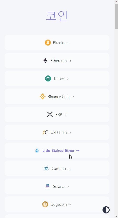
구현 화면
다크모드 구현 완료! 아래와 같이 잘 작동한다!😎

Markup Developer🧑💻