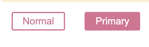
1. Props 적용해보기
primary 를 통해서 색깔을 변경하는 버튼을 만들어보자!
primary prop 상태가 true, false일 때, background, color가 변경될 것이다.
const Button = styled.button`
  /* primary color 를 통한 색깔 변경*/
  background: ${(props) => (props.primary ? " palevioletred" : "white")};
  color: ${(props) => (props.primary ? "white" : "palevioletred")};
  /* 공통된 button styles */
  font-size: 1em;
  margin: 1em;
  padding: 0.25em 1em;
  border: 2px solid palevioletred;
  border-radius: 3px;
`;
...

return (
      <Button> Normal</Button>
      <Button primary> Primary</Button>)
...
공통된 버튼 스타일은 동일하게 적용되며, background, color는 primary가 통제한다.
더 나아가서 JS의 ||, ?, && 등 논리연산자를 통해서 여러가지를 적용할 수 있다!
2. 스타일 확장하기
방금 만든 button을 색깔을 조금만 바꾸고 싶은데 그렇다고 이 모든 것을 하나더 써서 하면 낭비일것이다!
그래서 다음과 같은 방법을 쓰면 아주 양호하게 해결할 수 있다.
const TomatoButton = styled(Button)`
  color: tomato;
  border-color: tomato;
`;
styled 뒤에 . 이 아닌 ()을 통해 확장하고픈 Component를 넣는다!
한번만 쓰는 새로운 색깔을 추가하기 위해 prop를 하나 더 추가하기 보다 해당 방법을 사용하는 것이 더욱 깔끔할 것이다!

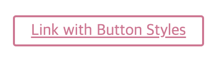
3. "as" 동적 태그 변경
Button으로 쓰던 스타일을 a태그처럼 작동하게 만들고 싶을 때도 있을 것이다.
그렇다고 해서 styled.button ~ 이던 것을 styled.a 로 하나더 만들어서 하기엔 너무 귀찮기도 하고 너무 비효율적인 것 같다고 느끼면 이제 이 as를 사용하면 된다!
...
      <Button as="a" href="/">
        Link with Button Styles
      </Button>
      <TomatoButton as="a" href="/">
        Link with TomatoButton Styles
      </TomatoButton>
...as="a"를 적어 기존의 Button 스타일을 적용하면서 a태그의 역할을 하도록 변모하게 했다! 즉, styled.button -> styled.a로 만든 것이다!
anchor link와 button이 혼합된 navigation bar 만들 때 주로 쓴다고 한다.

4. "as"를 통해 다른 Components 적용
as의 다른 활용을 알아보도록 하자! 이거는 나도 뭐에 쓰는지 모르겠다? 어떻게 활용을 해야할지,,, 아무튼 as를 동적으로 이미 쓰여진 스타일을 바꿀 수 있다고 한다!
const ReversedButton = (props) => (
  <Button {...props} children={props.children.split("").reverse()} />
);

...
      <Button as={ReversedButton}>
        Custom Button with Normal Button styles
      </Button>
...ReversedButton은 children을 거꾸로 쓸 수 있는 친구인데 이를 기존 Button에 as를 통해 적용해 나타낼 수 있다! 와우!
다음에는 attr, Pseudo, nesting 을 알아보도록 하겠다!