이제 길고 긴 API 연결은 끝이 났다. ㄹㅇ 기록하는 것도 일이다 일이야..
이제 QA와 알파테스트 준비하고, 리팩토링하고 그래야하는데 중간에 디자인이 바뀌었고, 그에 맞게 공통 UI를 만들어야한다고 프론트에서 협의해서 만들기로 했다! 고기릿 해보자.
디자인 및 기획
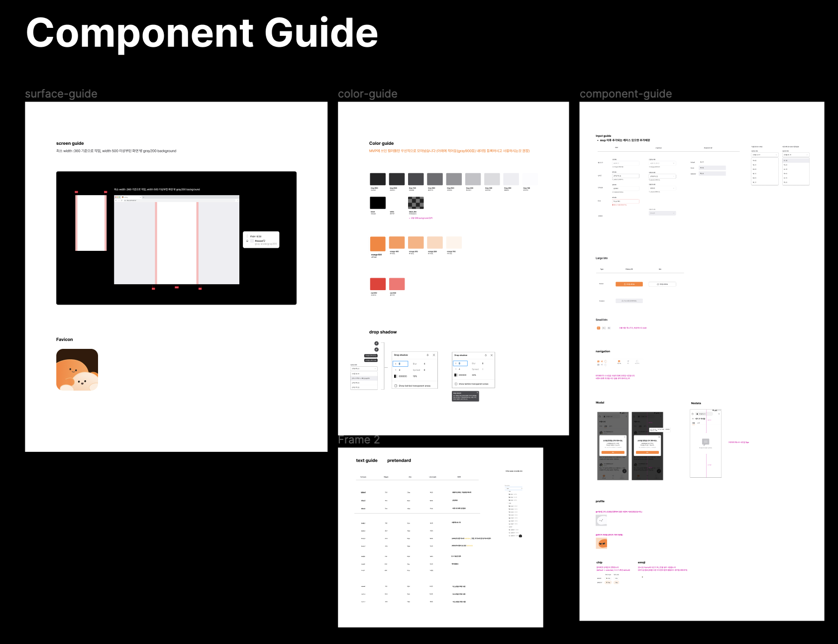
위 사진처럼 디자이너분이 공통 UI를 만들어 놨다. Color부터 Text, Button, Input, 드롭다운 등등을 설정하고 재사용하라고 저렇게 작성해주셨다. 압도적 감사!
그래서 Styled-Component로 Props를 사용해 만들자고 협의 봤다.
무슨 말이냐면 아래 theme을 만든 예시를 보면 알 것이다.
export const theme: DefaultTheme = {
  color: {
    black: "#000000",
    white: "#FFFFFF",
    gray100: "#FCFCFE",
    gray200: "#EEEEF2",
    gray300: "#DCDCE0",
    gray400: "#C2C2C7",
    gray500: "#959599",
    gray600: "#6C6C70",
    gray700: "#49494D",
    gray800: "#303033",
    gray900: "#222223",
    orange100: "#FFF3EB",
    orange200: "#FFD7BD",
    orange300: "#FFB07E",
    orange400: "#FF9856",
    orange500: "#FF812E",
    red400: "#FF7070",
    red500: "#F03030",
  },
  boxShadow: {
    normal: "0px 4px 4px rgba(0, 0, 0, 0.1)",
    popover: "0px 4px 8px rgba(0, 0, 0, 0.24);",
  },
};
이런 식으로 말이다! 이렇게 만드는데 Input은 디자인 요소만이 아닌 TSX 부분도 필요하기 때문에 쓰는 Props에 대해서 우리에게 맞게 타입도 설정하고, 필요한 디자인을 할 것이다.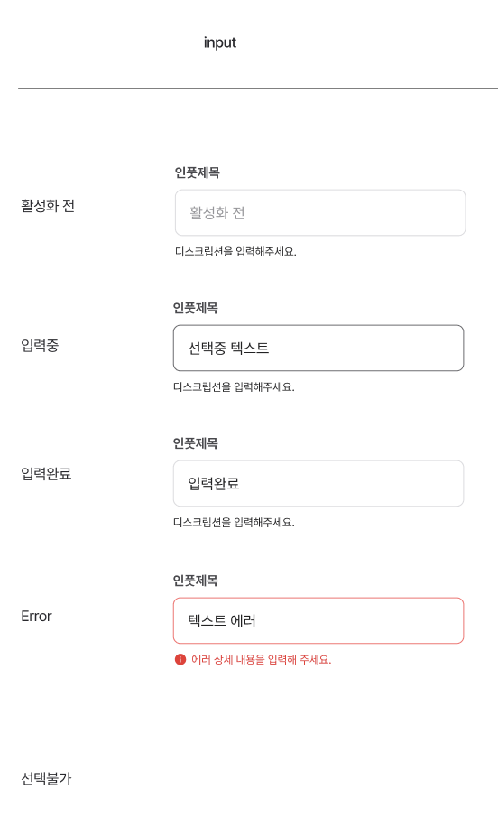
위 사진은 Input에 필요한 상태들이고, 이 상태들을 구현할 것이다.
UI 제작
이제 제작을 시작할 것이다! 일단 뭐가 필요한지 재료를 만들어보자.
모델 제작 : Props 타입 설정
// InputField Props만 따로 정의
interface InputFieldProps {
  width?: string; // width가 없을 경우 기본값 311px
  error?: boolean; // error가 true일 경우 border 색상 변경
}

// TextInputUI Props 정의
interface TextInputProps extends InputFieldProps {
  label?: string; // 제목
  name: string; // input의 name
  value: string; // input의 value
  onChange: (event: React.ChangeEvent<HTMLInputElement>) => void; // input의 onChange
  onBlur?: (event: React.FocusEvent<HTMLInputElement>) => void; // input의 onBlur
  disabled?: boolean; // input의 disabled, 기본값 false, true일 경우 input 비활성화
  placeholder?: string;
  errorMessage?: string; // error가 true일 경우 보여줄 에러 메시지, error 필수
  description?: string; // error가 false일 경우 보여줄 메시지, description 겸용
}
이렇게 만들었다.
활성화 전, 에러 및 메세지 등을 넣었고, disabled도 추가하여 입력 불가하게끔 만들었다. width도 만들어 기본 크기와 커스텀할 수 있게 만들 것이다.
on~이 붙어있는 Props는 Void한 함수를 붙여주면 되는데 입력 데이터를 받는 setter 함수를 넣어주면 된다.
특이한 점은 extends로 확장을 했는데 InputFieldProps는 Styled-Components의 컴포넌트인 InputField에 사용하고, 그를 확장하여 TextInputUI의 Props 타입을 지정하여 2가지 역할을 연관지어 만들었다.
이제 View 부분을 만들어보자. 따로 상태나 핸들링하는 Presenter는 여기에서 사용하지 않는다.
뷰 제작 : TSX 구현
Props 작성
우선 Props를 모두 받아야겠지?
export default function TextInputUI({
  label,
  width,
  name,
  value,
  onChange,
  error,
  onBlur,
  disabled = false,
  placeholder,
  errorMessage,
  description,
}: TextInputProps)TextInputProps를 타입으로 받고, 나머지 전부를 Props로 받아준다.
특이한 점은 disabled에 false로 초기화를 일단 해줬다. 나중에 보면 알겠지만 disabled는 선택 옵션이다. 그래서 disabled의 기본값은 undefied이다.
그런데 false로 기본값이 돼야 CSS가 적용이 되기도 하고, 애초에 속성 특성 상 undefied가 되면 이상하기 때문에 불린으로 고정해둔 모습이다.
TSX 작성
이제 TSX를 작성해보자.
  return (
    <S.Container>
      {label && <S.DropDownLabel disabled={disabled}>{label}</S.DropDownLabel>}
      <S.InputField width={width} error={error}>
        <input
          type="text"
          id={name}
          name={name}
          value={value}
          onChange={onChange}
          onBlur={onBlur}
          disabled={disabled}
          placeholder={placeholder}
        />
      </S.InputField>
      {error ? (
        <S.ErrorWrapper>
          <Image src="/auth/error.svg" alt="error" width={16} height={16} />
          <Margin direction="row" size={8} />
          <Text.Caption3 color="red500">{errorMessage}</Text.Caption3>
        </S.ErrorWrapper>
      ) : (
        description && (
          <Text.Caption3 color="gray900">{description}</Text.Caption3>
        )
      )}
    </S.Container>
  );
일단 꾸미기 전에 구조 상으로 div, label 등을 작성해뒀다.
핵심은
label을 기점으로label이 있다면 제목이 있다.InputField에width,error를 넣어 CSS 코드에 활용하기- 거의 핵심인
input태그에 Props 집어넣기value,onChange,placeholder등등
error를 조건으로Error컴포넌트 렌더링error가 없고,description이 있다면 Input 설명 렌더링
이렇다! 좀 어려웠던 부분은 error와 description의 조건을 조합해서 제대로 분기 처리하는 것이 헷갈렸다.
Styled-Conponents 작성
이제 작성해보자구잇
const S = {
  Container: styled.div`
    display: flex;
    flex-direction: column;
  `,
  DropDownLabel: styled.label<{ disabled: boolean }>`
    margin-bottom: 8px;
    font-size: 16px;
    font-weight: 700;
    color: ${({ theme, disabled }) =>
      disabled ? theme.color.gray500 : theme.color.gray700};
  `,
  InputField: styled.div<InputFieldProps>`
    height: 50px;
    border: 1px solid
      ${({ error, theme }) =>
        error ? theme.color.red400 : theme.color.gray300};
    border-radius: 8px;
    margin-bottom: 8px;

    & > input {
      width: ${({ width }) => (width ? { width } : "312px")};
      border: none;
      padding: 14px 16px;
      border-radius: 8px;
      height: 22px;
      font-weight: 400;
      font-size: 16px;
      line-height: 140%;
      color: ${({ theme }) => theme.color.gray900};

      &::placeholder {
        color: ${({ theme }) => theme.color.gray300};
      }
    }
  `,
  ErrorWrapper: styled.div`
    display: flex;
  `,
};DropDownLabel:disabled를 넣어 UX적으로 입력이 안된다는 걸 명시적으로 보이기 위해 색 변경InputFielderror:true라면 에러가 뜬 걸 명시적으로 표시하기위해border색 바꾸기width:width가 있다면 커스텀이 되고, 아니면 기본 크기인312px로 보여주기
이렇게 하면 된다. 디자인적인 부분은 알아서 하면 되기에 여기까지 얘기하고 각설하겠다.
사용 예시 코드
이제 사용 예시를 작성해줘 내 공통 UI 코드를 사용하는 사람에게 Placeholder를 꽂아주자.
// EXAMPLE : 아래처럼 사용하세요!!(src/pages/test.tsx)
// expo// EXAMPLE : 아래처럼 사용하세요!!(src/pages/test.tsx)
export default function Test() {
const [inputValue, setInputValue] = useState("");
const handleInputChange = (event: any) => {
setInputValue(event.target.value);
};
const handleError = () => {
if (inputValue.length < 5) {
return true;
} else {
return false;
}
};
return (
<>
<Margin size={50} direction="column" />
<div>
<TextInputUI
name="test"
value={inputValue}
onChange={handleInputChange}
onBlur={() => console.log("onBlur")}
error={handleError()}
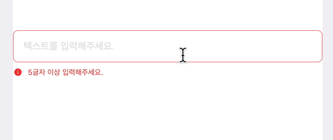
placeholder="텍스트를 입력해주세요."
errorMessage="5글자 이상 입력해주세요."
description="5글자 이상 하셨군요!"
/>
</div>
</>
);
}이런 식으로 사용한다.
value, onChange에는 useState로 선언한 getter 변수, setter 함수를 작성한 handleInputChange을 선언해 가져와 사용했다.
error에는 boolean받는 Props이니 함수의 실행값인 handleError()를 할당해주었다.
결과
잘 되는 모습이 보인다! 끝!


css 구조화도 참 중요한 것 같습니다 쥬륵 ㅠ 귀찮