이제 signup 막바지다. 성별을 클릭하는 라디오 버튼, 이용약관 필수 및 선택 버튼을 만들어보자!
라디오 버튼
기능 / 디자인 기획
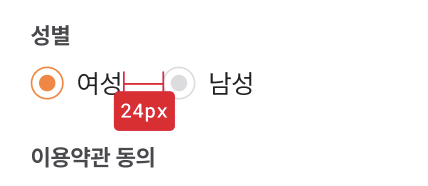
이런 식으로 만들면 된다. 한 곳을 클릭하면 다른 한곳의 값은 안되게 하나의 상태로 관리해야한다. 2개로 관리하고, 서버에도 boolean 데이터로 리코일아톰에 담아 보내줘야한다.
true면 여자고, false면 남자다. 남자는 가짜인가?!
디자인 코드는 아래와 같다.
import React, { useCallback, useState } from "react";
import styled from "styled-components";
import { Text, Margin } from "@/src/components/ui";
import Image from "next/image";

export default function GenderSelectBox() {
  const [gender, setGender] = useState(true);

  return (
    <>
      <Text.Body1 color="gray700">성별</Text.Body1>
      <S.Wrapper>
        <Margin direction="column" size={9} />
        <S.GenderWrapper>
          <Image
            onClick={() => {
              setGender(true);
            }}
            alt="isSelect"
            src={gender ? "/auth/normal.svg" : "/auth/disable.svg"}
            width={20}
            height={20}
          ></Image>
          <Margin direction="row" size={8} />
          <Text.Body3 color="gray900">여성 </Text.Body3>
        </S.GenderWrapper>
        <S.GenderWrapper>
          <Image
            alt="isSelect"
            onClick={() => {
              setGender(false);
            }}
            src={!gender ? "/auth/normal.svg" : "/auth/disable.svg"}
            width={20}
            height={20}
          ></Image>
          <Margin direction="row" size={8} />
          <Text.Body3 color="gray900">남성 </Text.Body3>
        </S.GenderWrapper>
      </S.Wrapper>
    </>
  );
}

const S = {
  Wrapper: styled.div`
    display: flex;
    margin-top: 9px;
    margin-bottom: 24px;
  `,
  GenderWrapper: styled.div`
    display: flex;
    text-align: center;
    margin-right: 24px;
  `,
};
이미지를 불러와 src에서 불린 데이터로 조건을 나눴다. 불린 데이터로 라디오 버튼이 주황색, 회색으로 바뀐다.
이제 리코일 아톰에 담길 수 있게 기능을 넣어주자.
아톰 아들 : 배고파요 useEffect 엄마
남자, 여자를 클릭할 때마다 아톰에 담기게 하고 싶다. 방식들이 여러가지가 있다.
- 직관적으로 버튼
onClick핸들러에 아톰 setter 함수를 할당하기 useEffect를 써서gender상태를 바뀔 때 마다 setter 함수 실행
두가지 버전을 생각했고, 최종적으로 2번이 나았다.
그 이유는 내 스타일은 '찾아라 드래곤볼!'같이 여기저기가 아닌 한곳에 모아둬 관리하는 것이 더 편리해서다. 또 나중에 문제가 생기면 그 곳만 고칠 수 있어 편리하다. 또!! useEffect 자체를 자주 쓰니 눈에도 익고 한곳에서 써서 가독성도 좋다! 글고 혹시 모를 제 3의 성의 추가에도 useEffect에 의존성 배열에만 넣어주면 되니 괜찮다^^
해보자.
export default function GenderSelectBox() {
  const [gender, setGender] = useState(true);
  const setSignUpFormData = useSetRecoilState(signUpFormDataAtom);

  useEffect(() => {
    setSignUpFormData((prev) => ({
      ...prev,
      gender,
    }));
  }, [gender, setSignUpFormData]);
...setSignUpFormData추가useEffect의 의존성 배열에gender추가 및setSignUpFormData추가- setter 함수에서 전개 연산자와
gender그대로 추가
참고로 gender : false 이렇게 바로 넣어주면 된다.
이용약관 동의 항목
기능 / 디자인 기획

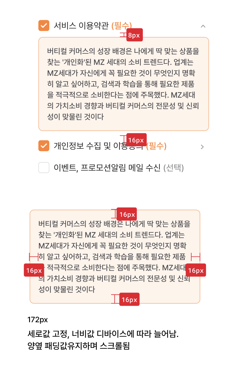
이런 식이다.
필요한 기능은 아래와 같다.
- 필수와 선택으로 나눔
- 버튼 누르고 말고의 상태 추가
- 상태 관련해서 체크 되고 말고의 조건을 추가하여 체크 이미지 변경
- 당연히 필수 2개만 들어가도 회원가입 버튼이 활성화되게 조건 추가
- 이용약관 토글 필요:
isActive추가
구현
디자인이 은근 많이 들어갔고, 컴포넌트도 2개가 필요하기에 따로 정리하겠다.
약관을 동의하는 항목에 3개 이상의 여러개가 되기 때문에 AgreementComponent를 만들어서 재사용성을 높일 것이다.
AgreementComponent
각 이용약관을 관리하는 상태가 있는 agreeBox.tsx 아래 약관 디테일을 만든 컴포넌트 AgreementComponent를 만들 것이다.
필요한 프롭스는 아래와 같다.
agreementTitle: 이용약관 제목 - StringisRequired: 필수, 선택 나누는 조건 - BooleanhandleCheck: 관련 상태 setter 함수를 핸들해주는 함수 - Funcdetail: 토글을 클리하면 나오는 내용
나머지는 체크한 상태를 체크할 수 있는 isAgreed, 토글 열어줄 수 있는 isActive 등이 필요하다.
export function AgreementComponent({
  agreementTitle,
  isRequired,
  handleCheck,
  detail,
}: AgreementComponentProps) {
  const [isAgreed, setAgreed] = useState(false);
  const [isActive, setActive] = useState(false);

  useEffect(() => {
    handleCheck(isAgreed);
  }, [handleCheck, isAgreed]);

  return (
    <>
      <S.AgreementWrapper>
        <Image
          alt="selectedCheck"
          width={20}
          height={20}
          src={isAgreed ? "/auth/selectedCheck.svg" : "/auth/unselectedCheck.svg"}
          onClick={() => {
            setAgreed((prev) => !prev);
          }}
        />
        <Margin direction="row" size={8} />
        <Text.Body2
          color="gray900"
          pointer={true}
          onClick={() => {
            setAgreed((prev) => !prev);
          }}
        >
          {agreementTitle}
        </Text.Body2>
        <Margin direction="row" size={3} />
        {isRequired ? (
          <Text.Body2 color="orange500">(필수)</Text.Body2>
        ) : (
          <Text.Body2 color="gray500">(선택)</Text.Body2>
        )}

        <S.PrivacyPolicyIcon Condition={isRequired}>
          <Image
            alt="selectedCheck"
            width={20}
            height={20}
            src="/auth/arrow_down.svg"
            onClick={() => {
              setActive((prev) => !prev);
            }}
          />
        </S.PrivacyPolicyIcon>
      </S.AgreementWrapper>
      <S.PrivacyPolicyContent Condition={isActive}>
        <Text.Body6 color="gray700">{detail}</Text.Body6>
      </S.PrivacyPolicyContent>
    </>
  );
}
const S = {
  AgreementWrapper: styled.div`
    display: flex;
  `,
  PrivacyPolicyIcon: styled.div<{ Condition: boolean }>`
    margin-left: auto;
    display: ${(props) => (props.Condition ? `block` : `none`)};
  `,
  PrivacyPolicyContent: styled.div<{ Condition: boolean }>`
    display: ${(props) => (props.Condition ? `block` : `none`)};
    overflow: auto;
    margin-top: 8px;
    padding: 16px;
    background-color: #fff3eb;
    border: 1px solid #ffb07e;
    border-radius: 8px;
    height: 140px;
  `,
};
이런 식으로 만들었다. isActive로 detail을 담은 것이 나온다.
가장 중요한 동의 관련 불린 데이터는 체크박스에 setAgreed을 넣어서 isAgreed가 변경되고, isAgreed가 변경되면 useEffect가 감지하여 handleCheck을 실행시킨다.
처음엔 useEffect를 쓰지 않고 여기저기 썼는데 유용한 훅을 쓰면서 더 간단해졌다!
AgreeBox
이제 AgreementComponent를 모아주는 AgreeBox를 만들어보자!
대강 총 4개의 재료가 필요하다.
- 각 항목의 동의 관련 불린데이터를 받는 상태
- 불린데이터를 수정하는 핸들러
- 값이 변경되는 걸 감지해서 아톰에 값이 들어가는
useEffect AgreementComponent활용: Props 채우기
export default function AgreeBox() {
  const [termsOfUse, checkTermsOfUse] = useState(false);
  const [termsOfPersonalInformation, checkTermsOfPersonalInformation] = useState(false);
  const [termsOfPromotion, checkTermsOfPromotion] = useState(false);

  const handleUseCheck = useCallback((check: boolean) => {
    checkTermsOfUse(check);
  }, []);

  const handlePersonalInformationCheck = useCallback((check: boolean) => {
    checkTermsOfPersonalInformation(check);
  }, []);

  const handlePromotionCheck = useCallback((check: boolean) => {
    checkTermsOfPromotion(check);
  }, []);

  const setSignUpFormData = useSetRecoilState(signUpFormDataAtom);

  useEffect(() => {
    setSignUpFormData((prev) => ({
      ...prev,
      termsOfUse: termsOfUse,
      termsOfPersonalInformation: termsOfPersonalInformation,
      termsOfPromotion: termsOfPromotion,
    }));
  }, [setSignUpFormData, termsOfPersonalInformation, termsOfPromotion, termsOfUse]);

  return (
    <>
      <Text.Body1 color="gray700">이용약관 동의</Text.Body1>
      <S.Wrapper>
        <AgreementComponent
          agreementTitle="서비스 이용약관"
          isRequired={true}
          handleCheck={handleUseCheck}
          detail={""}
        />
        <Margin direction="column" size={18} />
        <AgreementComponent
          agreementTitle="개인정보 수집 및 이용동의"
          isRequired={true}
          handleCheck={handlePersonalInformationCheck}
          detail={""}
        />
        <Margin direction="column" size={18} />
        <AgreementComponent
          agreementTitle="이벤트, 프로모션알림 메일 수신"
          isRequired={false}
          handleCheck={handlePromotionCheck}
          detail={""}
        />
      </S.Wrapper>
    </>
  );
}

const S = {
  Wrapper: styled.div`
    margin-top: 8px;
    margin-bottom: 48px;
  `,
};
아직 datail은 기획팀에서 약관을 안줘서 일단 나뒀고, 필수 2개 선택 1개로 나눠서 true false를 작성했다.
각각 3개의 상태를 작성하고, setter함수를 handleCheck에 넣어줬다. agreementTitle은 각각 맞는 제목을 넣어줬다! 결과물을 보자.
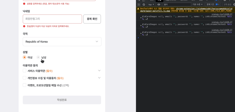


저도 주황컬러로 작성하는데 디자인 이쁘네요 폰트도 매력적입니다. 고생하셨습니다