
이제 토큰을 받아올 준비가 됐으니 로그인 페이지를 만들어 POST를 하고 아이디, 비밀번호를 입력해 버튼을 누르면 토큰을 받아 로컬스토리지에 넣는 방식까지 만들어 보겠다.
개발 전 준비
먼저 내 상황을 말해보겠다.
- 피그마로 디자인 팀, UI/UX 팀이 디자인을 만들어 놓은 상태.
- 전 프론트 팀이 만들어 놓은 기본적인 디자인 코드 구현.
이런 상태였다. 2번에서 미리 만들어 놓은 상태이긴 하지만 라우팅, 유효성 검사, 버튼 기능 X, POST API 등 부족한 것이 많았다. 완전 초기 상태.
import React, { useState } from "react";
import { Text, Margin } from "@/src/components/ui";
import styled from "styled-components";
import router from "next/router";
import Image from "next/image";
const Style = {
Header: styled.div`
width: 200px;
margin: 0 auto;
padding: 48px;
`,
AccountWrapper: styled.div`
padding-bottom: 30px;
`,
InputField: styled.div`
margin: 0 auto;
width: 452px;
height: 50px;
border: 1px solid #dcdce0;
border-radius: 8px;
margin-bottom:18px;
& > input {
border: none;
padding-left: 16px;
padding: 14px;
border-radius: 8px;
height: 22px;
&::placeholder {
font-weight: 400;
font-size: 16px;
line-height: 140%
color: #959599;
}
}
`,
ButtonWrapper: styled.div`
text-align: center;
`,
LoginButton: styled.button`
width: 452px;
height: 50px;
background-color: #eeeef2;
color: #959599;
border-radius: 8px;
padding-botton: 24px;
font-weight: 700;
font-size: 16px;
line-height: 22.4px;
`,
RegisterButton: styled.button`
width: 56px;
margin: 20px;
border-bottom: 1px solid #49494d;
color: #49494d;
font-weight: 800;
font-size: 16px;
line-height: 20px;
`,
};
export default function Login() {
const [email, setEmail] = useState("");
return (
<>
<Style.Header>
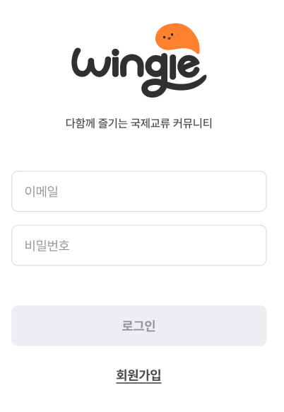
<Image src="auth/loginLogo.svg" alt="logo" />
<Margin direction="column" size={8} />
<Text.Body6 color="gray700">다함께 즐기는 국제교류 커뮤니티</Text.Body6>
</Style.Header>
<Style.AccountWrapper>
<Style.InputField>
<input type="email" placeholder="이메일"></input>
</Style.InputField>
<Style.InputField>
<input type="password" placeholder="비밀번호"></input>
</Style.InputField>
</Style.AccountWrapper>
<Style.ButtonWrapper>
<Style.LoginButton>로그인</Style.LoginButton>
<Style.RegisterButton onClick={() => router.push("auth/SignupPage")}>
회원가입
</Style.RegisterButton>
</Style.ButtonWrapper>
</>
);
}초기 코드를 보면 알겠지만 간단한 CSS만 구현이 되어 있고, 기능면은 아예 없다. 이제 순서대로 훑어 내려가보자
리팩토링
먼저 지금 팀에서 쓰는 문법 및 작성 방법을 통일해야한다. 세부 내용은 개발환경 세팅에 있다.
import React, { useState } from "react";
import styled from "styled-components";
import Image from "next/image";
import router from "next/router";
import { Text, Margin } from "@/src/components/ui";

export default function Login() {
  const [email, setEmail] = useState("");
  const [password, setPassword] = useState("");

  const handleLogin = () => {
  };

  const handleSignup = () => {
    router.push("/auth/signup");
  };

  return (
    <>
      <S.Header>
        <Image src="/auth/loginLogo.svg" alt="logo" width={200} height={200} />
        <Margin direction="column" size={8} />
        <Text.Body6 color="gray700">다함께 즐기는 국제교류 커뮤니티</Text.Body6>
      </S.Header>

      <S.AccountWrapper>
        <S.InputField>
          <input
            type="email"
            placeholder="이메일"
            value={email}
            onChange={(e) => setEmail(e.target.value)}
          />
        </S.InputField>
        <S.InputField>
          <input
            type="password"
            placeholder="비밀번호"
            value={password}
            onChange={(e) => setPassword(e.target.value)}
          />
        </S.InputField>
      </S.AccountWrapper>

      <S.ButtonWrapper>
        <S.LoginButton onClick={handleLogin}>로그인</S.LoginButton>
        <S.RegisterButton onClick={handleSignup}>회원가입</S.RegisterButton>
      </S.ButtonWrapper>
    </>
  );
}

const S = {
  Header: styled.div`
    width: 200px;
    margin: 0 auto;
    padding: 48px;
  `,

  AccountWrapper: styled.div`
    padding-bottom: 30px;
  `,

  InputField: styled.div`
    margin: 0 auto;
    width: 452px;
    height: 50px;
    border: 1px solid #dcdce0;
    border-radius: 8px;
    margin-bottom: 18px;
    display: flex;
    align-items: center;

    & > input {
      border: none;
      padding: 0 16px;
      border-radius: 8px;
      height: 100%;
      flex: 1;

      &::placeholder {
        font-weight: 400;
        font-size: 16px;
        line-height: 140%;
        color: #959599;
      }
    }
  `,

  ButtonWrapper: styled.div`
    display: flex;
    flex-direction: column;
    justify-content: center;
    align-items: center;
  `,

  LoginButton: styled.button`
    width: 452px;
    height: 50px;
    background-color: #eeeef2;
    color: #959599;
    border-radius: 8px;
    margin: 0 auto;
    font-weight: 700;
    font-size: 16px;
    line-height: 22.4px;
  `,

  RegisterButton: styled.button`
    margin: 20px;
    width: 56px;
    border-bottom: 1px solid #49494d;
    color: #49494d;
    font-weight: 800;
    font-size: 16px;
    line-height: 20px;
    cursor: pointer;
  `,
};
큰 수정은 Next.js에서 img 태그는 전부 Image 컴포넌트를 사용해야하니 그렇게 바꿨고, 기본적인 라우팅, password 상태, 리액트쿼리로 통신할 함수 handleLogin을 추가해 넣었다.
기능 구현
이제 개발환경과 비슷하게 했고, 로그인 데이터 담을 그릇은 구현했으니 로그인 관련 기능을 구현할 차례다.
버튼 유효성검사로 disabled 조절하기
기획/디자인 조건중에 로그인 버튼을 조절하는 기능도 있다.
- 아이디, 비밀번호 두 입력필드 모두에 한 자 이상 입력값이 있을경우 선택 가능한 버튼으로 바뀝니다.
- 아이디, 혹은 비밀번호에 오류가 있을경우 두 입력필드 밑에 오류문구가 나오고 버튼이 disable 로 변경됩니다.
이렇기 때문에 disabled라는 속성을 버튼에 따로 만들어서 조절해줘야한다.
<S.ButtonWrapper>
  <S.LoginButton disabled={isButtonDisabled} type="submit">
    로그인
  </S.LoginButton>
  <S.RegisterButton type="button" onClick={handleSignup}>
    회원가입
  </S.RegisterButton>
</S.ButtonWrapper>

const S = {
  ...

  LoginButton: styled.button`
    width: 452px;
    height: 50px;
    background-color: ${({ disabled }) => (disabled ? "#eee" : "#ff812e")};
    color: ${({ disabled }) => (disabled ? "#959599" : "#fff")};
    border-radius: 8px;
    margin: 0 auto;
    font-weight: 700;
    font-size: 16px;
    line-height: 22.4px;
    cursor: ${({ disabled }) => (disabled ? "not-allowed" : "pointer")};
  `,
  ...
}
이렇게 말이다. 이제 disabled에서 받는 불린데이터 값으로 조절이 가능해졌다.
isButtonDisabled를 만들어보자.
  const isButtonDisabled =
    email.length < 8 || !email.includes("@") || !email.includes(".") || !password;
일단 간단하게 바로 불린값을 받는 원시데이터 늒임으로 만들어봤다. 나중에 디자인이 변경된다고 해서 만약 에러메세지가 어떻게 나올지 정해진다면 isButtonDisabled가 불린 데이터 상태가 될 것이고, set을 통해 onError같은 걸로 조절할 터이니 임시로 이렇게 만들었다.
Login POST API
POST API 호출 관련 코드를 구현해보자.
명세서를 기반으로 1.0 편에서 instance를 이용하여 만들어서 호출하고, 리액트쿼리를 사용해 mutate해보자!
로그인 관련 API 명세서
요청과 응답으로 오는 데이터를 간단하게 표시하겠다.
Request Body
emailstring, 이메일passwordstring, 비밀번호
Response Body
grantTypestring, 인증 접두사accessTokenstring, access tokenrefreshTokenstring, refresh token keyadminboolean, 관리자 여부 - true면 관리자, false면 일반 유저
이렇게 받아주면 된다. 이를 토대로 API 코드를 작성해보자.
postLogin
/api/auth/LoginAPI.ts라는 경로에 만들었다.
import instance from "../axiosModul";

export const postLogin = async (email: string, password: string) => {
  const response = await instance.post("/auth/login", { email, password });
  return response.data;
};
겁나 간단하지 않는가? 이것이 바로 instance의 힘이다.
postLogin이라는 함수를 만들고 파라미터로 둘다string인email,password로 들어오게끔 만든다.
파라미터도 2개고, 타입도 간단해서 따로 타입 선언하지 않고 그냥 바로 넣어줬다./auth/login도메인에 POST 요청하는 코드를 만들고,response의data로 리턴하게끔 해줬다.
리액트쿼리로 API 호출하기
import { useMutation } from "react-query";로 불러와서 mutate해보자!
  const { mutate: login, isLoading } = useMutation(() => postLogin(email, password), {
    onSuccess: (res) => {
      console.log(`${res.message} ${res.data.refreshToken}`);
      // 액세스토큰 리프레쉬 토큰 로컬스토리지 넣기, admin에 따라 라우팅
      const { refreshToken, accessToken, admin } = res.data;
      saveRefreshTokenToLocalStorage(refreshToken);
      saveAccessTokenToLocalStorage(accessToken);
      // router.push(admin ? "/admin" : "/main");
    },
    onError: (error) => {
      console.log(`로그인 실패! ${error}`);
      // 로그인 실패시 에러 메시지 출력
      alert("로그인 실패! 이메일과 비밀번호를 확인해주세요.");
    },
  });

  const handleSubmit = (e: React.FormEvent<HTMLFormElement>) => {
    e.preventDefault();
    login();
};useMutation을 만들어postLogin(email, password)을 받아준다.onSuccess시 토큰이 반환되니 토큰을 가져와 로컬스토리지에 저장. 참고로 관리자 계정이면admin으로 라우팅되게 설정onError시 임시로alert되게 만들었다. 나중에 에러 메세지 디자인되면 저것에 맞게 만들것이다.- 비어있던
handleSubmit으로mutate인login()가 실행되게 설정
이런 식으로 했다!
결과
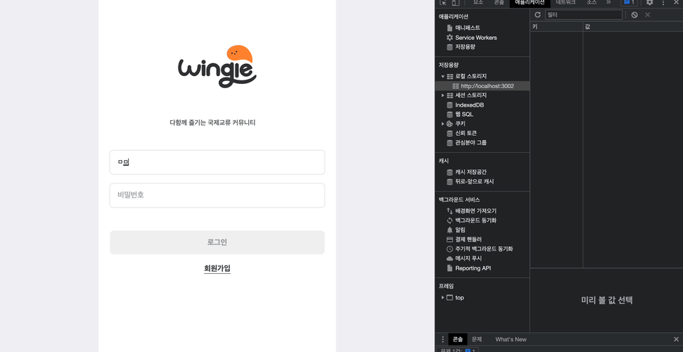
유효성 검사로 조건이 맞춰지지 않으면 로그인이 disabled 였다가 활성화가 된다. 또 로그인 되면 로컬스토리지에 잘 들어간다!
나중에 에러처리로 에러 메세지 및 로그인 버튼 비활성화되게 만들게 수정할 것이다. 그때 다시 보자! 끝!


mutate: login 이부분이 인상 깊네요 이런식으로 활용할 수 있는지 몰랐어요 ㅎㅎ 열심히 쓰셨네요 고생하셨습니다.