
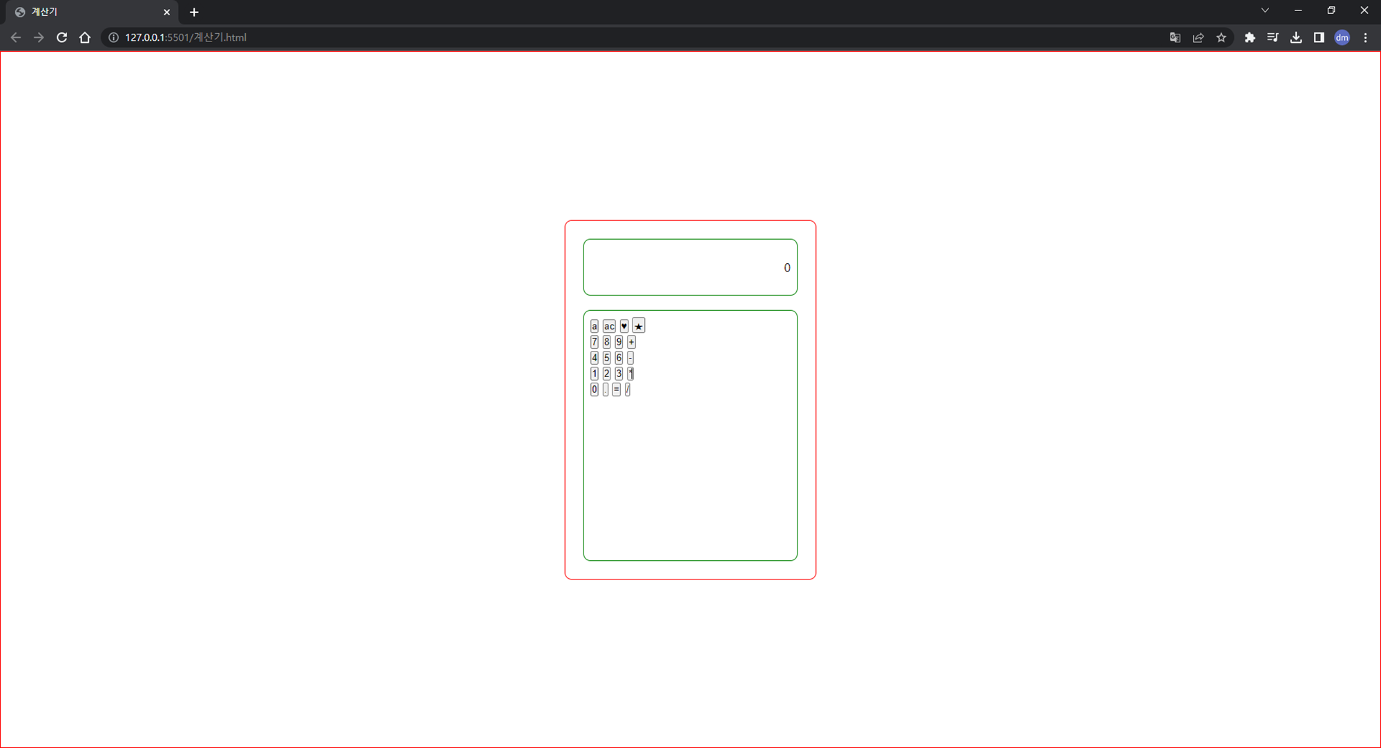
오늘은 그동안 배운 HTML과 CSS를 이용해 계산기 목업을 만들어보았다.
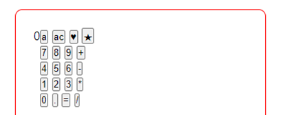
- HTML과 CSS를 활용하여 만든 계산기
아직은 목업단계이기 때문에 실제 계산기의 기능이 작동하지는 않는다!
계산기의 기능을 추가하는 것은 JavaScript를 적용해야 하는데아직 배우지 않았다..ㅎㅎ
스스로 100% 만족할만큼의 결과는 아니지만 어제의 나보단 분명 성장했음을 느꼈다!!
다음에는 좀 더 개성있는 계산기로 구현해보고 싶다.

작업 순서
1. 구조 설계하기
- 먼저 어떤 모양의 계산기를 만들지 와이어프레임을 설계해보았다.
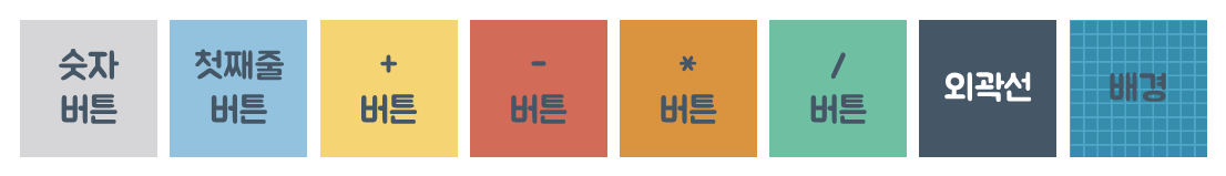
- 만들고 싶은 계산기의 모양을 파워포인트로 그린 모습
- 그 다음 어떤 색상을 적용할지 고민해보았다.
- 입히고 싶은 색상을 골랐다. (무작정 예쁜 색을 고르기 보다는 서로 조화로운 색을 고르려 했다.)
- 그리고 적용할 폰트와 어떤 요소에 해당 색상을 적용할지 결정했다.
- 결정한 색을 설계도에 입혀보았다.
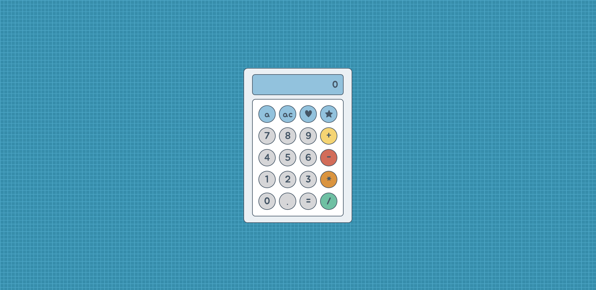
- 그린 설계도에 색상과 글꼴을 적용한 모습
파워포인트는 학생 때부터 자주 다루었던 거라 뚝!딱! 금방 만들 수 있었다.
문제는 이제 이 모습을 코드로 구현해야 한다는 것이었다.
완성할 때까지 정말 많은 시행착오를 겪었다..😂😂
하지만 직접 해보아야 내가 배운 것들을 잘 이해하고 적용할 수 있는지 느낄 수 있는 것 같다!
- 그린 설계도에 색상과 글꼴을 적용한 모습
2. HTML로 구조 만들기
- Vscode를 열어 웹 페이지의 구조를 만들어주는 HTML파일과 웹 페이지의 스타일을 적용해주는 CSS파일을 만든다.
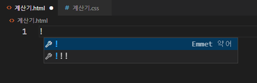
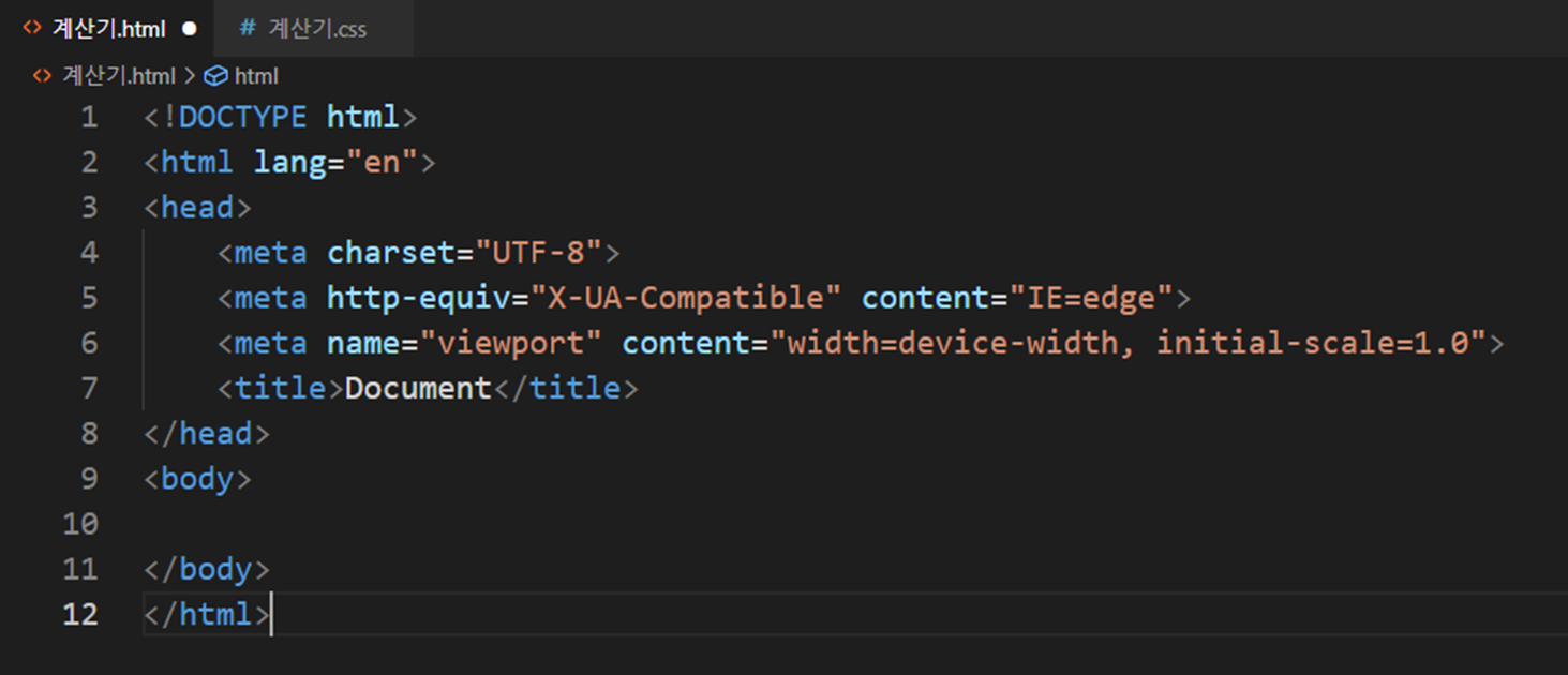
- !를 입력 후 tab키를 눌러 HTML의 기본 틀을 만든다.
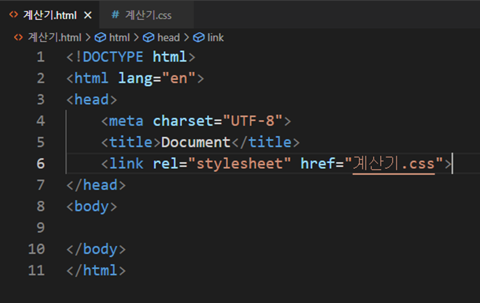
<link>속성을 이용하여 미리 만들어둔 CSS파일과 연결한다.
- 그렸던 설계도에 각 속성마다 어떤 클래스를 적용할지 적어둔다.
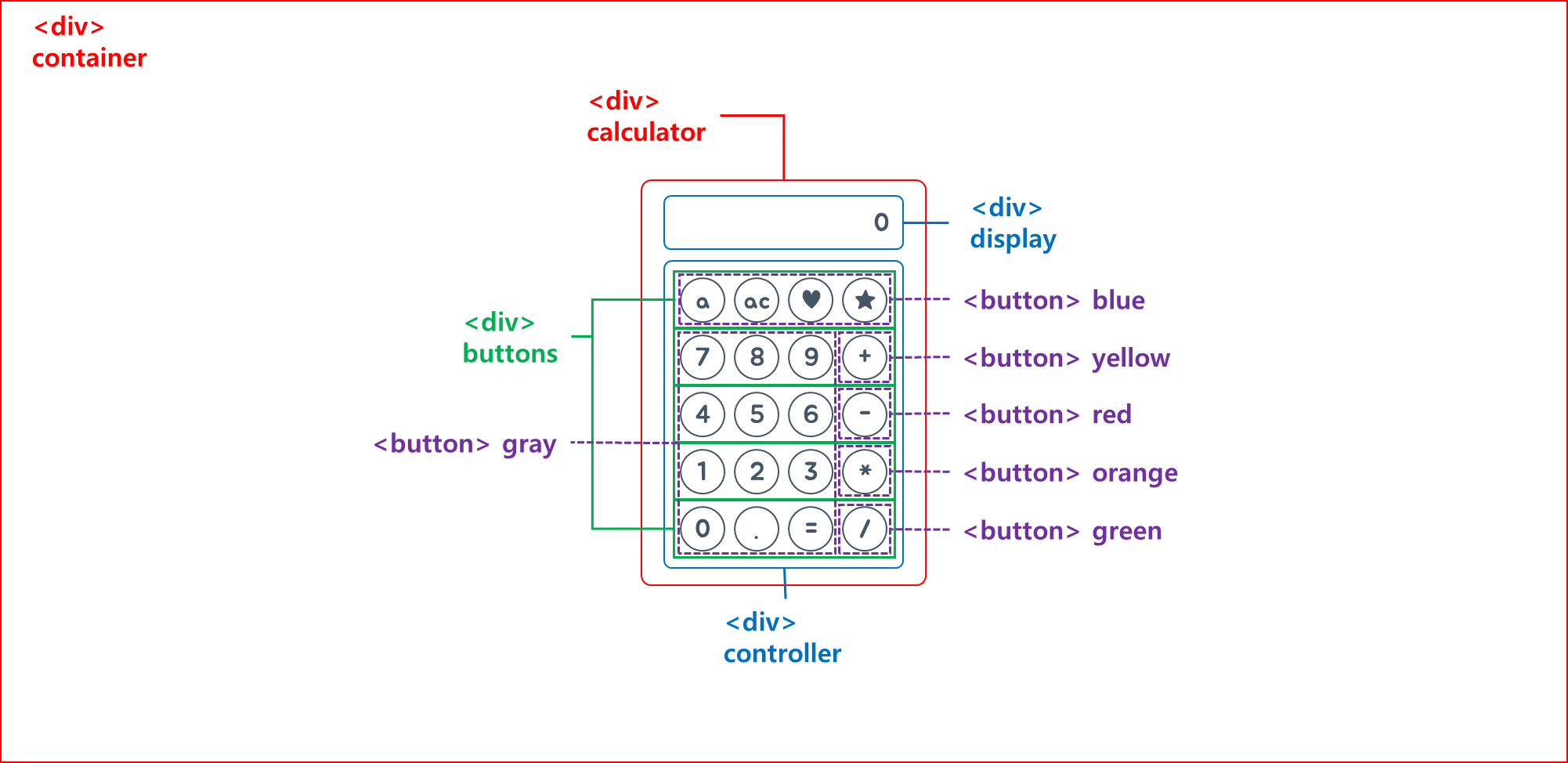
- 설계도를 참고하여 HTML 파일을 작성한다.
<div class="container">
        <div class="calculator">
            <div class="display">0</div>
            <div class="controller">
                <div class="buttons">
                    <button class="blue">a</button>
                    <button class="blue">ac</button>
                    <button class="blue">♥</button>
                    <button class="blue">★</button>
                </div>
                <div class="buttons">
                    <button class="gray">7</button>
                    <button class="gray">8</button>
                    <button class="gray">9</button>
                    <button class="yellow">+</button>
                </div>
                <div class="buttons">
                    <button class="gray">4</button>
                    <button class="gray">5</button>
                    <button class="gray">6</button>
                    <button class="red">-</button>
                </div>
                <div class="buttons">
                    <button class="gray">1</button>
                    <button class="gray">2</button>
                    <button class="gray">3</button>
                    <button class="orange">*</button>
                </div>
                <div class="buttons">
                    <button class="gray">0</button>
                    <button class="gray">.</button>
                    <button class="gray">=</button>
                    <button class="green">/</button>
                </div>
            </div>
        </div>
    </div>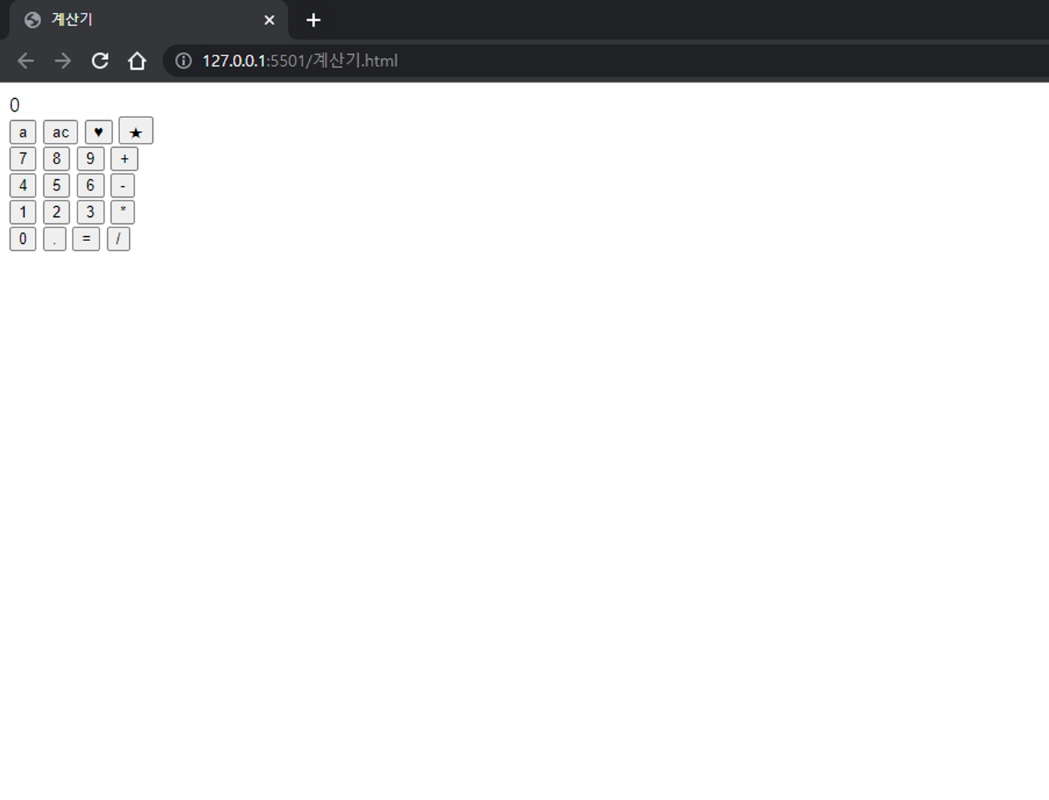
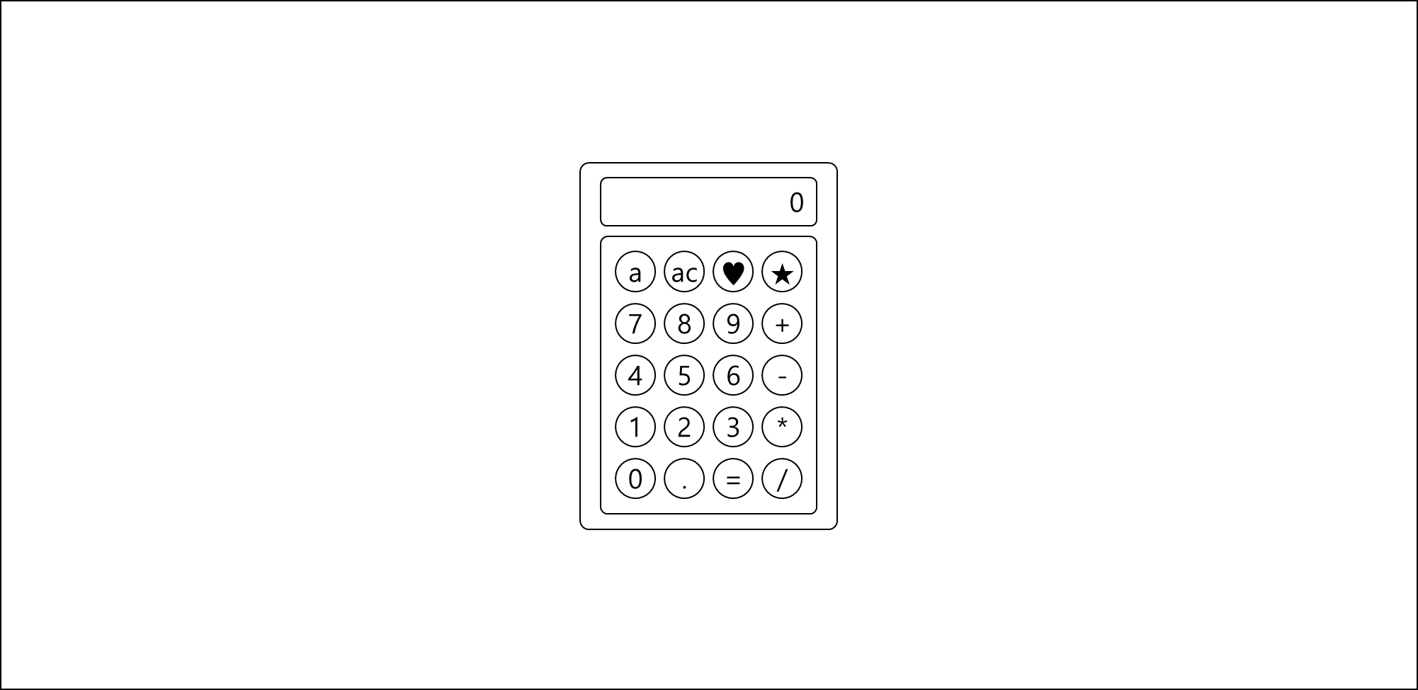
- HTML만 적용했을 때의 모습
이제 CSS를 이용하여 스타일을 입혀보자!
3. CSS로 틀 그리기
- 먼저 브라우저에 기본으로 적용 되어있는 스타일링을 제거한다.
* {
    margin: 0;
    padding: 0;
    box-sizing: border-box;
  }
- 배경 틀을 잡는다.
/* 1. 배경 */
.container {
   display: flex;
   border: 1px solid red;
   width: 100vw;
   height: 100vh;
   justify-content: center;
   align-items: center;
 }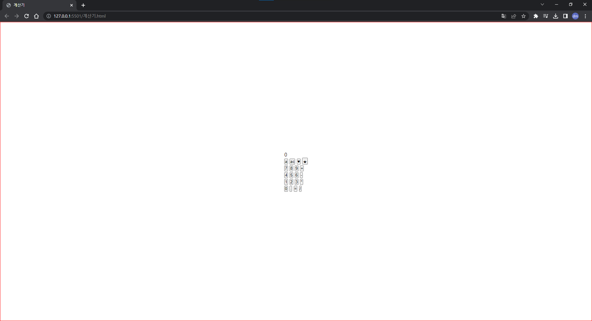
- display: flex : 부모 박스 요소에 적용해, 자식 박스의 방향과 크기를 결정하는 레이아웃
- width, height : 각각 100vw, 100vh를 지정하여 화면을 가득 채워준다.
- justify-content: center : 축 수평 방향을 가운데로 맞춘다.
- align-items: center : 축 수직 방향을 가운데로 맞춘다.
- 계산기 틀을 잡는다.
/* 2. 계산기 틀 */
.calculator {
    display: flex;
    border: 1px solid red;
    width: 350px;
    height: 500px;
    flex-direction: column;
    padding: 25px;
    border-radius: 10px;
  }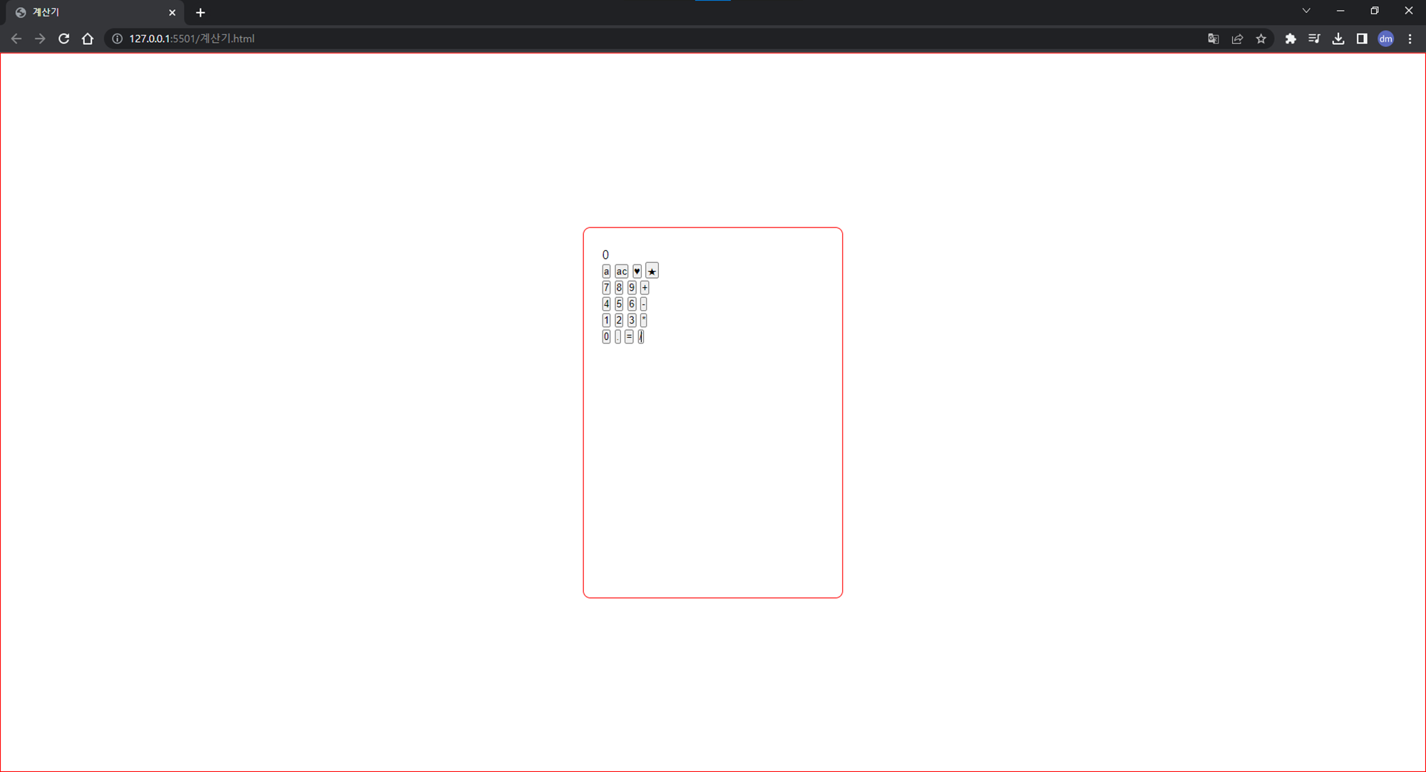
- width, height : 계산기의 크기를 350px, 500px로 지정했다.
- flex-direction : 정렬 축을 column으로 지정하여 세로 정렬을 한다.
- 세로 정렬을 안하면 아래 사진처럼 계산기 화면과 계산기 버튼이 가로로 정렬된다!
- 세로 정렬을 안하면 아래 사진처럼 계산기 화면과 계산기 버튼이 가로로 정렬된다!
- padding : 안쪽 여백을 25px 정도 주었다. (녹색)
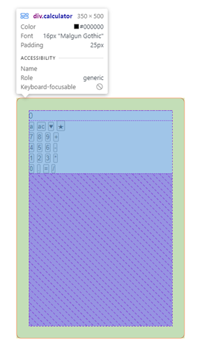
- border-radius: 테두리를 둥글게 만들어주는 속성이다.
-
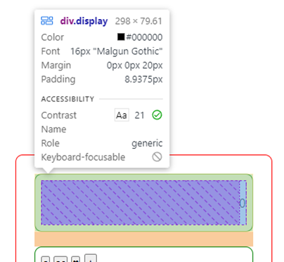
계산기 입력 화면과 컨트롤러 틀을 잡는다.
/* 3. 계산기 입력 화면 */ .display { display: flex; border: 1px solid green; flex: 10%; justify-content: flex-end; align-items: center; margin-bottom: 20px; padding: 3%; border-radius: 10px; }- justify-content: flex-end : 축 수평 방향을 끝으로 맞춘다.
- margin-bottom: 바깥여백의 아래쪽 여백을 20px으로 주었다. (주황)
/* 4. 컨트롤러 틀 */ .controller { display: flex; flex: 70%; border: 1px solid green; flex-direction: column; padding: 3%; border-radius: 10px; }- flex-direction : 정렬 축을 column으로 지정하여 세로 정렬을 한다.
- 세로 정렬을 안하면 아래 사진처럼 계산기 버튼이 가로로 정렬된다!
- 세로 정렬을 안하면 아래 사진처럼 계산기 버튼이 가로로 정렬된다!
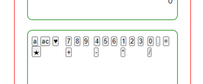
- 버튼들의 전체 틀을 잡는다.
/* 5. 버튼 전체 틀 */
.buttons {
    display: flex;
    border: 1px solid blue;
    flex: auto;
    justify-content: space-evenly;
}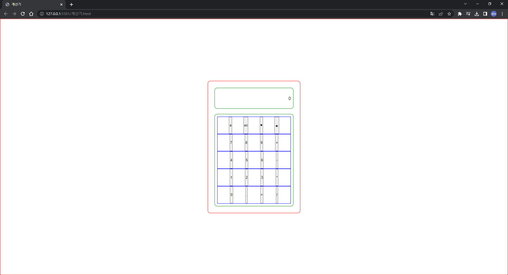
- justify-content: space-evenly : 버튼들 간에 동일한 여백을 준다.
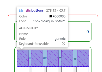
- flex: auto : auto 값을 갖는 방향(세로)으로 빈 공간을 채우게 된다.
- auto 값을 주지 않으면 아래 사진처럼 버튼이 텍스트 크기만큼만 유지된다!
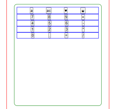
- auto 값을 주지 않으면 아래 사진처럼 버튼이 텍스트 크기만큼만 유지된다!
- justify-content: space-evenly : 버튼들 간에 동일한 여백을 준다.
- 버튼의 틀을 잡는다.
/* 6. 버튼 */
button {
  border: 1px solid purple;
		width: 52px;
  height: 52px;
  margin: 2%;
  border-radius: 50px;
}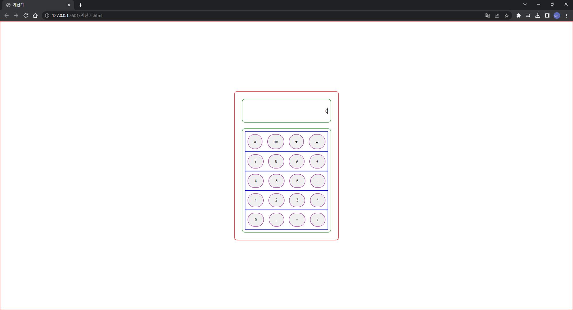
- margin : 버튼의 바깥쪽 여백을 2%으로 주었다. (주황)
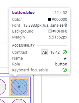
- margin : 버튼의 바깥쪽 여백을 2%으로 주었다. (주황)
4. CSS로 스타일 적용하기
- 폰트 설정하기
<head> <link rel="preconnect" href="https://fonts.googleapis.com"> <link rel="preconnect" href="https://fonts.gstatic.com" crossorigin> <link href="https://fonts.googleapis.com/css2?family=Jua&display=swap" rel="stylesheet"> </head>- Google Fonts 서비스를 이용하여 원하는 폰트를 고른 뒤, HTML 파일에 link 태그를 사용하여 폰트를 embed한다.
  /* 0. 폰트 */
  * {
    font-family: 'Jua', sans-serif;
  }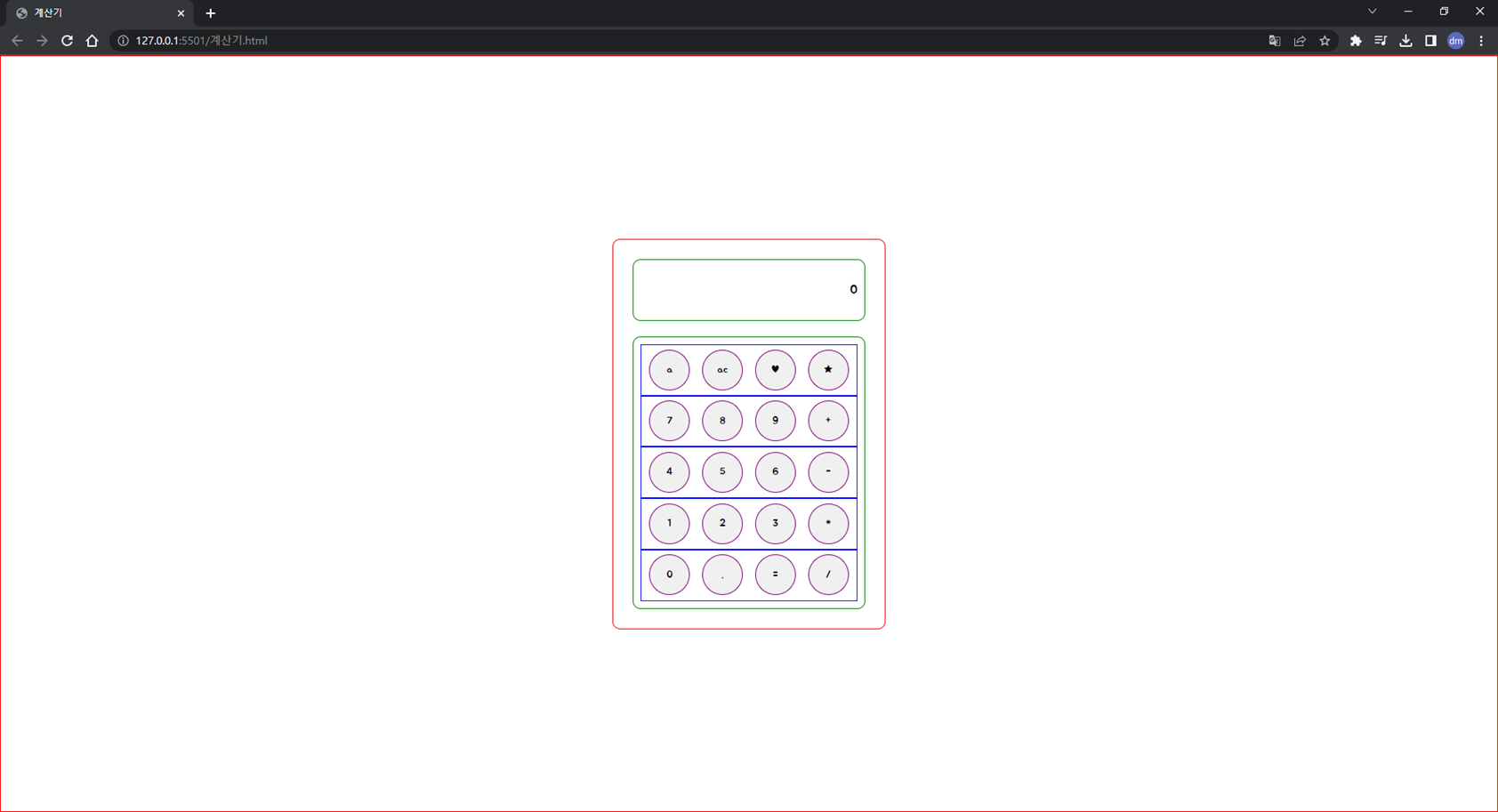
- 모든 영역에 같은 폰트를 적용할 것이기 때문에 * 안에 지정할 폰트를 입력한다.
- font-family : 글꼴을 설정할 수 있는 속성이다.
- Google Fonts 서비스를 이용하여 원하는 폰트를 고른 뒤, HTML 파일에 link 태그를 사용하여 폰트를 embed한다.
- 배경 스타일 적용하기
/* 1. 배경 */
.container {
    display: flex;
    /* border: 1px solid red; */
    background-image: url(배경.png);
    width: 100vw;
    height: 100vh;
    justify-content: center;
    align-items: center;
  }
- background-image : 배경의 이미지를 넣는 속성이다.
- 계산기 틀 스타일 적용하기
/* 2. 계산기 틀 */
.calculator {
    display: flex;
    border: 2px solid #465767;
    background-color: #EBF0F4;
    box-shadow: 5px 5px 20px #465767;
    width: 350px;
    height: 500px;
    flex-direction: column;
    padding: 25px;
    border-radius: 10px;
  }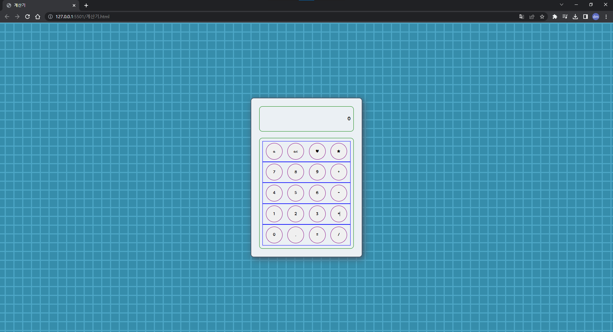
- border : 선 굵기, 선 종류, 선 색상을 지정해주었다.
- background-color : 배경색을 지정해주었다.
- box-shadow : 그림자를 지정해주었다.
-
계산기 입력 화면과 컨트롤러 틀 스타일 적용하기
/* 3. 계산기 입력 화면 */
.display {
    display: flex;
    border: 2px solid #465767;
    background-color: #92C2DD;
    box-shadow: 1px 1px 5px #465767 inset;
    flex: 10%;
    justify-content: flex-end;
    align-items: center;
    margin-bottom: 20px;
    padding: 3%;
    border-radius: 10px;
    font-size: 2rem;
    color: #27313a;
}

/* 4. 컨트롤러 틀 */
.controller {
    display: flex;
    flex: 70%;
    border: 2px solid #465767;
    background-color: white;
    flex-direction: column;
    padding: 3%;
    border-radius: 10px;
}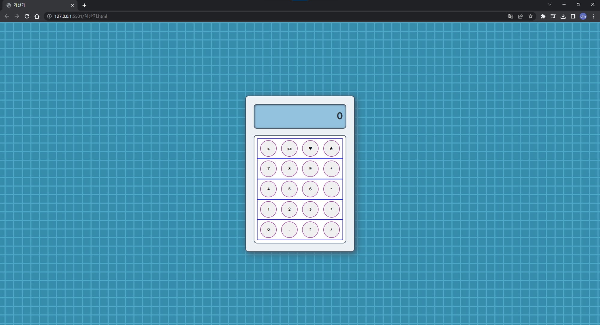
- box-shadow: inset로 안쪽 그림자를 넣어준다.
- font-size : 폰트의 사이즈를 지정한다.
- color : 폰트 색상을 지정한다.
-
버튼 전체 틀과 버튼 스타일 적용하기
/* 5. 버튼 전체 틀 */
.buttons {
    display: flex;
    /* border: 1px solid blue; */ /* 지워준다. */
    flex: auto;
    justify-content: space-evenly;
}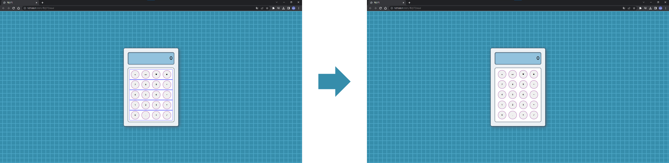
- 버튼 전체 틀의 파란 외곽선은 여백 설정을 위해 임시로 표시했던 것이므로 지워준다.
/* 6. 버튼 */
button {
    border: 2px solid #465767;
    width: 52px;
    height: 52px;
    margin: 2%;
    border-radius: 50px;
    box-shadow: 0px 4px 0px #465767;
    font-size: 1.5rem;
    color: #465767;
}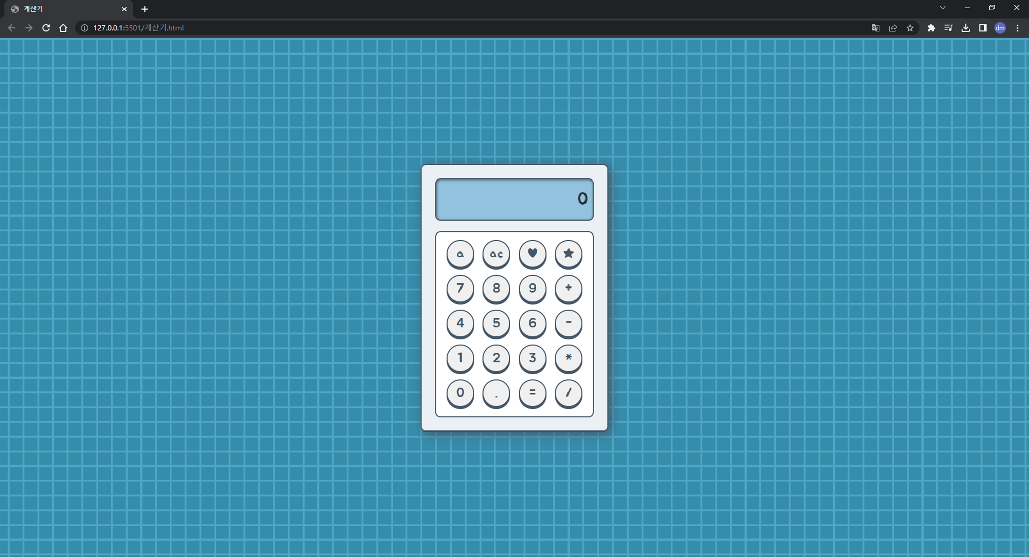
- box-shadow: 버튼에 입체감을 표현하고 싶어 아래쪽 그림자를 주었다.
(0px 4px 0px #465767 : 오른쪽, 아래, 흐림정도, 색상)
-
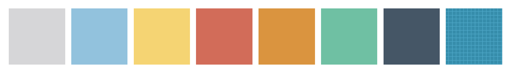
버튼 색상 스타일 적용하기
/* 7. 버튼 색상 */
.gray {
    background-color: #D6D6D8;
}

.blue {
    background-color: #92C2DD;
}

.yellow {
    background-color: #F5D473;
}

.red {
    background-color: #D26C59;
}

.orange {
    background-color: #DA943F;
}

.green {
    background-color: #6FC0A3;
}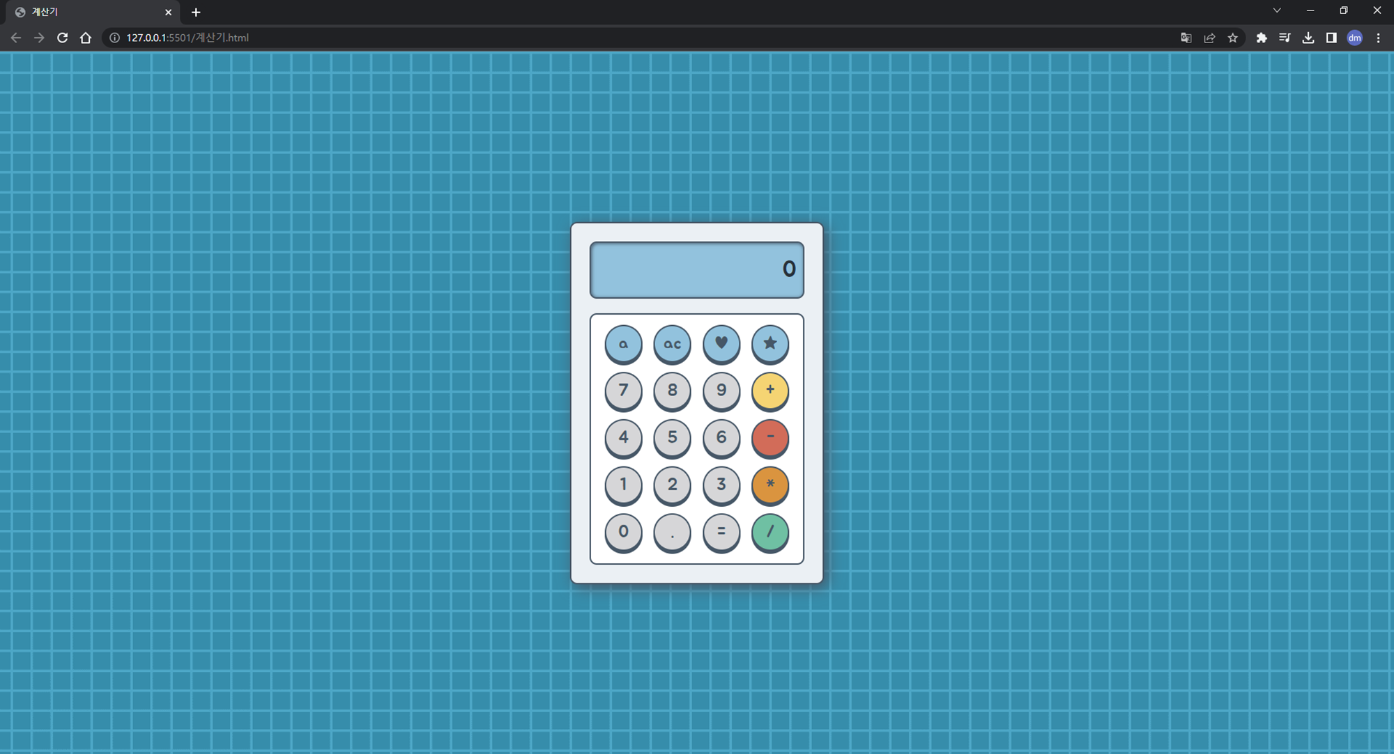
- background-color : 버튼 색을 지정해주었다.
-
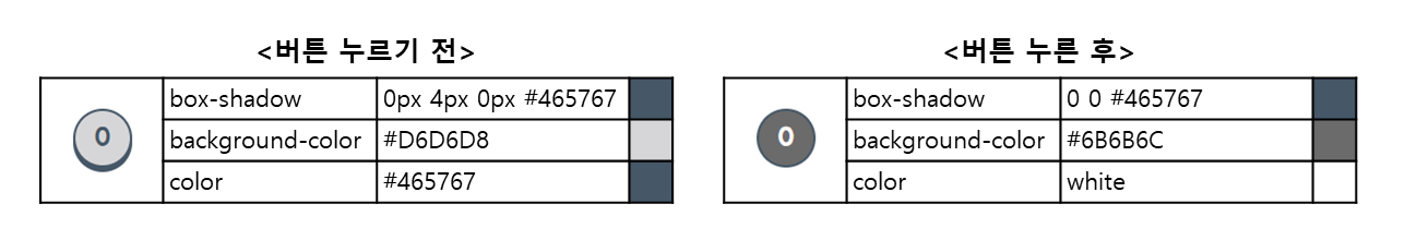
버튼 눌리는 효과 적용하기
/* 8. 버튼 눌리는 효과 */
.blue:active {
    box-shadow: 0 0 #465767;
    background-color: #49616F;
    color: white;
}

.gray:active {
    box-shadow: 0 0 #465767;
    background-color: #6B6B6C;
    color: white;
}

.yellow:active {
    box-shadow: 0 0 #465767;
    background-color: #7B6A3A;
    color: white;
}

.red:active {
    box-shadow: 0 0 #465767;
    background-color: #69362D;
    color: white;
}

.orange:active {
    box-shadow: 0 0 #465767;
    background-color: #6D4A20;
    color: white;
}

.green:active {
    box-shadow: 0 0 #465767;
    background-color: #386052;
    color: white;
}
- :active : 활성화 된(클릭된) 상태일 때
- 마우스를 누른 순간 box-shadow 속성으로 그림자를 조절해 누르는 듯한 효과를 낸다.
- 마우스를 누른 순간 box-shadow 속성으로 그림자를 조절해 누르는 듯한 효과를 낸다.
- :active : 활성화 된(클릭된) 상태일 때


과정이 잘 정리되어있어서 너무 좋아요! 잘 읽고 공부하고 갑니다😄