Front-end 국비지원 #007일
테이블에 관련된 속성 알아보기
테이블 속성 복습
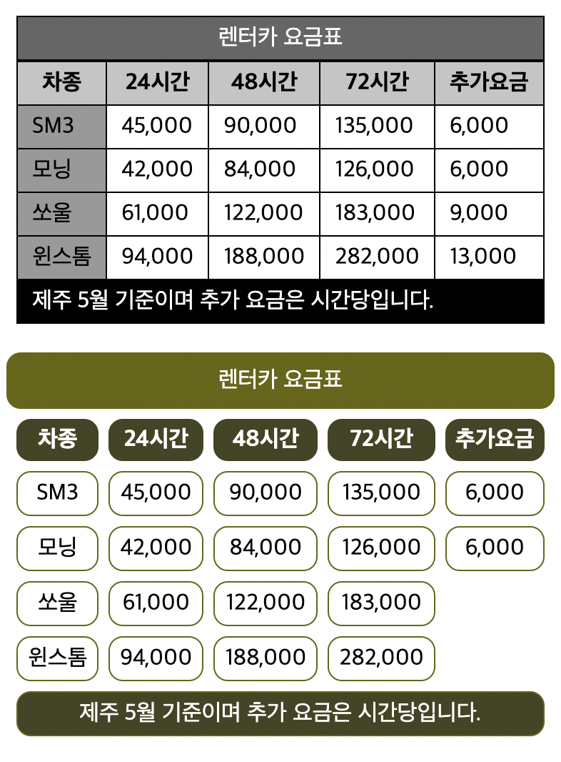
    #table2{
      border-spacing: 7px;
      margin:20px auto;
    }
    #table2 caption, #table2 th, #table2 td{
      border-radius: 10px;
    }
    #table2 caption{
      background: #660;
      padding: 10px 20px;
      color: #fff;
    }
    #table2 th, #table2 td{
      padding: 5px 7px;
    }
    #table2 th{
      background: #442;
      color: #fff;
    }
    #table2 td{
      border: 1px solid #660;
      text-align: center;
    }
    #table2 tr:last-child td{
      background: #442;
      color: #fff;
    }
    #table2 tr:nth-child(4) td:last-child{
      border: none;
    }
    #table2 tr:nth-child(5) td:last-child{
      border: none;
    }


     #table1{
      border: 1px solid #000;
      margin: 20px auto;
      border-collapse: collapse;
     }
     #table1 caption, #table1 th, #table1 td{
      border: 1px solid #000;
      padding: 5px 10px;
     }
     #table1 caption{
      background: #666;
      color: #fff;
     }
     #table1 th{
      background: #c5c5c5;
     }
     #table1 tr:last-child td{
      background: #000;
      color: #fff;
     }
     #table1 td:first-child{
      background: #999;
     }
FAQ 페이지 만들기
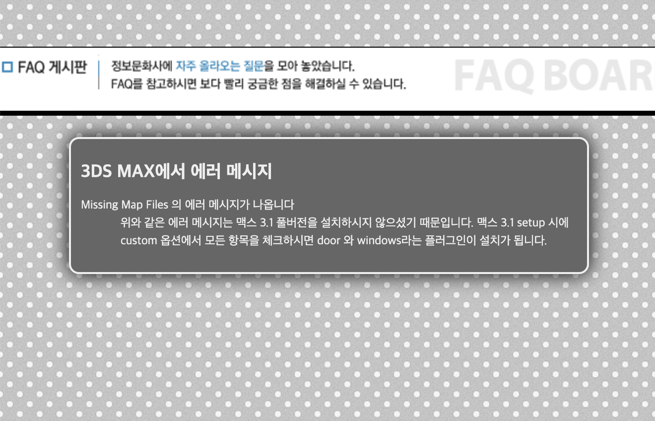
body{
				background: url(./images/pattern_gray.png);
				margin: 50px auto;
			}
			h1{
				text-align: center;
				background: #fff;
				padding: 5px 0;
				border-top: 1px solid #000;
				border-bottom: 5px solid #000;
			}
			#faqBox{
				width: 500px;
				margin: 0 auto;
				background: #666;
				padding: 10px;
				border-radius: 10px;
				border: 2px solid #efefef;
				box-shadow: 0 0 20px #000;
				color: #efefef;
				font: 9pt "맑은 고딕","돋움";
				line-height: 150%;
			}
Q... , A... 텍스트 앞에 붙이기
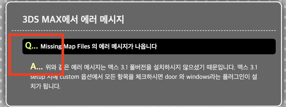
#faqBox dl dt::before{
					content: "Q... ";
					font-size: 17px;
					color: #cf6
				}
				#faqBox dl dd{
					margin: 5px 30px;
					padding: 5px;
					text-align: justify;
				}
				#faqBox dl dd::before{
					content: "A... ";
					font-size: 17px;
					color: #ff9;
					font-weight: bold;
				}
이미지 요소 옆에 문단 흐르게 만들기

img{
				border: 2px solid #efefef;
				box-shadow: 1px 1px 10px #000;

			}
			.floatLeft{
				float: left;
				margin: 10px 20px 10px 0;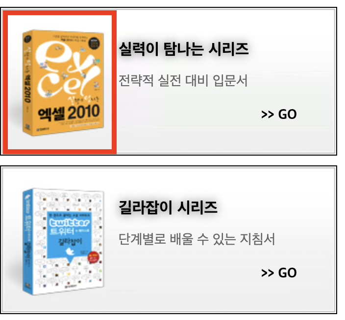
빨간테두리에 책의 이미지가 와야함. padding-left를 사용하여 공간을 확보한다.
h2{
				text-shadow: 0px 0px 10px #666;
				padding-left:120px;
				padding-top: 20px;
				font-size: 16px;
float:left , clear: left

창의 크기가 좁을때

창의 크기가 넓을때
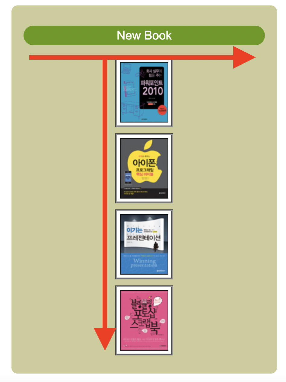
.book1{
				background: url(./images/bg_sm01.png) no-repeat;
				float: left;
				margin-right: 10px;
			}
			.book2{
				background: url(./images/bg_sm02.png) no-repeat;
				float: left;
			}
			.book3{
				background: url(./images/bg_sm03.png) no-repeat;
				clear: left;
				float: left;
				margin-right: 10px;
			}
			.book4{
				background: url(./images/bg_sm04.png) no-repeat;
				float: left;
			}
float : left 를 사용하여 book1,2,4번을 사용하고 book3번은 좁아지면 clear:left를 사용하여 2번과 4번 사이로 들어가게 설정할 수도 있다.
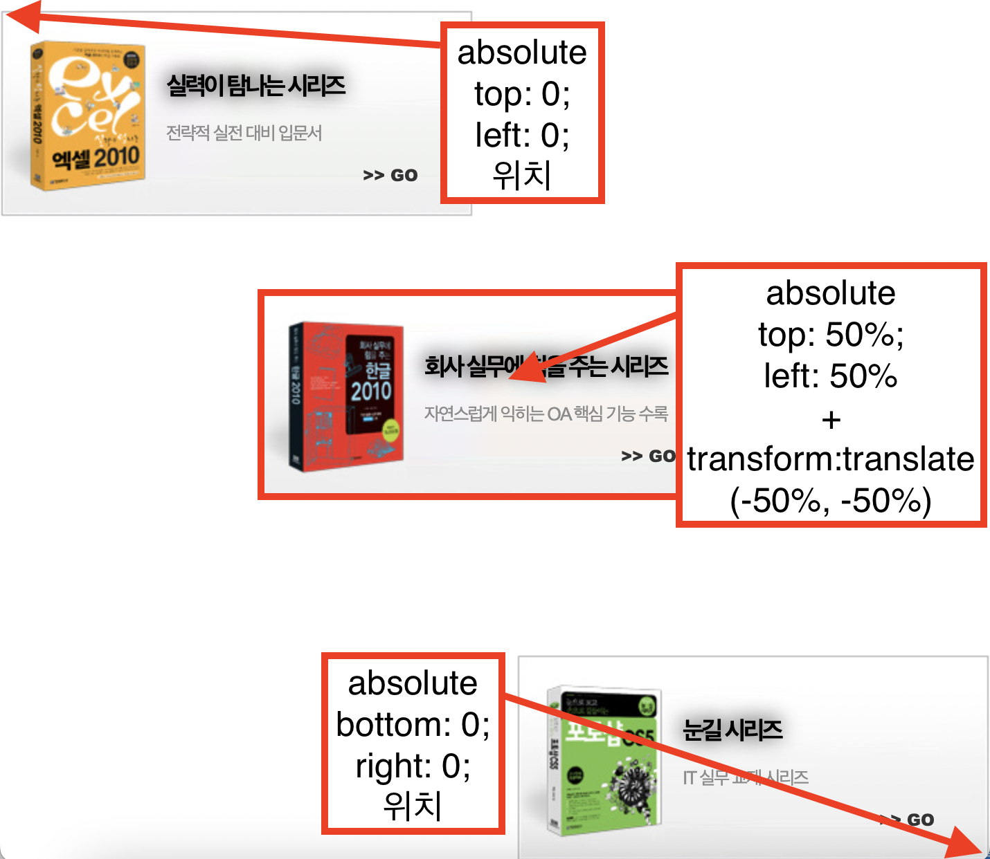
절대 좌표 방식으로 배치하기 position: absolute 속성
position 속성은 요소를 특정 위치에 배치할때 사용함 위치는 top, right, bottom, left 값에 결정됨
- static : 일반적인 값
- relative : 자신을 기준으로 위치 값을 적용함
- absolute : 요소를 일반적인 흐름이 아닌 가장 가까운 특정 부모 요소에 따라 상대적으로 배치, 부모에 특정한 포지션 속성이 없다면 상위 컨테이너 블록을 기준으로 함
- fixed : 요소의 일반적인 흐름이 아닌 뷰포트의 컨테이너 블록을 기준으로 배치함
- sticky : 스크롤 되는 가장 가까운 부모 컨테이너 블록을 기준으로 위치 값을 적용 (스크롤을 내리면 상단에 걸려서 고정됨)
- absolute
			#book1{
				background: url(./images/bg_sm01.png) no-repeat;
				position: absolute;
				top: 60px;
				left: 0;
			}
			#book2{
				background: url(./images/bg_sm02.png) no-repeat;
				position: absolute;
				top: 50%;
				left: 50%;
				/* margin-top: -75px;
				margin-left: -171px; */
				transform: translate(-50%, -50%);
			}
			#book3{
				background: url(./images/bg_sm03.png) no-repeat;
				position: absolute;
				top: 50%;
				right: 50%;
				/* margin-top: -75px;
				margin-right: -171px; */
				transform: translate(50%, -50%);
			}

			#book4{
				background: url(./images/bg_sm04.png) no-repeat;
				position: absolute;
				right: 0;
				bottom: 0;
			}
- relative
현재 기점에서
#logo{
	position: relative;
	top:-5px;
	left:-50px;
	float: left;
			}
top:-5px 이동
left:-50px 이동
- fixed
상단 메뉴바나 팝업창이 스크롤을 내리더라도 고정돼서 따라다니는 효과를 나타낼 때 사용
#titlePage{
			position: fixed;
			width: 100%;
			top: 0;
			left: 0;
			}
nav{
	width: 250px;
	background: yellow;
	position: fixed;
	top: 80px;
	left: 100px;
	padding: 20px;
	}
section{
		width: 500px;
		margin-left: 500px;
		}
fixed 는 화면상의 특정한 위치에 고정됨 스크롤을 내려도 해당 요소가 고정되어 있는 것을 확인.
- static
스크롤이 좁을 때
스크롤이 넓을 때

 @media screen and (max-width: 1000px) {
            .box2{position: static; width: 100%;}
            .box3{position: static; width: 100%;}
            .box4{position: static; width: 100%;}
            .box5{position: static; width: 100%;}
            .box6{position: static; width: 100%;}
            .box7,.box8,.box9{top: 1600px;}
         }
*반응형 웹페이지 제작시 사용
이미지 요소를 세로로 배치하기
이미지는 인라인 요소이기 때문에 블록화 시켜서 세로로 배치한다.
div img{
		display: block;
		margin: 10px auto;
		padding: 5px;
		background: #fff;
		border: 3px groove #999;
		}
목록 요소를 가로로 배치하기

세로로 된 li요소들을 인라인 요소로 바꿔서 가로로 배치한다.
#topMenu{
		background: #600;
		padding: 10px;
		text-align: center;
		}
#topMenu li{
		display: inline-block;
        padding: 0 20px;
        }
제목 텍스트 대신 이미지로 대체하기

h1 텍스트 요소는 컴퓨터가 중요한 텍스트라는걸 인식해야한다. 그래서 지우는 것보다 화면에 보이지 않게 처리하는 것이 좋다.
.ir-so{
		position: absolute;
        font-size: 0;
        left: -9999em;
        overflow: hidden;
		}
결과
*h1>span .ir-so 라는 클래스를 선택하여 position absolute를 사용하여 왼쪽 방향 9999em 으로 이동시키고
폰트사이즈는 0으로 설정 overflow는 hidden으로