Front-end 국비지원 #006일
소속을 정하는 트리 구조의 하위 자손 선택자
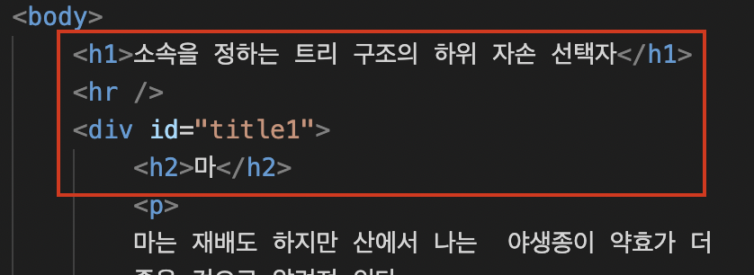
h2의 '마' 를 선택하여 백그라운드와 스타일을 지정하고싶다면

<div id="title1">
			<h2>마</h2>
div 안에-> h2를 부른다

#title1 h2{background: pink; color: #fff; width: 60px; padding: 5px; text-align: center;}

이런식으로

title1에 있는 h2는 #id'띄우고'h2를 지정한다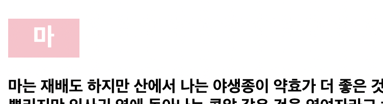
- 직계자손일 경우에는 ">" 손자일 경우 " " 띄어쓰기를 쓴다 ex) title>li>a
선택자간의 우선 순위 알아보기
- 선택자간의 우선 순위가 있다. 우선순위는 ID > Class > Tag 순이다.
만약 태그를 강제로 우선순위로 두려면 !important 를 쓴다.
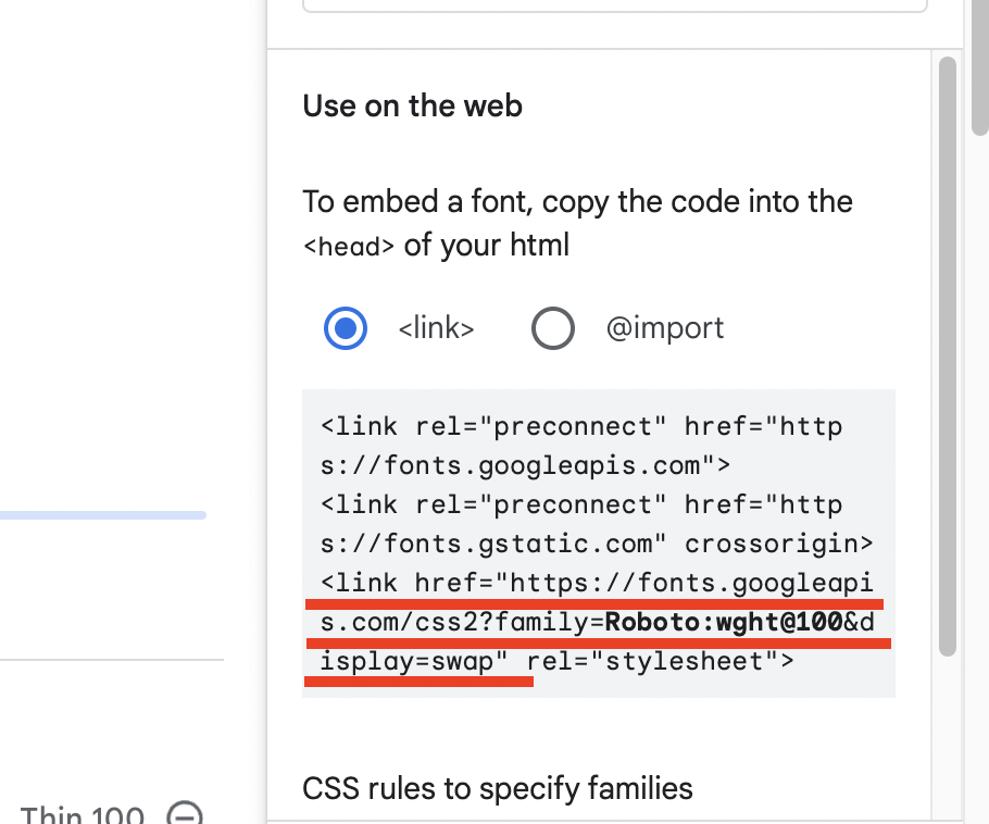
ex) span{color: green !important}글자와 관련된 속성 알아보기 / 구글폰트 사용하기 / link, @import적용
-
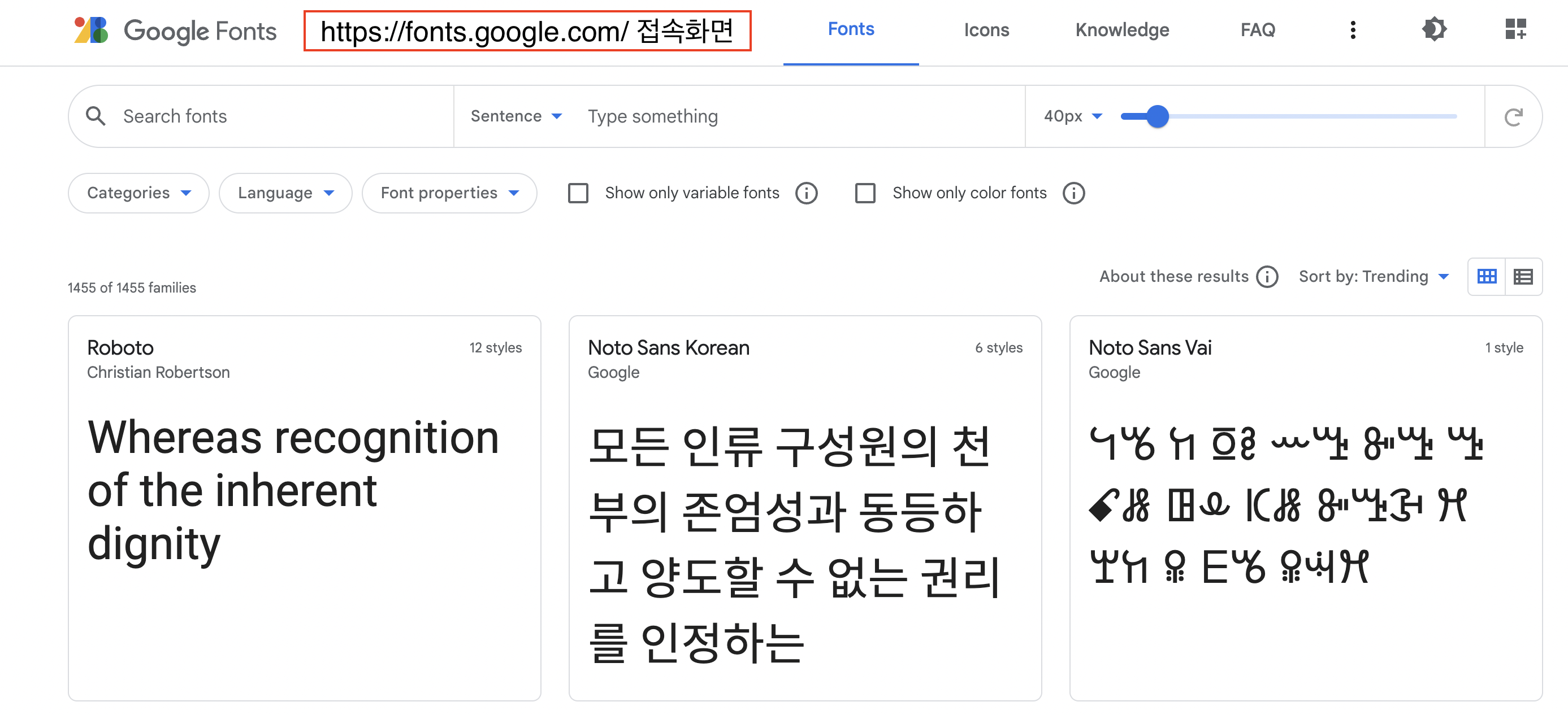
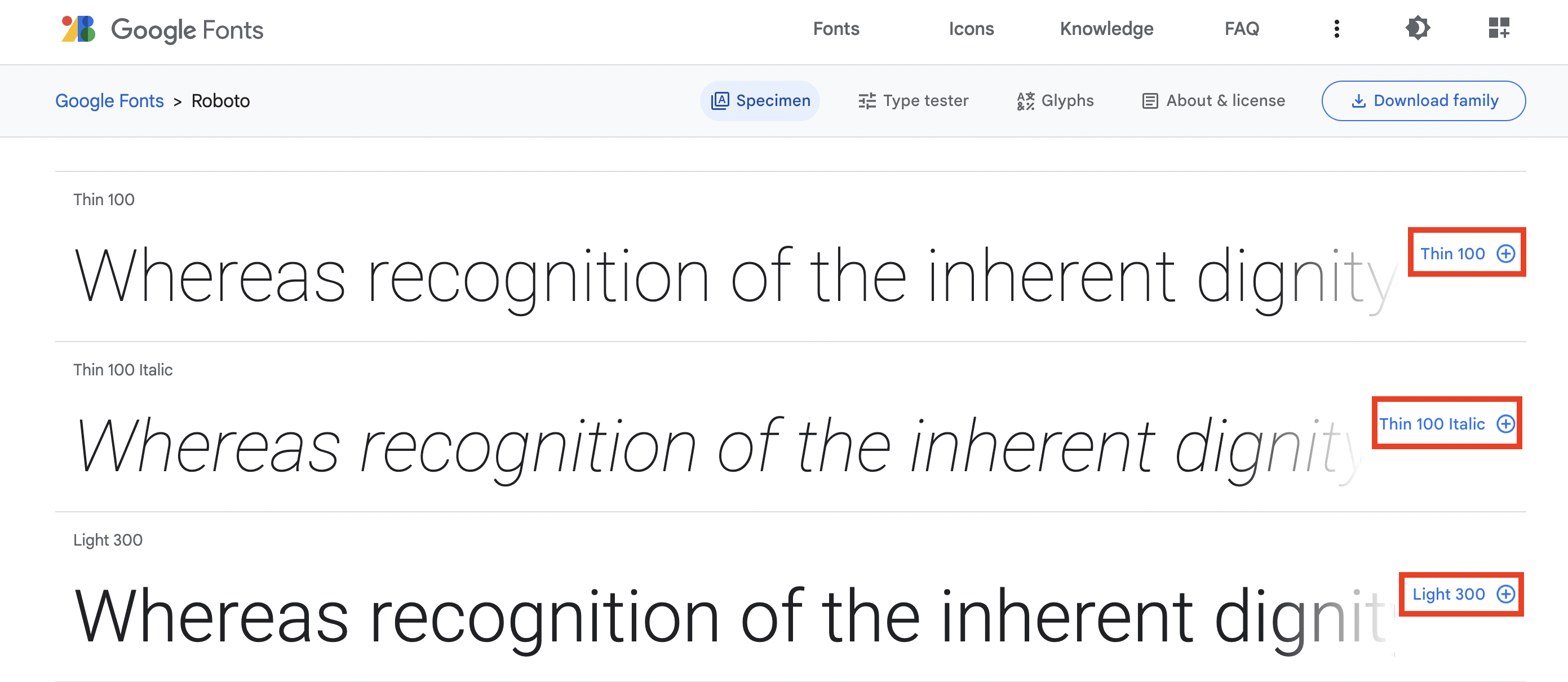
마음에 드는 폰트를 선택한 후 하단에 + 버튼을 누르면 우측 메뉴가 나온다
-
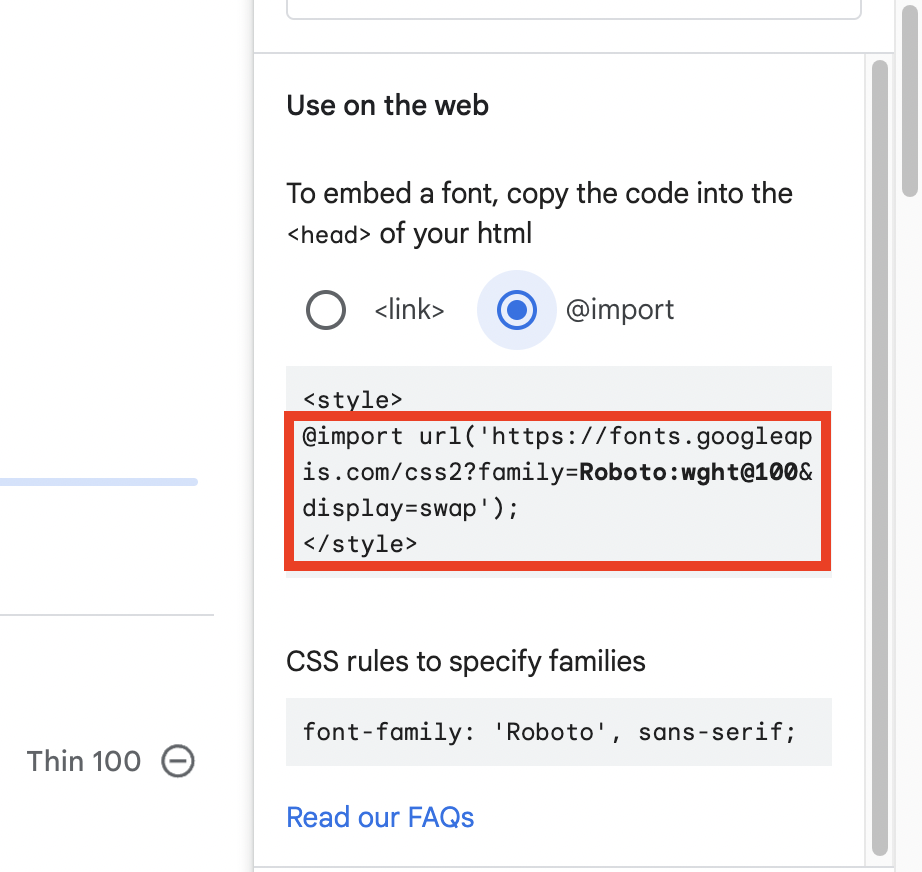
link 방식과 @import 방식이 나온다 빨간영역까지 복사한다.
<!DOCTYPE HTML>
<html>
	<head>
		<title> 글자와 관련된 속성 알아보기 </title>
		<meta charset="UTF-8" />
		<link href="https://fonts.googleapis.com/css2?family=Fuzzy+Bubbles:wght@400;700&display=swap" rel="stylesheet">
		<style type="text/css">
@import url('https://fonts.googleapis.com/css2?family=Fuzzy+Bubbles:wght@400;700&family=Oswald&display=swap');- link와 @import 위치에 맞게 복사한다.
#box1 h2{
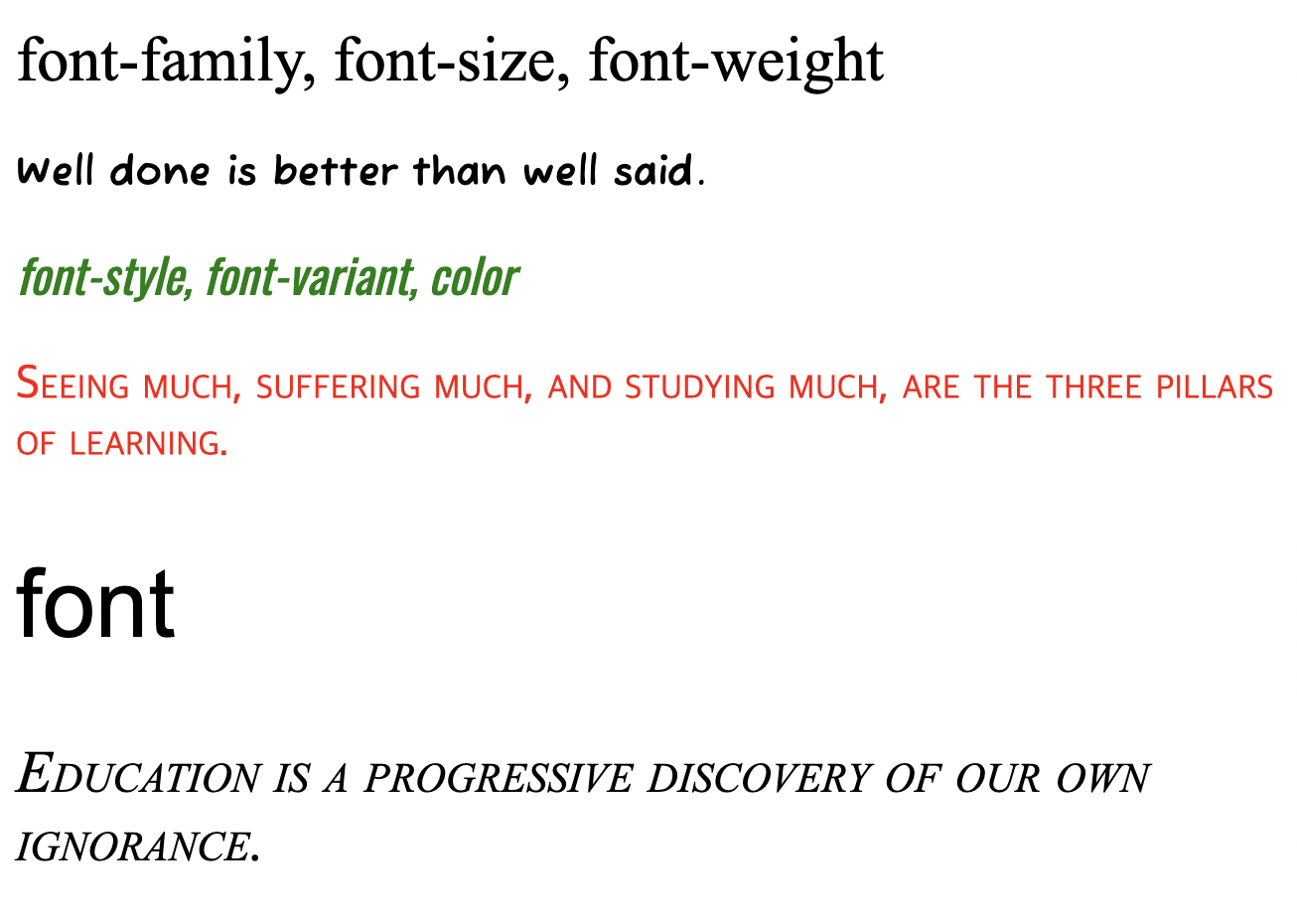
font-family: "Times New Roman", sans-serif;
font-size: 2em;
font-weight: normal;
}
#box1 p{
font-family: 'fuzzy bubbles', cursive;
font-size: 20px;
font-weight: 700;
}
#box2 h2{
font-family: 'Oswald', sans-serif;
font-weight: 400;
font-style: italic;
color: green;
}
#box2 p{
font-variant: small-caps;
font-size: 24px;
color: red;
}
#box3 h2{
font:3em Arial;
}
#box3 p{
font: small-caps italic 30px "Times New Roman"
}결과
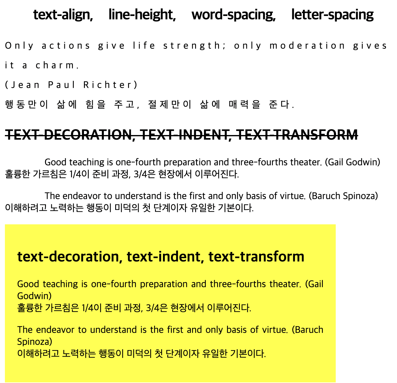
문단에 관련된 속성 알아보기
- text-align : 텍스트 정렬 (center,end,right,justify등)
- line-height : 글자간 줄 높이
- word-spacing : 글자 사이 간격
- letter-spacing : 단어 사이 간격
- text-decoration : (uppercase, line-through, underline, overline)
- text-indent : (들여쓰기)
- text-transform : (대,소문자 lowercase / uppercase)
- word-spacing : 단어와 단어사이 간격 조정
#box1 h2{
				word-spacing: 20px;
				text-align: center;
				letter-spacing: -1px;
			}
			#box1 p{
				letter-spacing: 5px;
				line-height: 200%;
			}

			#box2 h2{
				text-transform: uppercase;
				text-decoration: line-through;
				/*text-decoration: underline;
				text-decoration: overline; */
			}
			#box2 p{
				text-indent: 10%;
			}
			#box3{width: 500px; background: yellow; padding: 20px;}
			#box3 p{text-align: justify;}
결과
목록 문단에 이미지, 위치, 스타일 제어하기
list style
- list-style: disc; / 검정색 원
- list-style: circle; / 빈 원
- list-style: square; / 검정 네모
- list-style-image: url(이미지); / 이미지를 넣은 목록 모양
- list-style-position: inside; / 들여쓰기
- list-style-type: upper-roman; / 대문자 로마자
- list-style-type: lower-roman; / 대문자 로마자
- list-style-type: upper-alpha; / 대문자 알파벳
- list-style-type: lower-alpha; / 소문자 알파벳
- list-style: hiragana; / 히라가나
- list-style-type: decimal-leading-zero; / 두자리 앞에 '0'붙이기
list-style: disc;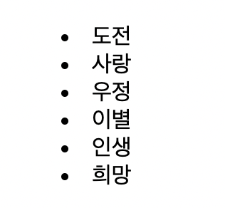
list-style: circle;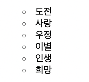
list-style: square;
list-style-image: url(./images/arrow.gif);
*outside: 기본값 inside: 한칸*/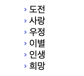
list-style-type: upper-roman;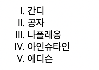
list-style-type: upper-alpha;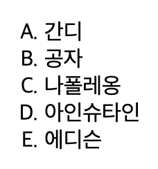
list-style: hiragana;
list-style-type: decimal-leading-zero;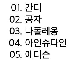
인용부호, 특정 문자열과 같은 콘텐츠 생성하기
content 속성
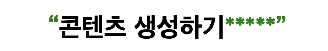
	h1::before{
				content: open-quote;
				color: green;
			}
			h1::after{
				content: "*****" close-quote;
				color: green;
			}
p{
white-space: pre;
counter-increment: counterIndex;
}
p::before{
content: counter(counterIndex, upper-roman);
font-size: 2em;
color: orange;
}
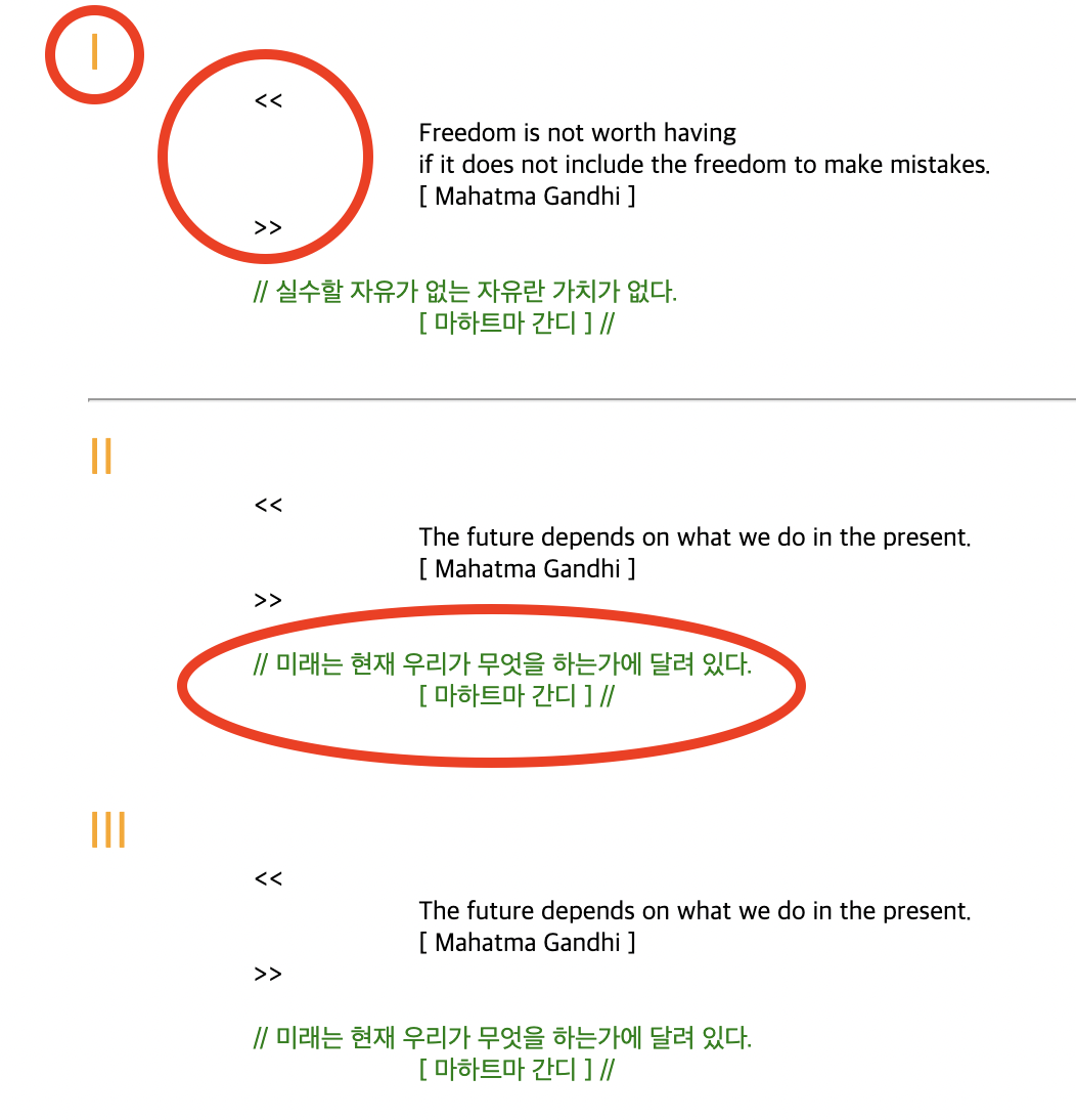
q{
quotes: "<<"">>""[""]";
}
.qStyle{
quotes: "//""//";
color: green;
}- 앞에 추가를 할 때는 before 뒤에 추가를 할 때는 after를 사용한다.
다양한 속성으로 테두리 표시하기
보더의 종류
- none
- solid
- dotted
- dashed
- double
- groove
- ridge
- inset
- outset
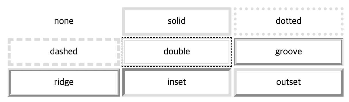
        .tbox1{border: 5px none #ddd }
        .tbox2{border: 5px solid #ddd }
        .tbox3{border: 5px dotted #ddd }
        .tbox4{border: 5px dashed #ddd }
        .tbox5{border: 5px double #ddd; outline: 1px dashed #000; }
        .tbox6{border: 5px groove #ddd }
        .tbox7{border: 5px ridge #ddd }
        .tbox8{border: 5px inset #ddd }
        .tbox9{border: 5px outset #ddd }
*{margin: 0;}
	body{
    	border: 15px solid #000;
        }
    h1{
    	text-align: center;
        border-top: 20px solid #ff3333;
		padding-top: 10px;
        }
   	div{
    	border: 15px double #669933;
        width: 70%;
        margin: 30px auto;}
    p{
    	border-bottom: 1px dashed #000;
        padding: 10px;
        }
    p.removeLine{
    	border: none;
}- .removeLine{border:none;} 보더라인 지우기
모서리가 둥근 테두리 만들기 : border-radius
border-radius
	body{
     	margin: 30px;
    	}
    div{
    	border: 15px solid #f03;
        border-radius: 20px;
        background: #6d6d6d;
        }
    p{
       	background: #fff;
        margin: 40px;
        padding: 15px;
        line-height: 200%;
      }
   	.round1{
    	border: 15px solid #f93;
        border-radius: 40px 0;
        }
    .round2{
      	border: 15px solid #f6f; border-radius: 40px 0 0 0;
        }
outline
.border1{
		border: 15px solid rgb(255, 162, 0);
        outline: 1px dashed black;
        padding: 20px 20px 40px;
        width: 45%;
        line-height: 180%;
        }
요소의 배경 처리하기 : background image
background-image: url(./images/bg0.png);
background: url(./images/bg1.png);- url경로를 찾아 배경에 이미지를 삽입한다.
body{
	margin: 0;
	background-color: rgb(37, 186, 114);
	background-image: url(./images/bg0.png);
	background-repeat: repeat-y;
	background-position: 0 0;
	background-attachment: fixed;
	}
div{
	background: url(./images/bg1.png) repeat-y right top fixed;
	padding-top: 20px;
	height: 100vh;
	padding-left: 80px;
	}
p{
	background: rgb(217, 103, 251) url(./images/dot.png) repeat-x bottom 	left;
	width: 92%;
	font-size: 1.2em;
	color: #fff;
	}
repeat : 반복, 바둑판배열
no-repeat : 반복하지 않음
background-repeat: repeat-x : x축 배열
background-repeat: repeat-y : y축 배열
!vh와 vw는 뷰포트 크기가 기준이고 100분의 1단위 입니다. 즉, 부모의 크기와 상관없습니다.
배경 그라데이션
background:linear-gradient(0deg, yellow, lightGreen, rgb(234, 44, 44));
백그라운드-> linear-gradient속성을 선택하고 deg(각도) 와 색상을 선택한다.
body{
	background:linear-gradient(0deg, yellow, lightGreen, rgb(234, 44, 44));
	width: 100vh;
	height: 100vh;
	margin: 0;
	}
이미지, 색상, 글자 투명도 조정하기
투명도를 주는 방법 3가지
- opacity 투명도 / 하위속성 모두 영향 / 마우스 반응할때
- background-color: hsla(hue, saturation, lightness, alpha); / 배경한테만 하위속성 영향없음 HSLA 채도, 투명도 등
- color:rgba(255, 255, 255, .5);
body{
margin: 0;
padding: 0;
background: url(./images/bg_gray.png) no-repeat #ccc;
}
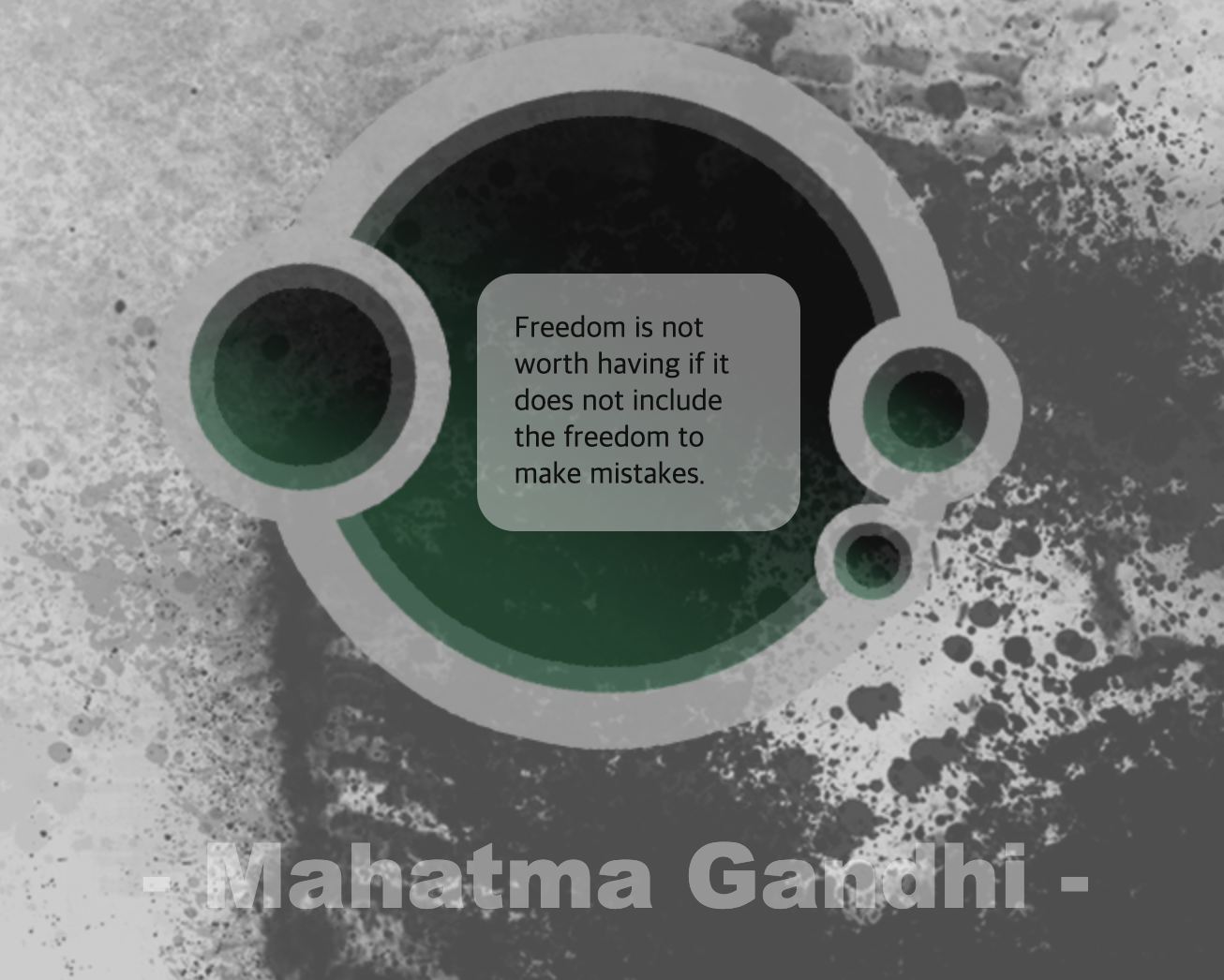
div{
background: url(./images/circle.png) no-repeat;
width: 530px;
height: 424px;
margin:0 auto;
padding-top: 150px;
padding-left: 20px;
opacity: .8;
}
div .textBox{
background-color: hsla(240, 100%, 100%, 0.5);
width: 25%;
padding: 20px;
border-radius: 20px;
margin: 0 auto;
}
div .people{
font: 3em "Arial Black";
color:rgba(255, 255, 255, .5);
padding-top: 100px;
}
그림자 효과 만들기
종류
- box-shadow
- text-shadow
box-shadow: 0(X축) 10px(Y축) 2px(블러) #ccc;(색상)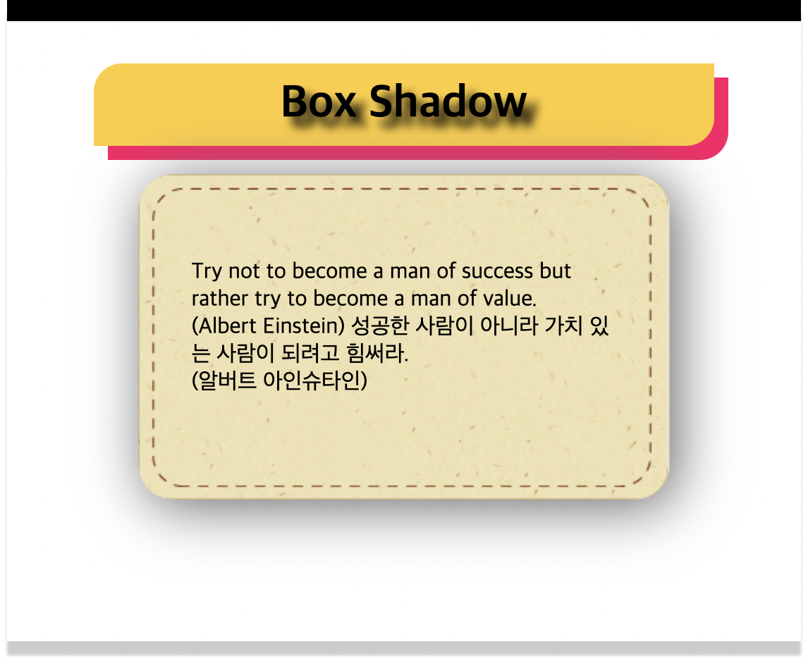
body{
                margin: 0 50px;
                height: 400px;
                border-top: 15px solid #000;
                box-shadow: 0 10px 2px #ccc;
                padding: 20px;
            }
            h1{
                text-align: center;
                width: 400px;
                background: #fc3;
                margin: 10px auto;
                padding: 10px 20px;
                border-radius: 20px 0;
                text-shadow: 7px 7px 7px #000;
                box-shadow: 10px 10px 0 #ff0066;
            }
            div{
                background: url(./images/frame_beige.png) no-repeat;
                width: 377px;
                height: 231px;
                margin: 20px auto;
                box-shadow: 5px 5px 40px #666;
                border-radius: 25px;
            }
            p{
                width: 80%;
                margin: 20px auto;
                padding-top: 60px;
            }