자주 쓰는 html,css
가상클래스 활용법
- tag 따라 붙는 image의 경우
- background image를 통해 on off 이미지가 달리하여 활성화 여부를 표시할 수 있는것
http://uxuiz.cafe24.com/wp/archives/4726
css float한거 영역 채우기 clearfix

float 속성을 적용한 요소의 부모요소에 ::after를 사용해주면 된다.
span과 ul태그를 감싸는 div 태그에 ::after를 추가하였습니다.
const StyledHeader = styled.div`
  background-color: #f1c40f;
  &:after {
    clear: both;
    content: '';
    display: block;
  }
`;
레퍼런스 : CSS / float를 clear하는 방법 네가지(clearfix) - 워너비스페셜
레퍼런스 : A new micro clearfix hack - nicolasgallagher.com
div 안에 컨텐츠 수직 가운데 정렬
line-height 속성을 이용한 방법
-
한 줄짜리 텍스트만 수직 가운데 정렬하는 방법이다.
-
모든 브라우저에서 작동한다.
-
block요소에서는 작동하지 않고 오직 텍스트에서만 작동하며, 한 줄 이상이 되면 내용이 아래로 밀린다.
-
HTML
<div id="content">
    내용
</div>- CSS
#content {
    height: 240px;
    line-height: 240px;
}
※ 컨텐츠를 담고 있는 요소의 height와 line-height 값을 같게 설정한다.
출처: https://includestdio.tistory.com/2 [includestdio]
div > a > img 에서 img태그 수직 가운데 정렬
a 태그 수평 가운데 정렬은
부모태그인 div 에 text-align:center를 주고
  .logo-box {
        background-color: #34425A;
        color: #CCCCCC;
        width: 160px;
        text-align: center;
    }
a 태그 수직 가운데 정렬은
div.navbar > div > a > img 로 구성되어있고,
최상단 div에서 높이를 고정해두었기 때문에 line-height === height과 같이 줌으로써
수직 가운데 정렬이 됩니다.
    .navbar{
        display: flex;
        height: 60px;
    }
    .logo-box a {
        line-height: 60px;
    }
img 수직 가운데 정렬
    .logo-box a img {
        vertical-align: center;
        width: 32px;
    }
table 세로 높이 주고싶어요.
min-height 안먹히고요.
td에 직접 height 줘야지 먹히네요.
pagination 하는데 가운데 정렬
clearfix
const StyledDiv = styled.div`
  text-align: center; <-
`;
const StyledPaginationDiv = styled.div`
  display: inline-block; <-
  &:after {
    clear: both;
    content: '';
    display: block;
  }
`;

    const pages = [];
    for (let i = startPage; i <= lastPage; i += 1) {
      pages.push(
        <StyledPaginationA key={i} href="#" onClick={this.onClick}>
          {i}
        </StyledPaginationA>,
      );
    }
    return (
      <StyledDiv>
        <StyledPaginationDiv>{pages}</StyledPaginationDiv>
      </StyledDiv>
    );
percent로 height을 줬는데 크기가 안변해요.
부모 컴포넌트에 100vh나 px값으로 정해둬야 자식컴포넌트의 width, height에 %가 잘 동작합니다.
https://stackoverflow.com/questions/8262852/css-height-in-percent-not-working
가변폭의 컨텐츠를 수평 중앙 정렬
너비가 고정되어 있지 않는 콘텐츠를 수평 가운데 정렬하는 방법입니다.
    <div class ="product-insert-btn">
        <div class="btngroup">
            <b-button>취소</b-button>
            <b-button type="is-primary">등록</b-button>
        </div>
    </div>
btngroup 가운데 정렬 하려고
    .product-insert-btn {
        text-align: center;
    }

    .btngroup {
        display: inline-block;
    }
btngroup을 inline-block으로 차지하는 크기만큼 width를 잡게한 후
btngroup의 부모 클래스에서 text-align: center로 둬서 inline, inline-block 요소들이 가운데 정렬 되게끔 했습니다.
출처: https://webdir.tistory.com/31 [WEBDIR]
float 한 div 엘리먼트 clearfix
        <div class="purchase-modify__btn">
            <div class="btngroup">
                <b-button type="is-primary">매입처 수정하기</b-button>
            </div>
</div> .purchase-modify__btn{
overflow: hidden;
}
.btngroup {
float: right;
}ul태그로 가로메뉴 만들기
li 태그로 메뉴를 만들어줍니다. 그러면 li는 block 요소기 때문에 세로로 생겨요.
                <div class="product-info-imgcol">
                    <ul>
                        <li><a :href="imageUrl1"><img :src="imageUrl1"></a></li>
                        <li><a :href="imageUrl2"><img :src="imageUrl2"></a></li>
                        <li><a :href="imageUrl3"><img :src="imageUrl3"></a></li>
                        <li><a :href="imageUrl4"><img :src="imageUrl4"></a></li>
                        <li><a :href="imageUrl5"><img :src="imageUrl5"></a></li>
                    </ul>
                </div>
/*
li 태그에 float: left 속성을 줘서 리스트를 li 태그의 길이만큼 float되어 가로로 놓이게 됩니다.
*/
.product-info-imgcol ul li {
float: left;
}
/*
li 태그의 width를 조절해서 한줄에 놓도록 합니다.
*/
.product-info-imgcol ul li a img {
width: 150px;
}ul > li > a 로 가로메뉴 만든 후 수직 가운데 정렬
li태그를 display: inline-block을 하면 가로 블록이 되기 때문에 list메뉴가 가로로 바뀝니다.
저는 div로 ul를 감쌌고, div를 60px로 맞췄기 때문에 line-height를 60px으로 height하고 똑같이 주면 수직 가운데 정렬이 됩니다.
    .top-menu ul li{
        display: inline-block;
        line-height: 60px;
        margin-right: 20px;
    }
float li 태그 가운데 정렬하기
                <div class="product-info-imgcol">
                    <ul>
                        <li><a :href="imageUrl1"><img :src="imageUrl1"></a></li>
                        <li><a :href="imageUrl2"><img :src="imageUrl2"></a></li>
                        <li><a :href="imageUrl3"><img :src="imageUrl3"></a></li>
                        <li><a :href="imageUrl4"><img :src="imageUrl4"></a></li>
                        <li><a :href="imageUrl5"><img :src="imageUrl5"></a></li>
                    </ul>
                </div>
/*
ul에 :after 선택자를 통해
clearfix를 하여 ul이 height를 갖게 됩니다.
*/
.product-info-imgcol ul:after {
clear: both;
content: '';
display: block;
}
/*
li를 둘러싸고 있는 ul에 display를 inline-block으로 둬서 가로 길이를 컨텐츠가 차지하는 만큼만 사용합니다,
*/
.product-info-imgcol ul{
display: inline-block;
}
/*
ul태그를 둘러 싸고 있는 div 태그에서 text-align: center를 해줌으로써 inline, inline-block 요소들은 수평 가운데 정렬이 됩니다.
*/
.product-info-imgcol {
text-align: center;
}navbar 네비게이션 바 flex이용해서 css styling
navbar 만들때
좌측 160px 우측 나머지 모두를 하고싶어요.
<div class="navbar">
        <div class="logo-box">
            <a href="#">
                <img src="../assets/favicon.svg" alt="logo">
                <span>navbar!</span>
            </a>
        </div>
        <div class="top-menu">
            <ul class="navbar-left">
                <li><a href="#"><span>1</span></a></li>
                <li><a href="#"><span>2</span></a></li>
                <li><a href="#"><span>3</span></a></li>
                <li><a href="#"><span>4</span></a></li>
                <li><a href="#"><span>5</span></a></li>
                <li><a href="#"><span>6</span></a></li>
                <li><a href="#"><span>7</span></a></li>
                <li><a href="#"><span>8</span></a></li>
            </ul>
            <ul class="navbar-right">
                <li><a href="#"><span>log out</span></a></li>
            </ul>
        </div>
    </div>
/*상위 바에서 flex*/
	.navbar{
        display: flex;
        height: 60px;
    }

/* 왼쪽 크기 160px로 고정하고*/
    .logo-box {
        background-color: #34425A;
        color: #CCCCCC;
        width: 160px;
    }

/*  나머지 가로 길이 다 차지하게끔 */
    .top-menu{
        flex: 1;
        display: flex;
        background-color: palevioletred;
    }
브라우저에서 색상 코드 찾아주는 확장프로그램
ColorZilla 유용하게 쓰고 있습니다.
https://jay891101.tistory.com/4
flex나 grid로 컬럼 레이아웃 잡으려고 할땐 bulma( bootstrap 종류 ) 가 있습니다.
columns.. 라는 아주 편한게 있네요..
사실 다른 boostrap도 비슷한게 있겠죠.
https://bulma.io/documentation/columns/sizes/
header를 맨위에 고정하고 싶습니다.
<template>
    <div class="main">
        <mynav/>
        <div class="page-title columns">
            <div class="page-section column">
                <h2 class="page-name">상품관리</h2>
                <nav class="breadcrumb" aria-label="breadcrumbs">
                    <ul>
                        <li><a href="#">홈</a></li>
                        <li><a href="#">상품관리</a></li>
                    </ul>
                </nav>
            </div>
            <div class="column">
                <div class="product-file-upload columns">
                    <div class="column">
                        <b-field class="file">
                            <b-upload v-model="file">
                                <a class="button is-primary">
                                    <b-icon icon="upload"></b-icon>
                                    <span>파일선택</span>
                                </a>
                            </b-upload>
                            <span class="file-name" v-if="file">
                                {{ file.name}}
                            </span>
                            <span class="file-name" v-else>선택된 파일이 없음</span>
                        </b-field>
                    </div>
                    <div class="column">
                        <button class="button is-primary">상품등록</button>
                    </div>
                </div>
                <div class="product-file-upload columns">
                    <div class="column">
                        <b-field class="file">
                            <b-upload v-model="file2">
                                <a class="button is-primary">
                                    <b-icon icon="upload"></b-icon>
                                    <span>파일선택</span>
                                </a>
                            </b-upload>
                            <span class="file-name" v-if="file2">
                                {{ file2.name}}
                            </span>
                            <span class="file-name" v-else>선택된 파일이 없음</span>
                        </b-field>
                    </div>
                    <div class="column">
                        <button class="button is-primary">상품등록</button>
                    </div>
                </div>
            </div>
        </div>
        <list/>
        <myfooter/>
    </div>
</template>
mynav라는 컴포넌트를 맨위에 고정시키고 싶어요.
mynav 컴포넌트에는 <div class="navbar">라는 div로 감싸놓았는데요.
position: fixed만 써놓으면 높이가 조금 먹히더라고요. top:0까지 해줍니다.
    .navbar{
        position: fixed; <-
        top: 0; <-
        display: flex;
        width: 100%;
        height: 60px;
    }
이러면 navbar가 fixed로 되어있기 때문에 <mynav>의 높이를 인식 못하고 올라가더라고요.
<div class="page-title columns"> 에서 이렇게 margin-top에 navbar와 똑같이 높이를 주면 됩니다.
높이를 인식하지 못하는 이유는
position을 absolute나 fixed로 설정시 가로 크기가 100%가 되는 block 태그의 특징이 사라지게 됩니다.
레퍼런스 : css position 속성 - ofcourse
    .page-title{
        margin-top: 60px;
        background-color: #E9EDF2;
    }
https://appsnuri.tistory.com/408
하나의 th에 여러개 td 두고싶을땐?
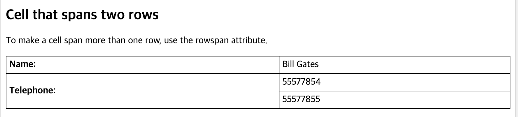
https://www.w3schools.com/html/tryit.asp?filename=tryhtml_table_rowspan
scss import로 스타일 가져오기
https://www.codingfactory.net/10109
& + & selector
const StyledInput = styled.input`
  font-size: 1rem;
  border: none;
  border-bottom: 1px solid ${palette.gray[5]};
  padding-bottom: 0.5rem;
  outline: none;
  width: 100%;

  &:focus {
    color: $oc-teal-7;
    border-bottom: 1px solid ${palette.gray[7]};
  }

  & + & {
    margin-top: 1rem;
    background-color: red;
  }
`;
...
	<form>
        <StyledInput
          autoComplete="username"
          name="username"
          placeholder="아이디"
        />
        <StyledInput autoComplete="email" name="email" placeholder="email" />
        <StyledInput
          autoComplete="new=password"
          name="password"
          placeholder="비밀번호"
          type="password"
        />
        <Button>로그인</Button>
     </form>
styledInput: styled-components로 감싼 input
이런식으로 처음 input 태그 말고 형제 태그들에 스타일링이 적용된게 확인 될것
& scss
Ampersand (상위 선택자 참조)
https://heropy.blog/2018/01/31/sass/
반드시 기억해야 하는 css 선택자
예를 들어, & + &
https://code.tutsplus.com/ko/tutorials/the-30-css-selectors-you-must-memorize--net-16048
rem
https://webdesign.tutsplus.com/ko/tutorials/comprehensive-guide-when-to-use-em-vs-rem--cms-23984
부트스트랩 layout
https://getbootstrap.com/docs/4.4/layout/overview/
css로 컬럼 원하는대로 설정하기
https://getbootstrap.com/docs/4.4/layout/grid/
grid를 이용합니다.
큰 범위는 grid로 예를 들어 다음과 같이 작업을 하고
<div class="col-4"></div>
grid 안에서 간격을 맞추기 위해서는 percent로 작업하면 됩니다.
<div class="w-30"></div>
.w-30 {
	display: "inline-block";
	width:30%;
}
이렇게 하면 부트스트랩 grid는 가로길이를 12분해서 써요.
예를 들어.
div.row 내부태그로
div.col-4 div.col-4 div.col-4 이런식으로 두면
가로를 1/3로 나눕니다.
그 안에는 percent로 세밀하게 조절할 수 있습니다. 부트스트랩으로 사내시스템 개발할때는 많이 쓰는 방법입니다.
우선순위
레퍼런스 : 웹표준, 디자인 - https://cafe.naver.com/wepub
* {} : 전체 선택자  0점
body {} : 태그 선택자 1점
.class {} : 클래스 선택자 10점
#id{} : 아이디 선택자 100점
a:link{} 가상 클래스 선택자 10점

<p style="color: red">인라인 방식의 스타일</p> 인라인방식의 스타일 : 1000점
최상위 적용 방법
<p style="color: red !important">인라인 방식의 스타일</p>

div + p : All <p> elements placed immediately after a <div> element
[target=_blank] : All elements with a target attribute equal to "_blank"
[title=flower] : All elements with a title attribute that contains space separated words, one of which is "flower"
[lang|=en] : All elements where the lang attribute's value is "en", even if the value contains a hyphen (-), like "en-us"
[href^='https://'] : All elements with a href attribute that starts with 'https://'
[href$='.pdf'] : All elements with a href attribute that ends with '.pdf'
[title*=sam] : All elements with a title attributes that includes 'sam' in title
[title~=flower] : All elements with a title attribute that contains space separated words, one of which is "flower"

:link : All links (<a> elements with href)
selector들 뭐가 있지?
https://www.w3schools.com/cssref/css_selectors.asp
left: auto란?
left: 해당 태그 위치를 좌측 기준으로 어디 쯤에 위치시킬건지 지정.
left: auto
현재 감싸고 있는 boundary에서 가장 왼쪽으로 위치하는건가? 내일 확인해볼 것
https://homzzang.com/b/css-112
말 줄임표시 ... 나오게 하기
max-width: 100px
overflow: hidden
text-overflow: ellipsis
position
static 디폴트
relative : top, left, bottom, right 속성을 통해 위치 조절이 가능함.
(static 기준)
absolute : relative처럼 속성을 통해 위치 조절 가능,
(position: relative 속성을 가진 부모 요소를 기준)
fixed : 보여지는 window의 상의 절대 위치를 기준으로 위치 조절이 가능함.
https://developer.mozilla.org/en-US/docs/Web/CSS/position
- 참고사항
position: fixed로 하면 화면 기준으로 위치를 정할 수 있는데 부모 요소에 갇히는 것이 webkit에서 발생하는 버그고, 부모요소에 transform있는지 찾아서 값을 날리면 부모요소에 갇히는 문제해결된다
프론트에서 스타일이 아닌 script용으로 사용하는 클래스에는 _ 를 접두사로 붙이자.
코딩컨벤션임.
input 태그에서 화살표 제거하기 css로
input[type="number"]::-webkit-outer-spin-button,
      input[type="number"]::-webkit-inner-spin-button {
      -webkit-appearance: none;
      margin: 0;
      }
http://melonicedlatte.com/web/2017/05/18/165344.html
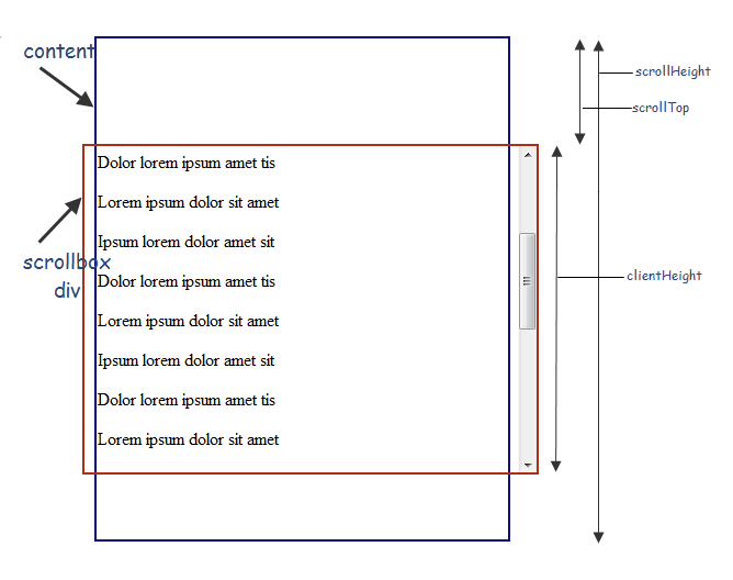
용어정리
window.scrollY : https://developer.mozilla.org/ko/docs/Web/API/Window/scrollY
문서가 수직으로 얼마나 스크롤 되었는지
pageYOffset
element.offsetTop, element.scrollTop, window.pageYOffset
https://baeharam.github.io/posts/javascript/js-window/
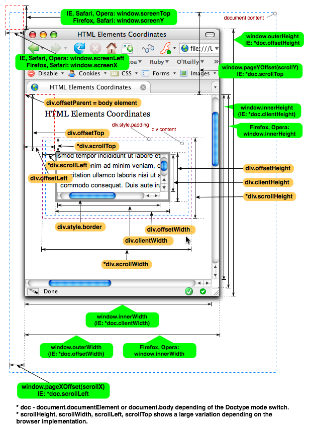
element.scrollHeight: https://developer.mozilla.org/ko/docs/Web/API/Element/scrollHeight
element.scrollTop:
https://stackoverflow.com/a/33189270
window.innerHeight, window.outerHeight, window.innerWidth
:https://sometimes-n.tistory.com/22
window.innerWidth는 창틀을 빼고, 스크롤 포함한 크기
요소 정리되어있는 것
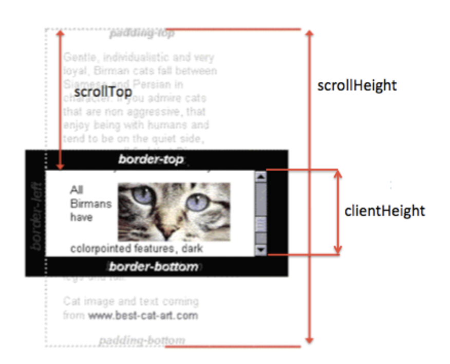
https://ko.javascript.info/size-and-scroll
scrollTop, scrollHeight, clientHeight
https://stackoverflow.com/a/33238025
css box model

https://www.geeksforgeeks.org/css-box-model/
margin으로 사이즈 간격 조절하면 background-color 적용안되지만
padding으로 사이즈 간격 조절하면 background-color 적용됌.
scss, sass
css hex, rgba
https://www.digitalocean.com/community/tutorials/css-hex-code-colors-alpha-values
overflow: auto, scroll 차이
출처: https://aboooks.tistory.com/tag/overflow%3A%20scroll%20auto%20%EC%B0%A8%EC%9D%B4
미디어 쿼리 min-width, max-width
출처 : https://studiomeal.com/archives/1004
min-width : 아래 코드↓는 min-width(최소 width)가 1000px, 즉 1000px 이상인 경우에 적용되는 코드이고
@media (min-width: 1000px) {
	body {
		background: gold;
	}
}
max-width: 아래 코드↓는 max-width(최대 width)가 1000px, 즉 1000px 이하인 경우에 적용되는 코드지요.
@media (max-width: 1000px) {
body {
background: gold;
}
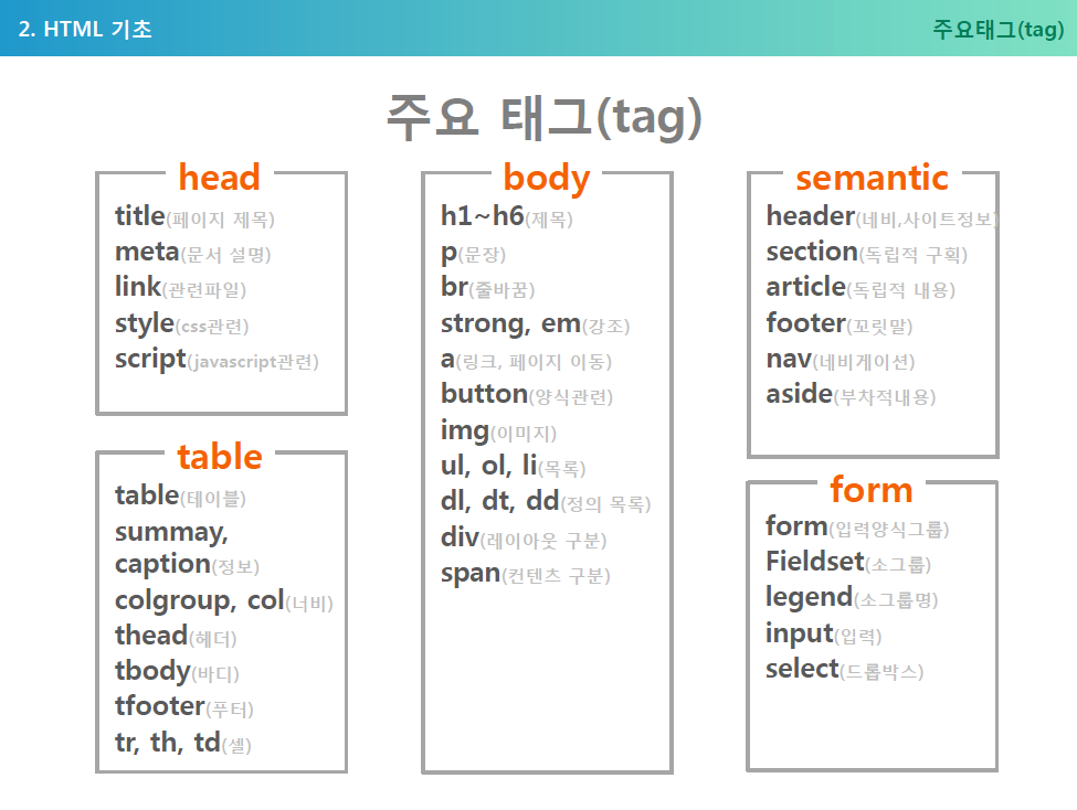
}주요 HTML 태그 정리
https://yunafo3333.tistory.com/3
자주 쓰이는 class명 참조
교보문고 웹퍼블리싱 가이드 예약어:
http://image.kyobobook.co.kr/ink/html/guide/guide_css.html#naming-reserv
2.2 id,class 네이밍 참조
https://nuli.navercorp.com/upload/2020/6672a2b7-abdd-411e-8a50-362911bc7999_Coding_Conventions_for_Markup.pdf
less파일에서 공통으로 사용하는 class style 그대로 가져다 쓰기
출처 : http://lesscss.org/features/#mixins-feature
공통 스타일 정의
style-common.less
.common-head {
  font-size: 20px;
  font-weight: bold;
  line-height: 28px;
}
sample.component.less
@import (reference) /src/style-common.less

.header {
  &:extend(.common-head);
}
이게 됩니다. 참고로 import 해오려는 class가 nested selector면 extend안됩니다.
출처: https://stackoverflow.com/questions/20091264/less-extend-a-previously-defined-nested-selector
.common {
  &-head{
    font-size: 20px;
    font-weight: bold;
    line-height: 28px;
  }
}
less extend vs mixin
공통으로 사용하는 typography 스타일 가이드가 있어요.
component로 가져다 쓸때는 @import (reference)로 가져오는 포스트를 했는데,
기존에는 extend기능을 자세히 안보고 썼음.
extend: 공통 클래스 selector에 extend하려는 selector가 concat되는 형식이에요.
http://lesscss.org/features/#extend-feature
예를 들어,
nav ul {
  &:extend(.inline);
  background: blue;
}
.inline {
  color: red;
}
output
nav ul {
  background: blue;
}
.inline,
nav ul {
  color: red;
}
기대했던 내용.
nav ul {
  ...속성들,
  color: red;
}
기대했던 대로 원했다면 mixins를 써야합니다.
http://lesscss.org/features/#mixins-feature
nav ul {
  .inline();
  background: blue;
}
.inline {
  color: red;
}
output
nav ul {
  color: red;
  background: blue;
}
어떻게 확인함?
https://beautifytools.com/less-compiler.php
이미지작업 종류
- 이미지태그 사용
- 백그라운드 이미지사용
이미지태그 사용
- 넘치는 부분 감출건가?
이미지를 담고있는 element크기가 늘어나면 이미지 크기도 상하좌우로 커진다.
max-height를 주면 높이제한을 두고
img태그에 width: 100%
img를 감싸는 요소에 overflow-hidden을 해주면 넘어서는 부분은 무시된다.
.box {
  overflow: hidden;
  img {
    width: 100%
  }
}- 가로 꽉채우고 세로길이를 제한할거면
object-fit : fill
width: 100%
max-height: 300px;
백그라운드 이미지 사용
배경에 깔리는 이미지의 경우 div에 백그라운드로 이미지를 넣음
height는 필수로 지정해줘야함.
  background: url('이미지링크');
  background-size: cover;
  background-repeat: no-repeat;
  background-position: center;
background-size
cover: 이미지를 크기의 변화에따라 이미지 비율깨면서 맞춤
contain: 이미지를 담고있는 사이즈가 커져도 이미지 비율 유지
background-repeat: 이미지가 크기보다 작은경우에 이미지를 반복할건지?
보통 백그라운드 이미지 쓸때 no-repeat , background-position: center 함께 쓰임
background-position: center 화면이 늘어남에 따라 이미지의 상하 좌우가 center기준으로 확대됨.
레퍼런스: https://www.codingfactory.net/10559
image 태그
https://developer.mozilla.org/ko/docs/Web/HTML/Element/img
이미지 태그는 일반적으로 폭응ㄹ 기준으로 사이즈를 다룸.
높이를 고정시키지 않고선 height: auto로 주면 폭에따라 이미지 높이가 조절되어 원본 비율 유지할 수 있음.
레퍼런스: https://brunch.co.kr/@skykamja24/386
그러면 언제 div에 background-image를 쓰냐?
텍스트가 위에 올라갈때는 나을 수 있음.
max-height, max-width
max-height보다 내용이 크면 overflow 프로퍼티 값에 따라 container가 핸들링됌.
내용이 max-height보다 작으면 프로퍼티는 효과없음.
max-height override height
레퍼런스: https://aboooks.tistory.com/336
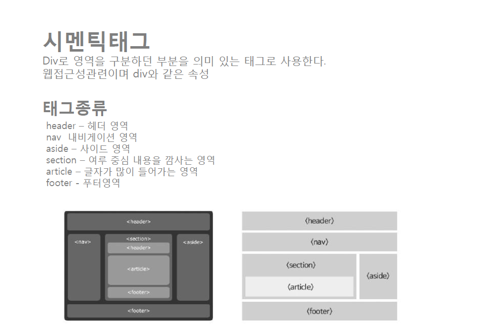
section, article
article
문서나 사이트에서 독립적이고, 이 부분을 다른 곳으로 옮기더라도 분리가 되어지고, 또 의미가 통해야함.
블로그에서 글, 포럼에서 포스팅, 코멘트를 예로 들 수 있음.
section
통상적인 문서 또는 어플리케이션의 구획을 형성하는 요소
웹 애플리케이션에서의 페이지의 묶음 단위
레퍼런스 :
https://stackoverflow.com/questions/14658468/is-it-semantically-correct-to-nest-articles
http://tcpschool.com/html/html5_element_semantic
BEM
레퍼런스 :
https://sparkbox.com/foundry/bem_by_example
https://en.bem.info/forum/12/
figure