웹팩으로 헬로우 리액트를 빌드한 가정하에 이어서 Ant Design을 붙여서 여러가지 사용해보겠습니다.
웹팩으로 리액트 사용하기
ant design 설치
yarn add antdstyled-components 설치
yarn add styled-componentsant design 테마를 커스터마이징
├── package.json
├── script
│ └── generate-less-var.js
├── src
│ ├── components
│ │ ├── App.jsx
│ │ └── StyledComponent.jsx
│ ├── index.html
│ ├── index.jsx
│ └── styles
│ ├── globals.js
│ ├── less
│ │ ├── antd-theme.less
│ │ └── index.less
│ └── theme.js
├── webpack.config.js
├── yarn-error.log
└── yarn.lock
antd-theme.less
@import '~antd/dist/antd.less';index.less
@import 'antd-theme.less';

/* insert custom global style */
global.js
import './less/index.less';styled-components 테마 커스터마이징
전역 css는 있으면 편하잖아요. reset css 처럼요.
theme.js
/**
 * styled-component global style
 */
const theme = {};

module.exports = theme;
레퍼런스: React Js - Global CSS 설정 + styled reset - 초보 코더 RightHot
이제 styled-componets랑 ant design 같이 세팅하겠습니다.
index.jsx
import React from "react";
import ReactDOM from "react-dom";
import App from "./components/App";

ReactDOM.render(<App />, document.getElementById("root"));
src/components/App.jsx
import React from 'react';
import { Layout, Menu, Breadcrumb } from 'antd';
import { ThemeProvider } from 'styled-components';
import theme from '../styles/theme';
import '../styles/globals';

const { Header, Content, Footer } = Layout;

const App = () => (
  <ThemeProvider theme={theme}>
    <div>
      ...
    </div>
  </ThemeProvider>
);

export default App;
styled-components로 ant design 컴포넌트 css 오버라이딩
...
import { Layout, Menu, Breadcrumb, Icon } from 'antd';
import styled, { ThemeProvider } from 'styled-components';
const { Header, Content, Sider } = Layout;
...

//일반 HTML tag
const StyledLogo = styled.div`
  width: 120px;
  height: 31px;
  background: rgba(255, 255, 255, 0.2);
  margin: 16px 28px 16px 0;
  float: left;
`;

//
const StyledContent = styled(Content)`
  background-color: #fff;
  padding: 24px;
  margin: 0;
  min-height: 280px;
`;
styled-components reset css 설정하는 방법
정확히 말하면 styled-components에 global style을 설정할 수 있습니다.
거기에 reset css를 추가하였습니다.
App.jsx
const GlobalStyle = createGlobalStyle`
/* http://meyerweb.com/eric/tools/css/reset/
   v2.0 | 20110126
   License: none (public domain)
*/

html, body, div, span, applet, object, iframe,
h1, h2, h3, h4, h5, h6, p, blockquote, pre,
a, abbr, acronym, address, big, cite, code,
del, dfn, em, img, ins, kbd, q, s, samp,
small, strike, strong, sub, sup, tt, var,
b, u, i, center,
dl, dt, dd, ol, ul, li,
fieldset, form, label, legend,
table, caption, tbody, tfoot, thead, tr, th, td,
article, aside, canvas, details, embed,
figure, figcaption, footer, header, hgroup,
menu, nav, output, ruby, section, summary,
time, mark, audio, video {
	margin: 0;
	padding: 0;
	border: 0;
	font-size: 100%;
	font: inherit;
	vertical-align: baseline;
}
/* HTML5 display-role reset for older browsers */
article, aside, details, figcaption, figure,
footer, header, hgroup, menu, nav, section {
	display: block;
}
body {
	line-height: 1;
}
ol, ul {
	list-style: none;
}
blockquote, q {
	quotes: none;
}
blockquote:before, blockquote:after,
q:before, q:after {
	content: '';
	content: none;
}
table {
	border-collapse: collapse;
	border-spacing: 0;
}

`;

const App = () => (
  <ThemeProvider theme={theme}>
    <GlobalStyle /> <- 이렇게 추가하였습니다.
    <BrowserRouter>
      ...
    </BrowserRouter>
  </ThemeProvider>
);
레퍼런스 : React Styled-Component 공부 - 리엑티브한 행복한 수지아빠
레퍼런스 : React Js - Global CSS 설정 + styled reset - 초보 코더 RightHot
styled-components에서 pseudo selector
float clearfix를 하기 위해 ::after를 써야합니다.
https://www.styled-components.com/docs/basics#pseudoelements-pseudoselectors-and-nesting
antd Form
https://ant.design/components/form/#Form-Item-Component
import { Form, Icon, Input, Button } from 'antd';

function hasErrors(fieldsError) {
  return Object.keys(fieldsError).some(field => fieldsError[field]);
}

class HorizontalLoginForm extends React.Component {
  componentDidMount() {
    // To disabled submit button at the beginning.
    this.props.form.validateFields();
  }

  handleSubmit = e => {
    e.preventDefault();
    this.props.form.validateFields((err, values) => {
      if (!err) {
        console.log('Received values of form: ', values);
      }
    });
  };

  render() {
    const { getFieldDecorator, getFieldsError, getFieldError, isFieldTouched } = this.props.form;

    // Only show error after a field is touched.
    const usernameError = isFieldTouched('username') && getFieldError('username');
    const passwordError = isFieldTouched('password') && getFieldError('password');
    return (
      <Form layout="inline" onSubmit={this.handleSubmit}>
        <Form.Item validateStatus={usernameError ? 'error' : ''} help={usernameError || ''}>
          {getFieldDecorator('username', {
            rules: [{ required: true, message: 'Please input your username!' }],
          })(
            <Input
              prefix={<Icon type="user" style={{ color: 'rgba(0,0,0,.25)' }} />}
              placeholder="Username"
            />,
          )}
        </Form.Item>
        <Form.Item validateStatus={passwordError ? 'error' : ''} help={passwordError || ''}>
          {getFieldDecorator('password', {
            rules: [{ required: true, message: 'Please input your Password!' }],
          })(
            <Input
              prefix={<Icon type="lock" style={{ color: 'rgba(0,0,0,.25)' }} />}
              type="password"
              placeholder="Password"
            />,
          )}
        </Form.Item>
        <Form.Item>
          <Button type="primary" htmlType="submit" disabled={hasErrors(getFieldsError())}>
            Log in
          </Button>
        </Form.Item>
      </Form>
    );
  }
}

const WrappedHorizontalLoginForm = Form.create({ name: 'horizontal_login' })(HorizontalLoginForm);

ReactDOM.render(<WrappedHorizontalLoginForm />, mountNode);
Form.create()(customizedForm);
https://ant.design/components/form/#Form.create(options)
const { getFieldDecorator, getFieldsError, getFieldError, isFieldTouched } = this.props.form; 얘네 용도가 뭐고 대체 어디서 나오는거지? this.props.form은?
If the form has been decorated by Form.create then it has this.props.form property. this.props.form provides some APIs as follows:
getFieldDecorator
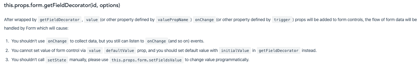
https://ant.design/components/form/#this.props.form.getFieldDecorator(id,-options)
input 태그의 value는 form에 추가되고, this.props.form.validateFields(의 콜백함수 인자로 values가 들어갑니다.)
  handleSubmit = e => {
    e.preventDefault();
    this.props.form.validateFields((err, values) => {
      if (!err) {
        console.log('Received values of form: ', values);
      }
    });
  };
this.props.form
에서 this.props.form은 누가 주는건데? 부모 컴포넌트에서 props로 던져주는거잖아.
const { getFieldDecorator, getFieldsError, getFieldError, isFieldTouched } = this.props.form;내 예측에는 Form.create()(적용할 컴포넌트) 를 했기 때문에 props.form에 접근할 수 있는 것 같다.
스택오버플로우에서 그렇다고 한다. 공식문서에서 봤을때도 그렇다.
const WrappedHorizontalLoginForm = Form.create({ name: 'horizontal_login' })(HorizontalLoginForm);https://stackoverflow.com/questions/55107026/ant-design-getfielddecorator
Form layout
요 뭔뜻일까..
<Form layout="inline" onSubmit={this.handleSubmit}>한 라인 안에 form에 들어갈 필드들을 렌더링하라.
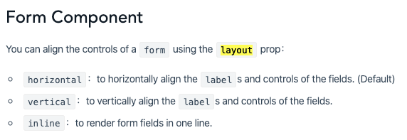
https://ant.design/components/form/#Form-Component
Form.Item
Form에는 input, textarea 등등 한 개 이상의 form fields들로 구성됩니다.
이런 field들은 <Form.Item> 태그를 사용합니다.
<Form.Item validateStatus={usernameError ? 'error' : ''} help={usernameError || ''}>validateStatus, help
The validation status. If not provided, it will be generated by validation rule. options: 'success' 'warning' 'error' 'validating'
isFieldTouched(input태그의 name) : field에 터치가 되었는지 true or undefined
getFieldError(input태그의 name) : field가 안채워졌으면 getFieldDecorator에서 rules옵션에서 message로 정해놓은 값이 들어갑니다. , field값이 채워졌으면 undefined
    // Only show error after a field is touched.
    const usernameError =
      isFieldTouched('username') && getFieldError('username');
    const passwordError =
      isFieldTouched('password') && getFieldError('password');

    console.log(
      `isFieldTouched('username')=${isFieldTouched('username')}`,
      `getFieldError('username')=${getFieldError('username')}`,
      `usernameError=${usernameError}`,
    );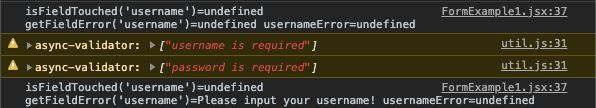
getFieldError <- 는 <Form.Item 의 getFieldDecorator에서 'username' 이란 id로
rules 옵션을 통해서 required: true는 필수값을 뜻하는 것 같고, message: 'Please input your username!'로 에러메시지를 주는 것 같습니다.
입력 태그를 넣을때 이런식으로 감싸서 하고 있다 라고 이해했습니다.
		...
		<Form.Item
          validateStatus={usernameError ? 'error' : ''}
          help={usernameError || ''}
        >
          {getFieldDecorator('username', {
            rules: [{ required: true, message: 'Please input your username!' }],
          })(
            <Input
              prefix={<Icon type="user" style={{ color: 'rgba(0,0,0,.25)' }} />}
              placeholder="Username"
            />,
          )}
        </Form.Item>
		...
그래서 Form에 input을 추가할때는 먼저 Form.Item으로 감싸고, 그 안에 에러메시지를 보여주고 싶을때는 저렇게 제공된 형식을 사용하라는 의미인듯 합니다.
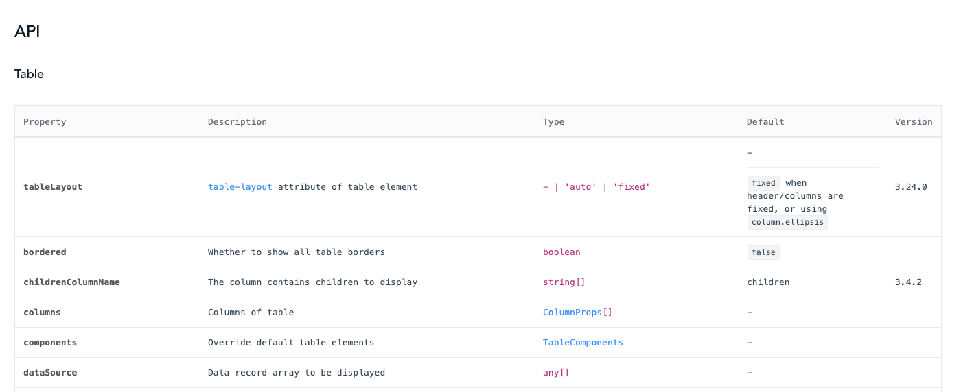
Table
Table 베이직 구조
https://ant.design/components/table/#How-To-Use
현재 적용하려는 테이블
https://ant.design/components/table/#components-table-demo-edit-row
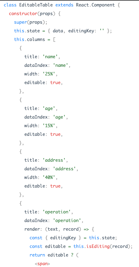
title, dataIndex, width, render 이런건 대체 어디있는가?
테이블화면에서 링크를 타고가면
https://github.com/ant-design/ant-design/blob/e4c72cf6f553376dbef6746bd0a74966152494fe/components/table/interface.tsx#L32
Table 인터페이스를 정의해둔게 있습니다.
editable은 안보이네요.
tbody, tr, td 스타일링
export const Tr = styled.tr`
  color: #666;
`;

export const Td = styled.td`
  color: #666;
`;

export const Tbody = styled.tbody`
  color: #666;
  & > td {
    text-align: left;
    padding: 20px;
    vertical-align: top;
    border-top: 0;
  }
`;
Or
export const Tr = styled.tr`
  color: #666;
`;

export const Td = styled.td`
  color: #666;

  tbody > & {
    text-align: left;
    padding: 20px;
    vertical-align: top;
    border-top: 0;
  }
`;

export const Tbody = styled.tbody`
  color: #666;
`;
https://github.com/styled-components/styled-components/issues/330
Icon
antd 아이콘 쓰면서 onClick받고싶은데.. onClick속성이 없네요.
a태그 안에 Icon을 넣죠.
import { Menu, Dropdown, Icon, message } from 'antd';

const onClick = ({ key }) => {
  message.info(`Click on item ${key}`);
};

const menu = (
  <Menu onClick={onClick}>
    <Menu.Item key="1">1st menu item</Menu.Item>
    <Menu.Item key="2">2nd memu item</Menu.Item>
    <Menu.Item key="3">3rd menu item</Menu.Item>
  </Menu>
);

ReactDOM.render(
  <Dropdown overlay={menu}>
    <a className="ant-dropdown-link" href="#">
      Hover me, Click menu item <Icon type="down" /> <-
    </a>
  </Dropdown>,
  mountNode,
);
https://github.com/ant-design/ant-design/blob/master/components/dropdown/demo/event.md
a tag에 onclick 됩니다.
http://egloos.zum.com/pdw213/v/3493140
styled-components naming conventions?