0527
https://getbootstrap.com/ (영문 최신버전)
-CDN 방식
-install(다운로드) 방식
학습내용
-부트스트랩 예제들 훑어봄!
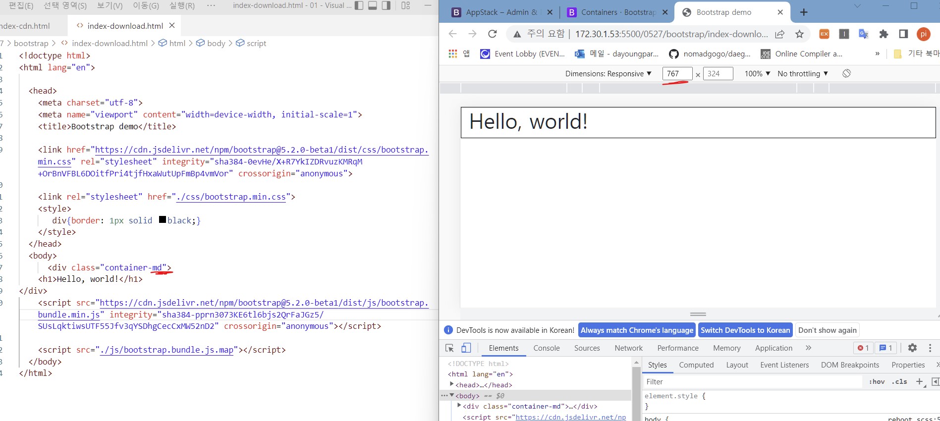
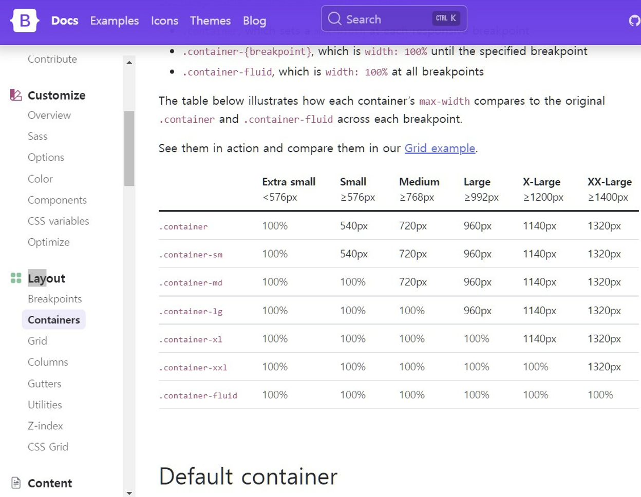
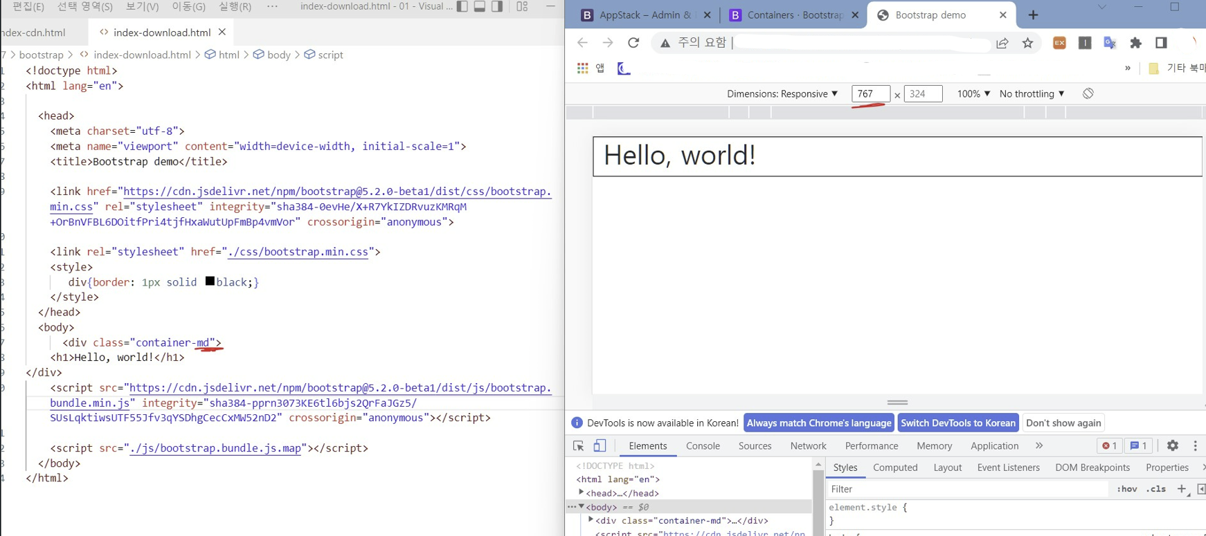
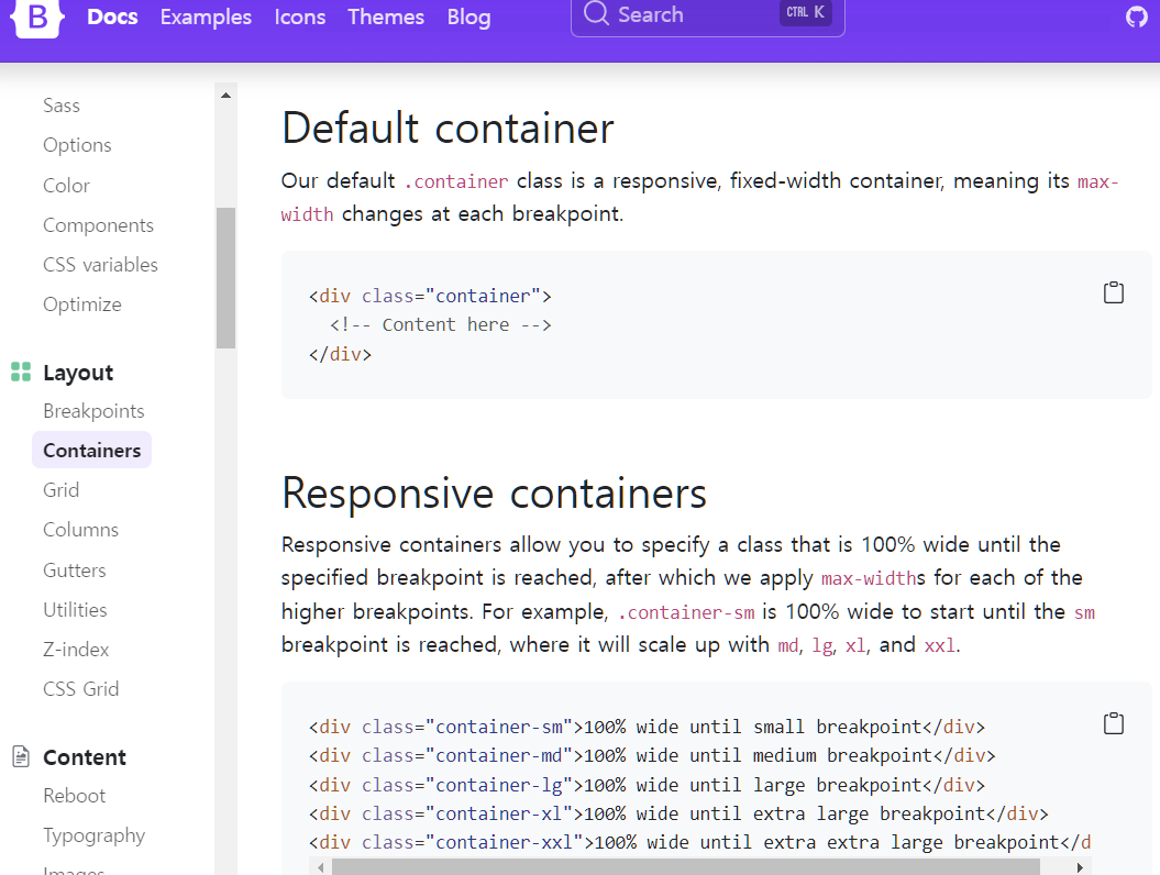
컨테이너 (창크기)
Default container (고정폭)
버튼

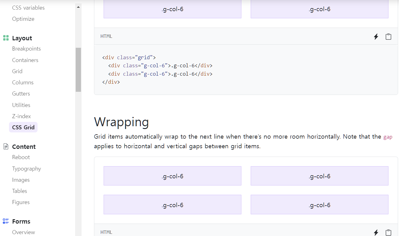
css 그리드
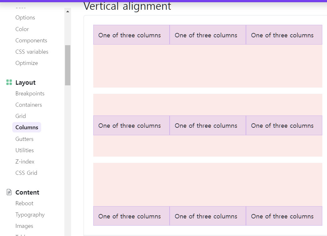
레이아웃 Columns
<div class="container">
  <div class="row align-items-start">
    <div class="col">
      One of three columns
    </div>
    <div class="col">
      One of three columns
    </div>
    <div class="col">
      One of three columns
    </div>
  </div>
  <div class="row align-items-center">
    <div class="col">
      One of three columns
    </div>
    <div class="col">
      One of three columns
    </div>
    <div class="col">
      One of three columns
    </div>
  </div>
  <div class="row align-items-end">
    <div class="col">
      One of three columns
    </div>
    <div class="col">
      One of three columns
    </div>
    <div class="col">
      One of three columns
    </div>
  </div>
</div>
row 밑에 col을 쓰는 구조...
<div class="row align-items-start"> 수직정렬
<div class="col align-self-start"> 가로 정렬
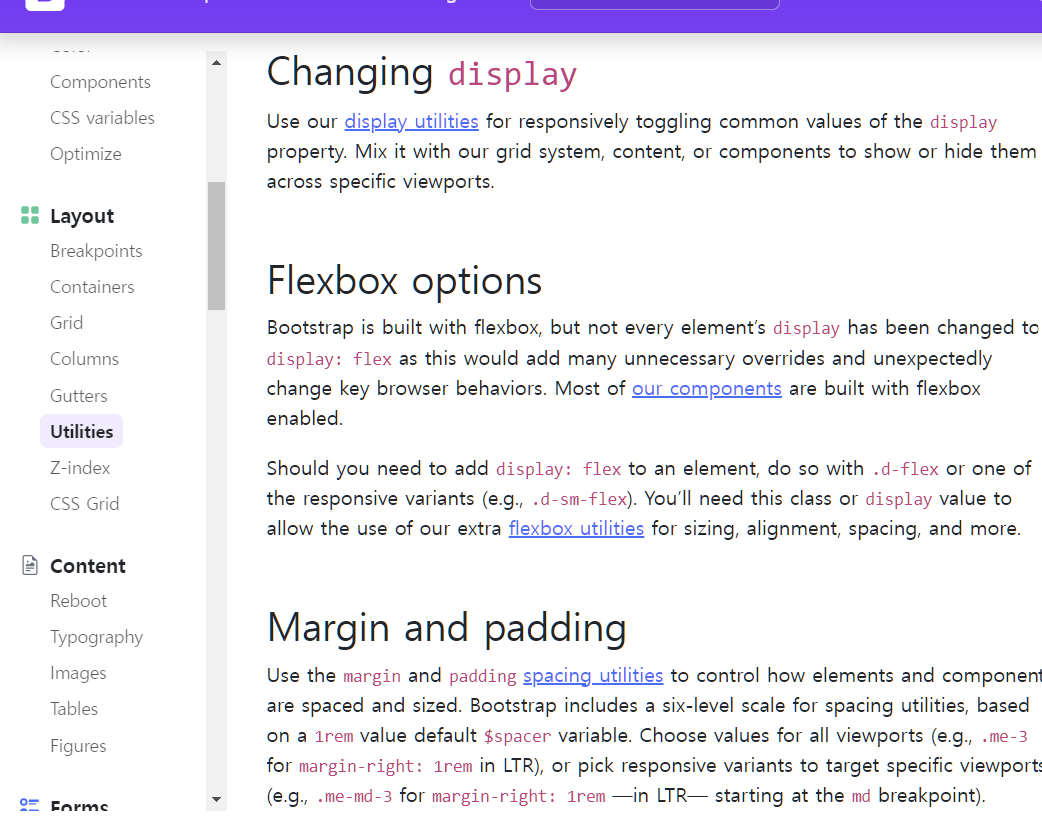
Utilities 의 display
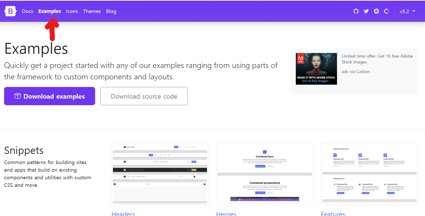
Examples 이용해서 쉽게 홈페이지 만들어보

<!doctype html>
<html lang="en">
<head>
<meta charset="utf-8">
<meta name="viewport" content="width=device-width, initial-scale=1">
<title>Bootstrap demo</title>
<link href="https://cdn.jsdelivr.net/npm/bootstrap@5.2.0-beta1/dist/css/bootstrap.min.css" rel="stylesheet" integrity="sha384-0evHe/X+R7YkIZDRvuzKMRqM+OrBnVFBL6DOitfPri4tjfHxaWutUpFmBp4vmVor" crossorigin="anonymous">
<link rel="stylesheet" href="./css/bootstrap.min.css">
</head>
<body>
<i class="bi bi-alarm"></i>
<header>
<div class="px-3 py-2 bg-dark text-white">
<div class="container">
<div class="d-flex flex-wrap align-items-center justify-content-center justify-content-lg-start">
<a href="/" class="d-flex align-items-center my-2 my-lg-0 me-lg-auto text-white text-decoration-none">
<svg class="bi me-2" width="40" height="32" role="img" aria-label="Bootstrap"><use xlink:href="#bootstrap"/></svg>
</a>
<ul class="nav col-12 col-lg-auto my-2 justify-content-center my-md-0 text-small">
<li>
<a href="#" class="nav-link text-secondary">
<svg class="bi d-block mx-auto mb-1" width="24" height="24"><use xlink:href="#home"/></svg>
Home
</a>
</li>
<li>
<a href="#" class="nav-link text-white">
<svg class="bi d-block mx-auto mb-1" width="24" height="24"><use xlink:href="#speedometer2"/></svg>
Dashboard
</a>
</li>
<li>
<a href="#" class="nav-link text-white">
<svg class="bi d-block mx-auto mb-1" width="24" height="24"><use xlink:href="#table"/></svg>
Orders
</a>
</li>
<li>
<a href="#" class="nav-link text-white">
<svg class="bi d-block mx-auto mb-1" width="24" height="24"><use xlink:href="#grid"/></svg>
Products
</a>
</li>
<li>
<a href="#" class="nav-link text-white">
<svg class="bi d-block mx-auto mb-1" width="24" height="24"><use xlink:href="#people-circle"/></svg>
Customers
</a>
</li>
</ul>
</div>
</div>
</div>
<div class="px-3 py-2 border-bottom mb-3">
<div class="container d-flex flex-wrap justify-content-center">
<form class="col-12 col-lg-auto mb-2 mb-lg-0 me-lg-auto" role="search">
<input type="search" class="form-control" placeholder="Search..." aria-label="Search">
</form>
<div class="text-end">
<button type="button" class="btn btn-light text-dark me-2">Login</button>
<button type="button" class="btn btn-primary">Sign-up</button>
</div>
</div>
</div>
</header>
<script src="https://cdn.jsdelivr.net/npm/bootstrap@5.2.0-beta1/dist/js/bootstrap.bundle.min.js" integrity="sha384-pprn3073KE6tl6bjs2QrFaJGz5/SUsLqktiwsUTF55Jfv3qYSDhgCecCxMW52nD2" crossorigin="anonymous"></script>
<div class="container col-xxl-8 px-4 py-5">
<div class="row flex-lg-row-reverse align-items-center g-5 py-5">
<div class="col-10 col-sm-8 col-lg-6">
<img src="https://getbootstrap.com/docs/5.2/examples/heroes/bootstrap-themes.png" class="d-block mx-lg-auto img-fluid" alt="Bootstrap Themes" width="700" height="500" loading="lazy">
</div>
<div class="col-lg-6">
<h1 class="display-5 fw-bold lh-1 mb-3">Responsive left-aligned hero with image</h1>
<p class="lead">Quickly design and customize responsive mobile-first sites with Bootstrap, the world’s most popular front-end open source toolkit, featuring Sass variables and mixins, responsive grid system, extensive prebuilt components, and powerful JavaScript plugins.</p>
<div class="d-grid gap-2 d-md-flex justify-content-md-start">
<button type="button" class="btn btn-primary btn-lg px-4 me-md-2">Primary</button>
<button type="button" class="btn btn-outline-secondary btn-lg px-4">Default</button>
</div>
</div>
</div>
</div>
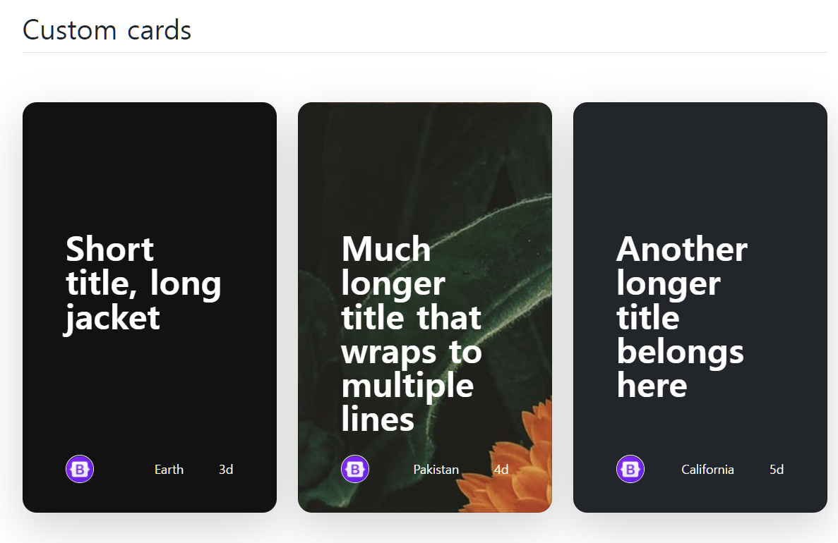
<div class="container px-4 py-5" id="custom-cards">
<h2 class="pb-2 border-bottom">Custom cards</h2>
<div class="row row-cols-1 row-cols-lg-3 align-items-stretch g-4 py-5">
<div class="col">
<div class="card card-cover h-100 overflow-hidden text-white bg-dark rounded-4 shadow-lg" style="background-image: url(https://getbootstrap.com/docs/5.2/examples/features/unsplash-photo-1.jpg);">
<div class="d-flex flex-column h-100 p-5 pb-3 text-white text-shadow-1">
<h2 class="pt-5 mt-5 mb-4 display-6 lh-1 fw-bold">Short title, long jacket</h2>
<ul class="d-flex list-unstyled mt-auto">
<li class="me-auto">
<img src="https://github.com/twbs.png" alt="Bootstrap" width="32" height="32" class="rounded-circle border border-white">
</li>
<li class="d-flex align-items-center me-3">
<svg class="bi me-2" width="1em" height="1em"><use xlink:href="#geo-fill"/></svg>
<small>Earth</small>
</li>
<li class="d-flex align-items-center">
<svg class="bi me-2" width="1em" height="1em"><use xlink:href="#calendar3"/></svg>
<small>3d</small>
</li>
</ul>
</div>
</div>
</div>
<div class="col">
<div class="card card-cover h-100 overflow-hidden text-white bg-dark rounded-4 shadow-lg" style="background-image: url(https://getbootstrap.com/docs/5.2/examples/features/unsplash-photo-2.jpg);">
<div class="d-flex flex-column h-100 p-5 pb-3 text-white text-shadow-1">
<h2 class="pt-5 mt-5 mb-4 display-6 lh-1 fw-bold">Much longer title that wraps to multiple lines</h2>
<ul class="d-flex list-unstyled mt-auto">
<li class="me-auto">
<img src="https://github.com/twbs.png" alt="Bootstrap" width="32" height="32" class="rounded-circle border border-white">
</li>
<li class="d-flex align-items-center me-3">
<svg class="bi me-2" width="1em" height="1em"><use xlink:href="#geo-fill"/></svg>
<small>Pakistan</small>
</li>
<li class="d-flex align-items-center">
<svg class="bi me-2" width="1em" height="1em"><use xlink:href="#calendar3"/></svg>
<small>4d</small>
</li>
</ul>
</div>
</div>
</div>
<div class="col">
<div class="card card-cover h-100 overflow-hidden text-white bg-dark rounded-4 shadow-lg" style="background-image: url('https://getbootstrap.com/docs/5.2/examples/features/');">
<div class="d-flex flex-column h-100 p-5 pb-3 text-shadow-1">
<h2 class="pt-5 mt-5 mb-4 display-6 lh-1 fw-bold">Another longer title belongs here</h2>
<ul class="d-flex list-unstyled mt-auto">
<li class="me-auto">
<img src="https://github.com/twbs.png" alt="Bootstrap" width="32" height="32" class="rounded-circle border border-white">
</li>
<li class="d-flex align-items-center me-3">
<svg class="bi me-2" width="1em" height="1em"><use xlink:href="#geo-fill"/></svg>
<small>California</small>
</li>
<li class="d-flex align-items-center">
<svg class="bi me-2" width="1em" height="1em"><use xlink:href="#calendar3"/></svg>
<small>5d</small>
</li>
</ul>
</div>
</div>
</div>
</div>
</div>
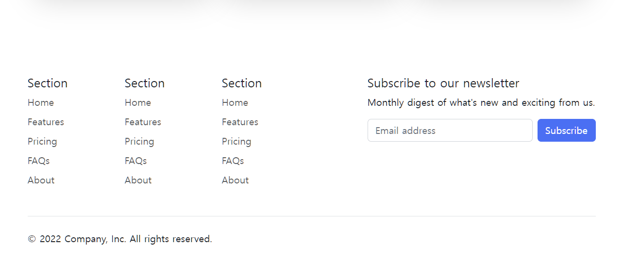
<div class="container">
<footer class="py-5">
<div class="row">
<div class="col-6 col-md-2 mb-3">
<h5>Section</h5>
<ul class="nav flex-column">
<li class="nav-item mb-2"><a href="#" class="nav-link p-0 text-muted">Home</a></li>
<li class="nav-item mb-2"><a href="#" class="nav-link p-0 text-muted">Features</a></li>
<li class="nav-item mb-2"><a href="#" class="nav-link p-0 text-muted">Pricing</a></li>
<li class="nav-item mb-2"><a href="#" class="nav-link p-0 text-muted">FAQs</a></li>
<li class="nav-item mb-2"><a href="#" class="nav-link p-0 text-muted">About</a></li>
</ul>
</div>
<div class="col-md-5 offset-md-1 mb-3">
<form>
<h5>Subscribe to our newsletter</h5>
<p>Monthly digest of what's new and exciting from us.</p>
<div class="d-flex flex-column flex-sm-row w-100 gap-2">
<label for="newsletter1" class="visually-hidden">Email address</label>
<input id="newsletter1" type="text" class="form-control" placeholder="Email address">
<button class="btn btn-primary" type="button">Subscribe</button>
</div>
</form>
</div>
</div>
<div class="d-flex flex-column flex-sm-row justify-content-between py-4 my-4 border-top">
<p>© 2022 Company, Inc. All rights reserved.</p>
<ul class="list-unstyled d-flex">
<li class="ms-3"><a class="link-dark" href="#"><svg class="bi" width="24" height="24"><use xlink:href="#twitter"/></svg></a></li>
<li class="ms-3"><a class="link-dark" href="#"><svg class="bi" width="24" height="24"><use xlink:href="#instagram"/></svg></a></li>
<li class="ms-3"><a class="link-dark" href="#"><svg class="bi" width="24" height="24"><use xlink:href="#facebook"/></svg></a></li>
</ul>
</div>
</footer>
</div>
<!-- <script src="./js/bootstrap.bundle.js.map"></script> -->
</body>
</html>'페이지 소스 보기'로 코드 복사 붙여넣기
어려웠던 점
Example을 활용해서 웹페이지를 만드는 과정에서 이미지가 표시되지 않아 웹페이지 주소를 복사 붙여넣기 하는 과정을 설명하시면서 코드 위치를 제대로 설명해주지 않고 너무 빠르게 진행하셔서 또 놓쳤다.
해결방안
결국 녹화영상 다시 보고 일시정지 시켜서 코드위치를 확인한 후 붙여넣기 해서 해결했다.
학습소감
강사님 강의 속도가 빠르다는 피드백을 거의 매번 받으시는 것 같은데 습관이신건지..잘 반영이 되지 않는 것 같다. 제발 코드의 정확한 위치 좀 차근차근 설명해주면서, 화면 전환 바로 확 해버리기 전에 위치 확인 모두 했는지 수강생들에게 다시 한번 물어보고 천천히 진행해 주셨으면 좋겠다.

.