
글자와 아이콘 스타일
class MyApp extends StatelessWidget {
const MyApp({super.key});
Widget build(BuildContext context) {
return MaterialApp(
home: Scaffold(
appBar: AppBar( title: Text('앱임')),
body: SizedBox(
child: Text('안녕하세요')
),
)
);
}
}위와 같이 작성하면
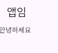
이런 텍스트가 출력된다.
텍스트에 스타일을 추가해보자.
Color
Colors.red
class MyApp extends StatelessWidget {
const MyApp({super.key});
Widget build(BuildContext context) {
return MaterialApp(
home: Scaffold(
appBar: AppBar( title: Text('앱임')),
body: SizedBox(
child: Text('안녕하세요',
style: TextStyle( color: Colors.red ),
)
),
)
);
}
}Text 안에 style: TextStyle을 추가하였다.

예상대로 빨간색의 글자가 출력된다.
Color()
색상 코드로 스타일을 주고 싶을 땐 Color()을 이용하자.
class MyApp extends StatelessWidget {
const MyApp({super.key});
Widget build(BuildContext context) {
return MaterialApp(
home: Scaffold(
appBar: AppBar( title: Text('앱임')),
body: SizedBox(
child: Text('안녕하세요',
style: TextStyle( color: Color(0xffa30000) ),
)
),
)
);
}
}Colors.red가 아닌 Color(0xffa30000)을 입력하였다.

여기서 주의할 점은, 색상코드 앞에 0xff를 꼭 붙여야 한다.
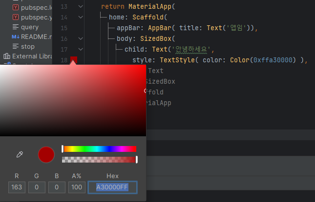
Color(0xffa30000)을 입력한 라인 왼쪽에 현재 코드의 색이 보인다.
저 색 상자를 클릭하면 사진처럼 색깔을 정할 수 있다.
Color.fromRGBO
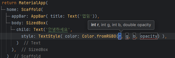
rgbo를 입력하여 색을 추가할 수도 있다.
fontWeight
style: TextStyle( fontWeight: FontWeight.w700),fontWeight: FontWeight.~~ 을 통해 굵기도 설정할 수 있다.

w700을 적용한 모습
Icon 또한 size: ~~, color: ~~ 을 통해 스타일을 줄 수 있다.
버튼 넣는 법과 스타일
TextButton
child: TextButton( child: , onPressed: (){}, )버튼은 TextButton()을 이용해서 넣을 수 있다.
이 때, onPressed(){}을 입력하지 않으면 오류가 발생한다고 한다.
    return MaterialApp(
      home: Scaffold(
        appBar: AppBar( title: Text('앱임')),
        body: SizedBox(
          child: TextButton(
            child: Text('글자'),
            onPressed: (){},
          )
        ),
      )
    );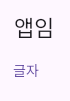
위 사진처럼 텍스트로 된 버튼을 넣을 수 있다.
하지만 너무 못생겼다.
ElevatedButton

TextButton 대신 ElevatedButton을 입력하였다.
TextButton 보단 나은 거 같다.
위 사진처럼 Style을 추가할 수 있다.
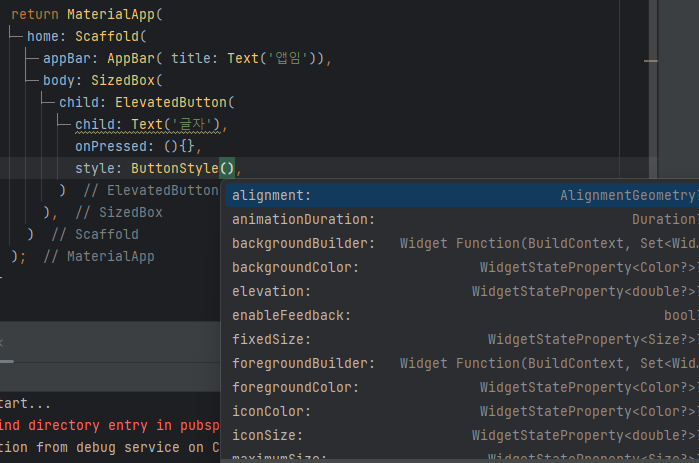
IconButton
    return MaterialApp(
      home: Scaffold(
        appBar: AppBar( title: Text('앱임')),
        body: SizedBox(
          child: IconButton(
            icon: Icon(Icons.star),
            onPressed: (){},
            style: ButtonStyle(),
          )
        ),
      )
    );
TextButton이 있다면 IconButton도 있다. 위와 같이 작성하면
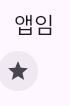
star 아이콘이 들어간 버튼이 생성된다.
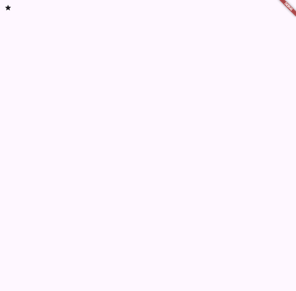
Appbar
title
return MaterialApp(
      home: Scaffold(
        appBar: AppBar( title: Text('타이틀'),

        ),
        body: SizedBox(),
      )
    );
여태 사용한 것처럼 appBar에 title을 입력하면 왼쪽 위에 작성되는 타이틀을 만들 수 있다.
leading
appBar: AppBar( leading: Icon(Icons.star),

        )
leading을 사용하면 좌측 위에 아이콘을 입력할 수 있다.
보통 메뉴버튼으로 많이 사용한다.
appBar: AppBar( leading: Icon(Icons.star), title: Text('타이틀'),
        ),
이렇게 타이틀과 같이 사용할 수 있다.
actions
appBar: AppBar( actions: [Icon(Icons.star), Icon(Icons.star)], title: Text('타이틀'),우측에 표시하는 actions 파라미터를 사용하였다. 배열로 여러가지를 추가할 수 있다.
Icon.star을 두 개 넣어보면

이렇게 우측 상단에 별 두 개가 출력되는 것을 확인할 수 있다.
출처 코딩애플