layout 만들기
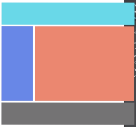
이러한 모양으로 레이아웃을 만들 예정
여러가지 방법이 있지만 float로 만들 예정이다
시작 코드
<!DOCTYPE html>
<html>
    <head>
        <meta charset="UTF-8">
        <title>Document</title>
        <link href="css/index.css" rel="stylesheet">
    </head>
    <body>

        <div class="container">

        </div>

    </body>
</html>
css는 이전에 썻던 파일 그대로 사용
float할때는 폭을 미리 지정해서 밖으로 나오지 않게 해주는것이 중요하다.
head
html
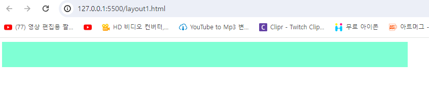
        <div class="container">
            <div class="header">

            </div>
        </div>
헤더 부분은 꽉차게 할것이기 때문에 폭은 100%로 부모 폭을 따라가게 설정한다.
css
.header{
    width: 100%;
    height: 50px;
    background-color: aquamarine;
}
왼쪽 파란 박스
html
<div class="left-menu"></div>css
.left-menu{
    width: 20%;
    height: 400px;
    background-color: cornflowerblue;
}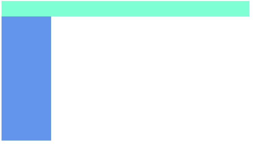
오른쪽 주황색 박스
html
<div class="content"></div>css
.content{
width: 80%;
height: 400px;
background-color: coral;
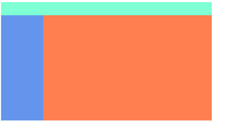
}이렇게 하면 다음과 같은 결과가 나온다.
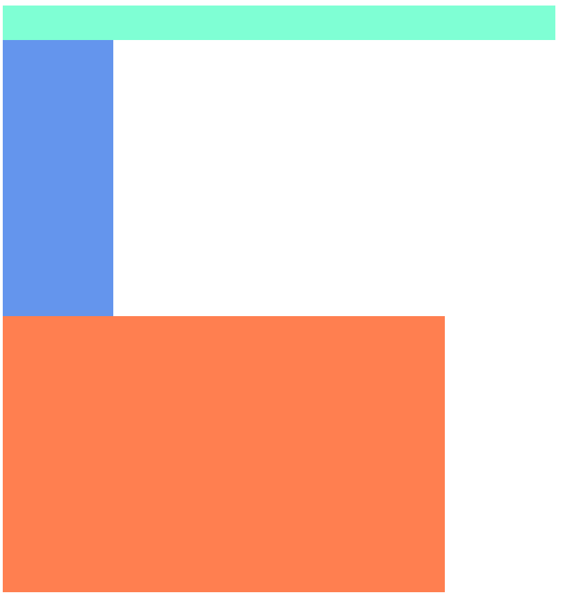
하지만 우리는 원하는 것이 메뉴와 콘텐트를 같은 높이에 있기를 원하기에 다음과 같은 속성을 css에 추가해준다
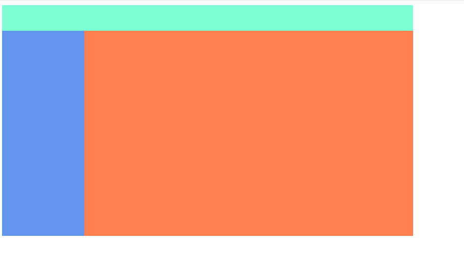
float: left;
float: right;
left는 left-menu에 주고 rigth는 content에 준다
css
.left-menu{
    width: 20%;
    height: 400px;
    background-color: cornflowerblue;
    float: left;
}

.content{
    width: 80%;
    height: 400px;
    background-color: coral;
    float: right;
}
하단 회색
html
<div class="footer"></div>css
.footer{
    width: 100%;
    height: 100px;
    background-color: grey;
}
이렇게 할 경우 앞선 float속성 때문에 파랑색과 주황색이 글과 함께 같은 속성으로 되어 footer의 박스가 이 두개를 무시하고 다음과 같은 결과를 도출한다.
보이지 않지만 현재 파랑색과 주황색 뒤에 위치해 있다.
그렇기에 float 속성을 통한 현상을 clear 속성을 줘서 고쳐본다.
clear: both;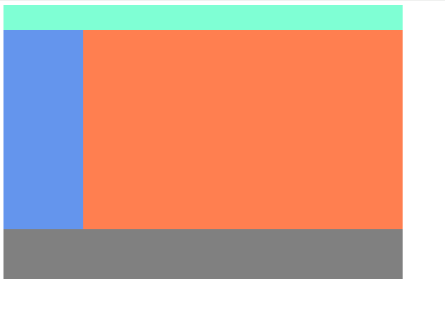
현재 총코드
html
<!DOCTYPE html>
<html>
    <head>
        <meta charset="UTF-8">
        <title>Document</title>
        <link href="css/index.css" rel="stylesheet">
    </head>
    <body>

        <div class="container">
            <div class="header">

            </div>

            <div class="left-menu">

            </div>

            <div class="content">

            </div>

            <div class="footer">

            </div>
        </div>

    </body>
</html>
css
.container{
    width: 800px;
}

.header{
    width: 100%;
    height: 50px;
    background-color: aquamarine;
}

.left-menu{
    width: 20%;
    height: 400px;
    background-color: cornflowerblue;
    float: left;
}

.content{
    width: 80%;
    height: 400px;
    background-color: coral;
    float: right;
}

.footer{
    width: 100%;
    height: 100px;
    background-color: grey;
    clear: both;
}
Never give up Impossible is nothing
출처 : 애플코딩 강의