
✔ OpenCV
산술연산, 비트 연산
덧셈
src1=cv2.imread('./data/lena.jpg', cv2.IMREAD_GRAYSCALE)
src2=np.zeros(shape=(512,512), dtype=np.uint8)+100
# 단순 이미지를 print하면 numpy의 ndarray로 return
# 흑백은 2차원, 컬러는 3차원으로 읽는다.
# dst=src1+src2
# 단순 덧셈을 해버리면 오버플로우 가능성이 존재함
# 이미지 색상은 0 ~255 인데, 덧셈을 하면 256 이상 값은
# 256으로 나눈 나머지 값을 가지게 됩니다.
dst=cv2.add(src1,src2)
# opencv 함수를 이용해서 더하면
# 256 이상의 값은 255로 설정됩니다.
# add -> 밝아짐, subtract -> 어두워짐
plt.imshow(dst, cmap='gray')
plt.axis('off')
plt.show()
수학 및 통계 함수
- 최대값과 최소값을 이용한 연산을 수행하면 화질 개선 효과를 볼 수 있습니다.
- 특히, 화소간의 값 차이가 적은 경우에 더욱 효과적입니다.
# min 과 max의 차이로 화질개선을 해보자.
src=cv2.imread('./data/minMax.jpg', cv2.IMREAD_GRAYSCALE)
# 최대값과 최소값을 얻어보자.
(min_val, max_val, _,_)=cv2.minMaxLoc(src)
ratio=255/(max_val-min_val)
dst=np.round((src-min_val)*ratio).astype('uint8')
# plt.imshow(src, cmap='gray')
# plt.imshow(dst, cmap='gray')
# plt.axis('off')
# plt.show()
fig = plt.figure()
rows = 1
cols = 2
ax1 = fig.add_subplot(rows, cols, 1)
ax1.imshow(src, cmap='gray')
ax1.set_title('원본')
ax1.axis("off")
ax2 = fig.add_subplot(rows, cols, 2)
ax2.imshow(dst, cmap='gray')
ax2.set_title('minMax작업 정규화')
ax2.axis("off")
plt.show()
- 밝은 것은 더 밝게, 어두운 것은 더욱 어둡게
- 의료영상에서도 주로 쓰인다.
- 큰 차이가 안보이는 애들에 사용한다. (확연한 차이를 보여주자.)

✔ 통계
기술 통계
통계학
- 논리적 사고와 객관적인 사실에 따르면 일반적이고 확률적 결정론에 따라 인과 관계를 규명하는 학문
- 연구 목적에 의해 설정된 가설들에 대하여 분석 결과가 어떤 결과를 뒷받침하고 있는지 통계적 방법으로 검정
통계학의 분류
- 기술 통계학
- 수집된 자료형의 특성을 쉽게 파악하기 위해서 자료를 표나 그래프, 대표값으로 정리, 요약해서 다루는 것 - 추론 통계학
- 모집단에서 추출한 정보를 이용해서 모집단의 다양한 특성을 과학적으로 추론하는 것
기술 통계
- 자료를 요약하는 기초적인 통계량
- 데이터 분석 전에 전체적인 데이터 분포를 이해하고 통계적 수치를 제공
- 모집단의 특성을 유추하는데 이용
pandas의 기술 통계 함수
- count, min, max, sum, mean(평균), median, var, std
- argmin, argmax, idxmin, idxmax
- qunatile(사분위수)
- describe(기술 통계 요약)
- cumsum, cumin, cummax, cumprod
- diff(이전 데이터와의 차이)
- pct_change(백분율로 차이를 리턴)
- unique(동일한 값을 제외한 배열 리턴 - Series 에서만 가능)
- value_counts(도수를 리턴 - Series 에서만 가능)
변수의 분류
- 변수
- 통계학에서 변수의 의미는 열(DB : Column, Attribute, ML : Feature)
질적 변수와 양적 변수
- 질적 변수
- 구분하기 위한 변수 : Tableau : 차원- 양적 변수
- 양을 나타내기 위한 변수 : Tableau : 측정값
척도(Scale)에 따른 분류
- 명목(Nominal) 척도 - 질적
- 목적이 구분, 순서가 없음- 순서(Ordinal) 척도 - 질적
- 목적이 구분인데, 순서가 있는 경우- 등간(Interval) 척도 - 양적
- 각 항목이 구분이 되고, 크기가 존재하지만 연산은 하지 않는 경우- 비율(Ratio) 척도 - 양적
- 구분 가능, 연산 가능
descriptive.csv
- resident : 거주지역
- 1 : 서울특별시, 2 : 광역시, 3 : 시군- gender : 성별
- 1 : 남 2 : 여- age : 나이
- level : 부모의 학력 수준
- 1 : 고졸, 2 : 대졸, 3 : 대학원졸 이상- cost : 생활비
- type : 학교 유형
- 1 : 4년제 2 : 2년제- survey : 만족도
- 1 ~ 5 의 만족도- pass : 합격 여부
- 1 : 합격, 2 : 불합격
실습
university=pd.read_csv('./data/descriptive.csv')
university.head()
- 명목 척도
- 구별만을 위해서 만들어진 의미없는 수치# gender는 성별을 구분하기 위한 변수 # 즉, 명목 척도가 되어서 요약 통계량은 의미가 없으며 # 구성 비율만 의미를 갖습니다. print(university['gender'].describe()) # 의미 없음 print(university['gender'].value_counts()) #인원수 # 인원수에서 0과 5가 존재함(이상치) # 이상치가 존재하면, 카테고리 형의 데이터에서는 # 제거하는 경우가 많다. # 양을 나타내는 경우에는 # 정규화 / 표준화를 이용해서 숫자의 범위를 조절하는 경우도 있다.university_gender=university[(university['gender']==1) | (university['gender']==2)] university_gender['gender'].value_counts()
- logical or를 할 때, ()를 해서 연산 순서를 잘 맞춰주자.
# 성별 비율 시각화
# 항목이 5개가 넘지 않기에 막대나 파이차트를 이용해보자.
university_gender['gender'].value_counts().plot.bar(color='magenta', alpha=0.7)
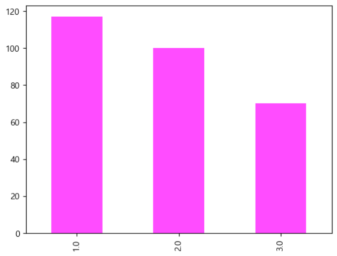
순서 척도
- 구분을 하고, 순서를 정하기 위해서 만들어진 수치 데이터
- 구성 비율 정도가 의미를 갖습니다.
- 실습 - level : 순서 척도
실습
- level : 순서 척도 (1, 2, 3)
university['level'].value_counts()
university['level'].value_counts().plot.bar(color='magenta',alpha=0.7)
- 비율을 제시해주자.
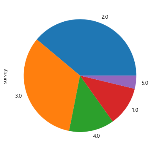
등간 척도
- 속성의 간격이 일정한 값을 갖는 척도
- 요약 통계량이 의미를 갖음
- 구성 비율도 의미를 갖음
# 요약통계량
# survey는 등간 척도라서 요약 통계량과
# 구성 비율도 의미를 갖음
university_gender['survey'].describe()
# 주로 의미를 갖는것은 mean
university_gender['survey'].value_counts().plot.pie()
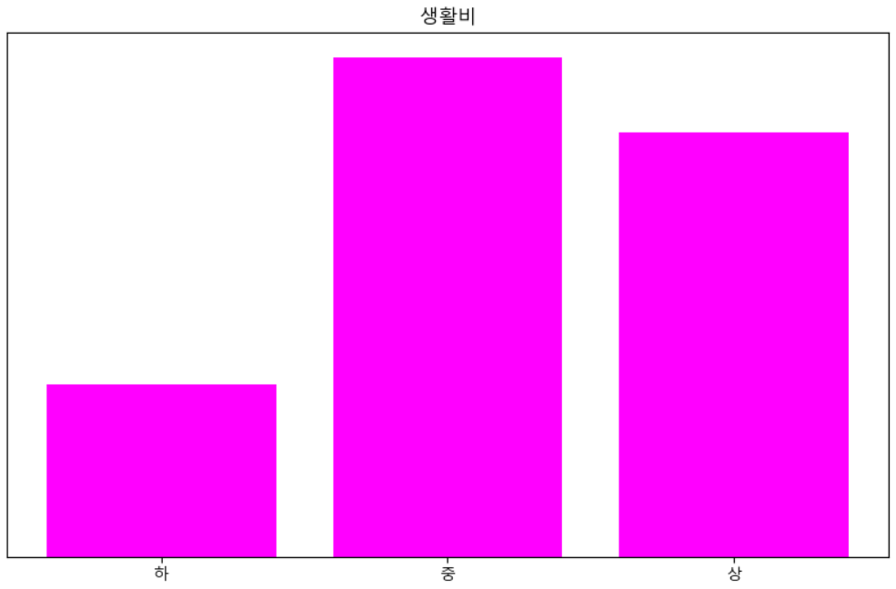
비율 척도
- 응답자가 직접 수치로 입력한 변수로 기준점이 존재하는 수치 데이터라서 사칙 연산이 가능한 척도
- 빈도 분석(구성 비율) 과 기술 통계량 모두가 의미를 갖지만, 빈도 분석의 경우는 구간화를 해야 할 수 도 있습니다.
print(university_gender['cost'].describe())
# 값의 종류가 너무 많음
# 비율 척도가 직접 입력하는 형태가 되므로
# 이상치나 결측치의 발생 가능성이 높음
# UI를 만들 때, 다른 척도에 비해서 주의를 기울여야 합니다.
print(university_gender['cost'].value_counts())
# 일반적인 생활비는 2 ~ 10 으로 설정 cost=university_gender['cost'] print(cost[(cost>=2)&(cost<=10)].describe()) print(cost[(cost>=2)&(cost<=10)].value_counts())
- cost의 빈도 분석을 위해서 3 구간으로 분할해서 시각화
# 시각화 영역 크기 설정
plt.figure(figsize=(10,6))
ys,xs,patches=plt.hist(cost[(cost>=2)&(cost<=10)],
                      bins=3, #구간의 개수
                      density=True, # 백분율 설정
                      cumulative=False, # 누적 여부
                      histtype='bar', # bar, step 존재
                      orientation='vertical', # 방향
                      rwidth=0.8, # 너비
                      color='magenta')
# y축 레이블 제거
plt.yticks([])
# x축 레이블 추가
plt.xticks([(xs[i]+xs[i+1])/2 for i in range(0,len(xs)-1)],["하","중","상"])
plt.title('생활비')
plt.show()
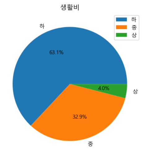
- 직접 구간화 작업을 또 해보자.
# 직접 구간화 작업을 수행하자
cost=cost[(cost>=1)&(cost<=10)]
cost[(cost>=1)&(cost<=3)]=1
cost[(cost>3)&(cost<=6)]=2
cost[(cost>6)&(cost<=10)]=3
cost=cost.astype(int)
plt.pie(cost.value_counts(), labels=["하","중","상"], autopct='%1.1f%%')
plt.title('생활비')
plt.legend()
plt.show()
이산형 변수와 연속형 변수
- 이산형
- 하나의 값을 취하는 변수인데, 서로 인접한 숫자 사이에 값이 존재하지 않는 경우 - 연속형
- 값과 값 사이에 다른 값이 존재할 수 있는 경우
데이터의 특성
특성 파악
- 데이터를 정리해서 데이터의 특징을 대략적으로 파악하는 것
- 방법
- 평균이나 분산 등의 수치 지표를 데이터에 따라 요약
- 시각화
평균
- 산술 평균
- 모든 값의 총합을 데이터의 개수로 나눈 값 - 기하 평균
- 평균 비율을 구할 때 사용하는 평균
- 각 데이터의 비율을 곱한 후 제곱근을 구하는 방식
- 매출액이 100인 회사에서 다음해 매출 110, 그 다음해 매출 107.8일 때 연 평균 성장률은 얼마인가? (비율을 구하는 것)
- 산술 평균 : (10-2)/2 : 4% (X)
- 기하 평균 : (1.1*0.98)의 제곱근 - 조화 평균
- 2개의 수의 곱에 2를 곱한 뒤, 2개의 수를 더한 값으로 나누는 값
- 속도 계산에 이용 - 동일한 거리를 한 번은 시속 100km, 한 번은 60km로 갔을 때, 평균 속도는?
- 300km를 갔을 때, 3시간, 5시간 걸림 600km를 8시간 걸린 것이다.
- 2(10060)/(100+60) =75
- 평균 시속 75km로 간 것이다.
import math
s=pd.Series([10,11,10.78])
# 산술 평균
print('평균 성장률', s.pct_change().mean())
print(10*1.040000000000000036*1.040000000000000036)
# 기하 평균
print('기하 평균 :', math.sqrt((11/10)*(10.78/11)))
print(10*1.0382677881933928*1.0382677881933928)
-
가중 평균
- 가중치를 곱한 값의 총합을 가중치의 총합으로 나눈 값
- 데이터를 수집할 때, 모든 사용자 그룹에 대해서 정확이 같은 비율을 반영하는 데이터를 수집하는 것이 어렵기 때문에, 데이터가 부족한 소수 그룹에 더 높은 가중치를 부여해서 반영 -
이동 평균
- 데이터 전체의 평균을 구하는 것이 아니고, 데이터의 범위를 이동하면서 구하는 평균
- 시간의 흐름을 반영하기 위해서 사용
-
가중 이동 평균
- 각 데이터에 가중치를 부여하는 방식으로 일반적으로 최근의 데이터에 가중치를 부여
- 주식, 운동선수의 데이터 등... -
지수 이동 평균
- 아주 과거의 데이터에도 낮은 가중치를 부여
- 단기와 장기 추세를 별도로 계산
- 단기 추세가 장기 추세를 돌파하면 매수를 하고 하향 돌파하면 매도를 한다. -
절사 평균(Trimmed mean)
- 정해진 개수의 극단 값을 제외한 데이터의 평균
- 산술 평균의 문제점은 극단치(outlier, 이상치)에 영향을 많이 받음(Robust 하지 않다, 또는 저항성이 없다)
- 최대값과 최소값을 제외한 데이터를 가지고 평균을 구하는 경우가 있음
중앙값(Median)
- 데이터를 크기 순으로 나열하였을 때, 정확하게 중앙에 위치한 값
- 평균 값에 비해 이상치에 강하다는 특성을 가짐
- 데이터 짝수 : 중앙에 위치한 두 값의 평균을 사용함
평균과 중앙값 구하기
# 절사 평균을 구하기 위해서 import
from scipy import stats
tdata=pd.read_csv('./data/tdata.csv', encoding='cp949')
# print(tdata)
print("평균 : ", tdata['성적'].mean())
print("중앙값 : ", tdata['성적'].median())
print("절사 평균 : ", stats.trim_mean(tdata['성적'],0.1))
# 평균과 절사평균이 큰 차이가 없다면,
# 이상치의 영향을 크게 받는 것이 아니다.
가중 평균이나 가중 중앙값 구하기
- wquantiles 패키지 이용
-!pip install wquantiles해두기 - 평균이나 중앙값을 구할 때 weights라는 속성에 가중치를 부여하는 것이 가능
- 여론 조사의 결과를 발표할 때 주로 이용함
# 주 이름, 인구수, 살인사건 발생률, 주 이름 약자 데이터
# population은 인구이고, Murder.Rate는 살인사건 발생률
# Murder.Rate의 평균을 바로 구하는 것은 인구에 대한
# 가중치를 부여하지 않았기에 결과 왜곡의 가능성이 존재함
state=pd.read_csv('./data/state.csv')
#state.head()
print("평균 : ", state['Murder.Rate'].mean())
print("중앙값 : ", state['Murder.Rate'].median())
# 가중 중앙값과 가중 평균을 구해보자.
import wquantiles
print("인구 가중치를 부여한 평균 : ", np.average(state['Murder.Rate'],
weights=state['Population']))
print("인구 가중치를 부여한 중앙값 : ", wquantiles.median(state['Murder.Rate'],
weights=state['Population']))

최빈값(mode)
- DataFrame이나 Series의 mode 함수를 이용하면 구할 수 있음
- 질적 데이터(차원 - 비율 척도를 제외한 부분에서 사용)에서는 대표값으로 사용이 가능하지만, 양적 데이터(비율 척도)에서는 중첩해서 입력되는 경우가 별로 없기 때문에 대표값으로 사용하기가 곤란하다.
대표값
- 평균, 중앙값, 최빈값을 이용
변이 추정
- 데이터의 분포를 확인
- 산포도라고 하기도 합니다.
- 랜덤 변이와 실제 변이를 구분하고 실제 변이의 다양한 요인들을 파악하기 위해서 수행
지표
- 편차(Deviation)
- 관측 값과 위치 추정 값 사이의 차이로 오차 또는 잔차 - 분산(Variance)
- 평균과의 편차를 제곱한 값들의 합을 n-1로 나눈 값, 평균 제곱 오차라고 하기도 함 - 표준 편차(Standard Deviation)
- 분산의 제곱근으로 L2 norm 또는 유클리드 norm - 평균 절대 편차(Mean Absolute Deviation)
- 평균과의 편차의 절대값의 평균으로 L1 norm 또는 맨하튼 norm이라고도 함 - 중간값의 중위 절대 편차(Median Absolute Dviation from the Median)
- 중간 값과의 편차의 절대값의 중간 값 - 범위(range)
- 최대값과 최소값의 차이 - 순서 통계량(Order Statistics)
- 최소에서 최대까지 정렬된 데이터 값에 따른 계량형 - 백분위 수(Percentile)
- 퍼센트에 해당하는 값 - 사분위 범위(Interquartile Range)
- 75번째 백분위 수와 25번쨰 백분위 수 사이의 차이
표준 편차와 관련된 추정 값들
- 변위 추정은 관측 데이터와 위치 추정 값 사이의 차이 - 편차가 기본
- 편차는 중앙 값이나 평균 값을 기준으로 얼마나 퍼져있는지를 표현
- 편차는 직접 사용하기가 곤란한데 그 이유는 음의 편차가 양의 편차를 상쇄하기 때문
- 평균 절대 편차 - 편차의 절대값의 평균
- 분산은 제곱 편차의 평균이고 표준 편차는 분산의 제곱근
- 분산은 데이터의 scale이 원본 데이터와 다른 경우가 많아서 표준 편차를 사용
- 자유도(Degrees of freedom)
- 편차나 편차의 제곱을 데이터의 개수 n 으로 나누면 모집단의 분산과 표준편차의 참 값을 과소평가하게 되는데, 이를 편향(biased)라고 하며, n-1로 나누는 경우가 있는데, 이 경우 비편향(unbiased)추정이라고 함 - 표준 편차는 표본의 평균에 따른다는 제약조건이 있기 때문에, n-1개의 데이터는 어떠한 값을 가져도 되지만, 마지막 하나의 데이터는 모집단의 평균에 따라야 하므로, 정해진 값을 갖게 됩니다.
- 데이터가 5개 있고 평균이 90이라면 [90, 80, 100, 85, ?] 라면, 마지막 데이터는 95를 반드시 가져야 합니다.
- 이 경우 값을 자유롭게 가져도 되는 데이터의 개수는 4
- 자유도는 4 - 분산, 표준 편차, 평균 절대 편차 등은 이상치와 특이값에 로버스트 하지 않음 -
- 중위 절대 편차
- 관측값에서 중앙값을 뺀 값들의 중앙값을 구하는 것
- 회귀 분석에서 사용되는 최소 절대 편차가 유사한 개념 - 백분위 수를 이용한 변이 추정
- 특이값에 민감하지 않기 때문에 사용함
데이터의 분포 탐색
- 분포 탐색을 위한 시각화
- Box Plot
- Frequency Table(도수 분포표)
- Histogram
- Density Plot(밀도 그림) - 4분위수, 10분위수, 100분위수 등을 이용
- Boxplot 그리기
#4분위 수 와 백분위 수를 확인
state = pd.read_csv('./data/state.csv')
print(state['Murder.Rate'].quantile([0.05, 0.25, 0.50, 0.75, 0.95]))
#녹색 선이 50% 상자의 양 끝선이 25% 와 75% 에 해당하는 값
#수염의 끝은 하위 25%에서 (75%-25% * 1.5)을 뺀 값
#상위 75%에서 (75%-25% * 1.5)을 더한 값 값
#가장 일반적인 이상치 검사 방법이 수염 외부에 있는 값을 이상치로 간주하는 것
ax = (state['Population'].plot.box(figsize=(3, 4)))
plt.show()
- 도수 분포표
- 각 그룹의 개수를 표 형태로 표현
- 상대 도수는 전체 데이터에 대해서 각 그룹의 개수가 어느 정도 비율인지를 표현
- 누적 도수는 해당 그룹까지의 상대 도수의 합
- 그룹 분할에는 pandas의 cut 이용 가능함
- 단순한 도수 계산
#population을 10개의 그룹으로 분할 한 후 개수 구하기
binnedPopulation = pd.cut(state['Population'], 10)
#그룹 별로 데이터의 개수를 가지고 정렬해서 출력
#print(binnedPopulation.value_counts())
#각 구간에 속한 주 이름을 같이 출력
binnedPopulation.name = 'binnedPopulation'
#데이터 병합
df = pd.concat([state, binnedPopulation], axis=1)
#print(df)
#Population 순으로 데이터 정렬
df = df.sort_values(by='Population')
#print(df)
groups = []
#인구의 하한 과 상한으로 그룹화해서 필드를 생성
for group, subset in df.groupby(by = 'binnedPopulation'):
    groups.append({
        'BinRange': group,
        'Count': len(subset),
        'States': ','.join(subset.Abbreviation)
    })
print(pd.DataFrame(groups))
- 상대 도수와 누적 도수
#상대 도수 와 누적 도수 출력
scores = pd.read_csv('./data/scores_em.csv', index_col = 'student number')
#print(scores)
#영어 점수 꺼내기
english_scores = np.array(scores['english'])
#0 ~ 100까지를 10개의 구간으로 나누어서 개수를 파악
freq, _ = np.histogram(english_scores, bins=10, range=(0,100))
#print(freq)
#0~10, 10~20 형태의 문자열 만들기
freq_class = [f'{i}~{i+10}' for i in range(0, 100, 10)]
#print(freq_class)
#문자열 과 데이터 개수를 가지고 DataFrame 만들기
freq_dist_df = pd.DataFrame({'빈도_수': freq},
                            index=pd.Index(freq_class, name='구간'))
#print(freq_dist_df)
#상대 도수 만들기
rel_freq = freq / freq.sum()
#print(rel_freq)
#누적 상대 도수 만들기
cum_rel_freq = np.cumsum(rel_freq)
#print(cum_rel_freq)
freq_dist_df['상대도수'] = rel_freq
freq_dist_df['누적상대도수'] = cum_rel_freq
print(freq_dist_df)
- 히스토그램과 밀도 추정
#히스토그램
ax = state['Murder.Rate'].plot.hist(density=True, xlim=[0, 12],
                                   bins=range(1, 12), figsize=(4, 4))
#밀도 추정 - 히스토그램보다 부드럽게 곡선으로 데이터의 분포를 시각화
state['Murder.Rate'].plot.density(ax=ax)
plt.show()
다변량 탐색
다변량 탐색
- 평균이나 분산처럼 한 번에 하나의 변수를 다루는 것을 일변량 분석(univariate analysis)이라고 하고, 2개 이상의 변수의 관계를 파악하는 것을 다변량 분석(multivariate analysis)이라고 하는데, 2개의 변수의 관계를 파악하는 것은 이변량 분삭(bivariate analysis)이라고 합니다.
다변량 탐색에서 많이 사용하는 시각화
- 분할표(Contingency Table)
- 2가지 잇아의 범주형 변수의 빈도 수를 기록한 표 - 육각형 구간(Hexagonal Binning)
- 두 변수를 육각형 모양의 구간으로 나눈 그래프 - 등고 도표(Contour Plot)
- 지도 상에 같은 높이의 지점을 등고선으로 나타내는 것처럼, 두 변수의 밀도를 등고선으로 표시한 도표 - 바이올린 도표
- boxplot과 유사하지만, 밀도 추정을 함께 출력 - line chart나 scatter chart등 도 많이 사용한다.
교차 분석(Cross Table Analysis)
- 범주형 자료를 대상으로 두 개 이상의 변수들의 관련성을 아라보기 위해서 결합 분포를 나타내는 표
- 변수의 값이 10 미만인 경우 이용
#교차 분석
university = pd.read_csv('./data/descriptive.csv')
#print(university.head())
#cost 열 제거
university.drop("cost", axis=1, inplace=True)
#print(university.head())
#gender 대신에 남자 여자로 변경한 컬럼을 추가
university['성별'] = '남자'
idx = 0
for val in university['gender']:
    if val == 2:
        university['성별'][idx] = '여자'
    idx = idx + 1
university.drop('gender', axis=1, inplace=True)
#print(university.head())
university['학력'] = '응답없음'
idx = 0
for val in university['level']:
    if val == 1.0:
        university['학력'][idx] = '고졸'
    elif val == 2.0:
        university['학력'][idx] = '대졸'
    elif val == 3.0:
        university['학력'][idx] = '대학원졸'
    idx = idx + 1
university.drop('level', axis=1, inplace=True)
#print(university.head())
university['합격여부'] = '응답없음'
idx = 0
for val in university['pass']:
    if val == 1.0:
        university['합격여부'] = '합격'
    elif val == 2.0:
        university['합격여부'] = '불합격'
university.drop('pass', axis=1, inplace=True)
#print(university.head())
#응답없음 제거
university = university[(university['학력'] == '고졸') |
                        (university['학력'] == '대졸') |
                        (university['학력'] == '대학원졸')]
#학력 과 성별에 대한 교차 분할표
print(pd.crosstab(university['학력'], university['성별']))
- 분류 분석에서 정확도를 파악하기 위해서 사용하기도 합니다.
- 실제 값과 추정 값의 일치 여부를 확인하기 위한 용도로도 사용합니다.
- 분류 분석의 정확도만 제시하게 된다면, 데이터의 불균형으로 인한 문제를 확인할 수 없습니다.
- 정확도를 제시할 때는 교차 분할 표를 같이 제시해야 합니다.
두 데이터 사이의 관계를 나타내는 지표
- 공분산(Covariance)
- 결합 분포의 평균을 중심으로 각 자료들이 어떤게 분포되었는지를 보여주는 값 - 키와 체중의 공분산을 구하는 경우
(키의 첫번째 데이터- 키의 평균)(몸무게의 첫번째 데이터 - 몸무게의 평균) + (키의 두번째 데이터- 키의 평균)(몸무게의 두번째 데이터 - 몸무게의 평균).. 의 형태로 합계를 구한 후 데이터의 개수로 나눈 값- 공분산은 편차를 곱하기 때문에, 데이터 값의 범위에 따라서 차이가 커서 직접 사용하기가 곤란함
상관 계수(Correlation Coefficient)
- 실제 분석에서는 자료 분포의 방향성만 분리해서 보는 것이 유용
상관계수=공분산/(떼이터1의 표준편차*데이터2의표준편차)- 값의 범위는 -1 ~ 1 사이
- 두 변수 사이의 아무런 관계가 없다면, 상관계수는 0에 가까워지고, 강한 양의 상관 관계르 ㄹ가지게 된다면 +1에 가까워지고, 강한 음의 상관관계를 가지게 된다면 -1에 가까워지게 됩니다.
- 절대값 0.9 이상이면 아주 강한 상관관계, 0.7 이상이면 강한 상관관계, 0.4 이상이면 다소 높은 상관 관계 0.2이상은 낮은 상관관계이고 나머지는 상관 관계가 없음으로 판단
- 상관 분석이나 회귀 분석을 하기 전에 산점도를 그려보는 경우가 많음
- matplotlib.pyplot의 scatter
- pandas의 plot 함수에 kind 옵션을 scatter로 지정
- seaborn의 fairplot - 숫자로된 모든 컬럼의 산점도를 동시에 출력
- seaborn의 regplot - 숫자로된 모든 컬럼의 산점도를 동시에 출력하는데 회귀선도 출력 나으
- seaborn의 jointplot - 숫자로된 모든 컬럼의 산점도를 동시에 출력하는데, 히스토그램이 같이 출력 - 피어슨 상관 계수 : 일반적인 상관 계수
- 특이값(이상치와 극단치)에 영향을 많이 받음
- 선형 관계를 파악 - 비선형 관계는 제대로 판별하지 못할 수 있음
- DataFrame 의 corr 함수를 이용해서 구할 수 있고, scipy의 stats 서브 패키지의 pearsonr함수를 이용하면 상관 계수와 유의 확률을 같이 반환
- 피어슨 상관 계수 확인
mpg = pd.read_csv('./data/auto-mpg.csv', header=None)
mpg.columns = ['mpg', 'cylinders', 'displacement', 'horsepower', 'weight',
              'acceleration', 'model year', 'origin', 'name']
#print(mpg.head(5))
#모든 컬럼에 대한 산점도 그리기
import seaborn as sns
sns.pairplot(mpg)
#모든 숫자 컬럼의 상관 계수 확인
print(mpg.corr())
#이 경우 mpg 에 대한 회귀 분석을 할 때는 차원 축소나 제거를 고려
#cylinders 와 displacement 가 상관 계수가 높아서 아주 강한 상관 관계를 가지고 있음
#상관 관계를 가지고 있는 feature 들을 이용해서 분석을 하게 되면
#다중 공선성 문제가 불거지게 됩니다.
mpg.plot(kind='scatter', x='weight', y='mpg', c='coral', s=10, figsize=(10, 5))
plt.show()
#회귀선 과 분포를 함께 확인
sns.regplot(x='weight', y='mpg', data=mpg)
#회귀선 과 분포를 함께 확인
sns.jointplot(x='weight', y='mpg', kind='reg',  data=mpg)
#print(mpg.corr())
#모든 숫자 컬럼의 상관 계수를 구하는데 horsepower는 나오지 않음
#이런 경우 자료형 확인 - horsepower 가 object 타입
#print(mpg.info())
#print(mpg['horsepower'].unique())
mpg['horsepower'].replace('?', np.nan, inplace=True)
mpg.dropna(subset=['horsepower'], axis=0, inplace=True)
mpg['horsepower'] = mpg['horsepower'].astype('float')
print(mpg.corr())
#상관 계수 와 유의 확률을 같이 확인
#유의 확률: 우연히 이렇게 나올 확률
#이 확률이 낮으면 신뢰할 수 있는 값
#일반적으로 사용하는 값은 0.1, 0.05, 0.01
import scipy as sp
result = sp.stats.pearsonr(mpg['mpg'].values, mpg['horsepower'].values)
print(result)
#statistic=-0.7784267838977761, pvalue=7.031989029403434e-81
#유의확률이 0.01 보다 현저하게 적으므로 이 결과는 신뢰할 만 합니다.
앤스콤 데이터
- 상관 관계나 기술 통계량 만으로 분포의 형상을 추측할 때, 개별 자료가 상관 계수나 기술 통계량에 미치는 영향력이 다르다라는 점에 유의
- 서로 다른 4종류의 2차원 데이터 셋을 포함하고 있는 것으로 4종류 데이터 셋 모두 상관 계수와 기술 통계량이 비슷
- 피어슨 상관계수는 비선형을 정확하게 판단하기가 어렵기 때문에, 동일한 상관 계수를 갖더라도 동일한 데이터 분포라고 할 수 는 없습니다.
- 피어슨 상관 계수는 하나의 특이값에 대해서 계수가 많이 달라짐
#앤스콤 데이터 가져오기
import statsmodels.api as sm
data = sm.datasets.get_rdataset("anscombe")
df = data.data
#데이터 확인
#print(df)
#4개의 상관 계수가 동일
print(df[['x1', 'y1']].corr())
print(df[['x2', 'y2']].corr())
print(df[['x3', 'y3']].corr())
print(df[['x4', 'y4']].corr())
result = sp.stats.pearsonr(df['x1'].values, df['y1'].values)
print(result)
result = sp.stats.pearsonr(df['x2'].values, df['y2'].values)
print(result)
result = sp.stats.pearsonr(df['x3'].values, df['y3'].values)
print(result)
result = sp.stats.pearsonr(df['x4'].values, df['y4'].values)
print(result)
plt.subplot(221)
sns.regplot(x='x1', y='y1', data=df)
plt.subplot(222)
sns.regplot(x='x2', y='y2', data=df)
plt.subplot(223)
sns.regplot(x='x3', y='y3', data=df)
plt.subplot(224)
sns.regplot(x='x4', y='y4', data=df)
plt.suptitle("앤스콤 데이터")
plt.show()
스피어만 상관 계수(Spearman's Rank Correaltion Coefficient)
- 상관 계수를 구할 때, 실제 데이터의 값이 아닌 순위를 가지고 구하는 것
- 계산 방법이 쉽고, 비선형 관계의 연관성을 파악할 수 있다는 장점이 있음
- 피어슨 상관 계수는 연속형 데이터에만 적용이 가능하지만, 이산형 데이터나 순서형 데이터에도 적용이 가능
- 서로 다른 두 과목의 점수에 관한 연관성을 알아보고자 할 때는 피어슨 상관 계수를 이용하지만, 석차의 연관성을 알아보고자 할 때는 스피어만 상관 계수를 이용함
- pandas에서는 corr 함수에 method라는 옵션을 이용해서 spearman이라고 설정해서 할 수 있고, scipy.stats.spearman(a,b=None, aixs=0)을 이용
s1 = pd.Series([1, 2, 3, 4, 5, 6])
s2 = pd.Series([1, 8, 27, 64, 125, 216])
p1 = pd.Series([1, 2, 3, 4, 5, 6])
p2 = pd.Series([1, 1, 2, 3, 5, 8])
print("피어슨 상관 계수:", s1.corr(s2))
print("피어슨 상관 계수:", p1.corr(p2))
print("피어슨 상관 계수:", sp.stats.pearsonr(s1, s2))
print("스피어만 상관 계수:", s1.corr(s2, method='spearman'))
print("스피어만 상관 계수:", p1.corr(s2, method='spearman'))
print("스피어만 상관 계수:", sp.stats.spearmanr(s1, s2))
켄달 상관 계수(Kendal's Rank Correlation Coefficient)
- 2개의 숫자 증감이 같은지 아닌지만 판단해서 상관 계수를 구함
- xi<xj, yi<yj 보다 작다면 concordant로 판단하고, 반대이면 discordant라고 정의
- 이 값을 가지고 상관계수를 구하는 방식
- 스피어만 상관 계쑤와 거의 동일하게 결과가 나오게 됩니다.
- pandas의 corr함수에서는 method에 kendall을 설정하면 되고, scipy에서는 kendaltau함수 이용
s1 = pd.Series([1, 2, 3, 4, 5, 6])
s2 = pd.Series([1, 8, 27, 64, 125, 216])
print("피어슨 상관 계수:", s1.corr(s2))
print("피어슨 상관 계수:", sp.stats.pearsonr(s1, s2))
print("켄달 상관 계수:", s1.corr(s2, method='kendall'))
print("켄달 상관 계수:", sp.stats.kendalltau(s1, s2))
육각형 그래프와 등고선
- 산점도는 데이터가 아주 많은 경우, 점들이 너무 밀집해서 알아보기 어려움
#산점도
tips = sns.load_dataset('tips')
sns.jointplot(x='total_bill', y='tip', data=tips, kind='scatter')
- 육각형 그래프
- 각 데이터를 점으로 표시하는 대신, 육각형 모양의 구간으로 표시하고 색상 값에 따라 밀집도를 표현sns.jointplot(x='total_bill', y='tip', data=tips, kind='hex') kc_tax = pd.read_csv('./data/kc_tax.csv.gz') print(kc_tax.shape) kc_tax0 = kc_tax.loc[(kc_tax['TaxAssessedValue'] < 750000) & (kc_tax['SqFtTotLiving'] > 100) & (kc_tax['SqFtTotLiving'] < 3500)] print(kc_tax0.shape) ax = kc_tax0.plot.hexbin(x='SqFtTotLiving', y='TaxAssessedValue', gridsize=30, sharex=False, figsize=(5, 4)) plt.show()
- 등고선 차트: 등고선을 그려주는 것
- 데이터가 많은 곳은 등고선이 가까워지고 데이터가 적은 곳은 등고선이 멀어집니다.

밀가루 귀여워요