테마
테마를 설정하면 플러터 프로젝트에서 전역적으로 사용되는 옵션들을 설정할 수 있다.
ThemeData theme(){
  return ThemeData(
    primaryColor: Colors.white,
    appBarTheme: AppBarTheme(
      backgroundColor: Colors.white,
      foregroundColor: Colors.black,
      iconTheme: IconThemeData(
        color: Colors.lightBlue,
      ),
    ),
  );
}
backgroundColor 는 배경색을 설정한다.
foregroundColor 는 텍스트 기반 위젯의 색을 설정한다.
iconTheme는 위젯 아이콘의 테마를 설정한다.
더불어 일반적으로 다음의 옵션들을 주로 사용한다.
primaryColor - 앱의 기본색을 설정
accentColor - 앱의 강조색을 설정
fontFamily - 앱의 폰트를 설정
이외에도 여러 설정이 있다.
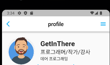
AppBar + Drawer
중간 코드만 가져왔는데
    return Scaffold(
      appBar: _appBar(), // 언더스코어 -> private
      endDrawer: profileDrawer(), // 우측 끝
)_appBar()는 AppBar를 메소드로 분리시켰다.
AppBar _appBar() {
  return AppBar(
    leading: Icon(Icons.arrow_back_ios),
    centerTitle: true,
    title: Text("profile"),
  );
}profileDrawer()는 따로 클래스로 분리시켰다.
class profileDrawer extends StatelessWidget {
const profileDrawer({super.key,});
Widget build(BuildContext context) {
return Container(
width: 170,
color: Colors.lightBlue,
);
}
}위코드로 그려진 AppBar
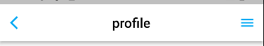
우측 Drawer를 클릭하면 우측해서 위젯이 나온다.

클릭되는 버튼
여러방법이 있는데 간단하게 만드는 방법은 InkWell을 사용한다.
Widget _buildFollowButton() {
  return InkWell(
    onTap: () {
      print("Follow 버튼 클릭됨");
    },
    child: Container(
      alignment: Alignment.center, // 내부에서 정렬해도 되고
      width: 150,
      height: 45,
      child: Text(
        "Follow",
        style: TextStyle(color: Colors.white),
      ),
      decoration: BoxDecoration(
        color: Colors.blue,
        borderRadius: BorderRadius.circular(10),
      ),
    ),
  );
}
alignment: Alignment.center, 는 해당 위젯의 자식을 정렬시켜준다.
여기서 Container의 자식이 아닌 Container를 정렬하고 싶다면 Align으로 감싼뒤 정렬하면 된다.
클릭되는 버튼을 만드려면 버튼의 onPressed속성으로 만들어도 되지만 버튼과 상관없이 아무 위젯으로도 InkWell을 이용한다면 onTap으로 클릭되었을때의 실행내용을 추가할 수 있다.
위 코드는 Container를 버튼처럼 사용하므로 크기도 아래 이미지처럼 만들었다.

BoxDecoration를 이용하면 컨테이너의 속성을 다양하게 변경할 수 있다.
작은것부터