Sliver
Sliver는 스크롤 가능한 위젯의 일종으로, 효율적인 스크롤 및 리스트 렌더링을 위해 사용되는 독특한 디자인 패턴을 말한다.
Sliver위젯은 리스트의 각 아이템을 개별적으로 렌더링하고 스크롤 이벤트를 처리하는 데 최적화되어 있으며, CustomScrollView 위젯과 함께 사용되는 경우 매우 효율적인 리스트 렌더링을 제공한다.
Sliver를 사용하게 되면 내부에도 모두 Sliver를 사용해야 한다.
일반적으로 sliver를 이용하지 않는다면 아래와 같이 AppBar를 제외한 화면의 크기를 계산해서 그림을 그려야한다.
height: MediaQuery.of(context).size.height // 전체 화면 높이
      - MediaQuery.of(context).padding.top // 상태바 높이
      - _appBar.preferredSize.height // 앱바 높이
      - 16 // 텍스트 높이
      - 48 // 버튼 높이
이러한 코드의 단점을 sliver를 통해 해결한다.
SliverList / SliverGrid

SliverGrid 에서는 gridDelegate를 이용해서 그리드 레이아웃을 정의한다.
매 index마다 itemBuilder가 생성된 그리드를 반환한다.
  SliverGrid(
    gridDelegate: SliverGridDelegateWithFixedCrossAxisCount(
      crossAxisCount: 2,
      childAspectRatio: 1.0,
    ),
    delegate: SliverChildBuilderDelegate(
          (context, index) {
        return Card(
          child: Container(
            color: Colors.blue[index % 9 * 100],
            child: Center(
              child: Text('Grid Item $index'),
            ),
          ),
        );
      },
      childCount: 20,
    ),
  ),
SingleChildScrollView
SingleChildScrollView는 단 하나의 자식 위젯을 가질 수 있으며 이름에서 알 수 있듯이 Column이나 Row를 스크롤 가능하게 만들어준다.
      Expanded(
        child: SingleChildScrollView(
            child: Column(
              children: [
                TimeLine(time: "2023년 1월 1일 금요일"),
                OtherChat(
                  name: "홍길동",
                  text: "새해 복 많이 받으세요",
                  time: "오전 10:10",),
                MyChat(
                  time: "오후 2:15",
                  text: "선생님도 많이 받으십시오.",
                ),
                ...List.generate(chats.length, (index) => chats[index]),
              ],
            )),
      ),
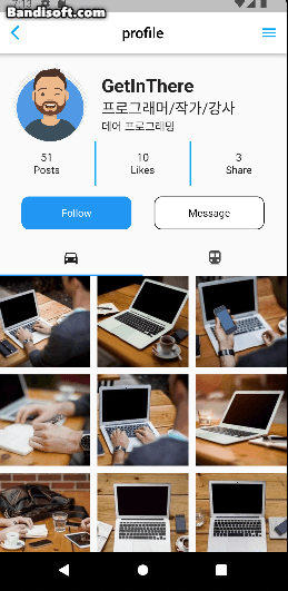
NestedScrollView
NestedScrollView는 스스로도 스크롤이지만 내부에 동적인 리스트를 가질수 있다.
아래 이미지를 참고 바란다.

    return Scaffold(
      body: NestedScrollView( // 리스트 안에 동적인 리스트가 있을때 사용
        body: ProfileTap(), // 동적인 리스트
        headerSliverBuilder: (context, innerBoxIsScrolled) {
          return [
            SliverList(
              delegate: SliverChildListDelegate(
                [
                  SizedBox(height: 20,),
                  SizedBox(width: 20,),
                  profileHeader(),
                  profileCountInfo(),
                  SizedBox(height: 15,),
                  profileButtons(),
                  SizedBox(height: 15,)
                ],
              ),
            ),
          ];
        },
      ),
    );
내부의 그리드 리스트는 GridView.builder로 구현된다.
GridView.builder(
  itemCount: 42,
  gridDelegate: SliverGridDelegateWithFixedCrossAxisCount(
      crossAxisCount: 3,
      crossAxisSpacing: 10,
      mainAxisSpacing: 10),
  	  itemBuilder: (context, index) {

      return CachedNetworkImage(
      imageUrl: "http://picsum.photos/id/${index + 1}/200/200",
      placeholder: (context, url) => CircularProgressIndicator(),
      errorWidget: (context, url, error) => Icon(Icons.error),
    );
    Image.network("");
  })
NestedScrollView는 GridView.builder나 SliverList를 모두 사용가능한 유연한 위젯이다.
SliverList를 사용해서 유동적인 높이를 가진 리스트를 가질수 있는 스크롤 가능한 위젯이다.
위 Gif 에서는 상단부분이 SliverList인데 headerSliverBuilder를 이용해서 생성했다.
SliverList는 자식 위젯들의 리스트를 스크롤 가능한 슬리버 위젯으로 만든다.
SliverList나 SliverAppBar같은 Sliver의 하위 위젯들은 NestedScrollView와 CustomScrollView에서 사용할 수 있다.
위 코드에서는 SliverChildListDelegate를 이용해서 Sliver의 자식 위젯 리스트를 생성하고 있다.
SliverChildBuilderDelegate를 이용한다면 동적인 스크롤을 만들 수 있다.
SliverChildListDelegate
일반적인 위젯 리스트를 슬리버 리스트로 만들어준다.

  SliverList(
    delegate: SliverChildListDelegate(
      [
        Container(
          child: Image(image: NetworkImage('https://picsum.photos/id/1/200/300'),fit: BoxFit.cover),
        ),
        SizedBox(height: 10,),
        Container(
          child: Image(image: NetworkImage('https://picsum.photos/id/2/200/300'),fit: BoxFit.cover),
        ),
        SizedBox(height: 10,),
        Container(
          child: Image(image: NetworkImage('https://picsum.photos/id/3/200/300'),fit: BoxFit.cover),
        ),
      ]
    ),
  ),
SliverChildBuilderDelegate
ListView.builder나 GridView.builder와 유사한 방식으로 작동한다.
매 index마다 itemBuilder 콜백을 사용하여 슬리버에 대한 자식을 반환한다.
동적인 리스트나 그리드를 쉽게 생성할 수 있다.
  SliverList(
    delegate: SliverChildBuilderDelegate(
      childCount: 10,
      (context, index) =>
        Padding(
          padding: const EdgeInsets.symmetric(vertical: 5.0),
          child: Image.network("https://picsum.photos/id/${index}/200/300",
          fit: BoxFit.contain,),
        ),
    )
  ),
ListView.builder / List.generate
List.generate는 미리 전체 아이템 리스트를 생성한다. 메모리를 더 먹게 된다.
ListView.builder는 lazy loading 기법을 사용하여 리스트 뷰 아이템이 필요할 때만 생성하고 화면에 표시한다.
itemBuilder 콜백함수를 이용해서 아이템이 필요할 때만 생성하므로 대규모 데이터 처리를 효율적으로 할 수 있다.
반면에 빌더로 적은 아이템을 생성하면 연산자원이 낭비된다.
따라서 SliverChildListDelegate 나 SliverChildBuilderDelegate는 적재적소에 사용해야 한다.
CustomScrollView
조금 더 세부적인 스크롤뷰를 만들 수 있다.
class HomePage extends StatelessWidget {
const HomePage({Key? key}) : super(key: key);
Widget build(BuildContext context) {
return Scaffold(
body: CustomScrollView(
slivers: [
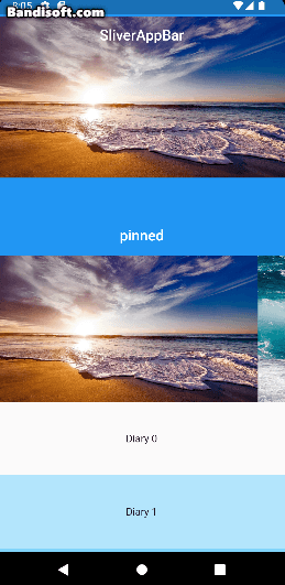
SliverAppBar(
snap: true,
floating: true,
title: Text("SliverAppBar"),
pinned: false,
expandedHeight: 250,
flexibleSpace: FlexibleSpaceBar(
title: Text("제목"),
centerTitle: true,
background: Image.network(
'https://picsum.photos/200/300',
fit: BoxFit.cover,
),
),
const SliverAppBar(
title: Text("pinned"),
pinned: true,
centerTitle: true,
), snap과 floating옵션을 이용하면 위아래로 살짝만 스크롤해도 SliverAppBar가 화면에 나타나고 사라진다.
pinned 옵션을 이용하면 스크롤을 올리더라도 앱바가 화면에서 사라지지 않는다.
expandedHeight로 앱바의 크기를 지정한다. 기본값은 60이다.
flexibleSpace는 유연한 공간을 제공하여 다양한 콘텐츠를 넣을수 있다.
SliverToBoxAdapter
일반적인 위젯을 슬리버에서도 사용할 수 있게 어댑터 역할 해준다.
     SliverToBoxAdapter(
       child: Container(
       height: 200,
       child: ListView.builder(
         scrollDirection: Axis.horizontal, // 가로 스크롤
         itemCount: 7,
         itemBuilder: (BuildContext context, int index) {
           return Image(
               image: AssetImage("assets/다운로드 (${index + 1}).jpg"));
         },
       ),
     )),
위 코드는 스크롤뷰 안에 어뎁터로 가로 리스트뷰를 넣었는데 다른 방법으로는 NestedScrollView 안에 ListView를 넣거나 CustomScrollView에서 SliverList를 생성하면 된다.
SliverFixedExtentList
내부 아이템들의 사이즈를 무시하고 지정한 크기 100으로 고정된다.
      SliverFixedExtentList(
          itemExtent: 100, // 내부 요소의 크기 무시
          delegate: SliverChildBuilderDelegate( // 계산이 필요하면 빌더를 사용
            (context, index) {
              if (index % 4 == 0 && index != 0)
                return Ad(((index / 4) - 1).toInt());
              return Diary(index);
            },
          )),
        ],
      ),
    );
  }
SliverFillViewport
현재 뷰포트를 채우기 위한 뷰를 생성한다.
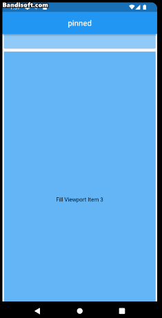
  SliverFillViewport(
    delegate: SliverChildBuilderDelegate(
      childCount: 10,
      (context, index) {
        return Card(
          child: Container(
            color: Colors.blue[index % 9 * 100],
            child: Center(
              child: Text('Fill Viewport Item $index'),
            ),
          ),
        );
      },
    ),
  ),
SliverFillRemaining
Sliver가 채우지 못한 남은 공간을 채우기 위한 뷰를 생성한다.

// 위에 있는 Sliver,
SliverFillRemaining(
child: Center(
child: Text('This is the remaining content.'),
),
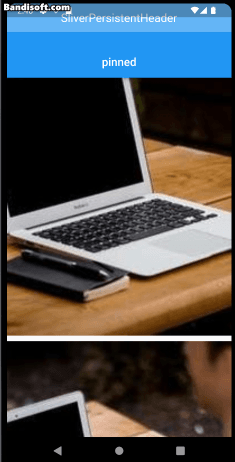
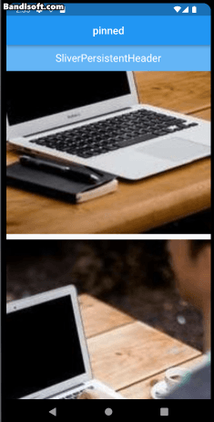
),SliverPersistentHeader
앱에서 항상 표시되는 헤더를 만든다.
 SliverPersistentHeader(
   pinned: false,
   floating : false,
   delegate: MySliverPersistentHeaderDelegate(
     minHeight: 50.0,
     maxHeight: 120.0,
     child: Container(
       color: Colors.blue[300],
       child: const Center(
         child: Text(
           'SliverPersistentHeader',
           style: TextStyle(color: Colors.white, fontSize: 20),
         ),
       ),
     ),
   ),
 ),
일반적으로 minHeight는 작은 값으로 축소된 헤더의 크기를 지정할 때 사용하므로 pinned: true일때 유효하다.
-
pinned: true일때
-
floating : false는 가장 상단으로 올라가야 내려온다.

-
floating : true는 스크롤을 하자마자 헤더가 내려온다.

SliverPersistentHeaderDelegate를 상속해서 필요한 메소드와 속성을 가져온다.
헤더의 크기와 위치를 동적으로 조정할 수 있게 된다.
class MySliverPersistentHeaderDelegate extends SliverPersistentHeaderDelegate {
MySliverPersistentHeaderDelegate({
required this.minHeight,
required this.maxHeight,
required this.child,
});
final double minHeight;
final double maxHeight;
final Widget child;
Widget build(
BuildContext context, double shrinkOffset, bool overlapsContent) {
return SizedBox.expand(child: child);
}
double get maxExtent => maxHeight;
double get minExtent => minHeight;
bool shouldRebuild(covariant MySliverPersistentHeaderDelegate oldDelegate) {
return maxHeight != oldDelegate.maxHeight ||
minHeight != oldDelegate.minHeight ||
child != oldDelegate.child;
}
}