1. 데이터 결합
데이터 실습
#tip1: 실제 csv파일은 경로를 넣어주어야한다
import pandas as pd
customer_master = pd.read_csv('https://raw.githubusercontent.com/jin0choi1216/dataset/main/table_data_anlaysis/shopping_mall/customer_master.csv')
item_master = pd.read_csv('https://raw.githubusercontent.com/jin0choi1216/dataset/main/table_data_anlaysis/shopping_mall/item_master.csv')
transaction_1 =pd.read_csv('https://raw.githubusercontent.com/jin0choi1216/dataset/main/table_data_anlaysis/shopping_mall/transaction_1.csv')
transaction_2 =pd.read_csv('https://raw.githubusercontent.com/jin0choi1216/dataset/main/table_data_anlaysis/shopping_mall/transaction_2.csv')
transaction_detail_1 =pd.read_csv('https://raw.githubusercontent.com/jin0choi1216/dataset/main/table_data_anlaysis/shopping_mall/transaction_detail_1.csv')
transaction_detail_2 =pd.read_csv('https://raw.githubusercontent.com/jin0choi1216/dataset/main/table_data_anlaysis/shopping_mall/transaction_detail_2.csv')
transaction_1과 transaction_2가 연결될 것 같다는 예상이 든다. 그렇다면 코드를 입력해보자.
#trasaction_1과 2의 앞뒤가 잘림
transaction_1.tail(2)
transaction_1의 tail을 보면 index는 transaction_id가 ‘~5112’로 끝난다는 걸 알 수 있다
transaction_2.head(2)transaction_2의 head는 index는 transaction_id가 ‘~5113’으로 시작한다.
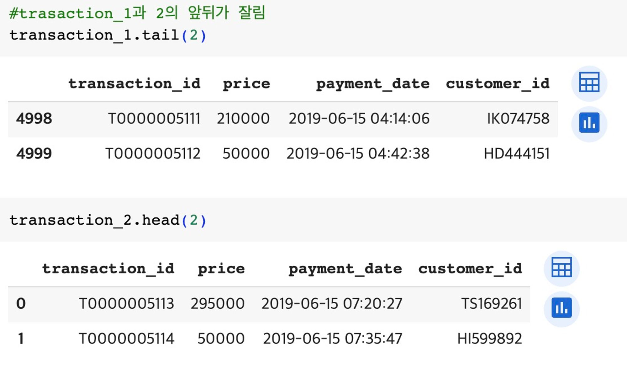
즉, transaction_1와 transaction_2이 잘린 데이터라는 걸 알 수 있다. 그렇다면 transaction_id가 잘려있기 때문에 concat을 사용
#concat을 이용해 1과 2를 연결
#concat을 하면 index가 겹치기 때문에 문제가 발생할 가능성이 있음
transaction = pd.concat([transaction_1,transaction_2],
	ignore_index = True) #index가 중복되니 없애준다
transaction_detail =  pd.concat([transaction_detail_1,transaction_detail_2],
	ignore_index = True)
merge1 = pd.merge(
left = transaction_detail, right = transaction.drop('price', axis = 1),#price를 drop해 오차를 없앤다
on = 'transaction_id', how = 'left')
merge1.head()
#발생할 수 있는 문제: quantity와 price가 겹쳐 quantity와 price 데이터를 분리된 데이터로 인식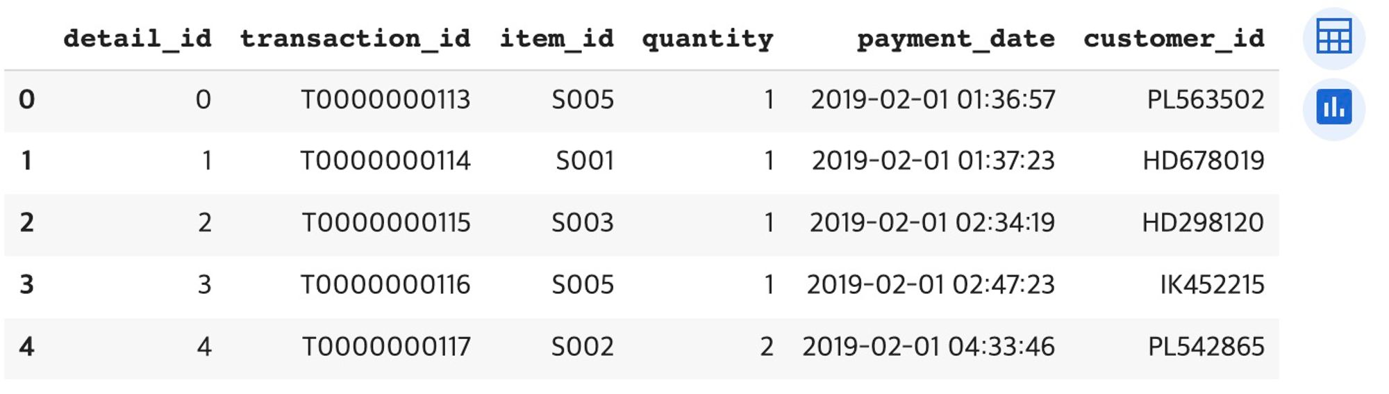
2. 데이터 시각화
- Figure vs Axes vs Axis
- Axes vs Axis
Figure: 도화지
Axes: 축
Axis: 축 안에 그려지는 x & y 축
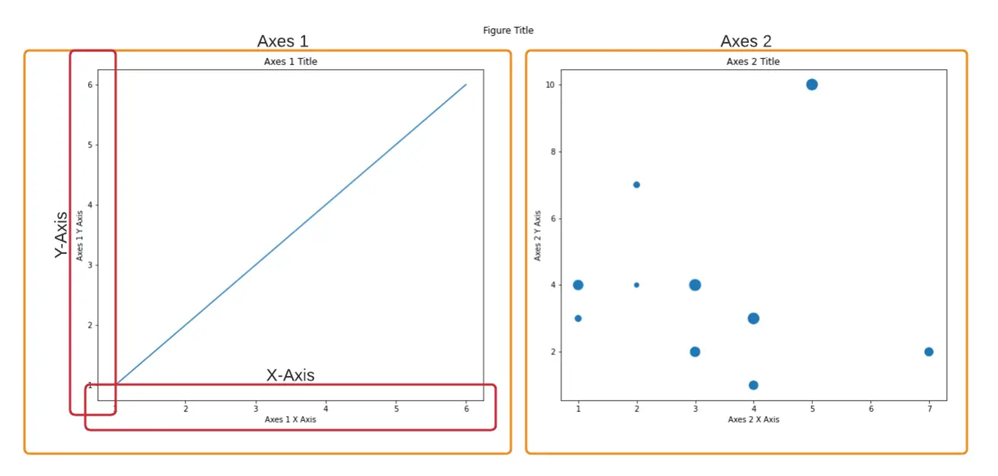
해석: 하나의 Figure 안에 Axes는 두 개 Axis는 네 개
굳이 Axis 숫자를 세진 않음
3. matplotlib
데이터 시각화
matplotlib을 사용해보자. matplotlib은 데이터 시각화를 위한 라이브러리로, VS Code를 사용할 시 pip install을 통해 라이브러리를 설치해야 한다.
예제를 하나 만들어보자.
# !pip install matplotlib

import matplotlib.pyplot as plt
import numpy as np

x = np.arange(100, 300, 10)
y = np.random.randn(20)

plt.plot(x,y)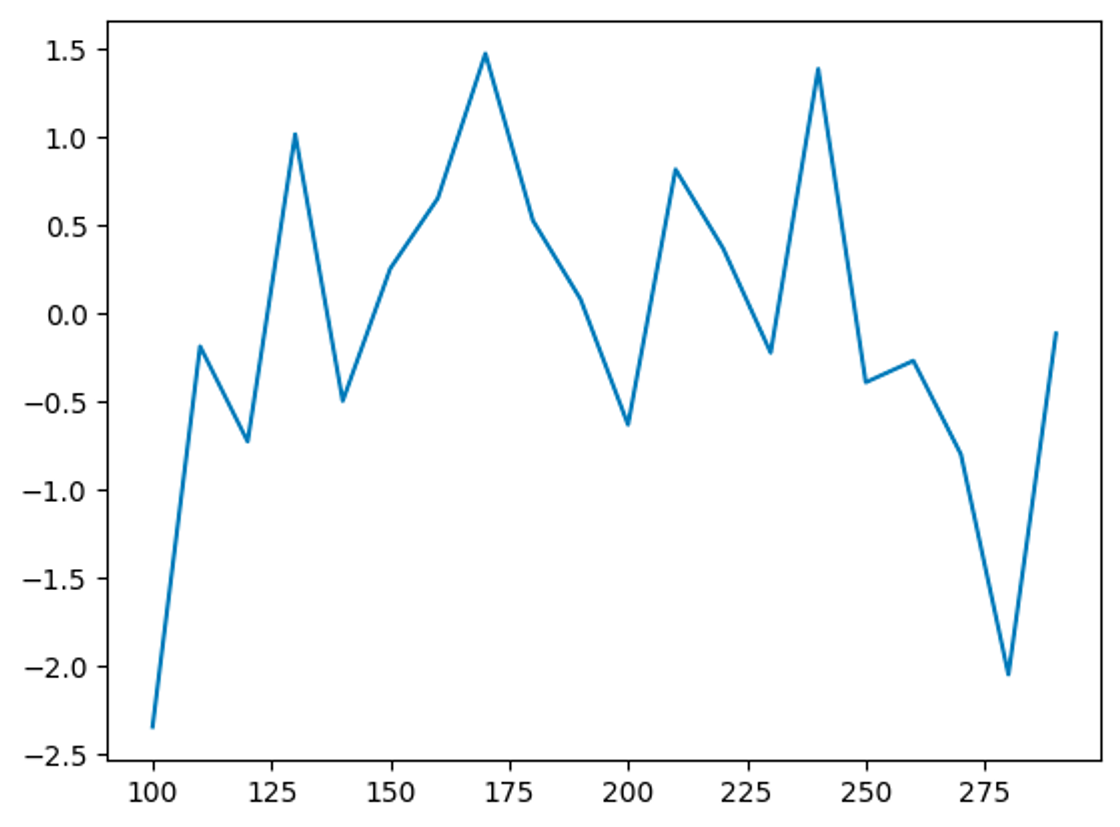
x축과 y축을 만든 뒤, plt.plot(x axis, y axis)를 설정하면 위와 같은 그래프가 생성된다. y값을 난수로 설정했기 때문에 높낮이가 다른 것을 확인할 수 있다
그래프 자체의 크기를 바꾸고 싶을 땐 어떻게 해야할까? plt.figure(figsize = (15,5))와 같이 사용할 수 있다. 이를 위해 figure / axes / axis의 개념을 이해할 필요가 있다
#figure 사이즈를 변경해야 x와 y축의 사이즈가 늘어남

plt.figure(figsize= (15,5))
plt.plot(x,y)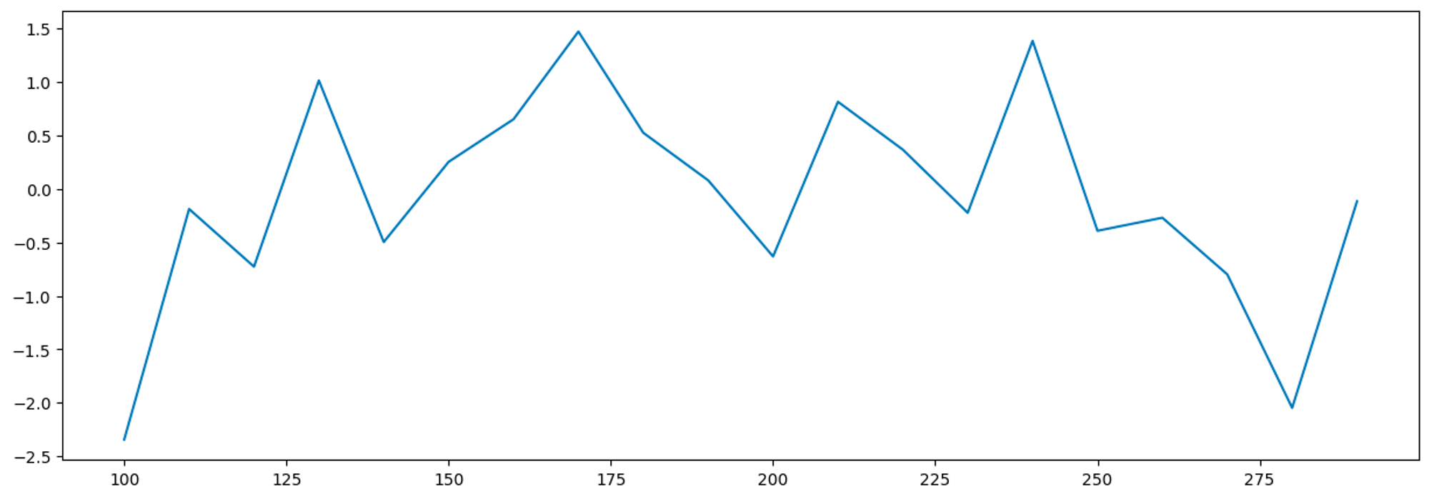
코드를 입력하면 위와 같은 그래프가 나온다. 가로의 길이가 길어진 것을 확인할 수 있다.
타이틀, 축의 이름 붙이기 + 그래프 꾸미기
타이틀, 축의 이름 붙이기
그래프를 보다보면 시각화를 진행해야 하는 경우가 있다. 이 때 라벨링을 통해 axes 그래프를 꾸며줄 수 있다. 뿐만 아니라 x축과 y축의 라벨링 또한 진행 시켜보자.
#그래프에 라벨 붙여주기
plt.plot(x,y)
plt.xlabel('X-axis')
plt.ylabel('Y-axis')
plt.title('Title')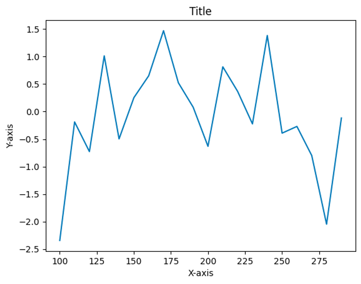
plt.xlabel / plt.ylabel을 이용해 x축과 y축에 label을 진행시킬 수 있으며, plt.title을 통해 axes 그래프의 타이틀을 설정해줄 수 있다.
그래프 꾸미기
타이틀을 꾸미는 방법에 대해 알아보자.
#그래프에 라벨 붙여주기
plt.plot(x,y, color = 'r', linestyle = '--', marker = 's') #컬러 / 라인 / 마커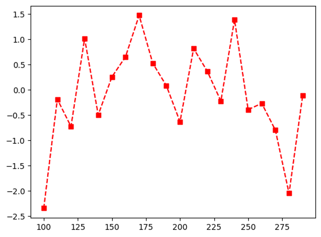
- ‘r’: red
- -: 점선
- ‘s’: square
이런 식을 통해 그래프를 꾸밀 수 있다. 외울 순 없으나 plot까지 꾸미는 방식을 익힐 수는 있어야 된다.
이렇게 그래프의 라벨링과 그래프 디자인을 진행시켰다. 하지만 궁금해지는 것이 있다. figure 하나에 여러 개의 axes 그래프를 그릴 순 없을까?
figure 하나, 여러 개의 axes 그래프를 그리고 싶다면?
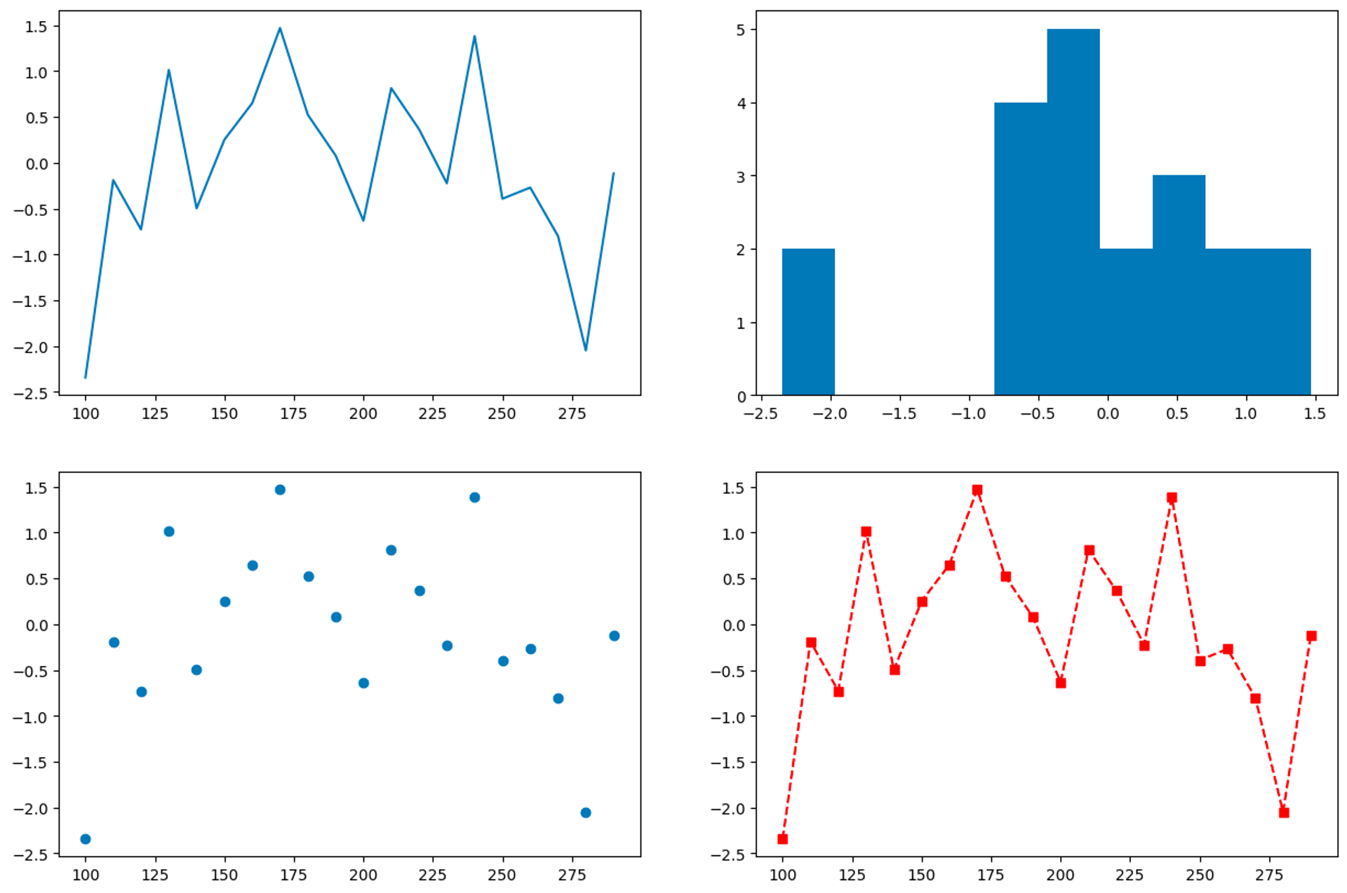
#1. 첫번째 방법
axes 그래프를 여러 개를 그려보자. figure에 axes 그래프를 여러 개 넣기 위해 사분면을 나누듯 subplot을 만들 수 있다.
#그래프를 여러개 만들고 싶다면?
# figure를 따로 따로 생성해야 한다
fig = plt.figure(figsize = (16,10))

#axes 하나를 만들기
axes1 = fig.add_subplot(2,2,1)#2x2 사이즈 만들어서 첫번째

#axes1을 plt 대신 집어넣는다. 1사분면에 존재하긴 함
axes1.plot(x,y, color = 'r', linestyle = '--', marker = 's')

axes2 = fig.add_subplot(2,2,2)#2x2 사이즈 만들어서 두번째
#axes2를 히스토그램으로 변경
axes2.hist(y)

axes3 = fig.add_subplot(2,2,3)#2x2 사이즈 만들어서 두번째
axes3.scatter(x,y)
위 코드를 입력해보자. axes2는 히스토그램, axes3는 스캐터로 제작해, 결과가 아래처럼 나왔다.
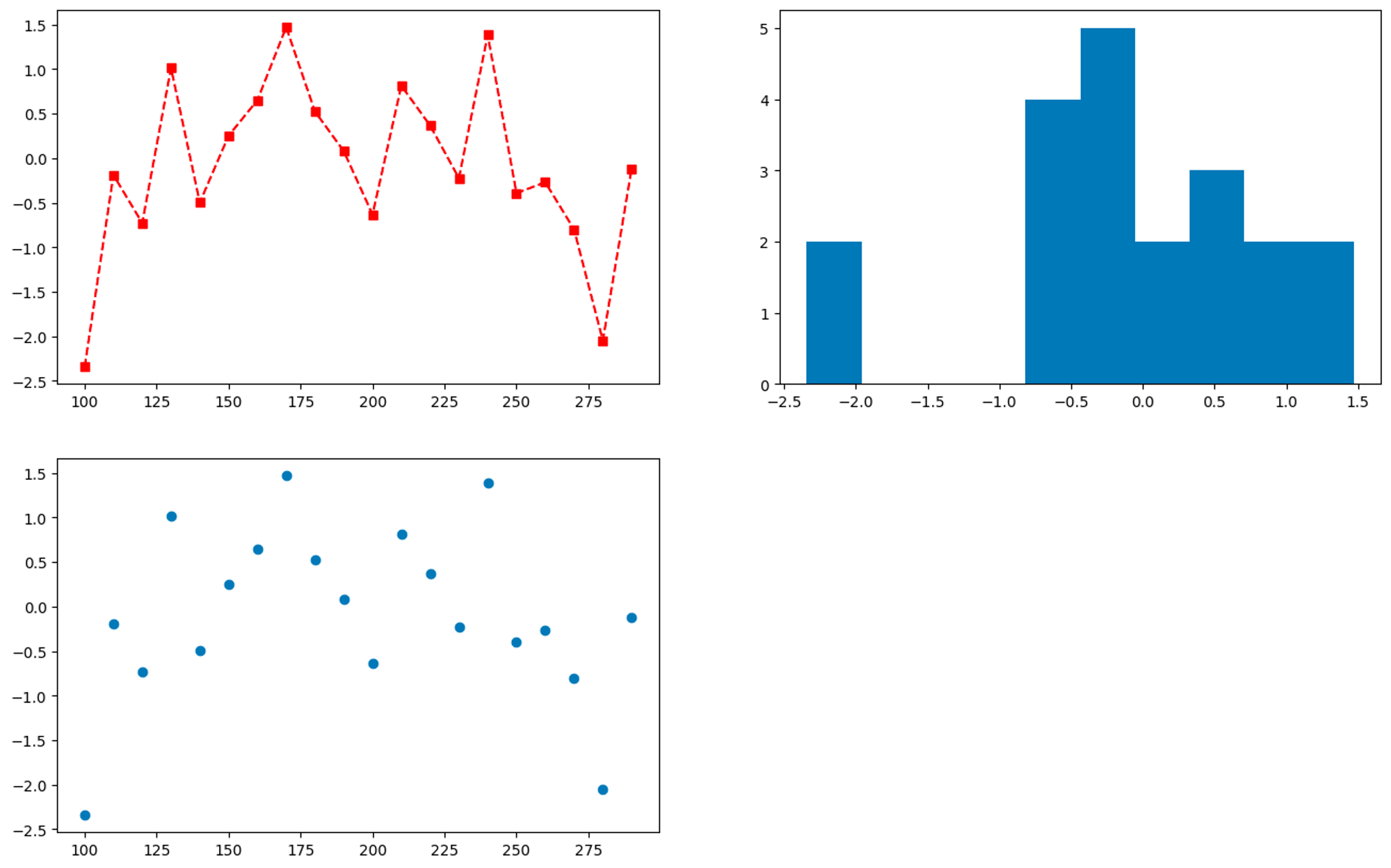
이렇듯 다양한 그래프 형식을 적용해 figure 내부에 axes 그래프를 그릴 수 있다
다음은 axes 그래프를 그리는 방법 두 번째를 알아보자.
#2. 두번째 방법
#방법2 fig와 axes를 나눠서 그래프 만드는 법
fig, axes = plt.subplots(2,2 , figsize = (15,10))

#axes 첫번째 접근
axes[0,0].plot(x, y)

#axes 두번째 접근
axes[0,1].hist(y)

#axes 세번째 접근
axes[1,0].scatter(x,y)

#axes 네번째 접근
#그래프 디자인을 간결하기
axes[1,1].plot(x,y,'r--s')
fig, axes = plt.subplots(2,2 , figsize = (15,10))
figure와 axes, fig size를 설정해 빈 figure와 axes를 생성한다
axes[1,1]에서는, (x,y) 뿐만 아니라 ‘r- -s’로 간결화 시켜 그래프의 디자인을 설정해줄 수 있다.
axes[1,1].plot(x,y,'r--s')
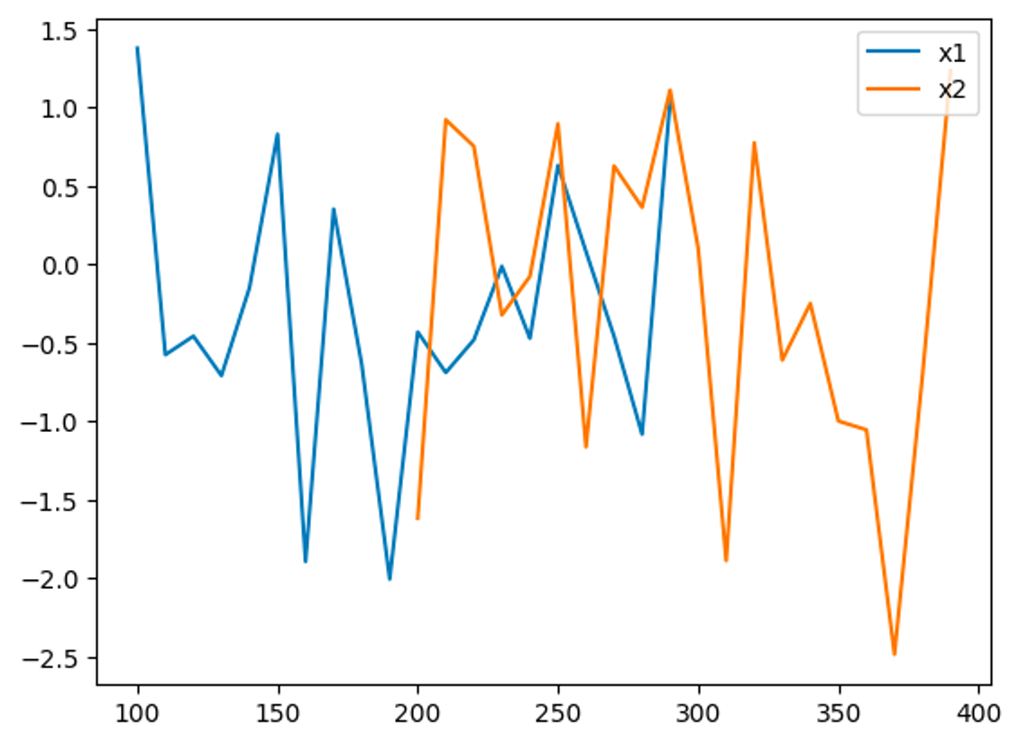
그렇다면 하나의 figure 안에 여러 개의 그래프를 그릴 수는 없을까? 가능하다. 변수를 미리 지정한다면 가능하다.
x1 = np.arange(100,300,10)
y1 = np.random.randn(20)

x2 = np.arange(200,400,10)
y2 = np.random.randn(20)

plt.plot(x1,y1, label = 'x1')
plt.plot(x2,y2, label = 'x2')

#범례(label)의 위치
#legend를 표시하는 함수
plt.legend(loc = 1)
뿐만 아니라 plt.legend를 함수를 통해 범례(label)를 표시할 수 있다
그렇다면 한 Figure 안에 여러 개의 axes를 넣을 순 없을까? 그리고 그 테이블의 label과 title를 설정해줄 수는 없을까?
여러 그래프의 label, title 다루기
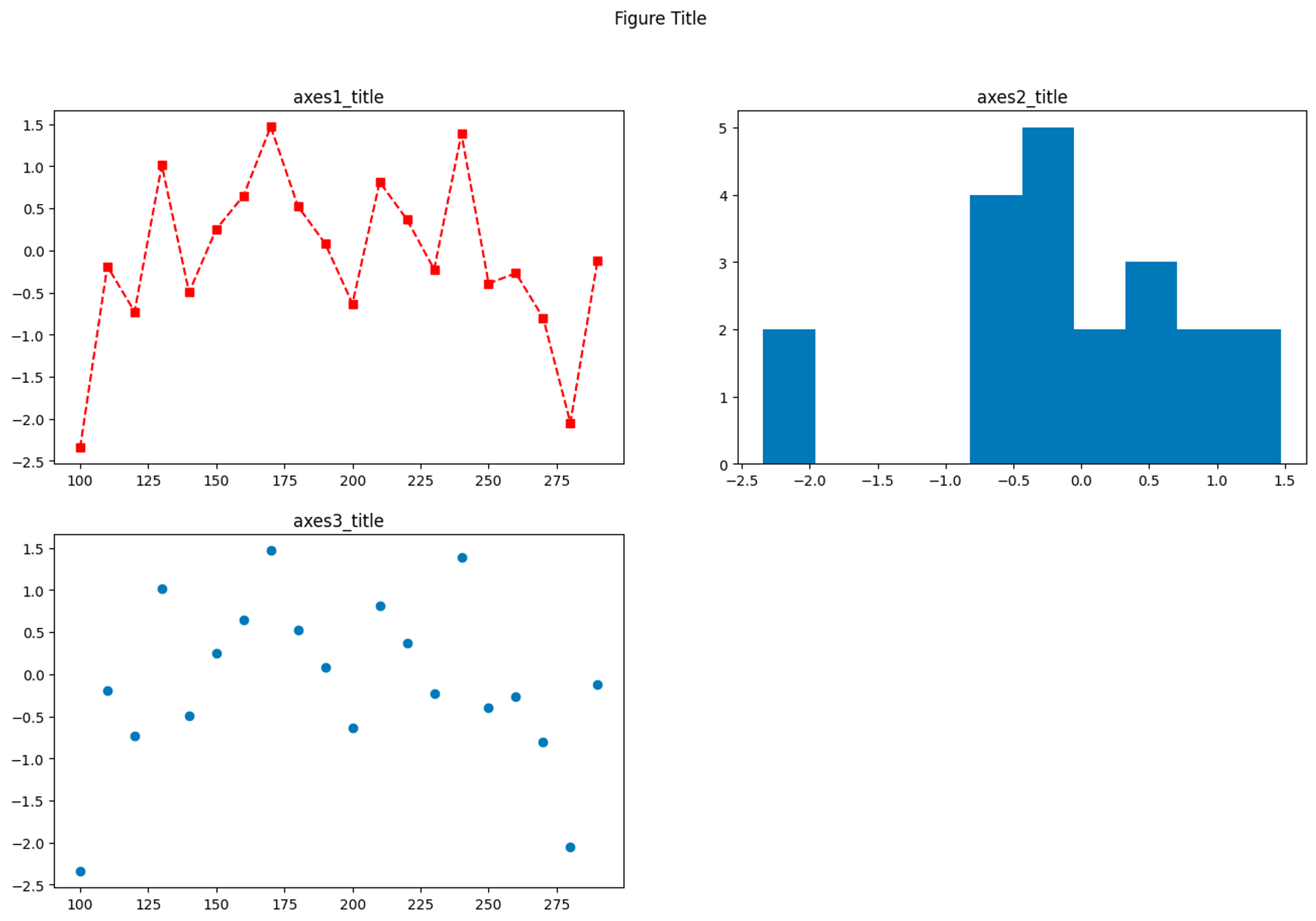
가능하다. 바로 add_subplot을 통해 가능하다. 우선 subplot 하나를 만든 후, plt 대신 선언된 변수 axes1을 넣어 axe1.plot()을 통해 그래프를 만들어준다.
#그래프를 여러개 만들고 싶다면?
# figure를 따로 따로 생성해야 한다
fig = plt.figure(figsize = (16,10))

#axes 하나를 만들기
axes1 = fig.add_subplot(2,2,1)#2x2 사이즈 만들어서 첫번째

#axes1을 plt 대신 집어넣는다. 1사분면에 존재하긴 함
axes1.plot(x,y, color = 'r', linestyle = '--', marker = 's')
axes1.set_title('axes1_title')
axes2 = fig.add_subplot(2,2,2)#2x2 사이즈 만들어서 두번째

#axes2를 히스토그램으로 변경
axes2.hist(y)
axes2.set_title('axes2_title')

axes3 = fig.add_subplot(2,2,3)#2x2 사이즈 만들어서 세번째
axes3.scatter(x,y)
axes3.set_title('axes3_title')

#figure 타이틀 - 그래프 총합의 제목 설정하기
fig.suptitle('Figure Title')
그 후, axes.set_title()함수를 통해 타이틀을 설정해준다. ‘axes1_title’ / ‘axes2_title’ / ‘axes3_title’로 설정해주었다.
그래프 템플릿 gallery
-
그래프 함수를 다 기억할 필요는 없다
- matplotlib gallery
- seaborn gallery
- plotlib gallery
-
어떨 때 사용하고, 이를 어떻게 수정할 수 있는 스킬이 가장 중요 -
예제를 찾아 상황에 맞는 그래프를 수정하는 능력을 갖춰야 함