
CSS3은이전버전의CSS와완전히호환되는CSS의최신표준권고안을의미
개발자들의다양한수요에따라CSS도발전을하고있다고생각
우리는키프레임 을사용할건데,키프레임(Keyframe) 은애니메이션중간중간에객체의위치와크기를지정해주는프레임이에요.
<!DOCTYPE html>
<html>
 <head>
  <style>
   div{
    width: 100px;
    height: 100px;
    background: cyan;
    position: relative;
    animation: 2s myanim;
    animation-iteration-count: 10;
   }

   @keyframes myanim{
    0% {left:0px; top:0px;}
    25% {left:100px; top:0px;}
    50% {left:200px; top:0px;}
    75% {left:100px; top:0px;}
    100% {left:0px; top:0px;}
   }
  </style>
 </head>
 <body>
  <div></div>
 </body>
</html>
지금이소스에서애니메이션의 대상 은div태그인박스
div태그의class를보면animation과animation-iteration-count가있는데각각10번째,11번째줄
animation: 2s myanim; 은애니메이션이2초동안지속되도록하고있어요.
animation-iteration-count: 10; 애니메이션을10번반복하도록하고있고요
14번째줄에서@keyframes 는키프레임을지정하는코드이고그옆의myanim 은애니메이션의이름을지정하는코드에요.
15번째줄부터는애니메이션이각각0%,25%,50%,75%,100%진행될때,대상의위치를지정하고있어요.
이렇게완성된소스는cyan색박스가왼쪽에서오른쪽으로왔다갔다하도록만들어요.
소스를 아래와 같이바꾸면색상이변하는것도확인해볼수있어요.
<!DOCTYPE html>
<html>
 <head>
  <style>
   div{
    width: 100px;
    height: 100px;
    background: cyan;
    position: relative;
    animation: 2s myanim;
    animation-iteration-count: 10;
   }

   @keyframes myanim{
    0% {background-color:cyan; left:0px; top:0px;}
    25% {background-color:#FFDAB9; left:100px; top:0px;}
    50% {background-color:tomato; left:200px; top:0px;}
    75% {background-color:#DDA0DD; left:100px; top:0px;}
    100% {background-color:cyan; left:0px; top:0px;}
   }
  </style>
 </head>
 <body>
  <div></div>
 </body>
</html>
CSS3을사용하면요소에애니메이션을적용할때.속도효과지정
속도효과중에서ease-out과ease-in
ease-out은움직임이멈출때,끝에이르러변화의정도가서서히감소하는것이에요.
ease-in은천천히시작하는것이죠
속도효과를사용해튀어오르는공애니메이션을작성할수있어요.
<!DOCTYPE html>
<html>
 <head>
  <style>
   #ball{
    width: 50px;
    height: 50px;
    background: tomato;
    position: absolute;
    border-radius: 70%;
    -webkit-animation-name: bounce;
    -webkit-animation-iteration-count: infinite;
    -webkit-animation-duration: 5s;
   }

   @-webkit-keyframes bounce{
    from, to{
     bottom: 0px;
     -webkit-animation-timing-function: ease-out;
    }
    50%{
     bottom: 300px;
     -webkit-animation-timing-function: ease-in;
    }
   }
  </style>
 </head>
 <body>
  <div id="ball"></div>
 </body>
</html>
9번째줄과23번째줄에서-webkit-animation-timing-function을통해속도효과를지정하고있는걸확인할수있어요.
10번째줄의border-radius는원처럼보이게경계선을둥글게해줘요.
11,12,13번째줄에서는각각-webkit-animation의이름,반복횟수,반복시간을지정하고있어요.
-webkit-animation의이름은bounce이고,반복횟수의제한은없으며,반복주기는5초네요.
이소스를실행하면토마토색공이화면의왼쪽하단에서통통튀어오르는것을볼수있어요.
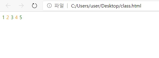
nth-child() .
:nth-child() 는형제요소중에서특정순서에있는요소를선택할때사용해요.
<!DOCTYPE html>
<html>
 <head>
  <style>
   span:nth-child(odd) {color:green;}
   span:nth-child(even) {color:orange;}
  </style>
 </head>
 <body>
  <div>
   <span> 1 </span>
   <span> 2 </span>
   <span> 3 </span>
   <span> 4 </span>
   <span> 5 </span>
  </div>
 </body>
</html>
5번째와6번째줄에서span의홀수번째요소는초록색으로,짝수번째요소는주황색으로출력하게하고있어요.
p:first 와p:last 에서p 는바로p 태그 를의미해요.
위의소스에서p:first는
<p> 내가 쏘아 올린 작은 공 </p>
<p> 너가 쏘아 올린 작은 공 </p>
내가 쏘아 올린 작은 공
p:last는?
100ml 생수
150ml 생수
200ml 생수