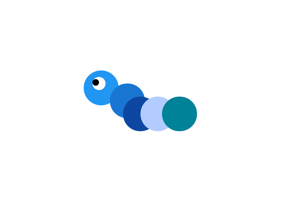
실습1번문제입니다.
위의조건을만족하는CSS코드를작성하세요.
다양한 position 속성을 활용해서 화면 속 이미지와 같은 귀여운 애벌레를 만들어 주세요!
<!DOCTYPE html>
<html>
<head>
<style>
div {
width: 80px;
height: 80px;
border-radius: 50px;
position: absolute;
}
.body_1 {
background-color: #2196F3;
}
.body_2 {
background-color: #1976D2;
top: 30px;
left: 60px;
z-index: 2;
}
.body_3 {
background-color: #0D47A1;
top: 60px;
left: 90px;
z-index: 3;
}
.body_4 {
background-color: #B2CCFF;
top: 60px;
left: 130px;
z-index: 4;
}
.body_5 {
background-color: #008299;
top: 60px;
left: 180px;
z-index: 5;
}
.eye_black {
width:15px;
height:15px;
background-color: black;
top: 20px;
left:20px;
z-index: 3;
}
.eye_white {
width:30px;
height:30px;
background-color: white;
top: 15px;
left:20px;
z-index: 2;
}
</style>
</head>
<body>
<div class="caterpillar-body">
<div class="eye_black"></div>
<div class="eye_white"></div>
<div class="body_1"></div>
<div class="body_2"></div>
<div class="body_3"></div>
<div class="body_4"></div>
<div class="body_5"></div>
</div>
</body>
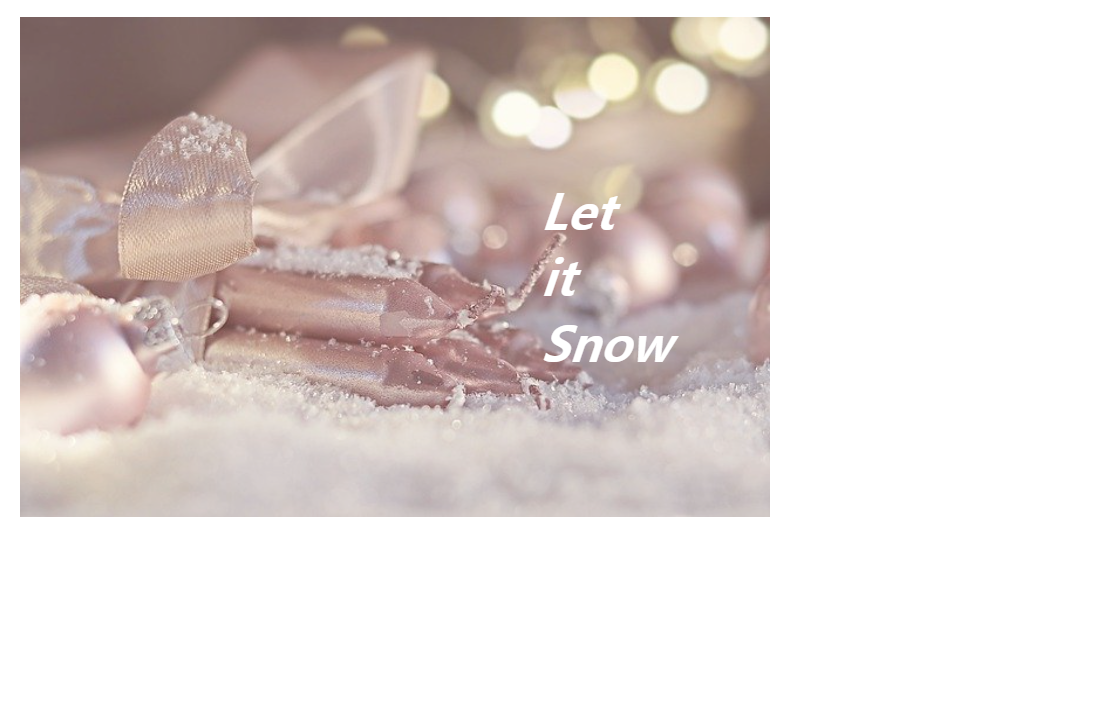
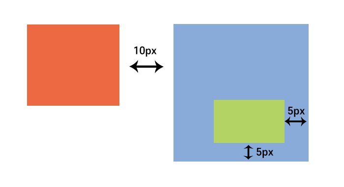
</html>실습2번문제입니다.
위의조건을만족하는CSS코드를작성하세요.
다양한 position 속성을 활용해서 화면 속 이미지와 같이 이미지 위에 글자를 입혀주세요.
hint: 이미지에 opacity 를 입히면 글자가 선명하게 보일 수 있습니다!
실습3번문제입니다.
위의조건을만족하는CSS코드를작성하세요.
z-index 와 transform 을 활용하여 아래와 같이 이미지 3개를 연이어 나열해 보세요!
<!DOCTYPE html>
<html>
  <head>
    <meta charset="utf-8">
    <title> image with text </title>

    <style>

    img {
      width: 300px;
      height: 200px;

    }

    .image1 {
      position: absolute;
      opacity: 0.8;
    }

    .image_text {
      position: absolute;
      right: 40px;
      top: 50px;
    }

    </style>
  </head>

  <body>

    <div class="image1">
          <img src="christmas-5834904_640.jpg"> /*받은 이미지 명 작성해 주세요!*/

          <div class="image_text">
            <h1 style="font-weight: bold; color: white; font-size: 20px;">
              <i>
                  Let
                  <br>
                  it
                  <br>
                  Snow
              </i>
            </h1>
        </div>
    </div>
  </body>
</html>
hint: 3 이미지가 놓여 있는 회색 창은 가로 920, 세로 420 px 로 지정하였습니다. 색상은 #E7E7E7 입니다.

<!DOCTYPE html>
<html>
<head>
<meta charset="utf-8">
<title></title>
<style>
img {
width: 300px;
height: 200px;
}
.container {
width: 920px;
height: 420px;
background-color: #E7E7E7;
position: relative;
}
.snowimages1 {
position: absolute;
top: 110px;
transform: skewY(30deg);
left: 40px;
z-index: 3;
}
.snowimages2 {
position: absolute;
top: 110px;
transform: skewY(30deg);
left: 100px;
z-index: 2;
}
.snowimages3 {
position: absolute;
top: 110px;
transform: skewY(30deg);
left: 200px;
}
</style>
</head>
<body>
<div class="container">
<div class="snowimages1">
<img src="snow-4682266_640.jpg"> /*받은 이미지 명 작성해 주세요!*/
</div>
<div class="snowimages2">
<img src="snowflake-1823942_640.jpg"> /*받은 이미지 명 작성해 주세요!*/
</div>
<div class="snowimages3">
<img src="forest-5847268_640.jpg"> /*받은 이미지 명 작성해 주세요!*/
</div>
</div>
</body>
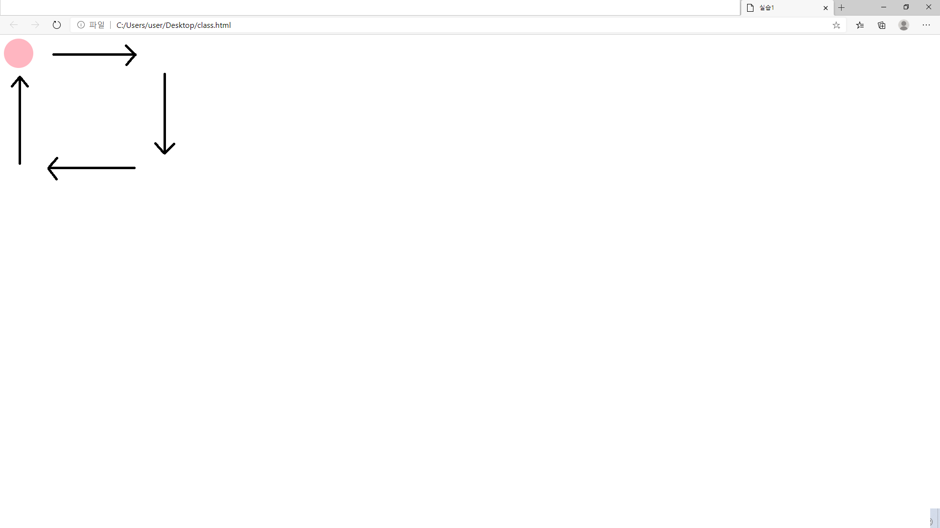
</html>실습4번문제입니다.
위의조건을만족하는CSS코드를작성하세요.
- 키프레임을 사용하세요.
- 왼쪽 상단에서 시작하여 시계 방향으로 사각형을 그리는 애니메이션을 완성하세요.
- 애니메이션 대상은 원입니다.
- 애니메이션은 3초 동안 지속됩니다.
- 애니메이션은 6번 반복됩니다.
<!DOCTYPE html>
<html>
<head>
<meta charset="utf-8">
<title> 실습1 </title>
<style>
div {
width: 60px;
height: 60px;
border-radius: 70%;
position: relative;
animation: 3s myanim;
animation-iteration-count: 6;
background: #FFB6C1;
}
@keyframes myanim {
0% { left: 0px; top: 0px;}
25% { left: 200px; top: 0px;}
50% { left: 200px; top: 200px;}
75% { left: 0px; top: 200px;}
100% { left: 0px; top: 0px;}
}
</style>
</head>
<body>
<div></div>
</body>
<html>
```
실습5번문제입니다.
위와같은결과물을출력하는소스를작성하세요.
파일을클릭해확인하세요!
https://d2iwdqgro8i2ew.cloudfront.net/lesson/script/53006-1.html
실습6번문제입니다.
위와같은레이아웃을작성해보세요!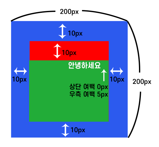
실습 7번 문제입니다.
위와 같은 레이아웃을 작성해보세요.
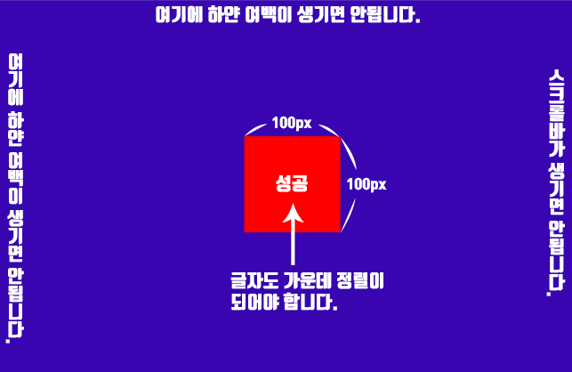
실습8번문제입니다.
* 외부 기능을 사용하지 않고 순수 css만을 사용해야 합니다.
* 화면 크기가 변경되어도 정사각형은 계속 가운데에 위치해야 합니다.
천방지축😛 얼레벌레🙄 빙글빙글🙃 돌아가는 수지의 코드~🎵