텍스트
text-indent : <length>|<percentage>; <!--들여쓰기-->
text-align : left|right|center|justify; <!--정렬-->
text-decoration : none|underline|overline|line-through; <!--텍스트 꾸미기-->
ex)
<a href = "http://www.naver.com" style = "text-decoration : none">네이버</a>
예시 코드
<!DOCTYPE html>
<html>
<head><title>텍스트 꾸미기</title>
<style>
h3 {
	text-align : right; /* 오른쪽 정렬 */
}
span {
	text-decoration : line-through; /* 중간 줄 */
}
strong {
	text-decoration : overline; /* 윗줄 */
}
.p1 {
	text-indent : 3em; /* 3 글자 들여쓰기 */
	text-align : justify; /* 양쪽 정렬 */
}
.p2 {
	text-indent : 1em; /* 1 글자 들여쓰기 */
	text-align : center; /* 중앙 정렬 */
} </style>
</head>
<body>
<h3>텍스트 꾸미기</h3>
<hr>
	<p class="p1">HTML의 태그만으로 기존의
		워드 프로세서와 같이 들여쓰기, 정렬, 공백,
		간격 등과 세밀한 <span>텍스트 제어</span>를
		할 수 없다. </p>
	<p class="p2">그러나,
		<strong>스타일 시트</strong>는 이를
		 가능하게 한다. 들여쓰기, 정렬에 대해서
		 알아본다
	</p>
	<a href="http://www.naver.com"
		 style="text-decoration : none">
			밑줄이 없는 네이버 링크</a>
</body></html>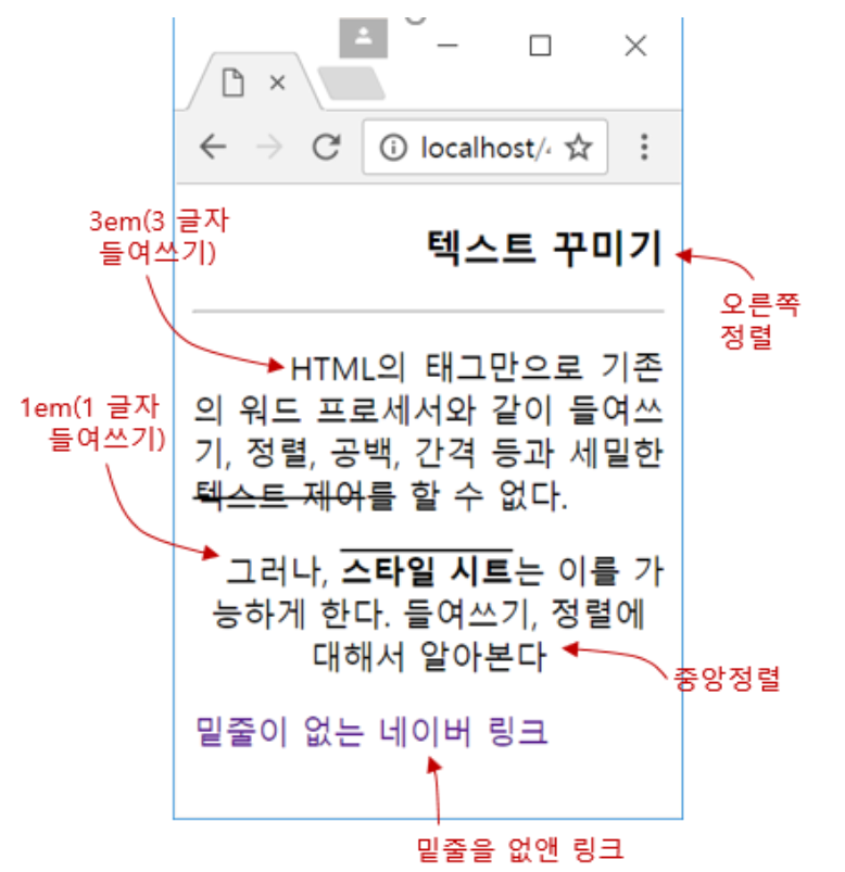
폰트 제어 CSS3 프로퍼티
-
font-family
font-family : arial, "times new Roman", Serif : -
font-size
font-size : 40px;
font-size : medium;
font-size : 1.6em;-
font-style
font-style : italic; -
font-weight
font-weight : 300; font-wieght : bold;
단축 프로퍼티, font
- font 프로퍼티
: font-style, font-weight, font-size, font-family를 순서대로 지정하는 단축 프로퍼티
ex) 20픽셀로 이탤릭 스타일에 bold 굵기로 consolas체
font : italic bold 20px consolas, sans-serif;
예시 코드)
<!DOCTYPE html>
<html>
<head><title>폰트</title>
<style>
body {
	font-family : "Times New Roman", Serif;
	font-size : large;
}
h3 {
	font : italic bold 40px consolas, sans-serif;
}
</style>
</head>
<body>
<h3>Consolas font</h3>
<hr>
<p style="font-weight:900">font-weight 900</p>
<p style="font-weight:100">font-weight 100</p>
<p style="font-style:italic">Italic Style</p>
<p style="font-style:oblique">Oblique Style</p>
<p>현재 크기의
	<span style="font-size:1.5em">1.5배</span>
	크기로</p>
</body>
</html>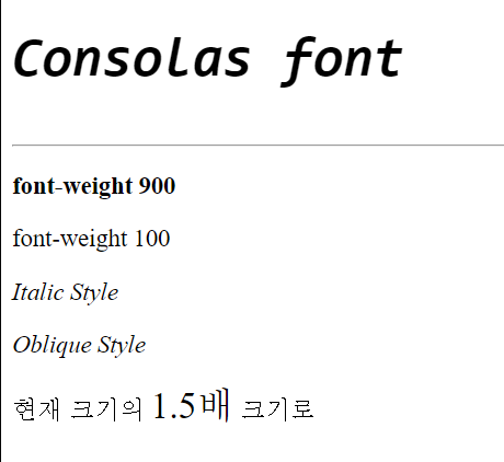
CSS3의 박스 모델
- HTML 태그는 사각형 박스로 다루어짐
- 박스 크기, 배경 색, 여백, 옆 박스와의 거리 등 제어 가능
박스 모델의 구성
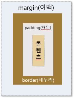
-
콘텐츠
: HTML 태그의 텍스트나 이미지가 출력되는 부분 -
패딩
: 콘텐츠를 직접 둘러싸고 있는 내부 여백 -
테두리
: 패딩 외부의 테두리로서 직선이나 점선 혹은 이미지로 테두리를 그릴 수 있음 -
여백
: 박스의 맨 바깥 영역이며 테두리 바깥의 공간으로 인접한 아래 위 이웃 태그의 박스와의 거리
예시 코드)
<!DOCTYPE html>
<html>
<head><title>박스 모델</title>
<style>
body { background : ghostwhite; }
Span { background : deepskyblue; }
div.box {
	background : yellow;
	border-style : solid;
 	border-color : peru;

	margin : 40px;
	border-width : 30px;
	padding : 20px;
}
</style>
</head>
<body>
	<div class="box">
		<span>DIVDIVDIV</span>
	</div>
</body>
</html>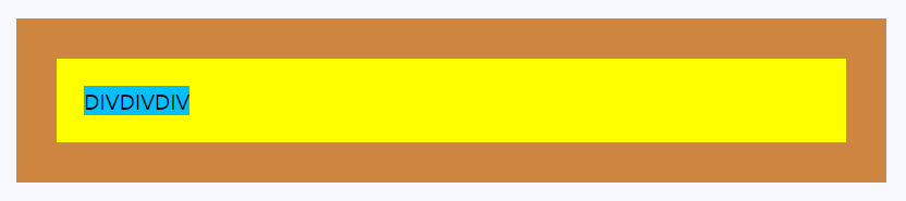
배경 다루기
background : 배경을 꾸미는 여러 값을 한 번에 지정하는 단축 프로퍼티
<!DOCTYPE html>
<html><head><title>배경 꾸미기</title>
<style>
div {
	background-color : skyblue;
	background-size : 100px 100px;
	background-image : url("media/spongebob.png");
	background-repeat : repeat-y;
	background-position : center center;
}
div {
	width : 200px;
	height : 200px;
	color : blueviolet;
	font-size : 16px;
}
</style>
</head>
<body>
<h3>div 박스에 배경 꾸미기</h3>
<hr>
<div>SpongeBob is an over-optimistic
 sponge that annoys other characters. </div>
</body>
</html>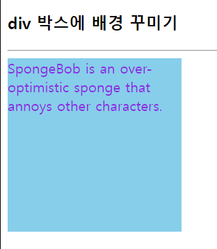
그림자
text-shadow 프로퍼티
text-shadow : h-shadow v-shadow blur-radius color|none
예시 코드 )
<!DOCTYPE html>
<html><head><title>텍스트 그림자</title>
<style>
div {
	font : normal 24px verdana;
}
.dropText {
	text-shadow : 3px 3px;
}
.redText {
	text-shadow : 3px 3px red;
}
.blurText {
	text-shadow : 3px 3px 5px skyBlue;
}
.glowEffect {
	text-shadow : 0px 0px 3px red;
}
.wordArtEffect {
	color : white;
	text-shadow : 0px 0px 3px darkBlue;
}
.threeDEffect {
	color : white;
	text-shadow : 2px 2px 4px black;
}
.multiEffect {
	color : yellow;
	text-shadow : 2px 2px 2px black,
					0 0 25px blue, 0 0 5px darkblue;
}
</style></head>
<body>
<h3>텍스트 그림자 만들기</h3>
<hr>
<div class="dropText">Drop Shadow</div>
<div class="redText">Color Shadow</div>
<div class="blurText">Blur Shadow</div>
<div class="glowEffect">Glow Effect</div>
<div class="wordArtEffect">WordArt Effect</div>
<div class="threeDEffect">3D Effect</div>
<div class="multiEffect">Multiple Shadow Effect</div>
</body>
</html>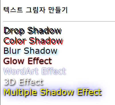
박스 그림자
box-shadow 프로퍼티
: 박스 전체에 그림자 효과
box-shadow : h-shadow v-shadow blur-radius spread-radius color|none|inset
예시 코드)
<!DOCTYPE html>
<html>
<head>
<title>div 박스에 그림자 만들기</title>
<style>
.redBox {
	box-shadow : 10px 10px red;
}
.blurBox {
	box-shadow : 10px 10px 5px skyBlue;
}
.multiEffect {
	box-shadow : 2px 2px 2px black,
			    			0 0 25px blue,
						   0 0 5px darkblue;
}
div {
	width : 150px;
	height : 70px;
    padding : 10px;
    border : 10px solid lightgray;
    background-image : url("media/spongebob.png");
    background-size : 150px 100px;
    background-repeat : no-repeat;
}
</style>
</head>
<body>
<h3>박스 그림자 만들기</h3>
<hr>
<div class="redBox">뚱이와 함께</div><br>
<div class="blurBox">뚱이와 함께</div><br>
<div class="multiEffect">뚱이와 함께</div>
</body>
</html>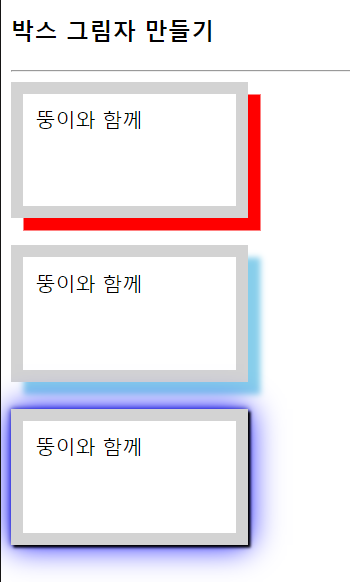
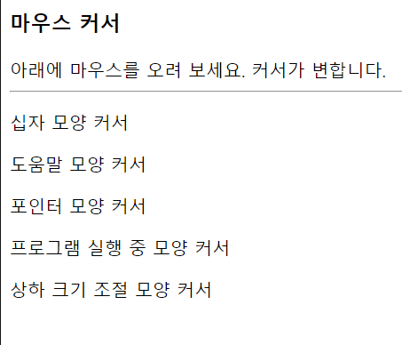
마우스 커서 제어
-cursor 프로퍼티
: HTML 태그 위에 마우스가 올라갈 때 마우스의 커서 모양 지정
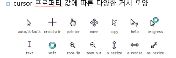
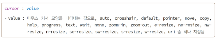
cursor : value
예시 코드)
<!DOCTYPE html>
<html>
<head><title>마우스 커서</title>
</head>
<body>
<h3>마우스 커서</h3>
아래에 마우스를 오려 보세요. 커서가 변합니다.
<hr>
<p style="cursor: crosshair">십자 모양 커서</p>
<p style="cursor: help">도움말 모양 커서</p>
<p style="cursor: pointer">포인터 모양 커서</p>
<p style="cursor: progress">프로그램 실행 중 모양 커서</p>
<p style="cursor: n-resize">상하 크기 조절 모양 커서</p>
</body>
</html>