디자인이라고는 모르는 BE 개발자가 react로 어드민 개발하는 방법
=> 라이브러리를 열심히 활용하기 ^^...
ant design을 고른 이유
라이브러리를 선택한 기준은 다음과 같다.
- 디자인 가이드가 있어야 함 (⭐️⭐️⭐️⭐️⭐️)
- 사용방법이 최대한 심플해야함 (⭐️⭐️⭐️⭐️⭐️)
- 많은 사람들이 사용하는 라이브러리 - 레퍼런스가 많아야함...
구글링을 해보았을때 1위는 Meterial UI, 2위는 Ant Design이라고 하여 둘 중에 고민하였으나 Ant Design의 심플함이 마음에 들어 선택.
알리바바 그룹에서 만들어서 (=중국꺼...) 아주 가끔 예시페이지에 갑분 중국어가 튀어나올 때가 있었지만 가이드가 영어로 제공되어 개발하는데 어려움은 없었다.
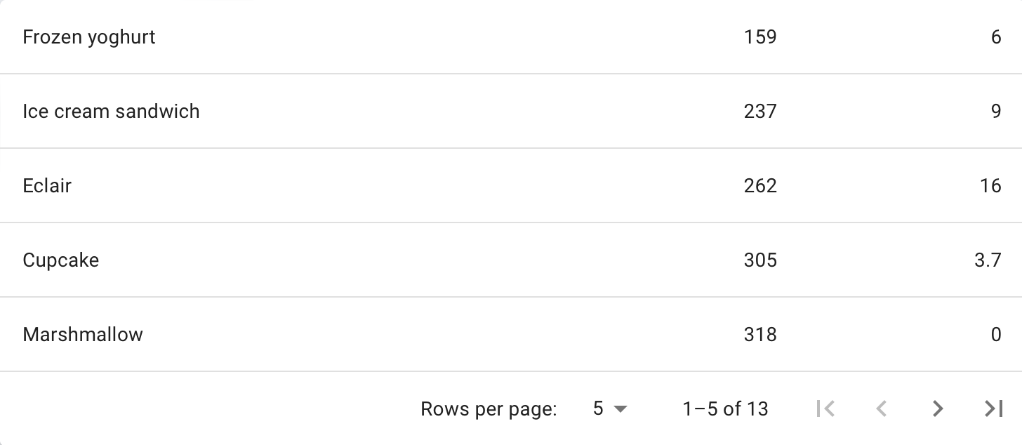
⬇️ Meterial UI - table
⬇️ Ant Design - table
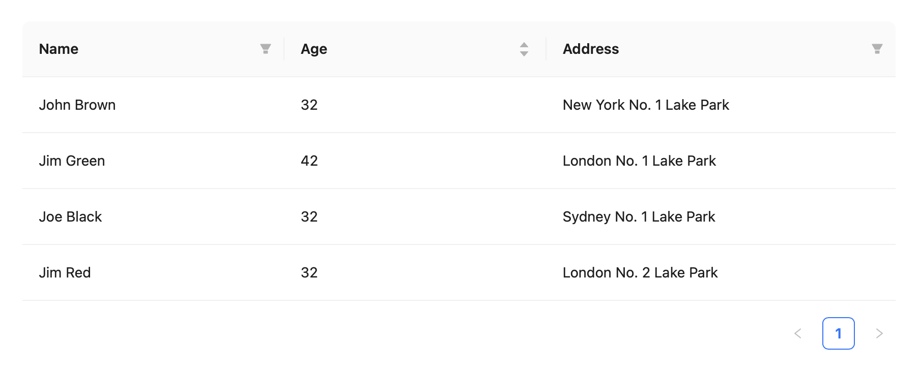
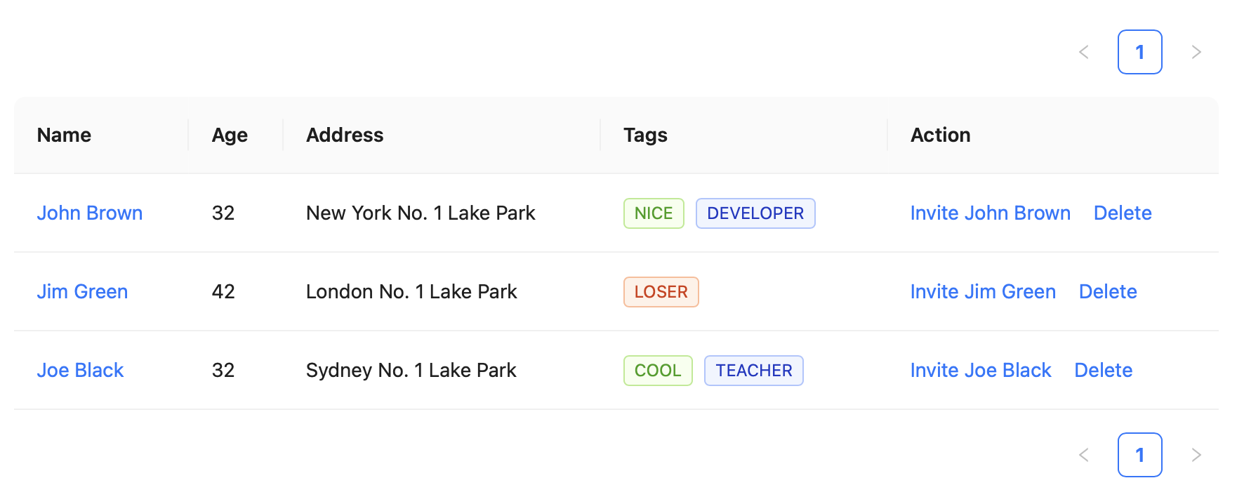
Table component 사용하기
ref: https://ant.design/components/table
- 사용한 기능
- pagination
- sorting
- filtering
1. dataSource & columns
테이블에 나타낼 데이터를 dataSource에 넣고, 해당 데이터의 속성(attribute)를 columns에 넣는다. (초단순)
- columns
- title : table에 보여지는 attribute 명
- dataIndex : dataSoure에 명시된 해당 데이터의 이름
- key : 구분값, 각 column이 다른 dataIndex를 가지고 있는 경우 생략 가능
const dataSource = [
{
key: '1',
name: 'Mike',
age: 32,
address: '10 Downing Street',
},
{
key: '2',
name: 'John',
age: 42,
address: '10 Downing Street',
},
];
const columns = [
{
title: 'Name',
dataIndex: 'name',
key: 'name',
},
{
title: 'Age',
dataIndex: 'age',
key: 'age',
},
{
title: 'Address',
dataIndex: 'address',
key: 'address',
},
];
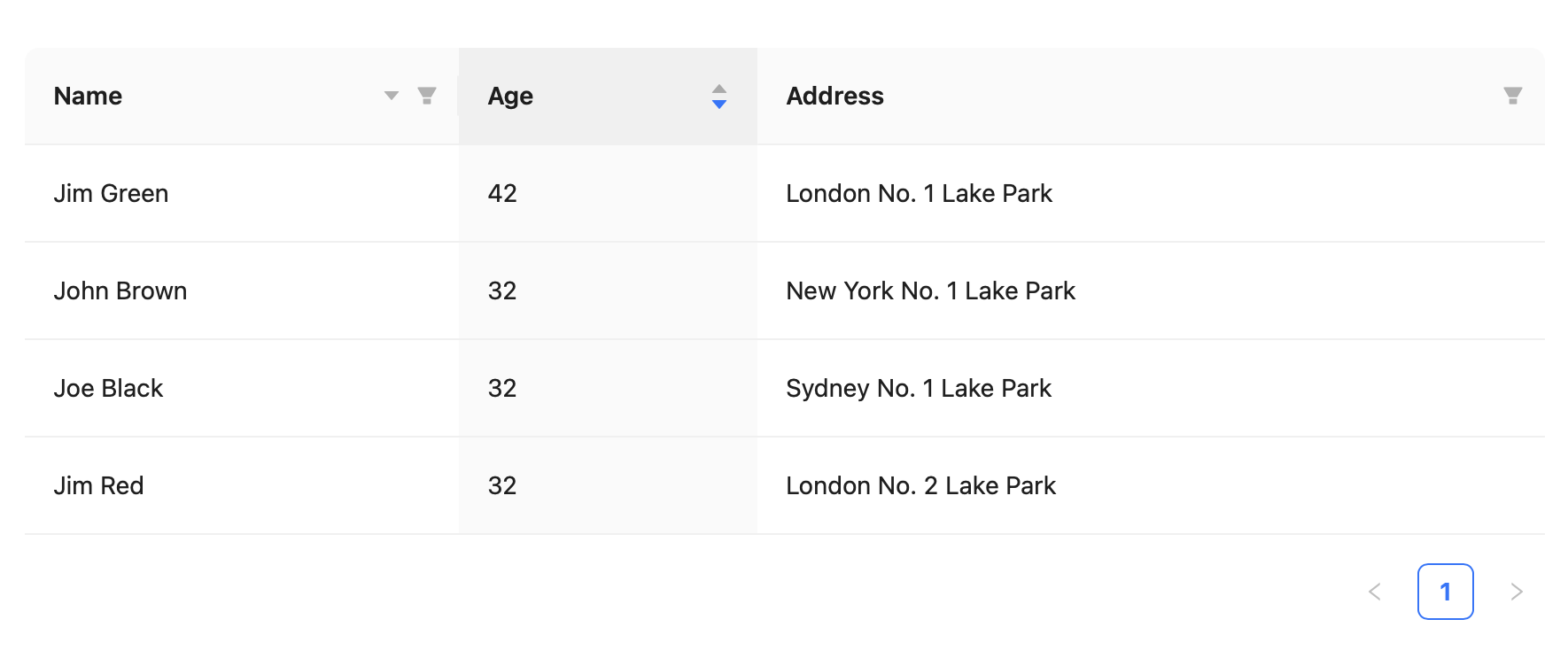
<Table dataSource={dataSource} columns={columns} />;2. Sorting
- columns의 각 attribute에 sorter(sorting function) 설정
- sortDirections :
['ascend' | 'descend']
const columns = [
  {
    title: 'Name',
    dataIndex: 'name',
    sorter: (a, b) => a.name.length - b.name.length,
    sortDirections: ['descend'],
  },
  {
    title: 'Age',
    dataIndex: 'age',
    defaultSortOrder: 'descend',
    sorter: (a, b) => a.age - b.age,
  },
  {
    title: 'Address',
    dataIndex: 'address'
  },
];
3. Filtering
- sorting과 마찬가지로, 각 attribute에 filtering 기준을 설정해준다.
- filtering icon을 클릭했을때 선택할 필터링 기준을 미리 설정해주어야 한다.
- filters:
[{text:"보여지는 값", value:"필터링하는 값"}]
- filters:
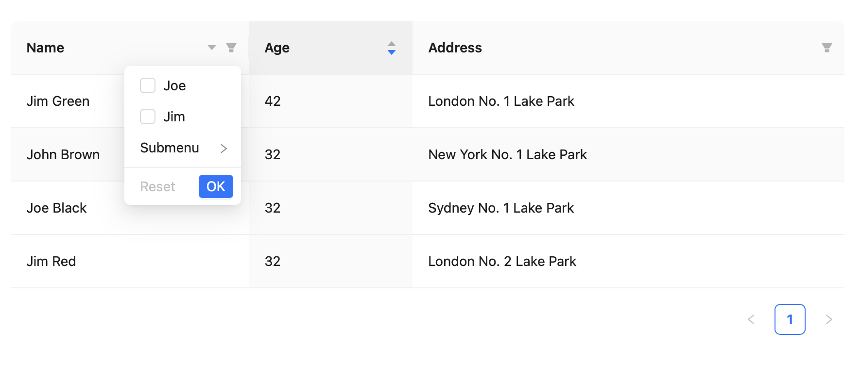
const columns = [
  {
    title: 'Name',
    dataIndex: 'name',
    filters: [
      {
        text: 'Joe',
        value: 'Joe',
      },
      {
        text: 'Jim',
        value: 'Jim',
      },
      {
        text: 'Submenu',
        value: 'Submenu',
        children: [
          {
            text: 'Green',
            value: 'Green',
          },
          {
            text: 'Black',
            value: 'Black',
          },
        ],
      },
    ],
    // specify the condition of filtering result
    // here is that finding the name started with `value`
    onFilter: (value, record) => record.name.indexOf(value) === 0,
    sorter: (a, b) => a.name.length - b.name.length,
    sortDirections: ['descend'],
  },
  {
    title: 'Age',
    dataIndex: 'age',
    defaultSortOrder: 'descend',
    sorter: (a, b) => a.age - b.age,
  },
  {
    title: 'Address',
    dataIndex: 'address',
    filters: [
      {
        text: 'London',
        value: 'London',
      },
      {
        text: 'New York',
        value: 'New York',
      },
    ],
    onFilter: (value, record) => record.address.indexOf(value) === 0,
  },
];
4. Pagination
- pageSize: 한페이지당 보이는 아이템 개수
- position: top/bottom 페이지 리스트 위치를 지정할 수 있다.
- hideOnSinglePage: 페이지가 1개밖에 없을 경우 페이지리스트를 숨기는 옵션
<Table
	columns={columns}
	dataSource={dataSource}
	pagination={{
        pageSize: 10,
    	position: ['topRight', 'bottomRight'],
        hideOnSinglePage: true
    }}
/>;
번외) Icon
ref: https://ant.design/components/icon
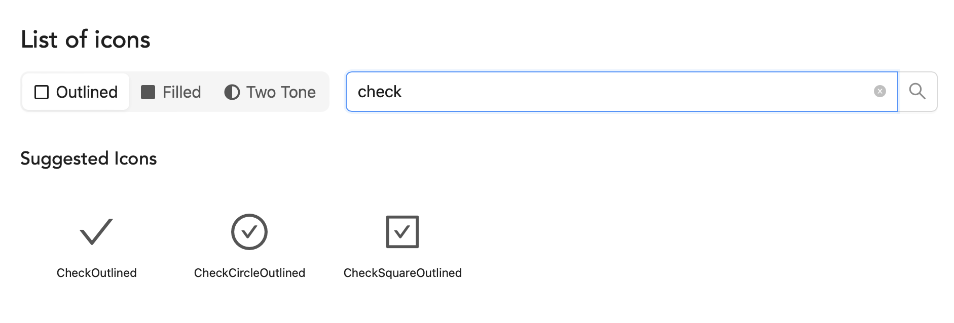
다양한 아이콘을 outlined / Filled / Two Tone 세가지 테마로 제공한다. 아주 깔꼬롬하고 style로 색상만 지정해주면 내 마음대로 쓸 수 있다!

매일매일 삽질중...