position:fixed와 postion:sticky
css만을 이용하여 스크롤 시 특정 엘리먼트를 좌표에 고정시켜놓고 싶을때 보통 두 옵션중 하나를 택하기 마련. position:fixed와 position: sticky.
하지만 나는 레이아웃을 만들때 fixed를 선호하지 않는다. 왜냐면...
position: fixed: The element is removed from the normal document flow, and no space is created for the element in the page layout. The element is positioned relative to its initial containing block, which is the viewport in the case of visual media. Its final position is determined by the values of top, right, bottom, and left.
출처 : https://developer.mozilla.org/en-US/docs/Web/CSS/position
설명처럼 position: fixed는 요소가 공간을 차지하지 않게 되는데, 이게 썩 골치아프다.
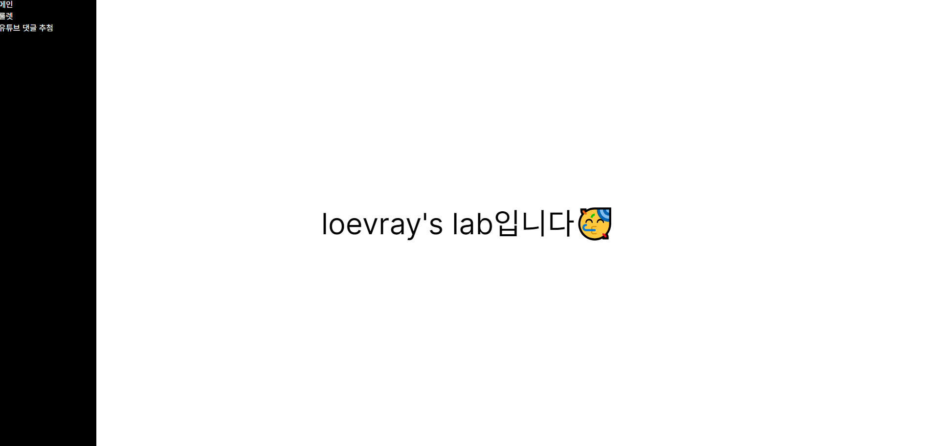
좌측 까만 영역(네비게이션바)이 스크롤 시 계속 따라오게 만들어야하고, 우측은 다양한 컨텐츠를 보여주기 위한 메인 레이아웃이라고 해보자.
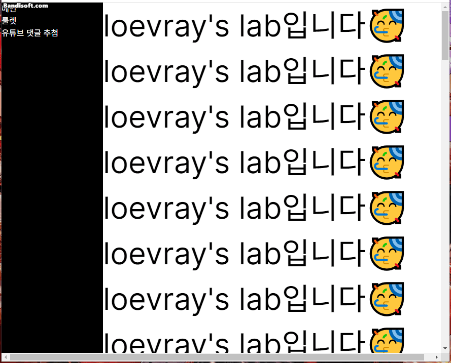
만약 좌측 영역에 position:fixed를 준다면, 공간을 차지하지 않게 된다.
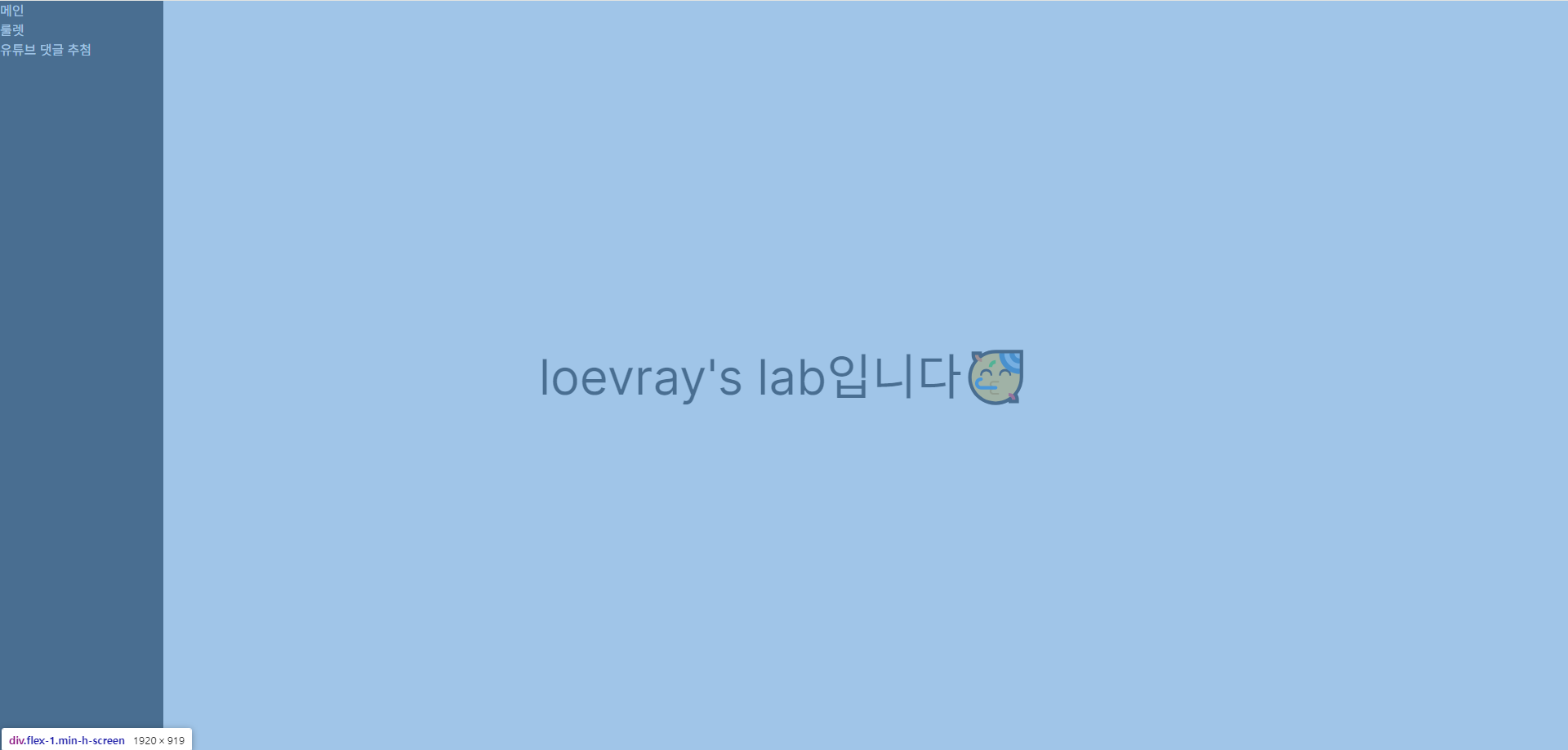
파란색으로 칠한 부분이 우측 엘리먼트다.
따라서 메인 레이아웃을 마크업할때, 자연스레 좌측 네비게이션 바의 너비 값을 알고 있어야한다. 예를들어 padding-left: 좌측 네비게이션바 너비 만큼 주고 사용한다던가. 특정 레이아웃의 너비를 저장해두고 계속 활용해야한다니, 얼마나 귀찮을까?
그래서 이런 생각을 해본다.
fixed처럼 작동하는데, 공간을 차지하면 어떨까?
이를 위한 태그가 position:sticky다. 근데 요녀석은 모르고 쓰면 살짝 문제가있다. 문제라기보단 원하는대로 동작하지 않는다
항상 설명서를 잘 읽어보자.
position:sticky를 잘 알고 사용하기
position:sticky를 사용할때 가끔 고정이 안될 때가 있다. 왜 그런지는 검색하면 나온다. 보통 조상 엘리먼트에 높이가 없어서 그런거라고 한다. 이는 사실이지만, sticky를 내맘대로 사용하려면 정의를 조금 더 명확히 알 필요가 있다.
position: sticky: The element is positioned according to the normal flow of the document, and then offset relative to its nearest scrolling ancestor and containing block (nearest block-level ancestor), including table-related elements, based on the values of top, right, bottom, and left. The offset does not affect the position of any other elements.
This value always creates a new stacking context. Note that a sticky element "sticks" to its nearest ancestor that has a "scrolling mechanism (created when overflow is hidden, scroll, auto, or overlay), even if that ancestor isn't the nearest actually scrolling ancestor.
출처는 MDN 공식문서(윗 목차와 동일)
테이블 관련 요소를 포함해 가장 가깝고 스크롤 가능한 부모 && 컨테이닝 블록을 기준으로 top, left, bottom, right 값에 따라 오프셋을 적용한다.
여기서 말하는 컨테이닝 블록이란 뭘까?
출처 : https://developer.mozilla.org/en-US/docs/Web/CSS/Containing_block
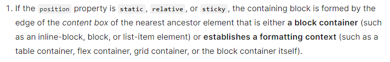
대부분 부모 엘리먼트를 뜻하지만, position: sticky일땐 가장 가까운 block(block, inline-block, list-item) 컨테이너 or 가장 가까우면서 formatting context를 형성하는 부모 엘리먼트(table, flex, grid, block컨테이너 본인)이다.
그러니까 요약하자면...
- 가장 가깝고 스크롤 가능해야하며
- 그중 block, inline-block, list-item, flex, grid, table인 부모 기준으로
top, left, bottom ,right값에 따라 오프셋이 적용된다.
재밌는 사실은 높이에 대한 얘기가 하나도 없다. 이게 어떻게 된 일일까? 항상 검색해서 찾는 해답은 부모 요소에 높이를 주어 해결하는 법 이었다.
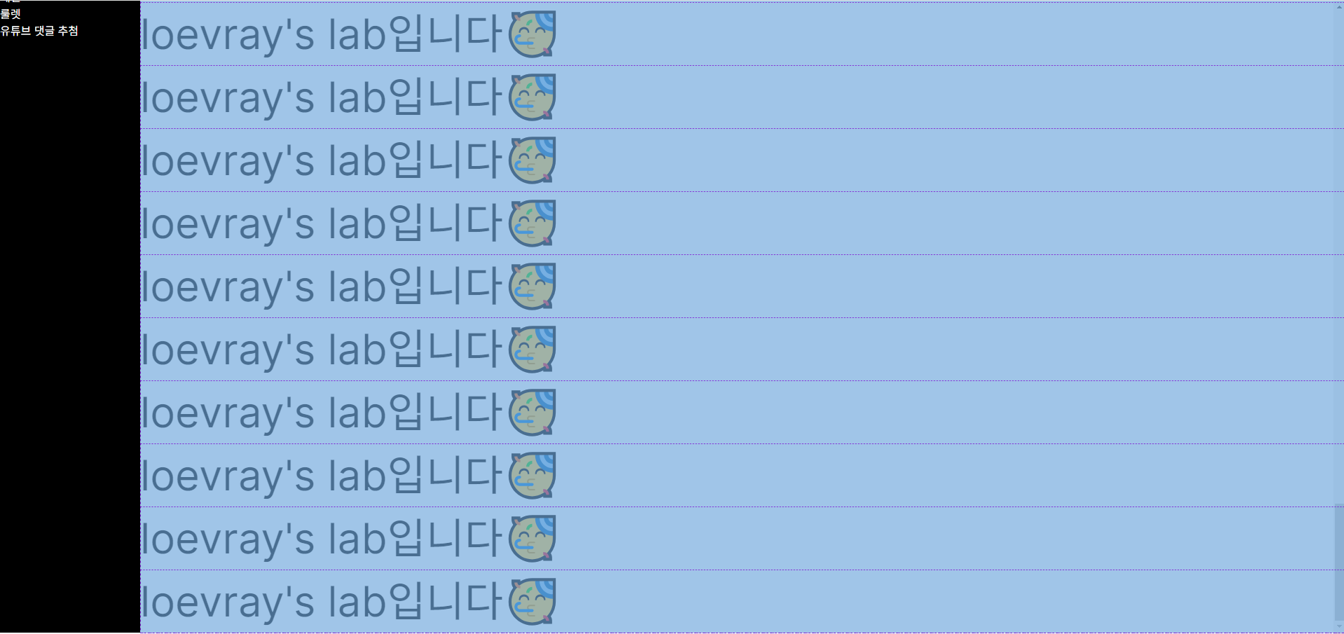
실제로 부모요소에 높이값이 명시적으로 들어있지 않지만, 가깝고 스크롤 가능한 부모+ formatting context를 형성하는 flex를 찾아서 잘 붙어있는 모습을 볼 수 있다.
여기서 작은 오류를 짚고넘어가자면, 좌측 영역이 마지막 장면에 부모 요소를 따라 미세하게 딸려올라간다.
잘 붙어있다가 왜 또 말썽을 피운걸까?
출처 : https://developer.mozilla.org/en-US/docs/Web/CSS/position
다른 컨테이닝 블록을 만나기 전까지 따라가다가, 이후부터는 stuck된다. 아니근데, 다른 컨테이닝블록이 어디있지...?🤨
=> x축 스크롤 바를 만나서 딸려올라갔던것. 이는 뷰포트와 관련이 깊다.
뷰포트 얘기는 다음에 자세히 하기로하고(ㅎㅎ) 어쨌든 x축 스크롤바를 없애면 미세하게 딸려 밀려올라가는 현상은 없어진다.
다시 높이 얘기로 돌아가서, 왜 대부분의 해답은 부모 요소 높이 지정으로 귀결되었던 걸까?
=> 부모 요소의 임계점을 늘리기 위해서다. 부모 요소가 다른 컨테이닝 블록 반대편 모서리를 만나면 해제되기에.
하지만 이번 학습으로 부모 요소 높이를 명시적으로 주지 않아도 된다는 것을 알게되었다!
스크롤 가능한데, 왜 안되지? (html,body태그의 특별함)
위에서 설명했듯, position:sticky는 flex등 뿐이 아니라 스크롤 가능한 조상에도 달라붙는다
Note that a sticky element "sticks" to its nearest ancestor that has a "scrolling mechanism" (created when overflow is hidden, scroll, auto, or overlay), even if that ancestor isn't the nearest actually scrolling ancestor.
우리의 끈끈이는 "스크롤 메커니즘" 에 부착된다. 스크롤 메커니즘이란 overflow: hidden, scroll, auto, overlay를 뜻한다.
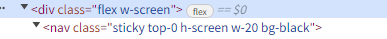
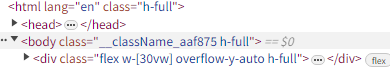
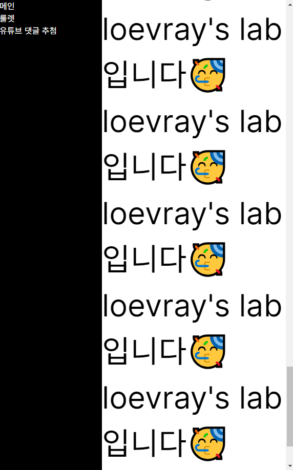
그렇다면 아래 레이아웃의 nav태그는 div에 줄곧 부착 될까?
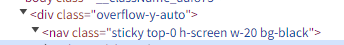
답은 아니오다.🙄
잠깐 짚고 넘어가자면, 아까 부모 요소에 overflow-y-auto를 지정하지 않고 flex만 적용했을때도 브라우저에 스크롤이 생겼다
UAs must apply the 'overflow' property set on the root element to the viewport. When the root element is an HTML "HTML" element or an XHTML "html" element, and that element has an HTML "BODY" element or an XHTML "body" element as a child, user agents must instead apply the 'overflow' property from the first such child element to the viewport, if the value on the root element is 'visible'. The 'visible' value when used for the viewport must be interpreted as 'auto'. The element from which the value is propagated must have a used value for 'overflow' of 'visible'.
출처 : https://www.w3.org/TR/CSS2/visufx.html#propdef-overflow
요약하자면...<body/>(html포함)태그는 overflow:auto를 가진다. 그 하위요소의 기본값이 overflow: visible이다.
실제로 부모요소 대신 body, html에 overflow-y-auto를 걸어주면, 놀랍게도 다시 우리의 끈끈이가 부모 요소에 착 달라붙어 끈끈해진다.
<body/>,<html/>태그는 어떤 특별함이 있길래 그런걸까?

출처 : https://www.w3.org/TR/CSS2/visudet.html#propdef-height
1.백분율은 containing block을 기준으로 계산된다. 예를들어 <body/>태그는 <html/>을 기준으로 계산된다. 단, 기준 높이가 없다면 'auto'취급을 받는다.
2. root element(html)은 이전에 설명했던 containing block대신 initial containg block높이의 영향을 받는다.
=> 분명 <html/>태그에는 명시적인 높이가 없다. 그러나 initial containing block이라는 초기 포함 블록의 영향을 받는다.
위 결론을 따라 한번 <html/>, <body/>태그에 height 100%를 주고, 바로 하위 자식인 <div/>태그에도 높이를 똑같이 줘보겠다.
끝까지 스크롤을 땡겼음에도 <nav/>태그가 잘 따라오는 모습을 볼 수 있다. 다만 높이를 이렇게 설정할 시 큰 문제가 생긴다.
<body/>태그의 높이가 브라우저 초기 크기에 고정되어 동적으로 커지지 않는다는 점이다.
<body/>태그의 높이에 min-height: 100vh or 100%를 주면 되지만, 이렇게 하면 다시 원하는대로 끈끈이가 동작하질 않는다. 결국 부모 요소에 명시적 높이를 주어야한다.
결론
position: sticky는 가장 가깝고 스크롤 가능한 부모(컨테이닝 블록)을 기준으로 움직인다.html, body태그는 기본적으로overflow: auto와 컨텐츠 기반 높이를 가진다.
2-1. 그렇기에overflow:visible을 제외한 값을 부모 요소에 사용할 시, 명시적 높이를 지정해주어야 한다.- 만약 부모 요소에
overlfow관련 스타일을 주지 않았다면, 부모 요소에 명시적 높이가 없어도 잘 작동할 것이다.