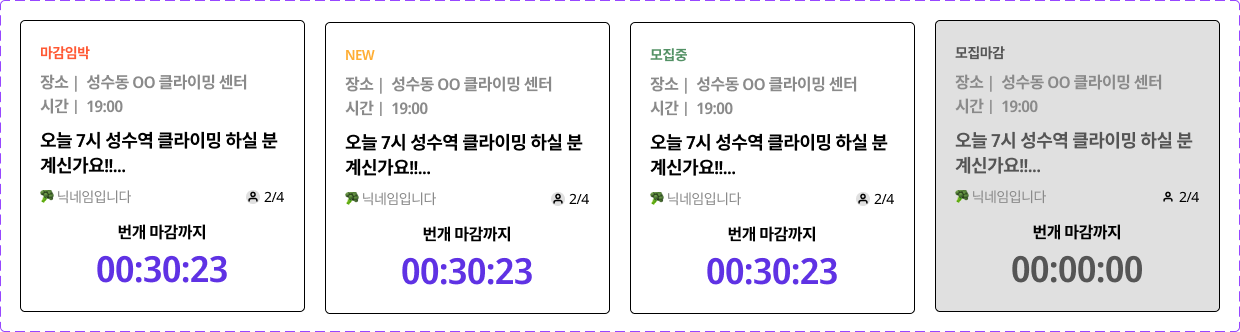
번개 카드 컴포넌트 마크업
번개 카드는 모집 현황에 따라 4개의 다른 UI를 갖는다.
const bungaeStatus = {
  // 번개 시간까지 1시간 이내
  imminent: {
    color: "statusRed",
    text: "마감임박"
  },
  // 번개 게시 1시간 이내
  new: {
    color: "statusYellow",
    text: "NEW"
  },
  // imminent나 new 상태는 아니지만 모집중
  recruiting: {
    color: "statusGreen",
    text: "모집중"
  },
  // 번개 시간이 지나 모집마감
  closed: {
    color: "statusGray",
    text: "모집마감"
  }
}
피그마로 만든 번개 카드 컴포넌트
<BungaeCard> 컴포넌트는 재사용성을 위해 아래와 아래와 같은 props를 가진다.
status: 모집 상태 객체place: 번개 장소time: 번개 시간title: 글 제목imoji: 유저 이모지nickname: 유저 닉네임numberOfParticipants: 참여자 수numberOfRecruits: 모집자 수duration: 번개 마감까지 기한
src/components/BungaeCard.js
import { Link } from "react-router-dom";
import styled, { css } from "styled-components";
const StyledBungaeCard = styled.li`
width: 285px;
height: 292px;
display: inline-flex;
flex-direction: column;
justify-content: space-between;
background: {(props) => props.theme.palette.white};
border: 1px solid black;
border-radius: 5px;
padding: 26px 20px;
${(props) =>
props.statusText === "모집마감" &&
css`
background: ${(props) => props.theme.palette.gray2};
`}
p {
display: inline-box;
}
> .status {
color: ${({ theme, statusColor }) => theme.palette[statusColor]};
font-size: 0.875rem;
font-weight: ${(props) => props.theme.fontWeight.bold};
margin-bottom: 14px;
}
> .place, .time {
color: ${(props) => props.theme.palette.gray4};
font-size: 1rem;
font-weight: ${(props) => props.theme.fontWeight.semiBold};
p:first-child {
margin-right: 8px;
}
}
> .place {
margin-bottom: 8px;
}
> .time {
margin-bottom: 14px;
}
> h1 {
font-size: 1.125rem;
font-weight: ${(props) => props.theme.fontWeight.bold};
margin-bottom: 12px;
line-height: 1.375rem;
height: 44px;
${(props) =>
props.statusText === "모집마감" &&
css`
color: ${({ theme, statusColor }) => theme.palette[statusColor]};
`}
}
> .bungaeInfo-nickname-numbers {
display: flex;
justify-content: space-between;
margin-bottom: 20px;
font-size: 0.875rem;
> .nickname, .numbers {
span:last-child {
margin-left: 4px;
}
}
> .numbers {
display: inline-flex;
align-items: center;
}
> .nickname {
color: ${(props) => props.theme.palette.gray4};
}
}
> .duration {
font-weight: ${(props) => props.theme.fontWeight.semiBold};
text-align: center;
> div {
color: ${(props) => props.theme.palette.mainViolet};
font-size: ${(props) => props.theme.fontSize["4xl"]};
font-weight: ${(props) => props.theme.fontWeight.bold};
margin-top: 10px;
${(props) =>
props.statusText === "모집마감" &&
css`
color: ${({ theme, statusColor }) => theme.palette[statusColor]};
`}
}
}
`;
function BungaeCard({
status,
place,
time,
title,
imoji,
nickname,
numberOfParticipants,
numberOfRecruits,
duration
}) {
return (
<Link>
<StyledBungaeCard statusColor={status.color} statusText={status.text}>
<div className="status">{status.text}</div>
<div className="place">
<p>장소 |</p>
<p>{place}</p>
</div>
<div className="time">
<p>시간 |</p>
<p>{time}</p>
</div>
<h1>{title}</h1>
<div className="bungaeInfo-nickname-numbers">
<div className="nickname">
<span>{imoji}</span>
<span>{nickname}</span>
</div>
<div className="numbers">
<img src="/images/recruit.svg" alt="recruit" />
<span>{`${numberOfParticipants}/${numberOfRecruits}`}</span>
</div>
</div>
<div className="duration">
<p>번개 마감까지</p>
<div>{duration}</div>
</div>
</StyledBungaeCard>
</Link>
);
}
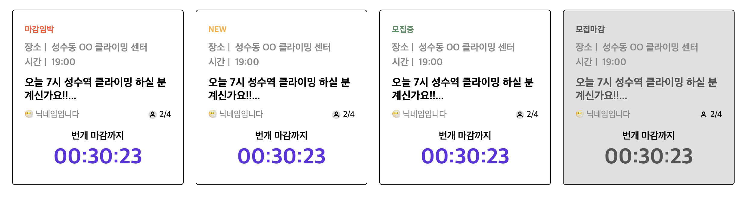
export default BungaeCard;번개 카드 컴포넌트를 사용해 메인 페이지에서 아래와 같이 출력 테스트를 해보았다. 추후 데이터들은 서버에서 받아와 렌더링하고, 작성 시간과 현재 시간을 계산해서 status와 duration의 상태는 프론트엔드 단에서 관리할 예정이다.
src/pages/BungaeMainPage.js
import BungaeCard from "../components/BungaeCard";
const bungaeStatus = {
imminent: {
color: "statusRed",
text: "마감임박"
},
new: {
color: "statusYellow",
text: "NEW"
},
recruiting: {
color: "statusGreen",
text: "모집중"
},
closed: {
color: "statusGray",
text: "모집마감"
}
};
function BungaeMainPage() {
return (
<div style={{ padding: "40px" }}>
<ul style={{ display: "flex", gridGap: "20px" }}>
<BungaeCard
status={bungaeStatus.imminent}
place="성수동 OO 클라이밍 센터"
time="19:00"
title="오늘 7시 성수역 클라이밍 하실 분 계신가요!!..."
imoji="😶🌫️"
nickname="닉네임입니다"
numberOfParticipants={2}
numberOfRecruits={4}
duration="00:30:23"
/>
<BungaeCard
status={bungaeStatus.new}
place="성수동 OO 클라이밍 센터"
time="19:00"
title="오늘 7시 성수역 클라이밍 하실 분 계신가요!!..."
imoji="😶🌫️"
nickname="닉네임입니다"
numberOfParticipants={2}
numberOfRecruits={4}
duration="00:30:23"
/>
<BungaeCard
status={bungaeStatus.recruiting}
place="성수동 OO 클라이밍 센터"
time="19:00"
title="오늘 7시 성수역 클라이밍 하실 분 계신가요!!..."
imoji="😶🌫️"
nickname="닉네임입니다"
numberOfParticipants={2}
numberOfRecruits={4}
duration="00:30:23"
/>
<BungaeCard
status={bungaeStatus.closed}
place="성수동 OO 클라이밍 센터"
time="19:00"
title="오늘 7시 성수역 클라이밍 하실 분 계신가요!!..."
imoji="😶🌫️"
nickname="닉네임입니다"
numberOfParticipants={2}
numberOfRecruits={4}
duration="00:30:23"
/>
</ul>
</div>
);
}
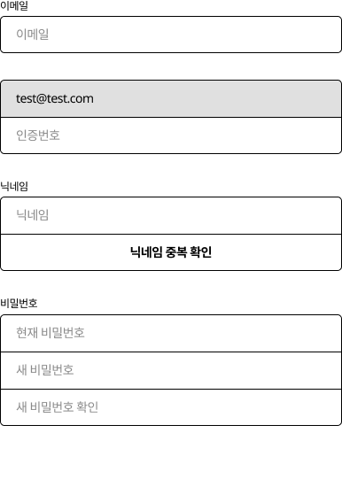
export default BungaeMainPage;인풋 컴포넌트 마크업
로그인, 회원가입, 이메일 인증 및 회원 정보 수정, 회원 탈퇴 페이지에서 일관된 스타일을 지닌 input 요소를 인풋 컴포넌트를 만들었다.
대체로 일관성 있는 디자인이지만 label 요소가 있을 때도, 없을 때도 있고 input 요소 2, 3개 붙어있거나 버튼과 함꼐 결합되는 디자인도 있어서 이를 props 및 조건부를 통해 필요에 따라 적절하게 활용할 수 있도록 작업했다.
피그마로 만든 인풋 디자인
<Input> 컴포넌트는 재사용성을 위해 아래와 아래와 같은 props를 가진다.
id: input idlabel: input labelname: input nametype: input type (default="text")placeholder: input placeholdervalue: input valueonChange: change 이벤트 핸들러onBlur: blur 이벤트 핸들러disabled: input disabledradius: input border-radius (default="default", "top", "bottom", "none")
src/components/UI/input.js
import styled, { css } from "styled-components";

const StyledInput = styled.div`
  width: 100%;

  > .label-wrapper {
    font-size: ${(props) => props.theme.fontSize.xs};
    margin-bottom: 6px;
  }

  > input {
    width: 100%;
    min-height: 42px;
    padding: 0px 18px;
    font-size: ${(props) => props.theme.fontSize.sm};
    border: 1px solid black;
    border-radius: 5px 5px 5px 5px;

    ${({ radius }) => {
      if (radius === "none") {
        return css`
          border-radius: 0px;
          border-bottom: 0px;
        `;
      }
      if (radius === "top") {
        return css`
          border-bottom-right-radius: 0px;
          border-bottom-left-radius: 0px;
          border-bottom: 0px;
        `;
      }
      if (radius === "bottom") {
        return css`
          border-top-left-radius: 0px;
          border-top-right-radius: 0px;
        `;
      }
    }}
  }
`;

function Input({
  id,
  label,
  name,
  type = "text",
  placeholder,
  value,
  onChange,
  onBlur,
  disabled,
  radius = "default"
}) {
  return (
    <StyledInput radius={radius}>
      {label && (
        <div className="label-wrapper">
          <label htmlFor={id}>{label}</label>
        </div>
      )}
      <input
        id={id}
        name={name}
        type={type}
        placeholder={placeholder}
        value={value}
        onChange={onChange}
        onBlur={onBlur}
        disabled=<{disabled}
      />
    </StyledInput>
  );
}

export default Input;
인풋 컴포넌트를 사용해 메인 페이지에서 아래와 같이 출력 테스트를 해보았다.

src/pages/BungaeMain.js
import styled from "styled-components";

import Button from "../components/UI/Button";
import Input from "../components/UI/Input";

const Wrapper = styled.div`
  padding-top: 40px;
  max-width: 386px;
  margin: 0 auto;
`;

function BungaeMainPage() {
  return (
    <Wrapper>
      <div style={{ marginBottom: "30px" }}>
        <Input id="이메일" label="이메일" placeholder="이메일" />
      </div>
      <div style={{ marginBottom: "30px" }}>
        <Input value="test@test.com" radius="top" disabled />
        <Input radius="bottom" />
      </div>
      <div style={{ marginBottom: "30px" }}>
        <Input id="닉네임" label="닉네임" value="닉네임입니다" radius="top" />
        <Button outline fullWidth radius="bottom">
          닉네임 중복 검사
        </Button>
      </div>
      <div>
        <Input
          id="비밀번호"
          label="비밀번호"
          placeholder="현재 비밀번호"
          radius="top"
        />
        <Input placeholder="새 비밀번호" radius="none" />
        <Input placeholder="새 비밀번호 확인" radius="bottom" />
      </div>
    </Wrapper>
  );
}

export default BungaeMainPage;
starter