버튼 컴포넌트 마크업
styled-component의 createGlobalStyle을 이용한 전역 스타일 설정에서 버튼 요소는 아래와 같은 스타일을 기본으로 한다.
src/styles/GlobalStyles.js
button {
    background: transparent;
	cursor: pointer;
    }
추가로 styled-components의 ThemeProvider를 활용해 공통 스타일을 적용하여 코드의 통일성을 높이고 유지 보수를 효율적으로 할 수 있도록 관리하고자 한다. 우선 당장 필요한 기본적인 값들을 설정하고 필요할 때마다 점차 추가/수정해 나갈 것이다.
src/styles/theme.js
const fontSize = {
  xs: "0.75rem", // 12px
  sm: "0.875rem", // 14px
  base: "1rem", // 16px
  md: "1.125", // 18px
  lg: "1.25rem" // 20px
};

const fontWeight = {
  semiBold: 600,
  bold: "bold"
};

const palette = {
  mainViolet: "#5F32E4",
  mainMauve: "#E5E2F6",
  black: "black",
  white: "white"
};

const theme = { fontSize, fontWeight, palette };

export default theme;
<Button> 컴포넌트는 재사용성을 위해 아래와 아래와 같은 props를 가진다.
childrenbackground: 배경색 (theme.js파일 참조)color: 폰트색 (theme.js파일 참조)size: large, medium (default), smalloutline: border (1px solid black)noPadding: padding 0fullWidth: width 100%marginTop: marginTop 조정 @ 23/05/09 추가radius: radius 조정 @ 23/05/09 추가iconWidth: img 태그를 감싸는 div 요소에 적용될 width @ 23/05/10 추가iconWithText: 이미지 + 텍스트 조합의 버튼 (margin-right) @ 23/05/10 추가
src/components/ui/Button.js
import styled, { css } from "styled-components";

// 버튼 background, color
const colorStyles = css`
  ${({ theme, background, color }) => {
    const selectedBg = theme.palette[background];
    const selectedColor = theme.palette[color];
    return css`
      background: ${selectedBg};
      color: ${selectedColor};
    `;
  }}
`;

const sizes = {
  large: {
    height: "3rem",
    fontSize: "1.25rem"
  },
  medium: {
    height: "2.875rem",
    fontSize: "1rem"
  },
  small: {
    height: "1.75rem",
    fontSize: "0.875rem"
  }
};


// 버튼 height, font-size에 따라 large, medium, small 3개로 분류
const sizeStyles = css`
  ${({ size }) => css`
    height: ${sizes[size].height};
    font-size: ${sizes[size].fontSize};
  `}
`;

// 버튼 width 100%
const fullWidthStyle = css`
  ${(props) =>
    props.fullWidth &&
    css`
      width: 100%;
      justify-content: center;
    `}
`;

const StyledButton = styled.button`
  /* 버튼 공통 스타일 */
  display: inline-flex;
  align-items: center;
  font-weight: ${(props) => props.theme.fontWeight.semiBold};
  outline: none;
  border: none;
  border-radius: 5px;
  ${({ radius }) =>
    radius === "bottom" &&
    css`
      border-top-left-radius: 0px;
      border-top-right-radius: 0px;
    `}

  padding-right: 0.875rem;
  padding-left: 0.875rem;
  ${({ marginTop }) =>
    marginTop &&
    css`
      margin-top: ${marginTop};
    `}


/* props에 따라 다른 스타일 적용 */

  ${colorStyles}

  ${sizeStyles}

  ${(props) =>
    props.outline &&
    css`
      border: 1px solid black;
    `}

  ${(props) =>
    props.noPadding &&
    css`
      padding: 0rem;
    `}

  ${fullWidthStyle}

  > .icon-with-text {
    margin-right: 6px;
  }
`;

function Button({
  children,
  background,
  color,
  size = "medium",
  outline,
  noPadding,
  fullWidth,
  marginTop,
  radius
}) {
  return (
    <StyledButton
      background={background}
      color={color}
      size={size}
      outline={outline}
      noPadding={noPadding}
      fullWidth={fullWidth}
      marginTop={marginTop}
      radius={radius}
    >
      {children}
    </StyledButton>
  );
}

export default Button;
메인 네비게이션 컴포넌트 마크업
메인 네비게이션은 다음 3가지와 관련된 props를 받아서 페이지와 상태에 따라 동적으로 UI가 변경돼야 한다.
- 로그인 상태인지 아닌지
- 검색바가 필요한지 필요 없는지
- 로고만 보여줄 것인지 아닌지
피그마로 만든 메인 네비게이션 컴포넌트
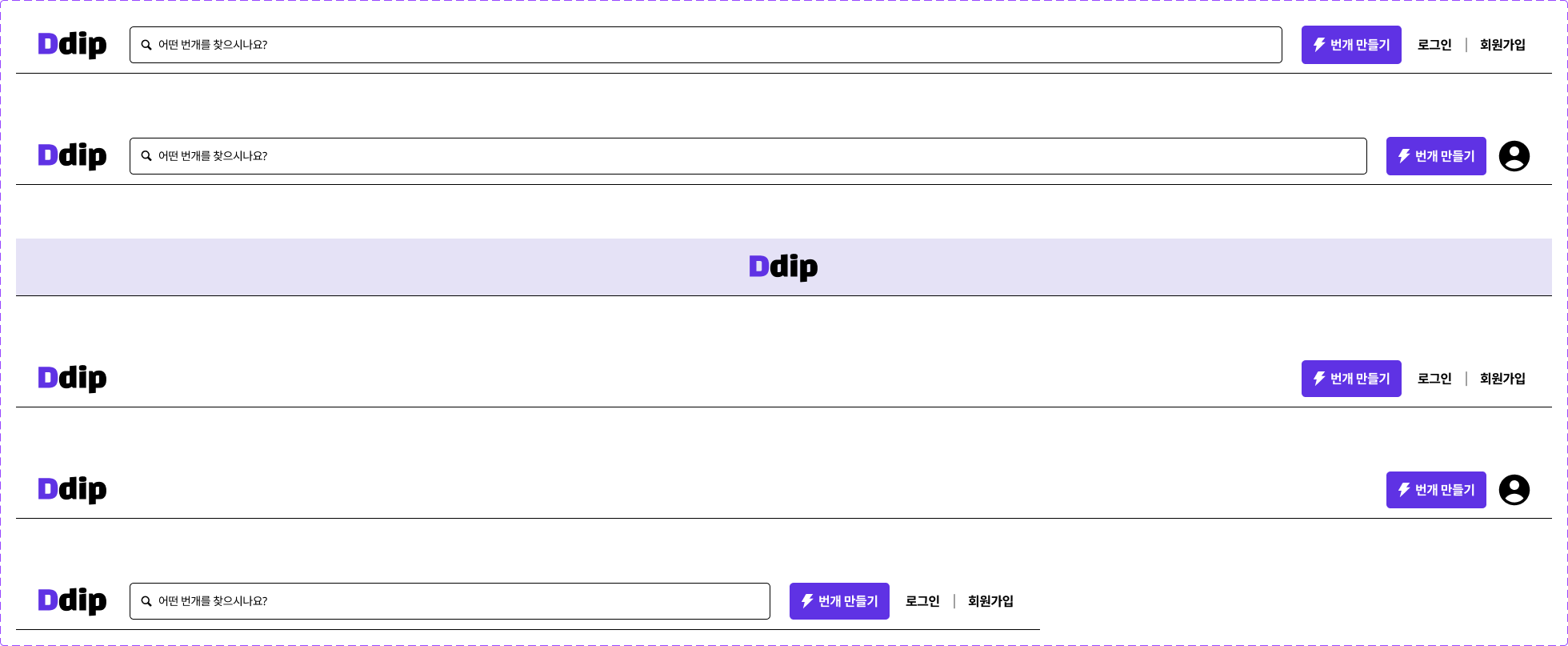
<MainNavigation> 컴포넌트는 재사용성을 위해 아래와 아래와 같은 props를 가진다.
logoOnly: 메인 네비게이션 중앙에 로고만 있는 레이아웃 (로그인, 회원 가입, 이메일 인증 페이지)noSearchBox: 메인 네비게이션에 검색바가 없는 레이아웃 (검색 페이지)loggedIn: 로그인 했을 때 레이아웃
src/componenets/MainNavigation.js
import styled, { css } from "styled-components";

import Button from "./UI/Button";

const Header = styled.header`
  position: sticky;
  top: 0;
  width: 100%;
  height: 72px;
  display: flex;
  align-items: center;
  padding-right: 1.5rem;
  padding-left: 1.5rem;
  border-bottom: 1px solid black;
  background: white;

  > .search-box {
    height: 46px;
    flex-grow: 1;
    display: flex;
    align-items: center;
    padding-right: 0.875rem;
    padding-left: 0.875rem;
    margin-right: 1.5rem;
    margin-left: 1.5rem;
    border: 1px solid black;
    border-radius: 5px;
    font-size: 0.875rem;

    > img {
      margin-right: 8px;
      margin-bottom: 2px;
    }
  }

  > .right-buttons {
    display: flex;
    > .auth-buttons {
      display: flex;
      align-items: center;
      padding: 2px;
      margin-left: 0.7rem;

      > hr {
        width: 1px;
        height: 12px;
        margin: 8px;
      }
    }
  }

  ${(props) =>
    props.logoOnly &&
    css`
      justify-content: center;
      background: ${props.theme.palette.mainMauve};
    `}

  ${(props) =>
    props.noSearchBox &&
    css`
      justify-content: space-between;
    `}
`;

function MainNavigation({ logoOnly, noSearchBox, loggedIn }) {
  if (logoOnly) {
    return (
      <Header logoOnly={logoOnly}>
        <img src="/images/logo.svg" alt="logo" />
      </Header>
    );
  }

  return (
    <Header noSearchBox={noSearchBox}>
      <img src="/images/logo.svg" alt="logo" />
      {!noSearchBox && (
        <div className="search-box">
          <img src="/images/search.svg" alt="search" />
          <span>어떤 번개를 찾으시나요?</span>
        </div>
      )}
      <div className="right-buttons">
        <Button background="mainViolet" color="white">
          <img
            className="icon-with-text"
            src="/images/thunder.svg"
            alt="thunder"
          />
          <span>번개 만들기</span>
        </Button>
        <div className="auth-buttons">
          {loggedIn ? (
            <img src="/images/user.svg" alt="user" />
          ) : (
            <>
              <Button noPadding>회원가입</Button>
              <hr />
              <Button noPadding>로그인</Button>
            </>
          )}
        </div>
      </div>
    </Header>
  );
}

export default MainNavigation;
starter