
📝 오늘 한 것
- grid - minmax() / auto-fill, auto-fit / min-content, max-content
📚 배운 것
1. grid
1) minmax()
minmax()를 이용해 grid item의 최솟값과 최댓값을 정할 수 있다.
예를 들어, grid item의 너비를 가능한 한 크게 만들고 싶지만 100px 이하로는 작아지지 않기를 원할 때 minmax(100px, 1fr) 이라고 설정할 수 있다.
grid-template-columns: repeat(4, minmax(100px, 1fr));
grid-auto-flow: column;
grid-auto-columns: minmax(100px, 1fr);
2) auto-fill / auto-fit
auto-fill과 auto-fit은 repeat()에서만 사용한다.
작은 화면에서는 auto-fill과 auto-fit은 차이가 없다.
그러나, grid item의 수보다 화면의 크기가 커지면 auto-fill과 auto-fit은 차이를 보인다.
grid item의 수나 크기를 사전에 알 수 없거나 반응형 디자인을 할 때 유용하게 이용할 수 있다.
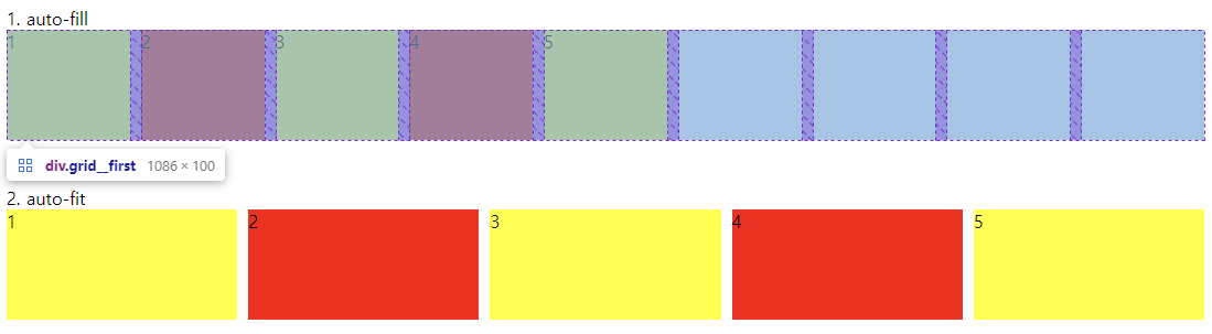
(1) auto-fill
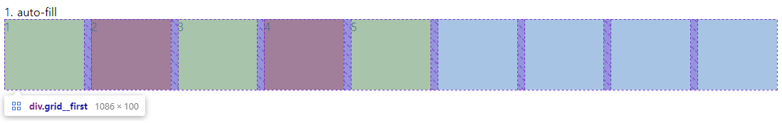
.grid {
  display: grid;
  gap: 10px;
  grid-auto-rows: 100px;
  grid-template-columns: repeat(auto-fill, minmax(100px, 1fr));
}
row를 columns로 채운다.
위와 같이 grid item의 수가 적어서 row를 다 채우지 못한다면 빈 columns로라도 row를 다 채운다.
(2) auto-fit
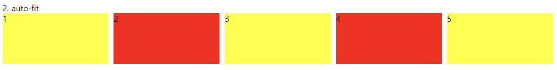
.grid__second {
  display: grid;
  gap: 10px;
  grid-auto-rows: 100px;
  grid-template-columns: repeat(auto-fit, minmax(100px, 1fr));
}
row에 딱 맞도록 현재 grid item들을 늘린다.
3) min-content / max-content
repeat(), minmax()와 함께 사용함으로써 완벽하게 반응형 디자인을 구현할 수 있다.
(1) min-content
min-content는 어절 단위로 끊었을 때 가장 긴 단어를 기준으로 하는 최소 너비를 말한다.
box를 content가 작아질 수 있는 만큼 작게 만든다.
(2) max-content
max-content는 content가 wrap 되지 않기 위해 필요한 최대 높이 혹은 너비를 말한다.
box를 content를 포함하기 위해 필요한 만큼 크게 만든다.
(3) 반응형 디자인
grid를 이용해 반응형 디자인을 구현해보려고 한다.
<div class="grid">
  <div class="item">Lorem ipsum dolor sit amet.</div>
  <div class="item">Lorem, ipsum dolor sit amet consectetur</div>
  <div class="item">Lorem, ipsum dolor.</div>
  <div class="item">
    Lorem ipsum dolor sit amet consectetur adipisicing elit. Quasi
  </div>
</div>
.grid {
display: grid;
gap: 10px;
grid-template-columns: repeat(5, minmax(max-content, 1fr)); 💡
grid-auto-rows: 100px;
}
grid item의 column의 너비의 최솟값은 content가 wrap 되지 않기 위해 필요한 최대값(max-content)로 설정하고, grid item의 column의 너비의 최댓값은 1fr로 설정했다.
1, 2, 4번째 div는 전자가, 3번째 div는 후자가 적용된 것을 확인할 수 있다.
한편, auto-fit, minmax, max-content를 혼용하여 또 다른 반응형 디자인을 구현할 수 있다.
.grid {
  display: grid;
  gap: 10px;
  grid-template-columns: repeat(auto-fit, minmax(120px, max-content));
  grid-auto-rows: 100px;
}
위 경우에는
auto-fit을 지정했기 때문에 row에 딱 맞도록 현재 grid item들이 늘어나야 한다.
그러나minmax(120px, max-content)로 인해 grid item은 120px 이하로는 작아질 수 없고, 'max-content 이상으로는 커질 수 없다.'
✨ 내일 할 것
- grid
