
📝 오늘 한 것
- grid - place-content / place-self / grid-auto-rows / grid-auto-flow / grid-auto-columns
📚 배운 것
1. grid
1) place content
(1) justify-content
grid의 content를 수평적으로 정렬하기 위해 justify-content를 사용해야 한다.
<div class="grid">
  <div class="header"></div>
  <div class="content"></div>
  <div class="nav"></div>
  <div class="footer"></div>
</div>
row와 column의 크기를 지정하기 위해 fr 대신 pixel을 사용했다.
.grid {
  display: grid;
  gap: 10px;
  height: 50vh;
  grid-template-columns: repeat(4, 100px);
  grid-template-rows: repeat(4, 100px);
  justify-content: space-evenly;
  background: black;
}
보다시피 justify-content의 값과는 상관없이 grid container(검정색으로 표현된 div.grid)의 크기는 변하지 않았다.
justify-content는 grid의 content를 수평적으로 정렬하는 방식에 영향을 미칠 뿐이다.
(2) align-content
grid의 content를 수직적으로 정렬하기 위해 align-content를 사용해야 한다.
<div class="grid">
  <div class="header"></div>
  <div class="content"></div>
  <div class="nav"></div>
  <div class="footer"></div>
  <div class="header"></div>
  <div class="content"></div>
  <div class="nav"></div>
  <div class="footer"></div>
  <div class="header"></div>
  <div class="content"></div>
  <div class="nav"></div>
  <div class="footer"></div>
  <div class="header"></div>
  <div class="content"></div>
  <div class="nav"></div>
  <div class="footer"></div>
</div>
뚜렷하게 비교하기 위해 justify-content 예제에서 코드를 약간 수정해줬다.
.grid {
  display: grid;
  gap: 10px;
  height: 80vh;
  grid-template-columns: repeat(4, 50px);
  grid-template-rows: repeat(4, 50px);
  align-content: space-between;
  background: black;
}
마찬가지로 align-content의 값과는 상관없이 grid container(검정색으로 표현된 div.grid)의 크기는 변하지 않았다.
align-content는 grid의 content를 수직적으로 정렬하는 방식에 영향을 미칠 뿐이다.
(3) place-content
place-content: align-content 값(수직) justify-content 값(수평);

.grid {
display: grid;
gap: 10px;
height: 80vh;
grid-template-columns: repeat(4, 50px);
grid-template-rows: repeat(4, 50px);
place-content: center end;
background: black;
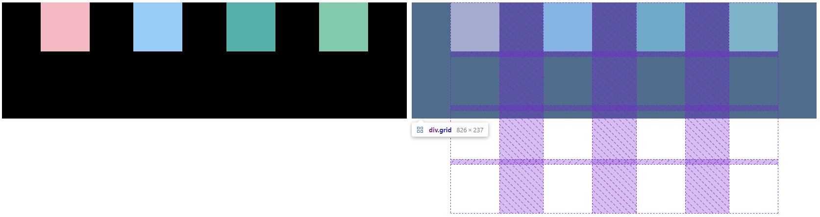
}💡 place-items VS place-content
grid에서 place-items와 place-content를 구별해야 한다.
place-items는 (비록 전체적으로 똑같이 적용될지라도) 그 대상이 각 사각형 하나하나인 반면, place-content는 모든 사각형이다..grid { display: grid; gap: 10px; height: 80vh; grid-template-columns: repeat(4, 50px); grid-template-rows: repeat(4, 50px); place-content: center end; ❗ place-items: center end; ❗ background: black; } /* place-items가 적용될 수 있도록 width와 height를 추가했다 */ .header { background-color: lightpink; width: 20px; height: 20px; } .content { background-color: lightskyblue; width: 20px; height: 20px; } .nav { background-color: lightseagreen; width: 20px; height: 20px; } .footer { background-color: mediumaquamarine; width: 20px; height: 20px; }

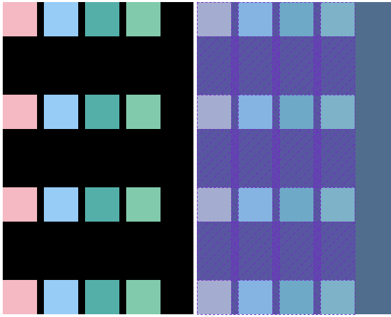
2) place-self
하나의 grid item에만 적용하기 위해 justify-self, align-self를 사용할 수 있다.
부모 컨테이너가 아닌 자식 컨테이너에서 사용함으로써 전체가 아니라 하나의 grid item에만 개별적으로 적용할 수 있다는 점에서 justify-items, align-items와 구별된다.

.grid {
  display: grid;
  gap: 10px;
  height: 80vh;
  grid-template-columns: repeat(4, 50px);
  grid-template-rows: repeat(4, 50px);
  place-content: center end;
  place-items: center end;
  background: black;
}

.header {
  background-color: lightpink;
  justify-self: start;
  align-self: end;
  width: 20px;
  height: 20px;
}
물론 justify-self와 align-self 또한 place-self를 이용해 한번에 작성할 수 있다.
( place-self: align-self 값(수직) justify-self 값(수평); )
3) auto columns & rows
(1) auto columns & rows가 필요한 이유
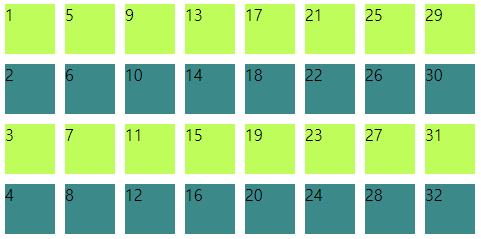
.item*32>{$}.grid {
display: grid;
gap: 10px;
grid-template-columns: repeat(4, 50px);
grid-template-rows: repeat(4, 50px);
}
.item:nth-child(odd) {
background-color: greenyellow;
}
.item:nth-child(even) {
background-color: darkcyan;
}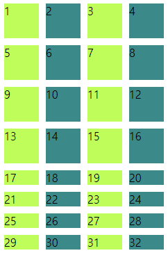
element는 많지만 columns와 rows를 4줄 4칸밖에 만들지 않아서 17번째 item부터는 text(숫자)의 height만큼만 공간을 차지할 뿐이다. (한 줄의 text가 모두 없었다면 그 줄은 화면에서 보이지 않았을 것.)
(2) grid-auto-rows
grid container에 grid-template-rows를 사용해 지정한 것 이상으로 더 많은 grid item이 있을 때 혹은 grid container에 grid-template-rows를 아예 사용하지 않았을 때 grid-auto-rows의 값을 기본값으로 사용하여 row를 생성할 수 있다.
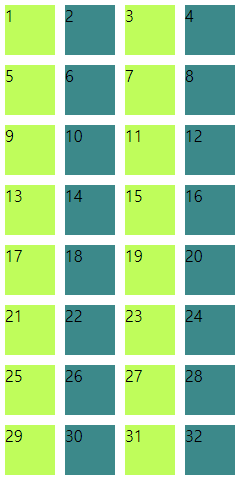
.grid {
  display: grid;
  gap: 10px;
  grid-template-columns: repeat(4, 50px);
  grid-template-rows: repeat(4, 50px);
  grid-auto-rows: 50px; ❗
}
(3) grid-auto-flow: column / grid-auto-columns
grid container에 grid-auto-flow: column을 지정하면 grid-template-rows에 의해 지정된 rows의 수보다 더 많은 div가 있을 때 추가적으로 rows를 생성하지 않고 columns를 생성한다.
새롭게 생성된 columns는 grid-auto-columns의 값을 기본값으로 사용한다.
.grid {
  display: grid;
  gap: 10px;
  grid-template-columns: repeat(4, 50px);
  grid-template-rows: repeat(4, 50px);
  grid-auto-flow: column; ❗
  grid-auto-columns: 50px; ❗
}
대부분의 경우에 grid-auto-rows이 사용되지만, 대표적으로 달력을 만들 때 grid-auto-flow: columns와 grid-auto-columns를 사용할 수 있다.
✨ 내일 할 것
- grid
