
CRISP-DM
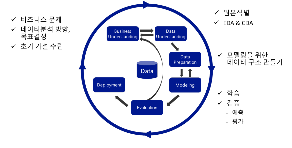
Business Understanding
- 비즈니스 목표에서 데이터 분석 목표로 순차적으로 내려가야함
Data Understanding
- 있는 데이터, 없는 데이터를 구분
- 있는 데이터 --> 바로 사용가능한 데이터, 가공해야 사용가능한 데이터
- 검토 및 과제수행
- 없는 데이터 --> 취득 가능한 데이터, 취득 불가능한 데이터
- 취득 가능시 --> 취득 비용 산정 후 과제 행
- 취득 불가능시 --> 의미정리, 정보 분할, 최대한 가용가능하게
Data Preparation
- 결측치 조치, 가변수화, 스케일링
데이터 전처리시 알아둬야 할 것
    1. 모든 셀은 값이 있어야 한다 (NaN 제거 필수)
    2. 모든 값은 숫자여야 한다 (가변수화)
    3. (필요에 따라) 숫자의 범위를 일치 (스케일링)
타이타닉 데이터로 각종 그래프 그리고, 전처리 해보기
titanic = pd.read_csv('titanic.csv')
titanicprint(titanic['Age'].mean(), '\n', '=' * 30) # 평균
print(titanic['Age'].mode(), '\n', '=' * 30) # 최빈값
print(titanic['Age'].median(), '\n', '=' * 30) # 중앙값
# print(np.percentile(titanic['Age'].notnull(), [0, 25, 50, 75, 100]), '\n', '=' * 30)
temp = titanic.loc[titanic['Age'].notnull(), 'Age']
print(np.percentile(temp, [0, 25, 50, 75, 100]), '\n', '=' * 30)
# 4분위수, Age에 NaN값이 존재해서 바로 위에서 제거해줌꿀팁
- 요소개수 / 행의개수 --> titanic['Embarked'].value_counts() / titanic.shape[0]
- 범주형 데이터는 집계를 먼저하고 차트를 그림
- temp = titanic['Pclass'].value_counts() <-- 얘는 시리즈, 인덱스 둘다있음
- 따라서 temp.index, temp.values로 원하는 것만 따로 빼줘야됨
- plt.bar(temp.index, temp.values)하고 show하면 바 그래프를 그려줌
- plt.barh하면 가로로 나옴
sns.distplot(temp, hist = True, bins = 16) # 밀도함수, 히스토그램을 한 화면에 띄워줌
plt.show()

# True로 하면 세로로 그려짐 아래 설명은 True 기준
plt.boxplot(temp, vert = False)
# 사각형 아래변은 1사분위수, 가운데는 중앙값, 윗변은 3사분위수, 점은 max / min 값
plt.show()
# 중요 : 아래 선은 min과 (1사분위값 - 1.5 X IQR)을 비교해서 큰값
# 윗선은 max와 (3사분위값 + 1.5 X IQR)을 비교해서 작은값 (IQR = 3사분위수 - 1사분위수)

# 범주별 비율 비교
temp1 = titanic['Pclass'].value_counts()
# startangle = 90 --> 90도부터 시작, counterclockwise = False --> 시계방향
plt.pie(temp1.values, labels = temp1.index, autopct = '%.2f%%')

plt.show()
seaborn 사용법
# 히스토그램, hue넣으면 저거별로 보여줌
sns.histplot(data = titanic, x = 'Age', bins = 16, hue = 'Survived')
plt.show()

# 밀도함수
sns.kdeplot(data=titanic, x='Age')
plt.show()

# .hist_kwx --> 중간에 회색선 넣어줌
sns.distplot(titanic['Age'], bins = 16, hist_kws = dict(edgecolor='gray'))
plt.show()

sns.jointplot(x = 'Age', y = 'Fare', data = titanic)
plt.show()
# 싹다 그려줌, 근데 매우 오래걸림
sns.pairplot(titanic, hue='Survived')
plt.show()# 집계 + barplot 그리기를 동시에 해줌
sns.countplot(x = 'Embarked', data = titanic)
plt.show()
# 이러면 Survival별로 그려줌
sns.countplot(x = 'Embarked', data = titanic, hue = 'Survived')
plt.show()
# 애는 그냥 barplot이 아니라 범주별 숫자의 평균을 비교해줌
# 회색은 신뢰구간, 그냥 가로는 각 컬럼의 평균
sns.barplot(x = 'Embarked', y = 'Fare', data = titanic)
plt.plot()heatmap 그리기
temp1 = titanic.groupby(['Embarked', 'Pclass'], as_index = False)['PassengerId'].count()
temp2 = temp1.pivot('Embarked', 'Pclass','PassengerId')
display(temp2)

plt.figure(figsize = (16, 16))
mask = np.zeros_like(temp2.corr(), dtype=np.bool)
mask[np.triu_indices_from(mask)] = True
# fmt는 e+05로 표시되는거 바꿔줌
sns.heatmap(temp2, annot = True, fmt = '.3f', mask = mask, cmap = 'RdYlBu_r',  vmin = -1, vmax = 1)
plt.show()
지식을 담습니다.