시연영상
어떻게하면 코드를 덜칠까를 많이 생각했다.
이거 까딱 잘못하면 하나하나 파일이름 폴더이름 쳐야하게 생긴것...^^;;
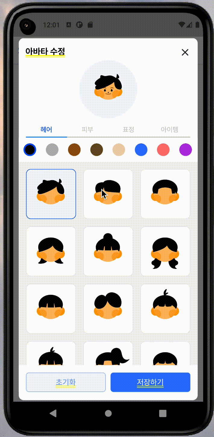
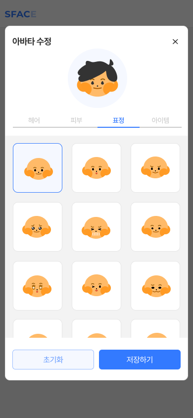
EditAvatarPopup.dart
아래 부분이 탭바다. tabList, tabBarViewList를 주입한다.
... 생략
ConstrainedBox(
              constraints: const BoxConstraints(
                maxHeight: 500,
              ),
              child: CustomTabbar(
                tabList: tabList,
                tabBarViewList: tabBarViewList,
              ),
            ),
tabList는 따로 리스트를 관리하면 좋을 것 같고, 탭바 뷰 리스트는 4개의 타입을 가지고 있다.
여기서 주의할 점 중 하나는, 아이템인데 보여지는 쇼케이스의 아이템은 정가운데에 크게 위치하지만 스택으로 쌓여서 실제 아바타에 보여질때의 아이템은 쇼케이스의 아이템과 다르게 위치가 조정되어있고 크기도 제각각이다. 여턴간 이 점을 생각해야함.
    List<String> tabList = ["헤어", '피부', '표정', '아이템'];

    List<Widget> tabBarViewList = [
      const AvatarCard(type: AvatarAssetType.hair),
      const AvatarCard(type: AvatarAssetType.face),
      const AvatarCard(type: AvatarAssetType.emotion),
      const AvatarCard(type: AvatarAssetType.item),
    ];
AvatarCard.dart
enum과 유틸함수들
우선 아이템 assets은 assets/avatar/Emotion/off_emotion_1.svg 이런 형태를 가지고 있다. 예측 가능한 구조적 형태라서 유틸함수를 잘 조합해서 아이템을 렌더링 할 수 있을 것 같았다.
enum AvatarAssetType { hair, face, emotion, item, itemForStack }위에서 언급한 아이템과 스택에 쌓일 아이템 타입을 따로 선언했다.
그리고 타입에 따라 아이템의 루트를 불러오는 'getRoute'유틸함수를 만들었다.
getRoute(AvatarAssetType type) {
  switch (type) {
    case AvatarAssetType.hair:
      return 'assets/avatar/Hair/';
    case AvatarAssetType.face:
      return 'assets/avatar/Face/';
    case AvatarAssetType.emotion:
      return 'assets/avatar/Emotion/';
    case AvatarAssetType.item:
      return 'assets/avatar/Item_Only/';
    case AvatarAssetType.itemForStack:
      return 'assets/avatar/Item/';
    default:
      return null;
  }
}
여기서 각 아이템의 이름이 숫자로 이루어져있다는 점에 착안해 완전 맘에 드는 건 아니지만 타입에 따라 아이템 개수를 리턴해주는 유틸함수 assetLength를 만들었다.
assetLength(AvatarAssetType type) {
  switch (type) {
    case AvatarAssetType.hair:
      return 24;
    case AvatarAssetType.face:
      return 9;
    case AvatarAssetType.emotion:
      return 24;
    case AvatarAssetType.item:
      return 18;
    case AvatarAssetType.itemForStack:
      return 18;
    default:
      return null;
  }
}
avatarItemAssets
주의할 점은 off_item_angel.svg 아이템의 경우는 숫자가 아니라 아이템명으로 되어있다는 것. 그래서 따로 리스트업을 해주었다. index로 아이템을 렌더링하는 수밖에 없음.
List<String> avatarItemAssets = [
  'angel',
  'beard',
  'bone',
  'cat',
  'devil',
  'flower',
  'glasses1',
  'glasses2',
  'graduate',
  'hand',
  'hat',
  'magician',
  'mask',
  'rabbit',
  'ribbon',
  'star',
  'sunglass',
  'tiara',
];
avatarCard 위젯
path와 length를 먼저 준비한다. 만일 타입이 헤어일 경우에는 헤어컬러를 선택할 수 있어야하기 때문에 palette를 같이 렌더링해준다.
    final path = getRoute(type);
    final length = assetLength(type);

    if (path == null || length == null) return Container();

    return Column(
      mainAxisSize: MainAxisSize.min,
      children: [
        type == AvatarAssetType.hair
            ? Container(
                color: Colors.white,
                child: Palette(
                  colorPicker: controller.selectColor,
                  selectedColor: controller.hairColor,
                ),
              )
            : Container(
                height: 16,
                color: Colors.white,
              ),
여기가 핵심이다.
String imageName = (type == AvatarAssetType.face)
                  ? "on_${type.name}_${index + 1}"
                  : "off_${type.name}_${index + 1}";
              String imagePath = "$path$imageName.svg";
face의 경우에는 네이밍이 on_face_1.svg 이런식으로 on이 들어가기 때문에 삼항연산자로 이미지명을 생성하도록 했다. 그리고 path와 이미지명을 합쳐 이미지를 가져올 최종 이미지경로(imagePath)를 생성한다.
String itemRoute = getRoute(AvatarAssetType.itemForStack);
                    imagePath =
                        '${itemRoute}off_${type.name}_${avatarItemAssets[index]}.svg';
                    controller.selectItems(type, imagePath);
이제 타입이 item일 경우와 아닐 경우를 따로 판별해 스택에 쌓으면 된다(selectItems에 추가). 이부분도 위 과정에서 핸들링했으면 좋았을 텐데 급하게 나중에 추가된 부분이라 다소 미흡했던 것 같다. 다른 좋은 방법도 있을 것 같음.
타입이 item일때 itemRoute를 itemForStack 타입의 경로로 다시 받고 imagePath의 경우에도 다시 받도록 한다.
Expanded(
          child: GridView.builder(
            itemBuilder: (context, index) {
              // ... 경로생성 생략
              return GestureDetector(
                onTap: () {
                  if (type == AvatarAssetType.item) {
                    // ... 경로생성 생략
                    return;
                  }
                  controller.selectItems(type, imagePath);
                },
                child: Obx( // 이 부분은 선택된 아이템일 경우 시각적으로 표현해주기 위해 추가한 부분.
                  () {
                    bool isSelected =
                        controller.selectedItems[type.name] == imagePath;
                    return Container(
                      width: 100,
                      height: 100,
                      decoration: BoxDecoration(
                        color: isSelected == true
                            ? AppColor.primary05
                            : AppColor.white,
                        border: Border.all(
                          color: isSelected == true
                              ? AppColor.primary
                              : AppColor.black10,
                        ),
                        borderRadius: BorderRadius.circular(10),
                      ),
                      // 이부분이 다소 복잡한데 리팩토링이 필요할 것 같다. 자세히 설명해보자면
                      child: (type == AvatarAssetType.item)
                          ? SvgPicture.asset(
                              '${path}off_${type.name}_${avatarItemAssets[index]}.svg',
                            )
                          : Stack(
                              children: [
                                SvgPicture.asset(
                                  'assets/avatar/Face/on_face_1.svg',
                                ),
                                type == AvatarAssetType.hair
                                    ? Obx(
                                        () => SvgPicture.asset(
                                          imagePath,
                                          color: controller.hairColor.value,
                                        ),
                                      )
                                    : SvgPicture.asset(
                                        imagePath,
                                      )
                              ],
                            ),
                    );
                  },
                ),
              );
            },
          ),
        ),
쇼케이스에 보여지는 부분(아이템 리스트)
- item 타입일 경우의 경로를 svgPicture에 할당.
- item 외의 타입일 경우 1번 face를 스택으로 쌓아 보여준다. 아래 부분을 위한건데, Emotion의 경우 얼굴 형태는 없이 표정만 나타나있다. 헤어도 마찬가지. 어차피 기본 얼굴은 가장 뒤에 위치해야 하기 때문에 피부 부분에서는 겹쳐서 보이지 않기 때문에 따로 핸들링하지 않았다.
- 헤어 컬러를 수정한다. 다른 svg에도 컬러를 주게 되면 안된다. 헤어일때만 컬러가 적용되어야함.
(type == AvatarAssetType.item)
                          ? SvgPicture.asset( // 1. 아이템 경로
                              '${path}off_${type.name}_${avatarItemAssets[index]}.svg',
                            )
                          : Stack( // 2. 얼굴형태
                              children: [
                                SvgPicture.asset(
                                  'assets/avatar/Face/on_face_1.svg',
                                ),
                                type == AvatarAssetType.hair // 3. 헤어컬러
                                    ? Obx(
                                        () => SvgPicture.asset(
                                          imagePath,
                                          color: controller.hairColor.value,
                                        ),
                                      )
                                    : SvgPicture.asset(
                                        imagePath,
                                      )
                              ],
                            ),
palette.dart
Palette(
                  colorPicker: controller.selectColor,
                  selectedColor: controller.hairColor,
                ),
헤어컬러를 정의해놓은 클래스로부터 컬러를 가져온다.
class AvatarColor {
  static const Color color1 = AppColor.black;
  static const Color color2 = AppColor.black30;
  static const Color color3 = Color(0xFF925319);
  static const Color color4 = Color(0xFF6B4D20);
  static const Color color5 = Color(0xFFEDD0AD);
  static const Color color6 = Color(0xFF337AFF);
  static const Color color7 = Color(0xFFFF7777);
  static const Color color8 = Color(0xFFB33CDD);
}
리스트로서 컬러를 가져온다. 지금 생각해보니 클래스에 컬러를 리스트로 내보내는 유틸함수를 같이 만들었다면 좋았을듯..
List<Color> get colorList => [
      AvatarColor.color1,
      AvatarColor.color2,
      AvatarColor.color3,
      AvatarColor.color4,
      AvatarColor.color5,
      AvatarColor.color6,
      AvatarColor.color7,
      AvatarColor.color8,
    ];
리스트뷰로 horizontal 방향으로 빌딩되도록 했다.
SizedBox(
      height: 50,
      child: ListView.builder(
        scrollDirection: Axis.horizontal,
        itemCount: colorList.length,
        itemBuilder: (context, index) {
          return Padding(
            padding: const EdgeInsets.symmetric(horizontal: 9, vertical: 12),
            child: ClipRRect(
              borderRadius: BorderRadius.circular(50),
              child: GestureDetector(
                onTap: () {
                  colorPicker(colorList[index]);
                },
                child: Obx(
                  () => Container(
                    decoration: BoxDecoration(
                      color: colorList[index],
                      shape: BoxShape.circle,
                      border: colorList[index] == selectedColor.value
                          ? Border.all(
                              color: AppColor.primary,
                              width: 3,
                            )
                          : null,
                    ),
                    width: 28,
                    height: 28,
                  ),
                ),
              ),
            ),
          );
        },
      ),
    );
customTabbar.dart
탭바 bottom에 border를 추가하는 데 생각보다 오랜 시간이 걸렸다. Stack + Positioned.fill 해주면 됨. 바닥 border가 될 컨테이너와 Tabbar를 스택으로 감싸주고, 컨테이너를 Positioned.fill로 감싸준다.
Material(
      type: MaterialType.transparency,
      child: DefaultTabController(
        length: tabList.length,
        child: Center(
          child: Column(
            mainAxisAlignment: MainAxisAlignment.center,
            children: [
              Container(
                margin: const EdgeInsets.symmetric(horizontal: 15),
                height: 30,
                child: Stack(
                  children: [
                    Positioned.fill(
                      child: Container(
                        decoration: const BoxDecoration(
                          border: Border(
                            bottom: BorderSide(
                              color: AppColor.black20,
                              width: 2.0,
                            ),
                          ),
                        ),
                      ),
                    ),
                    TabBar(
                      labelColor: AppColor.primary,
                      unselectedLabelColor: AppColor.black20,
                      labelStyle: AppTextStyles.body14M(),
                      tabs: tabList
                          .map(
                            (tabItem) => Tab(
                              text: tabItem,
                            ),
                          )
                          .toList(),
                    ),
                  ],
                ),
              ),
              Flexible(
                fit: FlexFit.loose,
                child: Container(
                  color: AppColor.black05,
                  child: TabBarView(
                    children: tabBarViewList
                        .map(
                          (tabBarView) => tabBarView,
                        )
                        .toList(),
                  ),
                ),
              ),
            ],
          ),
        ),
      ),
이 부분은 원래도 만들어놓고 뿌듯해서 어떻게 구현했는지 자세히 기록해놓고싶었다.
이제 이렇게 스택으로 쌓아서 만들어진 아바타를 스크린샷으로 찍고 서버로 전송한 후 프로필 아바타로 등록하면 끝이다.
스크린샷 사용한 부분도 정말 많은 시간을 썼기 때문에 따로 정리해 볼 거다.