Why Seaborn?
: Matplotlib 패키지에서 지원하지 않는 고급 통계 차트를 그리는 통계용 시각화 기능을 제공
!pip install -U seaborn- import
import seaborn as sns매개변수
hue = '열 이름': 해당 열별로 나누어 보여줌multiple = 'fill': 사각형 가득 채워서 그려줌
시각화
산점도(scatterplot)
sns.scatterplot(x = '열1 이름', y = '열2 이름', data = 데이터명)- 또는
sns.scatterplot('열1 이름', '열2 이름', data = 데이터명) - hue = '열3 이름' 추가하면: 열3 별로 나누어서 보여줌

- 또는
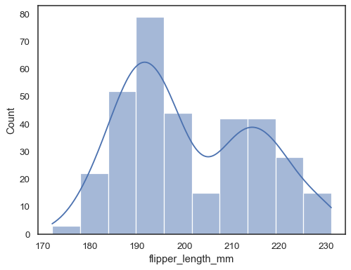
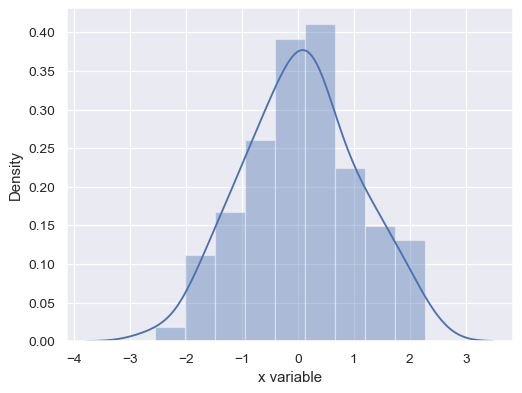
histplot(히스토그램)
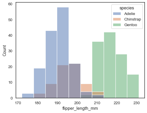
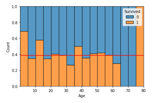
sns.histplot(data = 데이터명, x='열1', bins = n)- kde=True: 커널밀도함수를 같이 보여주는데, 끝이 댕강 잘림.
- hue = '열3 이름'
- hue, multiple='fill'
- kde=True: 커널밀도함수를 같이 보여주는데, 끝이 댕강 잘림.
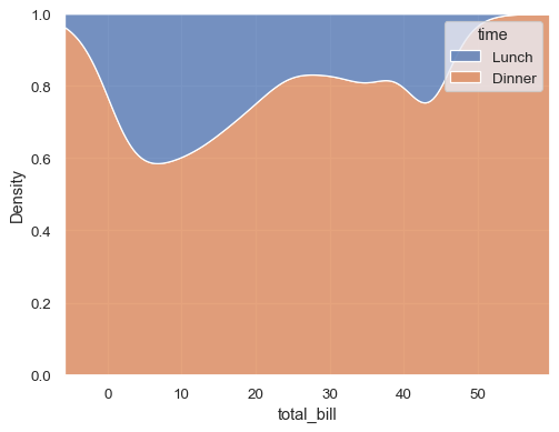
kdeplot(밀도함수 그래프)
sns.kdeplot(데이터명['열 이름'])- 커널 밀도 추정(Kernel Density Estimation) 그래프
- 흐름을 볼 수 있지만, 세밀한 조정이 불가능하다
sns.kdeplot(x='total_bill', data = 데이터명, hue ='time', common_norm = False)
plt.show()
- hue, multiple = 'fill': 비율만 볼 수 있다.
distplot(히스토그램 + 밀도함수)
sns.distplot(데이터명['열 이름'], hist = True, bins = 16): 히스토그램과 KDE를 한꺼번에 겹쳐서 볼 수 있음
boxplot
sns.boxplot(data = 데이터명, y = '열1 이름'): y 방향으로- x, y를 각각 지정하면, 범주별로 나눠서 그려줌
bar chart
sns.countplot(Mid_Test['Math']): 집계와 bar 차트 기능을 한꺼번에.
pairplot
sns.pairplot(데이터명): 숫자형 변수들의 산점도를 한꺼번에 보여준다. 수가 많은 만큼 출력 시간이 길다.
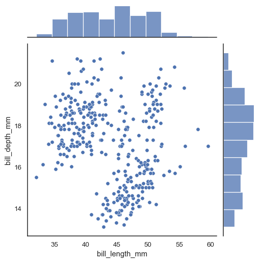
jointplot
sns.jointplot(x='열1 이름', y='열2 이름', data = 데이터명): 산점도와 히스토그램을 동시에
countplot: 집계 + barplot
sns.countplot(x="열1 이름", data=데이터명): Matplotlib에서는 bar plot을 그릴때, 반드시 집계가 선행되어야 하지만, seaborn의 countplot 은 집계를 포함하여 barplot을 그려준다.
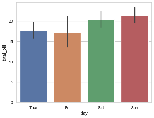
barplot
sns.barplot(x="열1 이름", y="열2 이름", data = 데이터명): 막대 길이는 평균을 나타내고, error bar는 신뢰구간을 나타낸다
heatmap
- groupby로 필요한 열을 기준으로 묶는다
- pivot으로 새로운 데이터로 재구성 한다
- heatmap으로 시각화 한다.
-
df.groupby(by = ['column1', 'column2'], as_index = False)['column3'].count() -
df.pivot('column1', 'column2', 'column3'): index, columns, values 순서대로 데이터를 재구성하여 나타냄-
변환 전
index columns values 1 col1 10 2 col1 20 1 col2 30 2 col2 40 -
pivot으로 변환 후
index col1 col2 1 10 30 2 20 40
-
-
sns.heatmap(data명, annot = True, fmt = 'd', linewidth = .2): 색상으로 표현할 수 있는 다양한 정보를 일정한 이미지위에 열분포 형태의 비쥬얼한 그래픽으로 출력- annot: 숫자를 표현할 거니? (annotation 주석달기)
- fmt = 'd': 정수로 만들어줌. '.1f': 소숫점 자리 하나까지만 출력해줘라.
- linewidth: 구간에 살짝 간격을 벌여줌

내 인생의 주연