- 출처:
Why Matplotlib?
: 파이썬에서 그래프를 그릴때 유용한 시각화 라이브러리
import matplotlib.pyplot as plt기본 문법
plt.plot('x이름', 'y이름', '스타일', data = 데이터명, label = '라벨명')- 값을 하나만 넣으면, y축으로 인식
plt.subplot(x,y,n): x행 y열의 n번째 그래프- index : 순서: 0이 아니라 1부터 시작함...! 주의하기!!!
- 꾸밀라면 subplot 다 각각 적용해야함
plt.xlabel('x죽 열이름')plt.ylabel('y축 열 이름')plt.title('제목')
plt.xticks(rotation=4n): 글씨가 겹쳐보이니까 n도 돌려서 보기 좋게 만들자
plt.figure(figsize = (n, m)): 가로, 세로plt.xlim(n, m),plt.ylim(n2, m2): 축 범위 설정
plt.legend(): 그래프에 범례를 표시plt.grid(): 눈금
plt.axhline(a, color = '색상명', linestyle = '스타일명')plt.axvline(b, color = '색상명', linestyle = '스타일명')plt.text(a, aa, '텍스트')
plt.tight_layout(): 그래프간 간격을 적절히 맞추기. 안써도 무방함plt.show(): 그래프를 출력. 이걸 안해도 그래프가 보이는 경우도 있지만, 아닌 경우도 있으므로 이걸 작성하는걸 습관화하자- 여러 그래프를 겹쳐 그릴때는, 쭈루룩 쓰고 한꺼번에 show!
plt.savefig('a'): 그래프 이미지를 파일로 저장
그래프 종류
숫자형 변수 시각화
plt.hist(데이터명['열 이름'], bins = n, edgecolor = '색상명'): 히스토그램. 구간을 n개로 나누고, 구간별로 카운트 한 값을 나타낸게 히스토그램. 숫자형 변수의 분포를 살펴볼때 넘버원!- bins: 구간
- 밀도함수 그래프: 아쉽게도, Matplotlib에는 존재하지 않는다. 대신 Seaborn에 존재.
plt.boxplot(데이터명, vert = False): boxplot- vert = False: vertical의 약자. 행으로 그려짐. 개인 취향임!!
- NaN이 있으면 그려지지 않는다~!
plt.boxplot(데이터명.loc[데이터명['열이름'].notnull(), '열이름']): not null인 데이터만 가져와서 boxplot을 그린다
plt.scatter(데이터['열1 이름'], 데이터['열2 이름']): 산점도.- 또는
plt.scatter('열1 이름', '열2 이름', data = 데이터명) - 순서대로 x축 값, y축 값
- 또는
범주형 변수 시각화
plt.bar(temp.index, temp.values)plt.barh(temp.index, temp.values)# 가로로 출력- bar chart는 집계 기능이 없어서 value_counts()를 사용하여 집계하는 작업이 사전에 필요
- 집계 + bar chart를 한꺼번에 = seaborn의 countplot
temp = Mid_Test['Math'].value_counts()
print(temp) # series로 출력됨
print(temp.index) # 아, 인덱스만 따로 떼어낼 수 있구나.
print(temp.values) # value 아니고 values 임!! 아, 따로 떼어낼 수 있구나
plt.bar(temp.index, temp.values)- `plt.pie(temp.values, labels = temp.index, autopct = '%.3f%%', startangle=90, counterclock=False, explode = [0.05, 0.05, 0.05], shadow=True)
- 집계 기능이 없어서 value_counts()를 사용하여 집계하는 작업이 사전에 필요
- startangle = 90 : 90도 부터 시작
- counterclock = False : 시계 방향으로
- explode: 중심으로부터 얼마나 띄울지 순서대로
- f가 소수점 2자리까지 %로 표현해라. 앞뒤로 붙은 %는 형식을 지정, 안에는 내용
그래프 옵션
- The following format string characters are accepted to control the line style or marker:
| character | description |
|---|---|
| '-' | solid line style |
| '--' | : dashed line style |
| '-.' | dash-dot line style |
| ':' | dotted line style |
| '.' | point marker |
| ',' | pixel marker |
| 'o' | circle marker |
| 'v' | triangle_down marker |
| '^' | triangle_up marker |
| '<' | triangle_left marker |
| '>' | triangle_right marker |
| '1' | tri_down marker |
| '2' | tri_up marker |
| '3' | tri_left marker |
| '4' | tri_right marker |
| 's' | square marker |
| 'p' | pentagon marker |
| '*' | star marker |
| 'h' | hexagon1 marker |
| 'H' | hexagon2 marker |
| '+' | plus marker |
| 'x' | x marker |
| 'D' | diamond marker |
| 'd' | thin_diamond marker |
| ' | ' |
| '_' | hline marker |
- The following color abbreviations are supported:
| character | color |
|---|---|
| ‘b’ | blue |
| ‘g’ | green |
| ‘r’ | red |
| ‘c’ | cyan |
| ‘m’ | magenta |
| ‘y’ | yellow |
| ‘k’ | black |
| ‘w’ | white |
그래프 예제
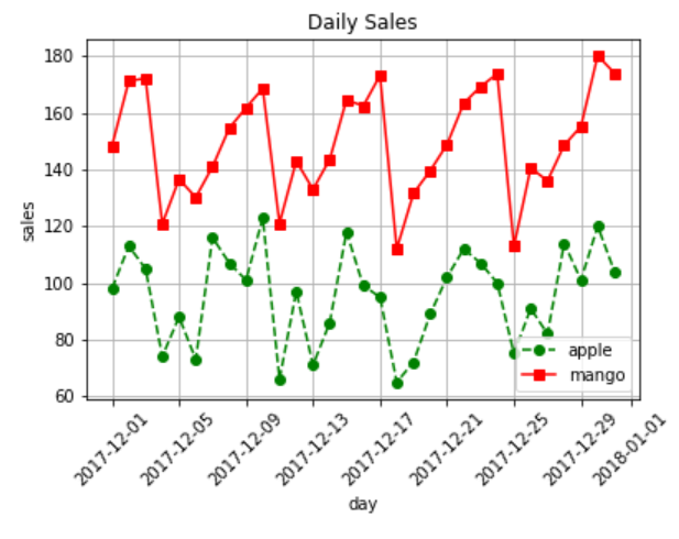
plt.figure(figsize = (10,6))

plt.plot('date', 'item1', 'go--', data = data, label = 'apple')
plt.plot('date', 'item2', 'b*-', data = data, label = 'mango')
plt.plot('date', 'item3', 'rs-', data = data, label = 'banana')

# 각 아이템의 평균 선(수평선) 추가
plt.axhline(data['item1'].mean(), color = 'grey')
plt.axhline(data['item2'].mean(), color = 'grey')
plt.axhline(data['item3'].mean(), color = 'grey')

plt.xticks(rotation=45)

plt.xlabel('day')
plt.ylabel('sales')
plt.title('Daily Sales')

plt.legend()
plt.grid()
plt.show()
plt.figure(figsize = (12,8))

plt.subplot(3,1,1)
plt.plot('date', 'item1', 'go--', data = data, label = 'apple')
plt.legend()

plt.subplot(3,1,2)
plt.plot('date', 'item2', 'b*-', data = data, label = 'mango')
plt.legend()

plt.subplot(3,1,3)
plt.plot('date', 'item3', 'rs-', data = data, label = 'banana')
plt.legend()

plt.show()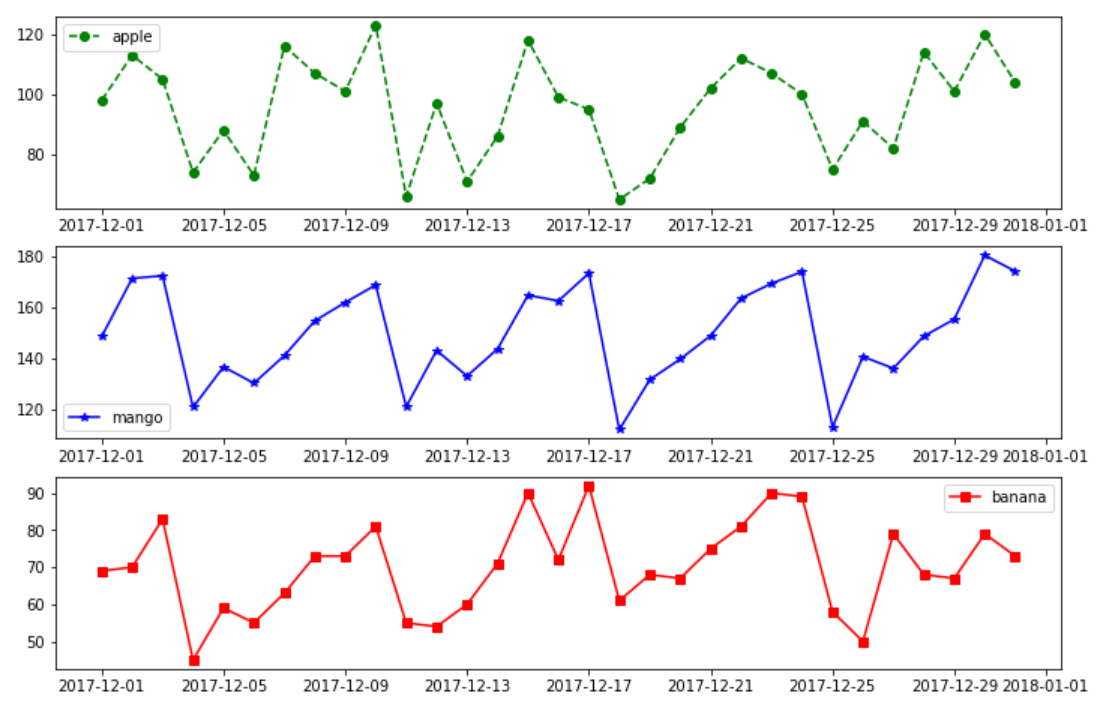
Score = {'Date': ['2022-03', '2022-04', '2022-05', '2022-06', '2022-7'], 'Korean': [20, 20, 95, 60, 70],
         'English': [10, 20, 80, 75, 90], 'Math': [30, 50, 60, 55, 60], 'Science': [30, 45, 100, 85, 90]}

# 오류 발생: Score['Korean'].mean(). 이게 dict 형이라서 오류 발생하는 것임.

mean_score = np.mean([Score['Korean'], Score['English'], Score['Math'], Score['Science']])

plt.figure(figsize = (10, 7))

plt.plot('Date', 'Korean', 'go--', data = Score, label = 'Korean')
plt.plot('Date', 'English', 'rs--', data = Score, label = 'English')
plt.plot('Date', 'Math', 'y^-.', data = Score, label = 'Math')
plt.plot('Date', 'Science', 'b*:', data = Score, label = 'Science')

plt.xlabel('Date')
plt.ylabel('Score')
plt.title('Test Result')

plt.axhline(mean_score, color = 'grey', linestyle = '--')
# plt.axvline: 수직선

plt.text(0, mean_score + 5, 'Score_mean')

plt.xlim(-1, 5)
plt.ylim(0, 110)

plt.xticks(rotation=45)
plt.legend() # 그래프에 범례를 표시
plt.grid() # 눈금

plt.show()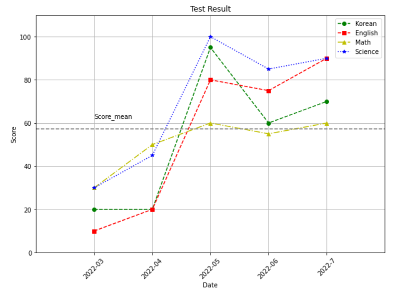
Score = {'Date': ['2022-03', '2022-04', '2022-05', '2022-06', '2022-7'], 'Korean': [20, 20, 95, 60, 70],
         'English': [10, 20, 80, 75, 90], 'Math': [30, 50, 60, 55, 60], 'Science': [30, 45, 100, 85, 90]}
plt.figure(figsize = (10, 7))

plt.subplot(2,2,1)
plt.plot('Date', 'Korean', 'go--', data = Score, label = 'Korean')
plt.ylim(0, 100)
plt.legend() # 그래프에 범례를 표시
plt.xticks(rotation=45)

plt.subplot(2,2,2)
plt.plot('Date', 'English', 'rs--', data = Score, label = 'English')
plt.ylim(0, 100)
plt.legend() # 그래프에 범례를 표시
plt.xticks(rotation=45)

plt.subplot(2,2,3)
plt.plot('Date', 'Math', 'y^-.', data = Score, label = 'Math')
plt.ylim(0, 100)
plt.legend() # 그래프에 범례를 표시
plt.xticks(rotation=45)

plt.subplot(2,2,4)
plt.plot('Date', 'Science', 'b*:', data = Score, label = 'Science')
plt.ylim(0, 100)
plt.legend() # 그래프에 범례를 표시
plt.xticks(rotation=45)

plt.tight_layout() # 그래프간 간격을 적절히 맞추기. 안써도 무방함
plt.show()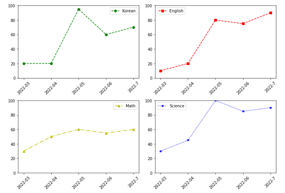

내 인생의 주연