rem, em를 알아보자
1rem -> 'html의 font-size' x`1
----> html의 font-size가 20px이면 1rem = 20px, 2rem = 40px
1em -> '상위 요소의 font-size' x 1
----> font-size가 20px로 지정된 div박스 안에서
1em = 20px, 2em =40px
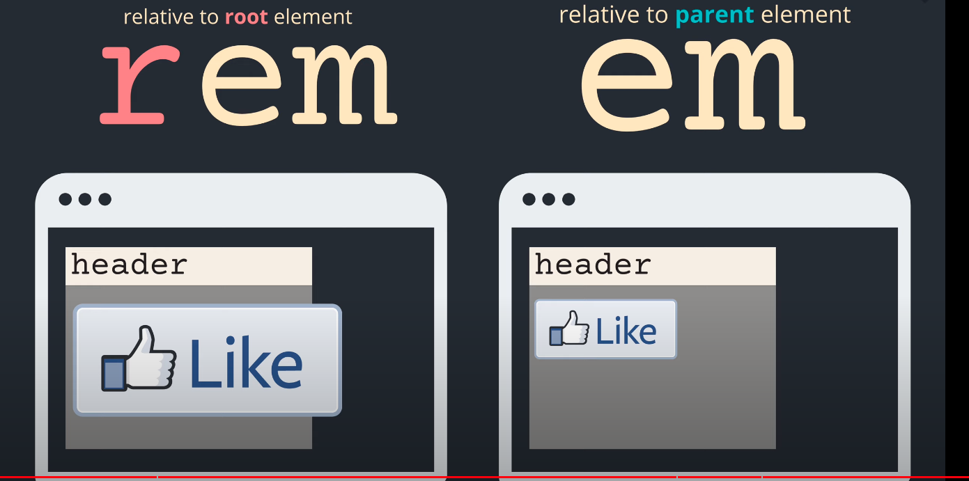
rem으로 size를 결정하면 어디에 있던 html자체의 font-s캡ize에서 크기가 결정된다,
em으로 하면 상위요소의 영향을 받는다.
나누는 기준
상위 요소기준으로 사이즈가 바껴야 할때
==> em
browser 기준으로 사이즈가 바껴야 할때
===> rem
vw / vh
vw = Viewport Width -->1vw = 뷰포트 너비의 1%
vh = Viewport Height --> 1vh = 뷰포트 높이의 1%
높이와 너비가 1000px일 경우
1vw = 10px
1vh = 10px
<!DOCTYPE html>
<html lang="en">
<head>
    <meta charset="UTF-8">
    <meta http-equiv="X-UA-Compatible" content="IE=edge">
    <meta name="viewport" content="width=device-width, initial-scale=1.0">
    <title>반응형</title>
    <style>
    // viewport가 width 1000px height 800px 일때
        .qq{
            background-color: aqua;
            width: 50vh;   // 500px
            height:50vw;	//400px
        }
    </style>

</head>
<body>
    <div class="qq">
    </div>
</body>
</html>
주의할점
vh라고 height에만 주는게아니라 width에도 줄 수 있다. (viewport 높이의 퍼센트값)
vmax. vmin
vmax는 높이와 너비중 더 큰 값을 기준으로 크기를 조절해 준다.
vmin은 반대이다.
<!DOCTYPE html>
<html lang="en">
<head>
    <meta charset="UTF-8">
    <meta http-equiv="X-UA-Compatible" content="IE=edge">
    <meta name="viewport" content="width=device-width, initial-scale=1.0">
    <title>반응형</title>
    <style>
    // viewport가 width 1000px height 800px 일때
        .qq{
            background-color: aqua;
            width: 50vmin;  // 400px
            height:50vmax;	//500px
        }
    </style>

</head>
<body>
    <div class="qq">
    </div>
</body>
</html>
안녕하세요 인터랙션한 웹 개발을 지향하는 프론트엔드 개발자 입니다. https://kimjunho97.tistory.com => 블로그 이전 중
역시 CSS 매스털👀