계산기 목업
사진
계산기에 대한 기능은 구현하지않은 목업입니다.
순수 HTML, CSS로 구현하였습니다.
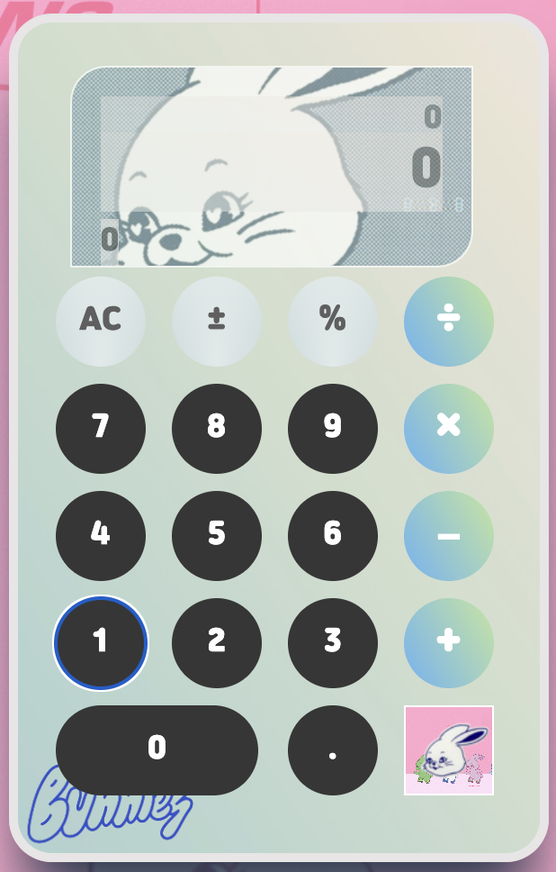
고퀄리티는 아니지만 뉴진스 로고로 계산기로 만들었다.
- 계산기 본체
- 디스플레이
- 계산기 디스플레이에 입력값, 입력값 미리보기, 결과값 세개로 구성 - 기호 버튼
- 사칙연산 버튼
- 숫자 키패드 버튼
진행과제
- HTML
<div class="calculator">
<div class="display-container">
<div class="display-in">0</div>
<div class="display-pre">0</div>
<div class="display-result">0</div>
</div>
<button class="button ac">AC</button>
<button class="button sign">±</button>
<button class="button sign">%</button>
<button class="button sign">÷</button>
<button class="button number">7</button>
<button class="button number">8</button>
<button class="button number">9</button>
.
.
.
</div>
</div>
- 계산기 레이아웃을 그리드로 구성하기 위해 각각 버튼의 클래스들을 생성
- display 클래스를 3개로 구분, 계산기 입력값, 입력값 미리보기, 결과값
- 이 후 자바스크립트에서 출력창의 값을 분배 - CSS
기본설정
* {
  margin: 0;
  padding: 0;
  box-sizing: border-box;
  /*css기본설정*/
  font-family: 'yg-jalnan';
  background-image: url("data/B.png");
폰트설정
@font-face {
  font-family: 'yg-jalnan';
  src: url('https://cdn.jsdelivr.net/gh/projectnoonnu/noonfonts_four@1.2/JalnanOTF00.woff') format('woff');
  font-weight: normal;
  font-style: normal;
}
눈누: https://noonnu.cc/ 사이트에서 원하는 글꼴을 찾아 css에 복사해주면된다.
wrap 클래스
.wrap {
  display: flex;
  height: 100vh;
  justify-content: center;
  align-items: center;
}
display를 flex로 설정해주고 justify-content와 align-times로 가운데 정렬
calc 클래스 (계산기 본체)
.calc {
  display: grid;
  grid-template-columns: repeat(4, 1fr);
  background-image: url("data/back.png");
  width: 300px;
  height: 471px;
  padding: 1.5rem 1rem 2rem;
  border-radius: 1.5rem;
  box-shadow: rgb(38, 57, 77) 0px 30px 35px -8px;
  border: 5px solid #E7E5E5;
}
display:grid 레이아웃을 그리드 속성으로 구성하고 repeat(4, 1fr) 4개의 열을 생성
본체에 그림자를 넣어 생동감을 주었다.
display 클래스
/*입력값 미리보기*/
.display-in {
  opacity: .4;
  height: 20px;
  overflow: hidden;   /*넘치는거 가림*/
  background-image: linear-gradient(to right top, #efefef, #f0eef0, #f4ecee, #f7ebe9, #f7ebe3);}
/*현재창(입력숫자)*/
.display-pre {
  opacity: .5;
  font-size: 1.7rem;
  background-image: linear-gradient(to right top, #efefef, #f0eef0, #f4ecee, #f7ebe9, #f7ebe3);}
/*결과값*/
.display-result {
  opacity: .6;
  position: absolute;
  bottom: 0;
  background-image: linear-gradient(to right top, #efefef, #f0eef0, #f4e
세 개의 디스플레이의 opacity(투명도)를 다르게 주어 구분
button 클래스
/*AC키패드*/
.button:nth-child(2),
.button:nth-child(3),
.button:nth-child(4) {
  font-weight: lighter;
  background-color: #CDDCDC;
  background-image: radial-gradient(at 50% 100%, rgba(255,255,255,0.50) 0%, rgba(0,0,0,0.50) 100%), linear-gradient(to bottom, rgba(255,255,255,0.25) 0%, rgba(0,0,0,0.25) 100%);
}
/* 사칙연산 키패드*/
.button:nth-child(5),
.button:nth-child(9),
.button:nth-child(13),
.button:nth-child(17),
.button:nth-child(20) {
  font-size: 1.4rem;
  background-image: linear-gradient(60deg, #64b3f4 0%, #c2e59c 100%);
}
/*버튼 키패드*/
.
.
.
클래스의 선언 순서대로 자식 숫자를 부여하고 색상과 글꼴을 설정
.button:nth-child(18) {
  width: calc(100px + .8rem);
  border-radius: 42px;
  grid-column: span 2;
}button:nth-child(18)은 숫자 0을 의미하므로 grid-column을 2로 설정(= 키패드 2칸 차지)
결과 화면
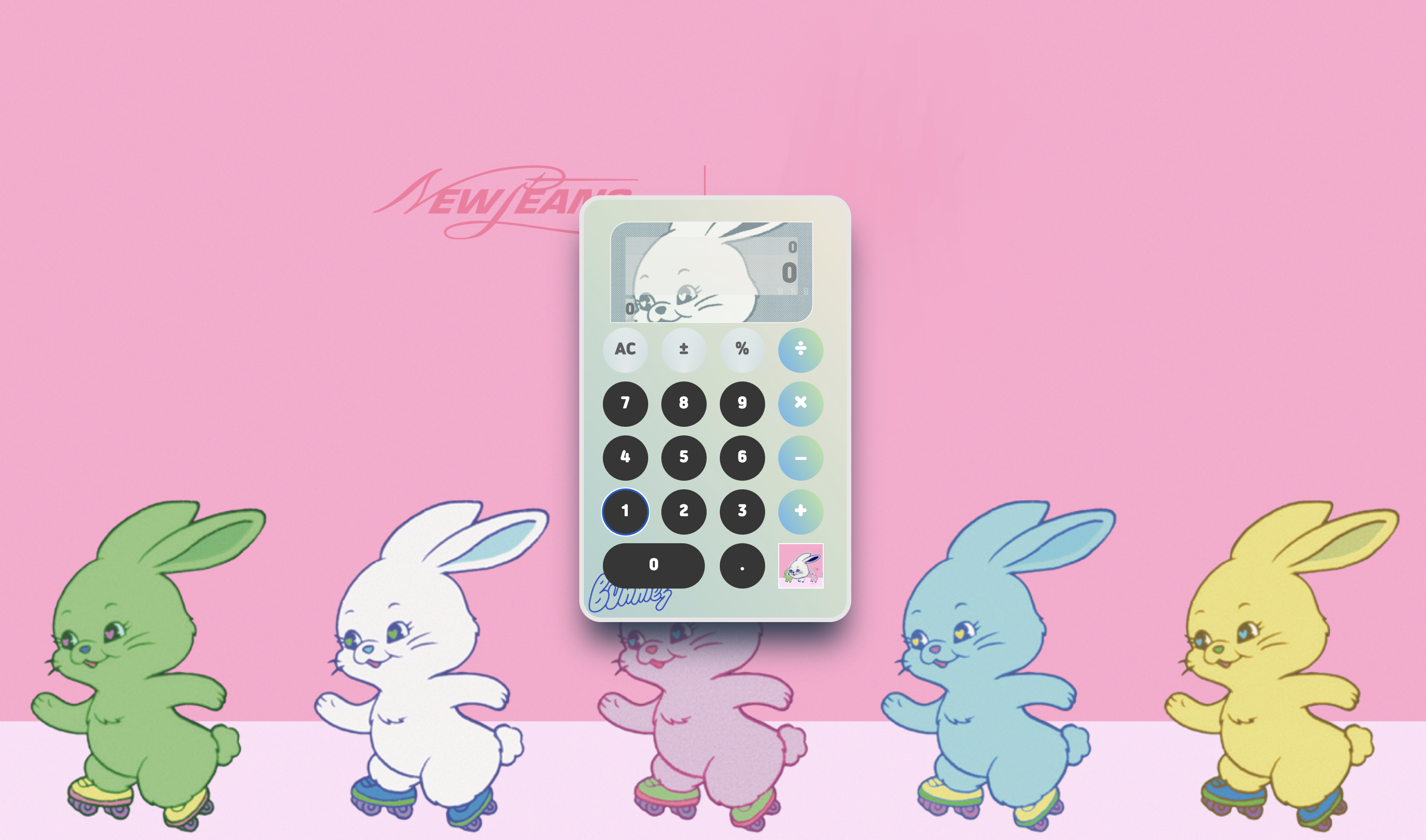
배경을 삽입하여 목업을 완성시켰다...
다시보니 너무 유치한거같,,,,

열심히 기록할 예정🙃