React Bootstrap
자기소개 페이지 만들기 with 리액트 부트스트랩
Bootstrap(부트스트랩)이란?
웹 프론트엔드 개발에 사용되는 오픈 소스 CSS 프레임워크입니다. 트위터에서 개발된 이 프레임워크는 웹 페이지 디자인과 레이아웃을 간편하게 구축할 수 있도록 도와주는 도구들의 집합체입니다. 부트스트랩은 미리 디자인된 스타일, 레이아웃, 그리드 시스템, 컴포넌트들을 제공하여 개발자가 웹 페이지나 웹 애플리케이션을 빠르게 구축하고 스타일링할 수 있도록 도와줍니다.
읽기 쉽고 깔끔한 코드를 위해 자체 컴포넌트를 지원하는 React-BootStrap
- 일단 React BootStrap은 BootStrap의 코드를 기초로 개발 되었기 때문에, BootStrap Library를 꼭 가지고 있어야 구동이 가능하다. 일반 BootStrap말고 React-BootStrap, Vue-BootStrap 같이 일반적으로 많이 사용되는 반응형 웹 프레임워크같은 경우엔 본인들만의 BootStrap을 따로 개발하여 사용하고 있습니다. div className=’’" 형식을 모두 제거하고 자신들만의 Element 이름을 만들어 코드를 더 간편하게 작성하는 데 초점이 맞춰져 있습니다.
react-bootstrap은 기존의 부트스트랩을 리액트 스타일의 컴포넌트로 압축하여 코드가 간단해진다는 장점이 있다.
❓그냥 Bootstrap과 React-bootstrap의 차이점은 ❓
Bootstrap은 상태값과 클래스를 사용하고, React-Bootstrap은 function과 hooks를 사용한다고 합니다.
가독성 면에서 React-bootstrap이 좋고 애니메이션 구현시 React-bootstrap이 더 유용하다고 합니다.
* 자기소개 웹사이트 만들기 with react Bootstrap
> 사용한 컴포넌트 : Container, Tab, Tabs, Col, Row, Image, Carousel, Button, Form, Card
라이브러리 다운
npm install react-bootstrap bootstrap
//Introduce.js
Container : 콘텐츠를 레이아웃에 맞게 배치
Tab: 각 탭에 해당하는 콘텐츠를 표시
Tabs : 여러 개의 탭을 그룹화하여 관리
Row : 그리드 시스템에서 행을 생성
제목과 3개의 탭(about/portfolio/Contact) 구성하고 초기화면에서는 sns와 하단 문구만 보임
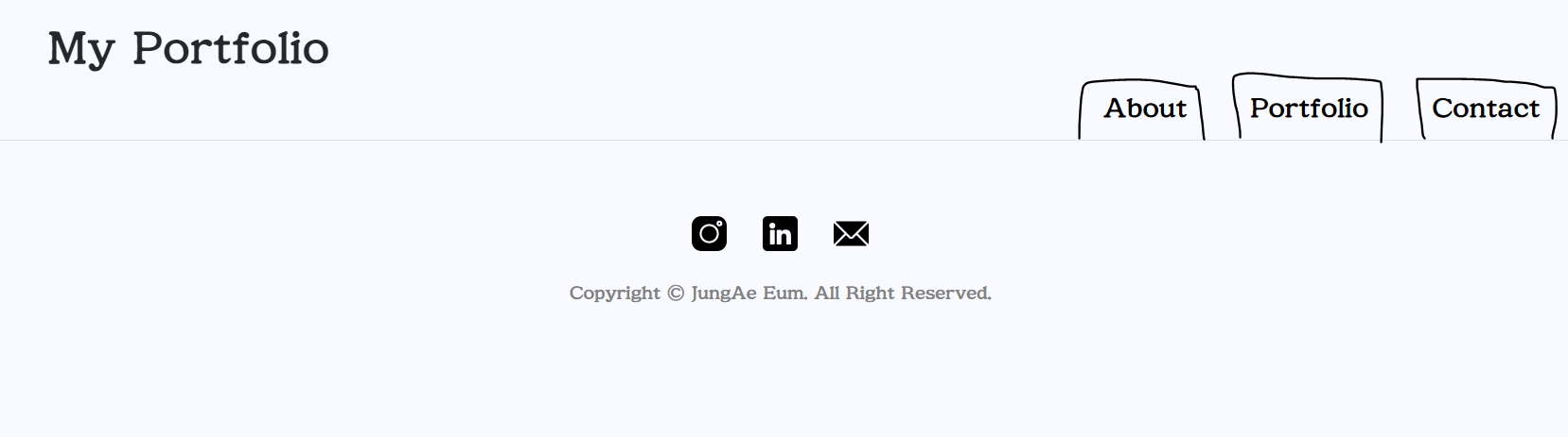
[ about ]
<Container id="about">
            <Row className="w-120 mt-5">
              <Col className="text-start">
                <h3 className="about__category ">About Me</h3>
                <p className="mt-4 mb-5 p_text">
                  I am JungAe from Gimpo, Republic of Korea. I am studying programming as a fontend developer for the past one year.
                </p>
                <p className="mt-4 mb-5 p_text">
                  I got featured various times on many big and small marketplaces, portfolio websites and blogs. I also received some awards and recognitions
                  from some of the big and small award companies. Besides programming, I like to write poems, stories and sing songs.
                </p>
                <Button variant="warning" className="about_btn">
                  Resume
                </Button>{" "}
              </Col>
              <Col className="text-center">
                {/* 이미지 파일의 경로는 public을 기본으로 한다. */}
                <Image src="./img/KakaoTalk_profile.jpg" alt="프로필 사진" className="custom-image" roundedCircle />
              </Col>
            </Row>
          </Container>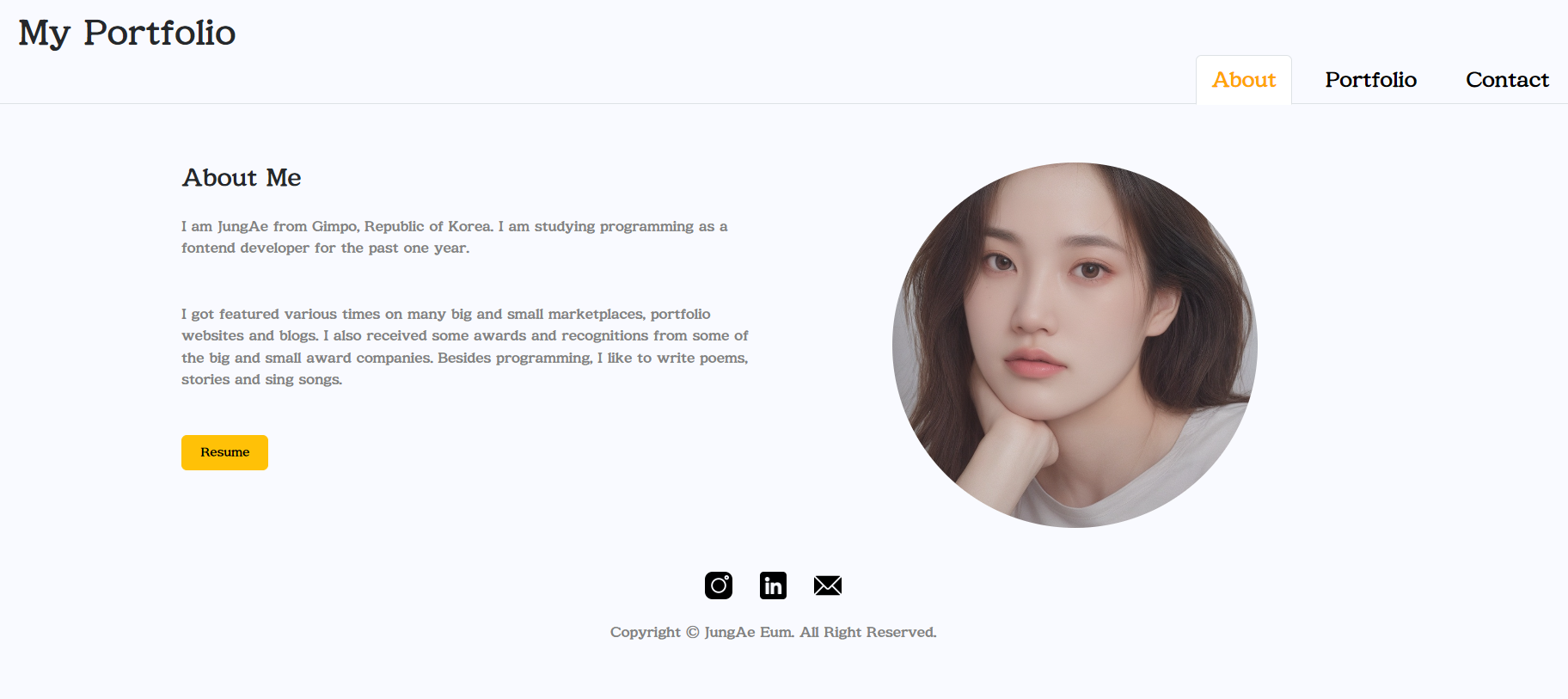
About 탭을 누르면 About 페이지가 나온후 Colum 태그 2개를 활용해여 왼쪽 description 부분과 오른쪽 profile image 부분으로 배치하여 프로필화면을 꾸며보았다.
💥 className 에 'w-120 mt-5' 이런건 뭔가요?
클래스를 조합하여 쓰는 것은 주로 부트스트랩과 같은 CSS 프레임워크에서 사용되는 스타일 클래스를 활용하는 방식입니다. 이런 방식의 장점은 다음과 같습니다:
간편한 스타일 적용: 클래스를 조합하면 빠르고 쉽게 원하는 스타일을 적용할 수 있습니다. 스타일을 직접 CSS로 작성하는 것보다 간단하며, 클래스 이름만으로도 어떤 스타일이 적용되는지 파악하기 쉽습니다.
재사용성: 부트스트랩과 같은 CSS 프레임워크는 미리 정의된 많은 스타일 클래스를 제공합니다. 이러한 클래스를 조합하여 사용하면, 동일한 스타일을 여러 곳에서 재사용할 수 있습니다.
Responsiveness(반응형): 부트스트랩과 같은 프레임워크는 반응형 디자인을 쉽게 구현할 수 있도록 도와줍니다. 클래스를 조합하여 사용하면 화면 크기에 따라 다른 스타일을 적용할 수 있습니다.
관리 용이성: 클래스를 사용하면 스타일 관련 코드와 HTML 구조가 분리되어 관리가 용이해집니다. 스타일 변경 시에도 HTML 코드를 수정하지 않고도 스타일을 조정할 수 있습니다.
[ portfolio ]
<Tab eventKey="portfolio" title="Portfolio">
<Container id="portfolio">
<Row className="py-5">
<Col>
<h2 className="heading">Projects</h2>
</Col>
<Row>
<Col>
<Card className="card">
<Card.Img variant="right" src="./img/Logo_Final.png" className="card_img" />
<Card.Body>
<Card.Title>Card Title</Card.Title>
<Card.Text>Some quick example text to build on the card title and make up the bulk of the card's content.</Card.Text>
<Button variant="primary">View Project</Button>
</Card.Body>
</Card>
</Col>
<Col>
<Card className="card">
<Card.Img variant="right" src="./img/Healing.png" className="card_img" />
<Card.Body>
<Card.Title>Card Title</Card.Title>
<Card.Text>Some quick example text to build on the card title and make up the bulk of the card's content.</Card.Text>
<Button variant="primary">View Project</Button>
</Card.Body>
</Card>
</Col>
</Row>
<Row>
<Col>
<Card className="card">
<Card.Img variant="right" src="./img/Trippian.png" className="card_img" />
<Card.Body>
<Card.Title>Card Title</Card.Title>
<Card.Text>Some quick example text to build on the card title and make up the bulk of the card's content.</Card.Text>
<Button variant="primary">View Project</Button>
</Card.Body>
</Card>
</Col>
<Col>
<Card className="card">
<Card.Img variant="right" src="./img/Crosswalk.jpeg" className="card_img" />
<Card.Body>
<Card.Title>Card Title</Card.Title>
<Card.Text>Some quick example text to build on the card title and make up the bulk of the card's content.</Card.Text>
<Button variant="primary">View Project</Button>
</Card.Body>
</Card>
</Col>
</Row>
</Row>
<Row className="mt-5 text-center clients">
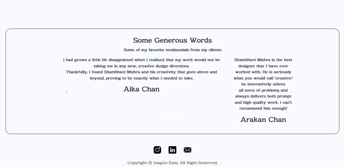
<h3>Some Generous Words</h3>
<p>Some of my favorite testimonials from my clients</p>
<Carousel className="w-75 m-auto d-flex" nextIcon={<BsChevronRight />} prevIcon={<BsChevronLeft />}>
<Carousel.Item className="d-flex justify-content-center">
<div className="car_context">
<p>
I had grown a little bit disappointed when I realized that my work would not be taking me in any new, creative design directions.
<br />
Thankfully, I found Shambhavi Mishra and his creativity that goes above and beyond, proving to be exactly what I needed to take.
</p>
<h3>Aika Chan</h3>
</div>
<div>
<p>
Shambhavi Mishra is the best designer that I have ever worked with. He is seriously what you would call 'creative': he innovatively solves
<br />
all sorts of problems and always delivers both prompt and high quality work. I can't recommend him enough!
</p>
<h3>Arakan Chan</h3>
</div>
</Carousel.Item>
<Carousel.Item className="md={6} justify-content-center">
<div className="car_context">
<p>
I got featured various times on many big and small marketplaces, portfolio websites and blogs. I also received some awards and
recognitions from some of the big and small award companies.
<br />
Besides designing, I like to write poems, stories and sing songs.
</p>
<h3>sdfsdfsdf</h3>
</div>
<div>
<p>
I got featured various times on many big and small marketplaces, portfolio websites and blogs. I also received some awards and
recognitions from some of the big and small award companies. Besides designing, I like to write poems, stories and sing songs.
<br />
all sorts of problems and always delivers both prompt and high quality work. I can't recommend him enough!
</p>
<h3>Losf dkfwd</h3>
</div>
</Carousel.Item>
<Carousel.Item className="md={6} justify-content-center">
<div className="car_context">
<p>
I had grown a little bit disappointed when I realized that my work would not be taking me in any new, creative design directions.
<br />
Thankfully, I found Shambhavi Mishra and his creativity that goes above and beyond, proving to be exactly what I needed to take.
</p>
<h3>Aika Chan</h3>
</div>
<div>
<p>
Shambhavi Mishra is the best designer that I have ever worked with. He is seriously what you would call 'creative': he innovatively solves
<br />
all sorts of problems and always delivers both prompt and high quality work. I can't recommend him enough!
</p>
<h3>Arakan Chan</h3>
</div>
</Carousel.Item>
</Carousel>
</Row>
</Container>
</Tab>
Card : 프로젝트 정보를 보여주기 위한 요소입니다. 각 카드에는 프로젝트 이미지, 제목, 설명 및 "View Project" 버튼이 들어있습니다. 카드 컴포넌트의 Card.Img, Card.Body, Card.Title, Card.Text, Button 등을 사용하여 내용을 구성합니다.
Carousel : 이미지 카루셀은 여러 이미지나 컨텐츠를 자동으로 슬라이딩하는 기능을 제공합니다. 각 Carousel.Item 안에는 프로젝트 카드와 마찬가지로 내용이 들어갑니다. Carousel 컴포넌트의 nextIcon 및 prevIcon 속성을 사용하여 화살표 아이콘을 지정할 수 있습니다.
Container, Row, Col 컴포넌트: 프로젝트 카드와 이미지 카루셀을 각각 컨테이너, 행, 열의 그리드 시스템을 사용하여 배치합니다. 이를 통해 반응형 디자인을 구현하고 레이아웃을 관리할 수 있습니다.
className 속성: 부트스트랩에서 제공하는 클래스 이름을 사용하여 스타일을 적용합니다. 예를 들어, w-75는 요소의 너비를 75%로 설정하고, m-auto는 가운데 정렬을 의미합니다.
justify-content-center: Flexbox를 사용하여 내용을 가로로 중앙 정렬합니다.
Carousel.Caption: 카루셀 내에서 캡션을 추가합니다. 각 Carousel.Item 안에 캡션을 넣어 이미지에 설명을 추가할 수 있습니다.
nextIcon 및 prevIcon: 이미지 카루셀의 다음 및 이전 슬라이드로 이동하는 화살표 아이콘을 지정합니다.
[ Contact ]
<Tab eventKey="contact" title="Contact">
          <Container id="contact">
            <Row className="py-5">
              <Col>
                <h2 className="heading">Let’s work together and make everything super cute and super useful.</h2>
              </Col>
              <Col className="justify-content-end py-2">
                <img className="w-100" src="./img/profile.png" alt="Profile" />
              </Col>
            </Row>
            <Row className="mb-4">
              <Col className="text-center border border-light px-0">
                <h3 style={{ margin: 0, padding: 3 }}>Projects</h3>
                <div style={{ borderTop: "5px solid orange", width: "100px", margin: "auto" }}></div>
              </Col>
            </Row>
            <Row className="justify-content-center py-5">
              <Form>
                <Form.Group className="mb-3" controlId="exampleForm.ControlInput1">
                  <Form.Label>Name</Form.Label>
                  <Form.Control type="name" placeholder="name" />
                </Form.Group>
                <Form.Group className="mb-3" controlId="exampleForm.ControlInput2">
                  <Form.Label>Email address</Form.Label>
                  <Form.Control type="email" placeholder="name@example.com" />
                </Form.Group>
                <Form.Group className="mb-3" controlId="exampleForm.ControlTextarea1">
                  <Form.Label>Message</Form.Label>
                  <Form.Control as="textarea" rows={5} />
                </Form.Group>
              </Form>
              <Row className="justify-content-end py-2">
                <Button variant="warning" className="contact_btn">
                  Send
                </Button>
              </Row>
            </Row>
          </Container>
        </Tab>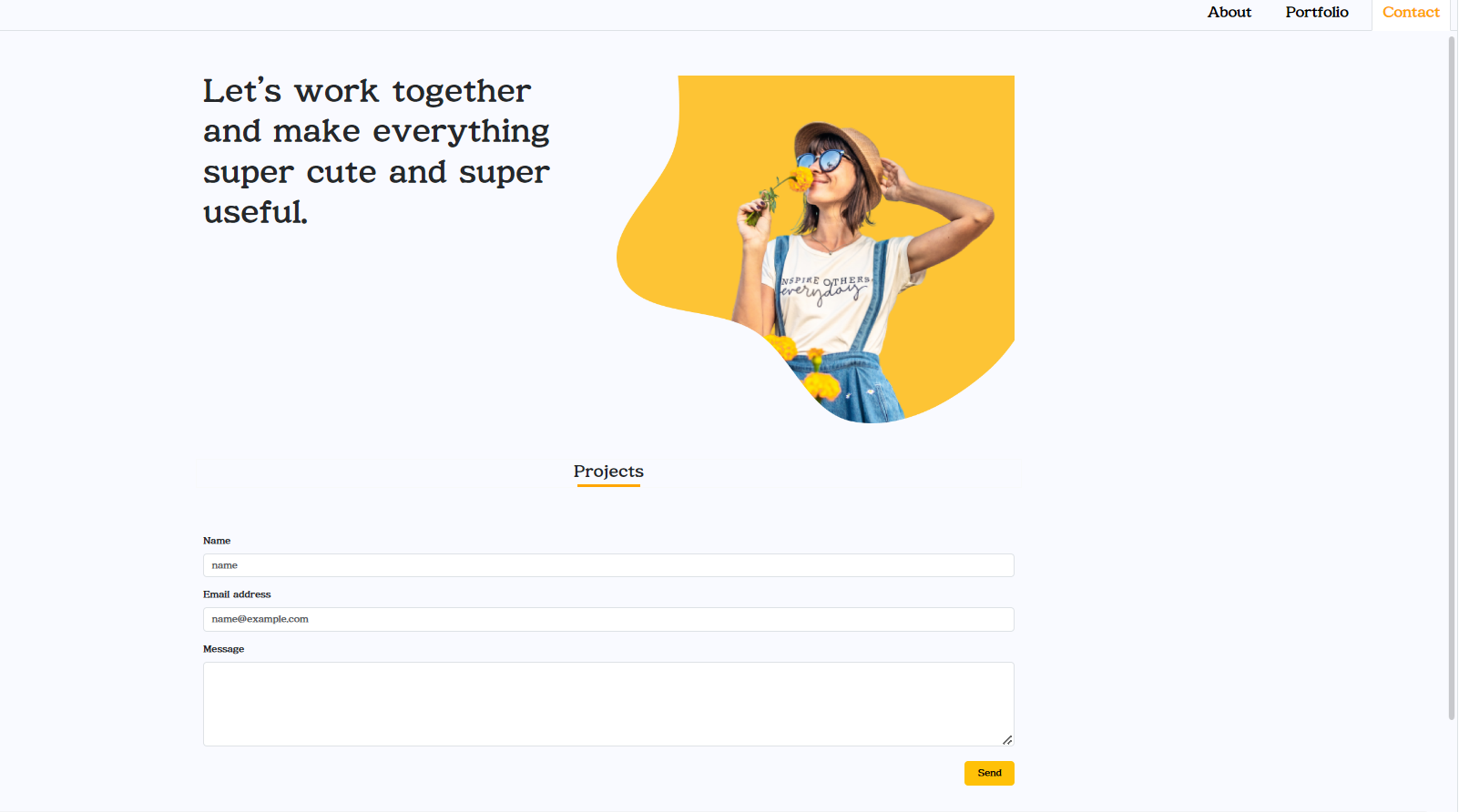
Form : 부트스트랩에서 제공하는 Form 컴포넌트를 사용하여 입력 폼을 구성합니다. Form.Group 컴포넌트로 입력 필드를 묶어 그룹화하고, Form.Control 컴포넌트로 각 입력 필드를 생성합니다.
Form.Label: 각 입력 필드 위에 레이블을 표시합니다. 사용자에게 입력할 내용에 대한 안내를 제공하는 역할을 합니다.
Form.Control: 입력 필드의 타입에 따라 적절한 입력 형식을 제공합니다. type 속성을 설정하여 입력 필드의 타입을 지정합니다.
Form.Control as="textarea": 텍스트 영역 입력 필드를 생성합니다. as 속성을 사용하여 텍스트 영역임을 지정합니다.
Button : 부트스트랩에서 제공하는 Button 컴포넌트를 사용하여 "Send" 버튼을 생성합니다. 버튼을 누르면 입력된 내용이 제출됩니다.
justify-content-center 및 justify-content-end: Flexbox를 사용하여 내용을 가로로 중앙 정렬하거나 오른쪽 정렬합니다.
위 코드에서는 Form.Group을 사용하여 이름, 이메일 주소 및 메시지를 입력할 수 있는 폼을 구성하고, 버튼을 클릭하여 이 정보를 전송할 수 있습니다.
🌙netflify 배포주소
https://intro-myself.netlify.app/