Imshow
matplotlib
시각화 : 많은 양의 자료를 시각화를 통해 전체적인 분포, 인사이트를 확인 가능
matplotlib 라이브러리를 이용 - seaborn이 추가적인 지원
- Figure : 차트가 그려지는 영역
- Axis : X축과 Y축
- Axes : Figure 내에서 그려지는 차트
- Tick : Label에 그려지는 눈금
matplotlib 사용시 한글/음수부호 깨짐을 방지하는 코드
plt.rc('font',family='malgun gothic')
plt.rcParams['axes.unicode_minus'] = False
기본적인 그래프 설정 관련 코드
import numpy as np
import matplotlib.pyplot as plt
#한글/음수 깨짐 방지
plt.rc('font',family='malgun gothic')
plt.rcParams['axes.unicode_minus'] = False
x = ['서울','인천','수원']
y = [5,3,7]

plt.xlim([-1,8]) #축 limit -1~3까지
plt.ylim([0,10])
plt.xlabel('지역')#축 라벨명
plt.ylabel('숫자')
plt.title('제목')

plt.yticks(list(range(0,10,3))) #각 tick에 대한 지점을 range로 지정 가능

plt.plot(x,y) #생성 후 시각화
plt.show()
축의 의미
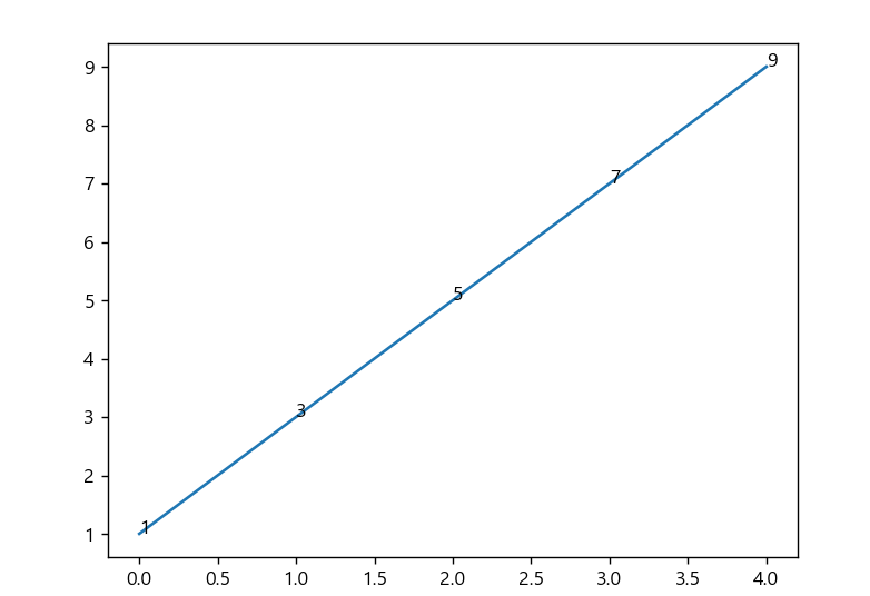
data = np.arange(1,11,2) #[1,3,5,7,9]
print(data)
plt.plot(data)
x = [0,1,2,3,4]
for a,b in zip(x,data): #튜플 쌍을 만듦(zip)
    plt.text(a,b,str(b))
plt.show()
arange로 [1,3,5,7,9] 수열을 생성.
X와 Y축을 따로 지정하지 않았음에도 불구하고 시각화가 되었다
통상적으로 지정되는 축의 의미는
Y축 = 이산적 데이터
X축 = 연속적인 데이터 로 표시한다.
Y축 수열의 간격(4)를 따라 x축이 결정되어 적용된 것을 확인 할 수 있다.
홀드 : 여러개의 plot명령을 겹쳐 그리기
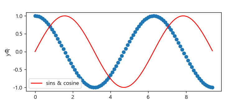
x = np.arange(0,3 * np.pi ,0.1)
y_sin = np.sin(x)
y_cos = np.cos(x)
plt.figure(figsize=(10,5)) #그래프 영역의 크기
plt.plot(x,y_sin,'r')
plt.scatter(x,y_cos) #산점도
plt.xlabel('x축')
plt.ylabel('y축')
plt.legend(['sins & cosine']) #범례
plt.show()
subplot: 한개의 그림 영역을 여러개로 분리
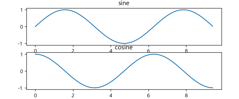
#subplot
plt.subplot(2,1,1) #2행 1열 1행
plt.plot(x,y_sin)
plt.title('sine')

plt.subplot(2,1,2) #2행 1열 2행
plt.plot(x,y_cos)
plt.title('cosine')
plt.show()- 시각화 이미지 저장 / 읽기
#이미지저장
fig = plt.gcf()
plt.show()
fig.savefig('test1.png')

#이미지 읽기
from matplotlib.pyplot import imread
img = imread('test1.png')
plt.imshow(img)
plt.show()
차트 표현 방법(style interface)
- 모두 결과는 같으나 기술 방법에 차이점이 있다.
- matplot style의 인터페이스
x = np.arange(10)

plt.figure() #plot객체 생성
plt.subplot(2,1,1) #2행 1열 1번째
plt.plot(x,np.sin(x))
plt.subplot(2,1,2)
plt.plot(x,np.cos(x))
plt.show()- 객체 지향 인터페이스
fig,ax = plt.subplots(nrows=2,ncols=1)
ax[0].plot(x,np.sin(x))
ax[1].plot(x,np.cos(x))
plt.show()- (1)방법과 유사
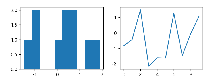
fig = plt.figure()
ax1 = fig.add_subplot(1,2,1) #공간 확보
ax2 = fig.add_subplot(1,2,2)
ax1.hist(np.random.randn(10),bins=10,alpha=0.7) #매개변수,계급,투명도
ax2.plot(np.random.randn(10))
plt.show()- 막대 그래프 (차트)
데이터양이 적고,이산데이터일때 주로 사용한다.
#세로막대 bar
plt.bar(range(len(data)),data)
plt.show()
#가로막대 barh
plt.barh(range(len(data)),data)
plt.show()- 원그래프 (pie chart)
plt.pie(data,explode=(0,0.2, 0,0,0),colors=['yellow','red','blue'])
plt.show()- 박스그래프 (데이터양이 많을때)
plt.boxplot(data)
plt.show()- 4~6번 통용
data =[50,80,100,55,90]
- pandas의 시각화(시계열 데이터 활용)
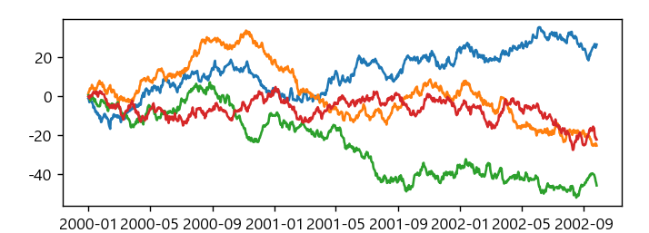
import pandas as pd
fdata = pd.DataFrame(np.random.randn(1000,4),\
                     index=pd.date_range('1/1/2000',periods=1000), \
                                         columns=list('abcd'))
fdata = fdata.cumsum()
print(fdata.head(3))
#matplotlib 기능
plt.plot(fdata)
plt.show()

#pandas 시각화기능
fdata.plot()
fdata.plot(kind='bar')
fdata.plot(kind='box')
#matplotlib 기능
plt.xlabel('time')
plt.ylabel('data')
plt.show
예제
- iris데이터 1,3열을 이용한 산점도
# 참고 : ipython 기반의 jupyter를 사용할 경우
# %matplotlib inline 하면 plt.show 생략가능

iris_data = pd.read_csv("../testdata/iris.csv")
print(iris_data.head(4))

# unique값을 확인하는 2가지 방법
print(iris_data['Species'].unique())
print(set(iris_data['Species']))

#1,3열을 이용하여 산점도 scatter(x,y)
plt.scatter(iris_data['Sepal.Width'],iris_data['Petal.Width'])
plt.show()
- pandas의 시각화
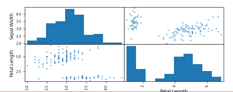
#pandas의 시각화
iris_col = iris_data.loc[:,'Sepal.Width':'Petal.Length']
from pandas.plotting import scatter_matrix
scatter_matrix(iris_col)
plt.show()
Seaborn을 사용한 데이터 분포 시각화
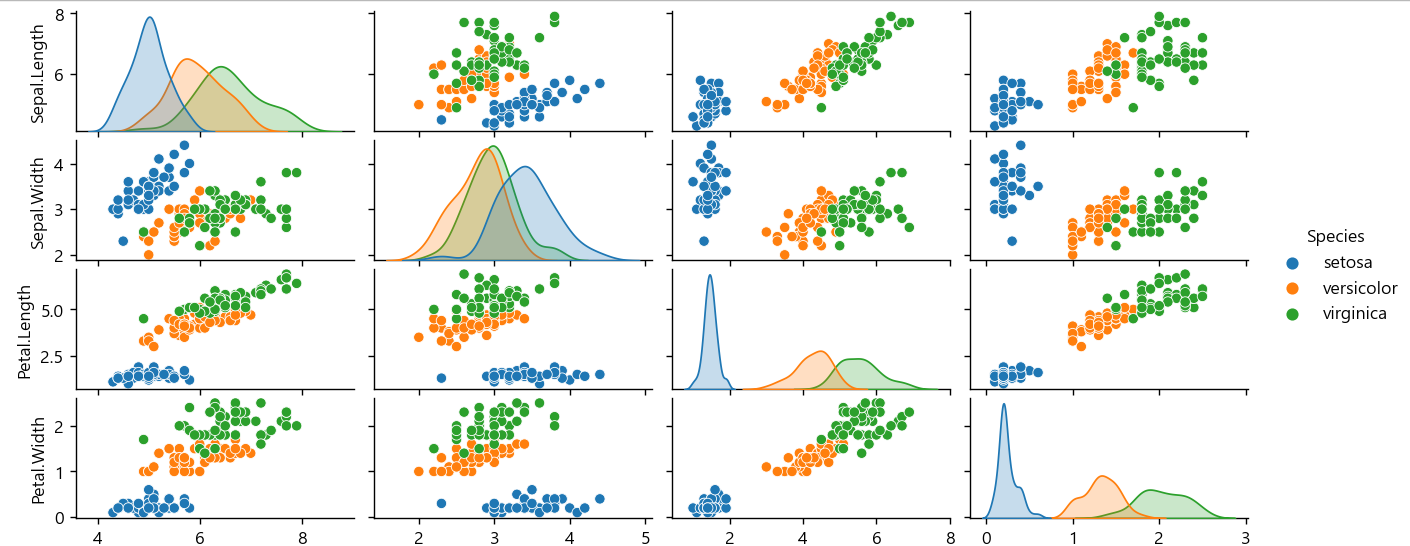
Seaborn은 Matplotlib을 기반으로 다양한 색상 테마와 통계용 차트 등의 기능을 추가한 시각화 패키지이다.
기본적인 시각화 기능은 Matplotlib 패키지에 의존하며 통계 기능은 Statsmodels 패키지에 의존한다.
Seaborn에 대한 자세한 내용은 다음 웹사이트를 참조한다.
#seaborn
import seaborn as sns
sns.pairplot(iris_data,hue='Species') #데이터,카테고리컬럼
plt.show()

#kdeplot
sns.kdeplot(iris_data['Sepal.Width'].values)
plt.show()