Flex Wrap
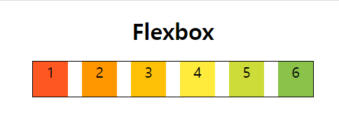
<h1>Flexbox</h1>
<div class="container">
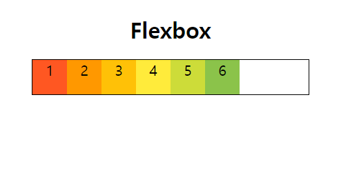
<div class="box" style="background-color: #FF5722">1</div>
<div class="box" style="background-color: #FF9800">2</div>
<div class="box" style="background-color: #FFC107">3</div>
<div class="box" style="background-color: #FFEB3B">4</div>
<div class="box" style="background-color: #CDDC39">5</div>
<div class="box" style="background-color: #8BC34A">6</div>
</div>
<!-- CSS -->
h1 {
text-align: center;
font-family: sans-serif;
font-size: 6rem;
}
.container {
border: 4px solid black;
width: 1200px;
margin: 40px auto;
display: flex;
}
.box {
width: 150px;
height: 150px;
font-size: 4rem;
text-align: center;
}
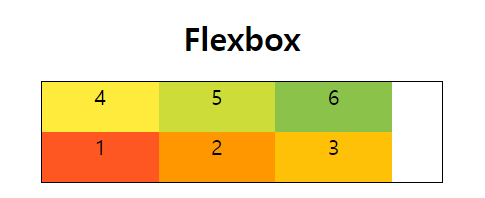
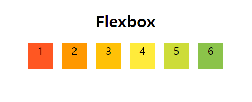
이상태에서 박스들의 width 를 키우면 어떻게 될까?
350정도로 해보자
.box {
  width: 350px;
  height: 150px;
  font-size: 4rem;
  text-align: center;
}
안넘치고 그냥 꽉 채워졌다.
여기서 Flex-wrap이 등장한다.
.container {
  border: 4px solid black;
  width: 1200px;
  margin: 40px auto;
  display: flex;
  flex-wrap: wrap;
}
width가 350만큼 늘어난 대신 아래로 늘어난 것을 확인할 수 있다.
flex-wrap 에는 wrap, nowrap, wrap-reverse가 있다.
width350에 wrap-reverse를 하게되면
감싸는 방식을 반대로 해주게 된다.
Justifty-content
굉장히 중요한 것이다.
justyfiy-content: flex-startflex하고있는 컨테이너들을 어떻게 배치할지 조절해주는것이다.
flex-start
기본 형태다. 시작부터 배치하기
flex-end
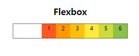
순서는 변하지 않지만 오른쪽에 붙었다. 오른쪽 정렬이라고 생각하면 된다.
flex-direction: row-reverse와는 다르다.
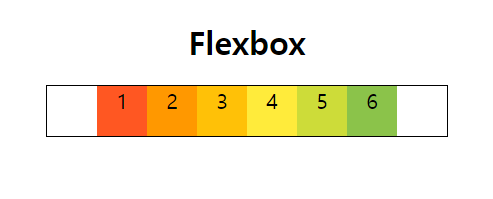
center
예상이 된다. 가운데 정렬이다.
space-between
빈공간을 같게 배치해준다, 균등 정렬 같은 느낌이다 .
space-around
모든 요소들이 같은 여백을 가질 수 있게 해준다.1번과 6번이 적어보이는 이유는 1번의 오른쪽 여백과 2번의 왼쪽여백이 합쳐진 여백이기 때문이다.
개발자 새싹🌱 The only constant is change.