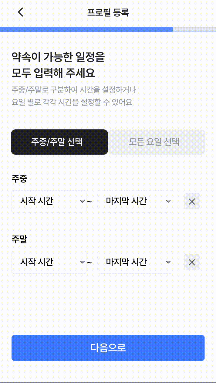
위와 같은 화면을 구현해보겠습니다
onClick했을 때 드롭다운이 내려오고 드롭다운을 제외한 영역(backdrop)을 클릭하면 닫히는 구조입니다
보통 모달창이나 드롭다운할 때 backdrop로직을 많이 구현하실텐데요!
ref써서 제외한 영역 잡고 useEffect로 핸들해줬는데 백숭공주서진엄마 코드리뷰 보고 유레카를 외쳤습니다
해당 내용을 공유해보겠습니다
useEffect로 구현한 코드
먼저 아래는 useEffect를 통해 구현한 코드입니다
const DropDown = ({
  variant = 'default',
  isActive = true,
  defaultValue,
  setProfile,
  isStartTime,
}: DropDownPropType) => {
  const [selectedValue, setSelectedValue] = useState<string>(defaultValue);
  const [isSelectDown, setIsSelectDown] = useState(false);
  const dropdownRef = useRef<HTMLDivElement>(null);

  const handleClickDropdown = () => {
    isActive && setIsSelectDown((prev) => !prev);
  };

  // eslint-disable-next-line no-undef
  const handleSelect = (value: string) => {
    setSelectedValue(value);
    setIsSelectDown(false);
  };

  const handleClickOutside = (e: MouseEvent) => {
    if (dropdownRef.current && !dropdownRef.current.contains(e.target as Node)) {
      setIsSelectDown(false);
    }
  };

  useEffect(() => {
    document.addEventListener('mousedown', handleClickOutside);
    return () => {
      document.removeEventListener('mousedown', handleClickOutside);
    };
  }, []);

  useEffect(() => {
    setProfile(selectedValue);
  }, [selectedValue]);

  useEffect(() => {
    setSelectedValue(defaultValue);
  }, [isActive]);

  return (
    <div ref={dropdownRef}>
      <DropdownContainer $isDefault={variant === 'default'} onClick={handleClickDropdown} $isActive={isActive}>
        <SelectedText $isActive={isActive}>{selectedValue}</SelectedText>
        <ArrowDownIcon isactive={isActive.toString()} />
      </DropdownContainer>
      {isSelectDown && (
        <SelectContainer $isStartTime={isStartTime}>
          {TIME_LIST.map((option) => (
            <SelectOption key={option} onClick={() => handleSelect(option)}>
              {option}
            </SelectOption>
          ))}
        </SelectContainer>
      )}
    </div>
  );
};
event handler 로 구현한 코드
import { ArrowDownIc } from '@assets/svgs';
import styled from '@emotion/styled';
import { TIME_LIST } from '@pages/seniorProfile/constants';
import { useEffect, useState } from 'react';

interface DropDownPropType {
  variant?: 'default' | 'secondary';
  isActive?: boolean;
  defaultValue: string;
  // eslint-disable-next-line no-unused-vars
  setProfile: (selectedValue: string | boolean) => void;
  isStartTime: boolean;
}

const DropDown = ({
  variant = 'default',
  isActive = true,
  defaultValue,
  setProfile,
  isStartTime,
}: DropDownPropType) => {
  const [selectedValue, setSelectedValue] = useState<string>(defaultValue);
  const [isSelectDown, setIsSelectDown] = useState(false);

  const handleClickDropdown = () => {
    isActive && setIsSelectDown((prev) => !prev);
  };

  // eslint-disable-next-line no-undef
  const handleSelect = (value: string) => {
    setSelectedValue(value);
    setIsSelectDown(false);
  };

  const handleClickOutside = () => {
    setIsSelectDown(false);
  };

  useEffect(() => {
    setProfile(selectedValue);
  }, [selectedValue]);

  useEffect(() => {
    setSelectedValue(defaultValue);
  }, [isActive]);

  return (
    <>
      {isSelectDown && <BackdropContainer onClick={handleClickOutside} />}
      <div>
        <DropdownContainer $isDefault={variant === 'default'} onClick={handleClickDropdown} $isActive={isActive}>
          <SelectedText $isActive={isActive}>{selectedValue}</SelectedText>
          <ArrowDownIcon isactive={isActive.toString()} />
        </DropdownContainer>
        {isSelectDown && (
          <SelectContainer $isStartTime={isStartTime}>
            {TIME_LIST.map((option) => (
              <SelectOption key={option} onClick={() => handleSelect(option)}>
                {option}
              </SelectOption>
            ))}
          </SelectContainer>
        )}
      </div>
    </>
  );
};

export default DropDown;

const BackdropContainer = styled.div`
  position: fixed;
  width: 100%;
  height: 100dvh;
  margin: -4rem 0 0 -2rem;
  z-index: 2;
`;

const DropdownContainer = styled.section<{ $isDefault: boolean; $isActive: boolean }>`
  display: flex;
  justify-content: space-between;
  align-items: center;

  width: ${({ $isDefault }) => ($isDefault ? '13rem' : '12rem')};
  height: 4rem;
  padding: 0.3rem 0 0.3rem ${({ $isDefault }) => ($isDefault ? '1.4rem' : '1.2rem')};
  border: 1px solid ${({ theme }) => theme.colors.grayScaleLG1};
  border-radius: 4px;

  background-color: ${({ theme }) => theme.colors.grayScaleWhite};

  cursor: ${({ $isActive }) => ($isActive ? 'pointer' : 'default')};
`;

const SelectedText = styled.p<{ $isActive: boolean }>`
  ${({ theme }) => theme.fonts.Title2_M_16};
  color: ${({ $isActive, theme }) => ($isActive ? 'black' : theme.colors.grayScaleMG1)};
`;

const ArrowDownIcon = styled(ArrowDownIc)<{ isactive: string }>`
  fill: ${({ isactive }) => (isactive === 'true' ? '#A2A7B0' : '#E7EAF2')};
`;

const SelectContainer = styled.ul<{ $isStartTime: boolean }>`
  overflow-y: scroll;
  position: fixed;
  top: 10rem;
  right: ${({ $isStartTime }) => !$isStartTime && '2.5rem'};
  left: ${({ $isStartTime }) => $isStartTime && '2.5rem'};
  z-index: 2;

  width: 20rem;
  height: 50rem;
  padding: 0;
  border: 1px solid ${({ theme }) => theme.colors.grayScaleLG1};
  border-radius: 4px;

  background-color: ${({ theme }) => theme.colors.grayScaleWhite};
  list-style: none;
`;

const SelectOption = styled.li`
  padding: 1rem 2rem;
  border: 1px solid ${({ theme }) => theme.colors.grayScaleLG1};

  ${({ theme }) => theme.fonts.Caption1_R_12};
  cursor: pointer;
`;
useEffect보다 event handler를 지향해야 하는 이유
- 즉시성 (Immediacy)
- 사용자의 입력이나 행동에 즉각 반응해야할 때,
eventhandler는 빠르게 응답 useEffect는 비동기적으로 동작 -> 사용자 경험에 약간의 지연이 발생
- 사용자의 입력이나 행동에 즉각 반응해야할 때,
- 직관성 (Intuitiveness)
- 이벤트 기반 로직: 보통 사용자의 입력과 직접 연결
- 코드 이해하고 디버그하는 것이 더 직관적
- 컨트롤 (Control)
event handler: 개발자가 코드의 흐름을 더 세밀하게 제어 가능useEffect: 의존성 배열을 통해 간접 제어 -> 예기치 않은 리렌더링, 사이트 이펙트 발생
- 성능 (Perfoermance)
useEffect: 종종 불필요한 리렌더링 유발event handler: 필요할 때만 실행 -> 성능 저하 감소
useEffect를 사용할 때는 한 번 더 생각하기!
event handler로 처리할 수 있는지 생각해보고 사용하기 !!

숭실대학교 컴퓨터학부 21