box.html이라는 폴더를 생성하고
html + 엔터 입력
-> 기본적인 HTML 코드가 나온다.
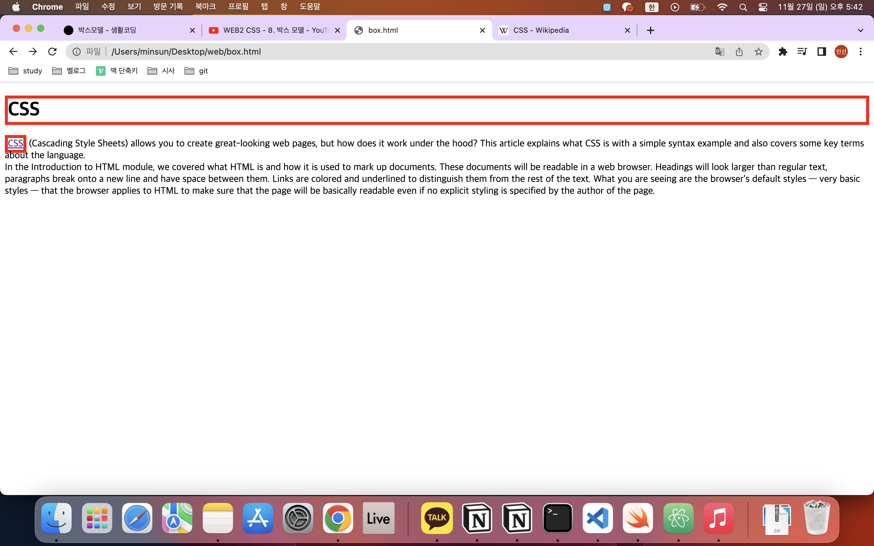
<제목에 빨간 테두리 두르기>
<style>
h1{
border-width:5px;
border-color:red;
border-style:solid;
}
</style>
</head>
<body>
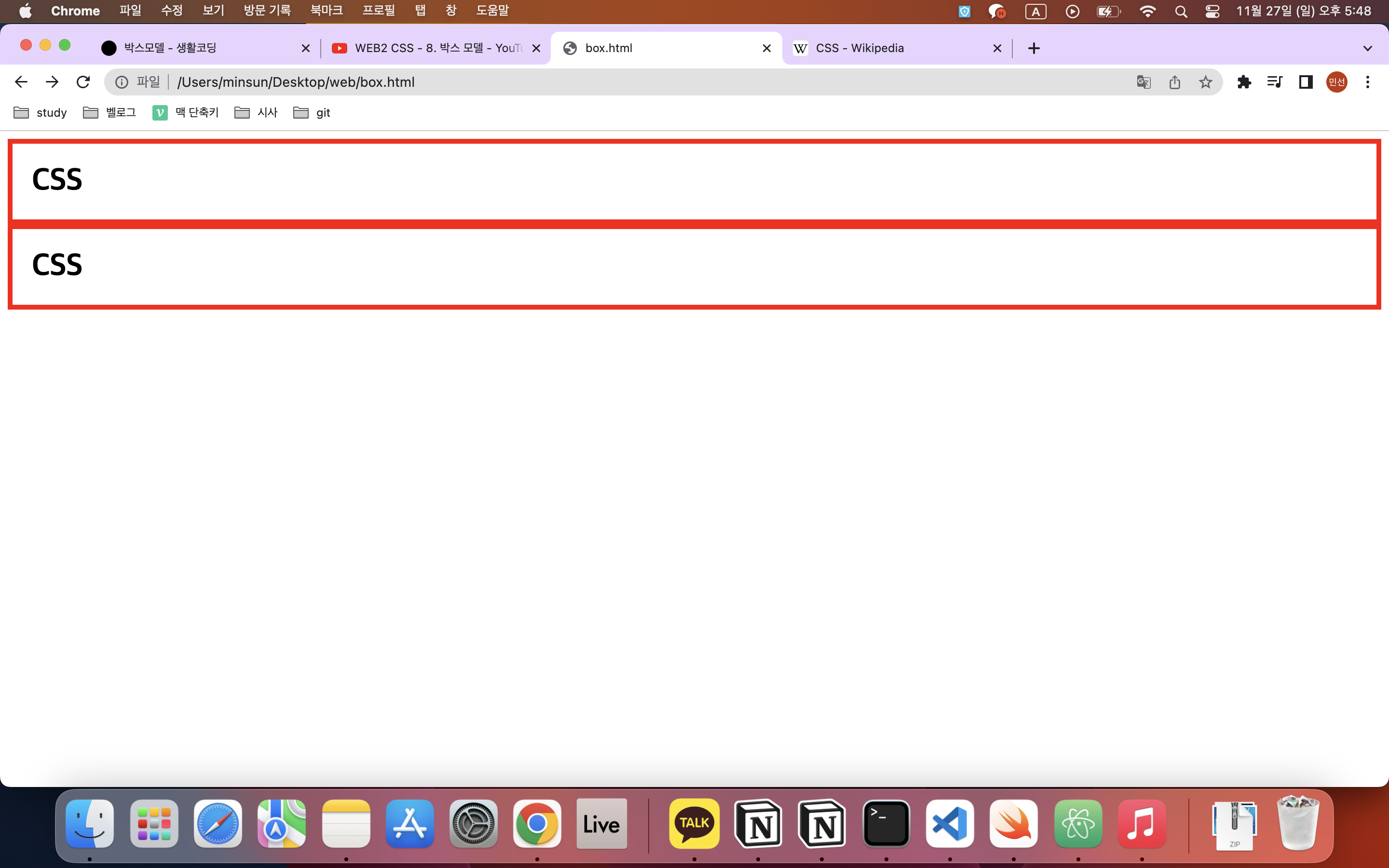
<h1>CSS</h1>링크에도 빨간 선을 둘러보자.
    <style>
      h1{
        border-width:5px;
        border-color:red;
        border-style:solid;
      }
      a{
        border-width:5px;
        border-color:red;
        border-style:solid;
      }
    </style>
제목은 해당 줄의 전체에 둘러지지만(->block level element: 화면 전체를 쓰는 태그 이용)
링크를 사용한 단어는 해당 단어에만 둘러진다.(->inline element: 해당 단어를 쓰는 태그)
(element는 태그와 같은 뜻)
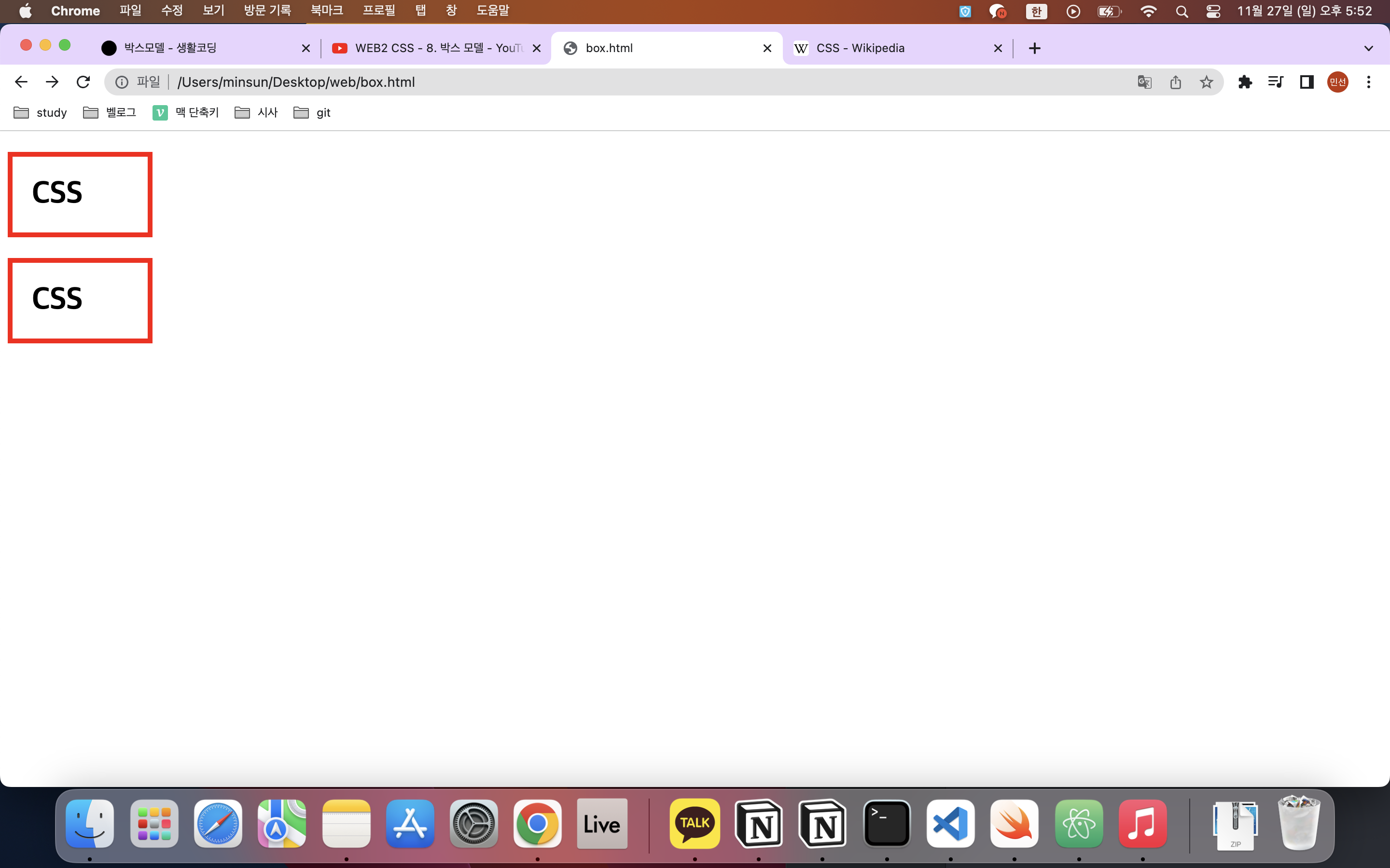
만약 block level element가 inline의 성격을 갖게 하려면?
    <style>
      h1{
        border-width:5px;
        border-color:red;
        border-style:solid;
        display: inline;
      }
      a{
        border-width:5px;
        border-color:red;
        border-style:solid;
      }
    </style>
display라는 속성을 추가하면 되지롱~ CSS 해당 단어에만 네모 박스가 쳐지게 된다. 즉 기본값은 CSS를 통해 언제든지 바꿀 수 있다!
display: inline;display: block;
참고로
display: none;
사용 시 사라져버림 ;;;
그런데 h1과 a의 속성이 중복된다? 코드의 양을 줄여보자.
    <style>
      h1, a{
        border: 5px solid red;
      }
    </style>
이렇게 초간단해진다고 ...? ;;; 획기적이얌⭐️
<컨텐츠와 테두리 사이에 여백 주기>
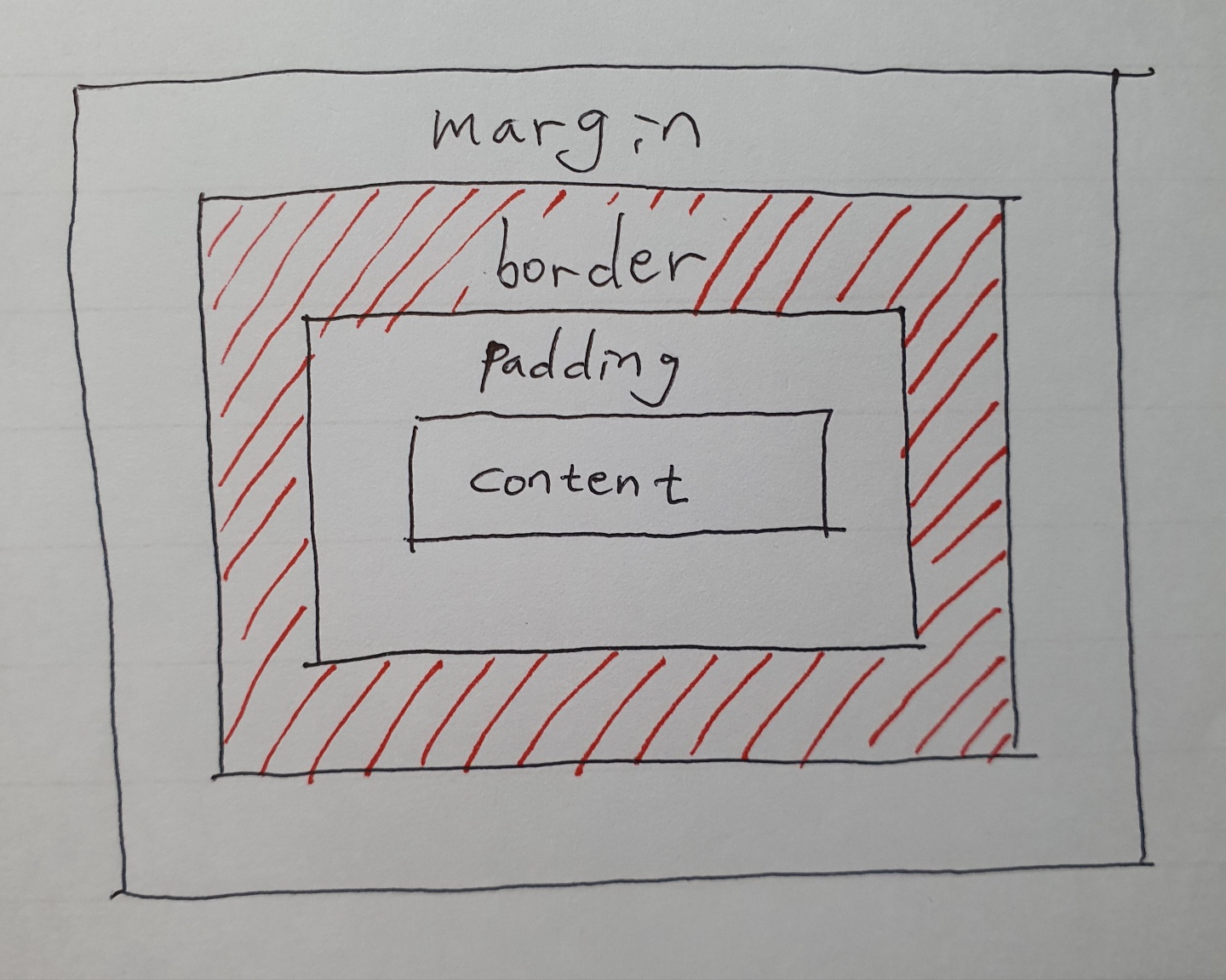
컨텐츠와 테두리 사이에 여백을 주고 싶다면? 패딩을 적용하자!

      h1{
        border: 5px solid red;
        padding:20px;
      }
테두리와 테두리 사이에 여백을 조정하고 싶다면? margin을 적용하자!
      h1{
        border: 5px solid red;
        padding:20px;
        margin:20;
      }
block element에 둘러지는 박스의 크기를 줄이고 싶다면? width와 height를 조정하자.
      h1{
        border: 5px solid red;
        padding:20px;
        margin:20;
        width:100px;
        height: 20px;
      }
내가 만든 홈페이지에서 마우스 우클릭-> 검사 ->
CSS
를 누르면 style을 볼 수 있다.<배운 것을 써먹자!>
  h1 {
    font-size: 67px;
    text-align: center;
    border-bottom: 1px solid gray;
  }
border가 아닌 border-bottom을 이용하면 아래쪽에만 줄이 쳐진다.
그렇다면 글자 오른쪽에 세로선을 긋고 싶다면? border-right을 이용!
  ol{
    border-right: 1px solid gray;
    width:100px;
  }
width:100px은 항목과 우측 선 사이의 간격임을 유의!
개발자 모드를 켜놓고 하나씩 조정해나가면 된다.
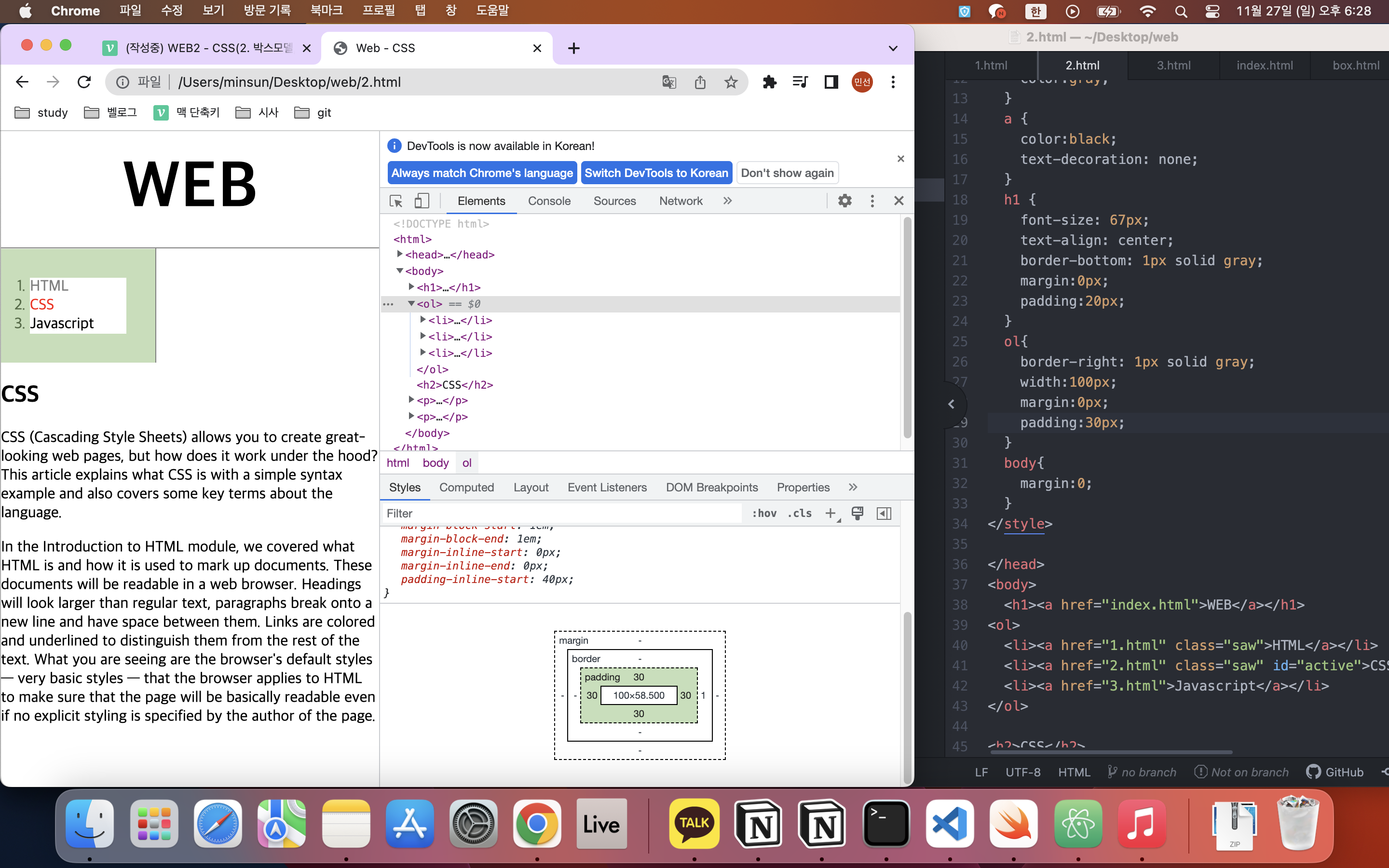
개발자모드 우측에 보이는 <body>, <ol>.. 등등 하나씩 눌러보면 밑에 레이아웃 그림이 뜬다. 색깔을 참조하여 padding, border, margin 등을 수정해 나가면 된다!
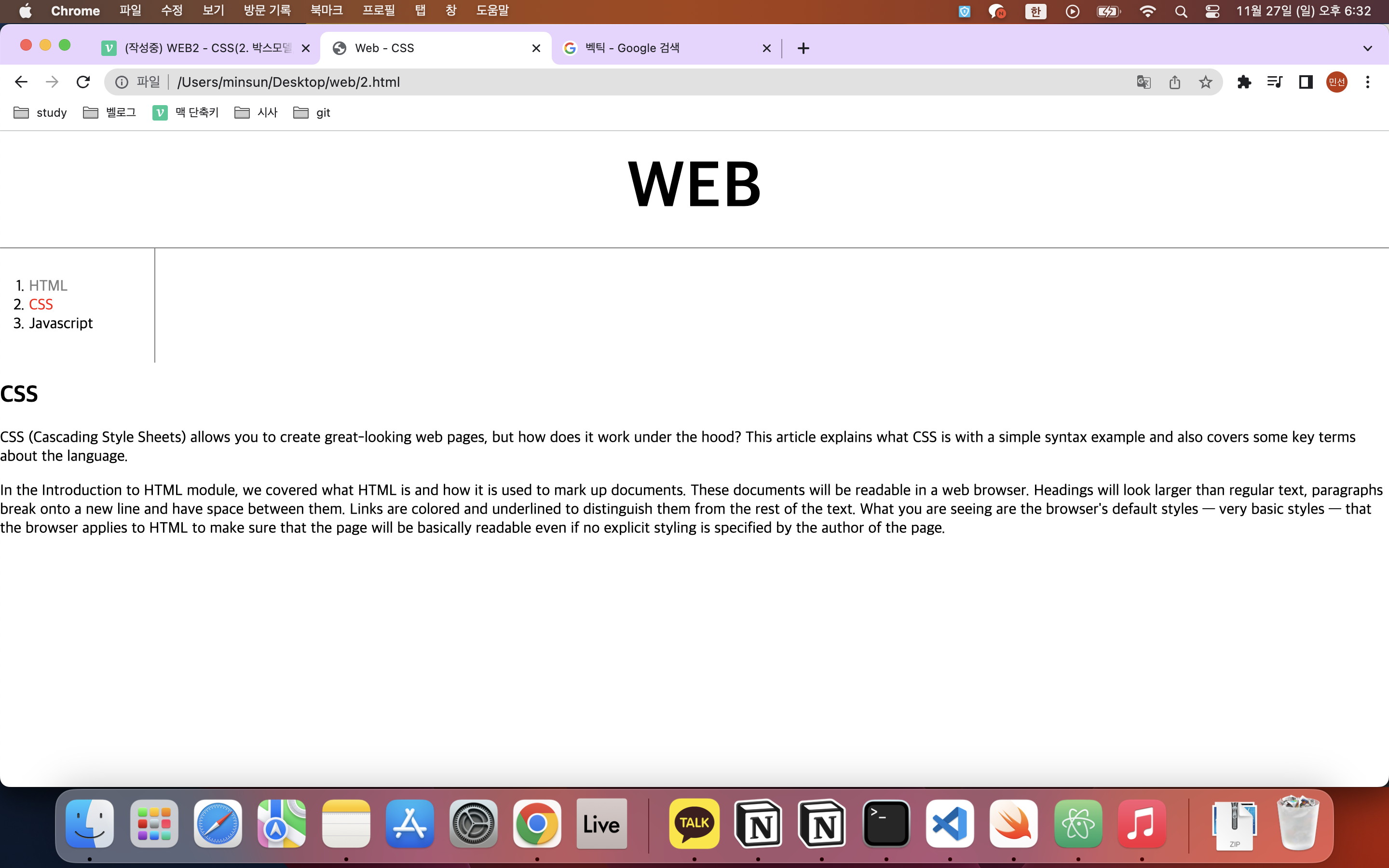
지금까지 결과를 보면 짜짠!!~!~
이제 CSS 본문 내용을 목차 우측의 공간으로 옮겨보자.
<그리드>
아무 의미 없는 태그가 있다? 이름하여 무색 무취의 태그.
div: block element
span : inline element
grid.html이라는 파일을 만들어보자.
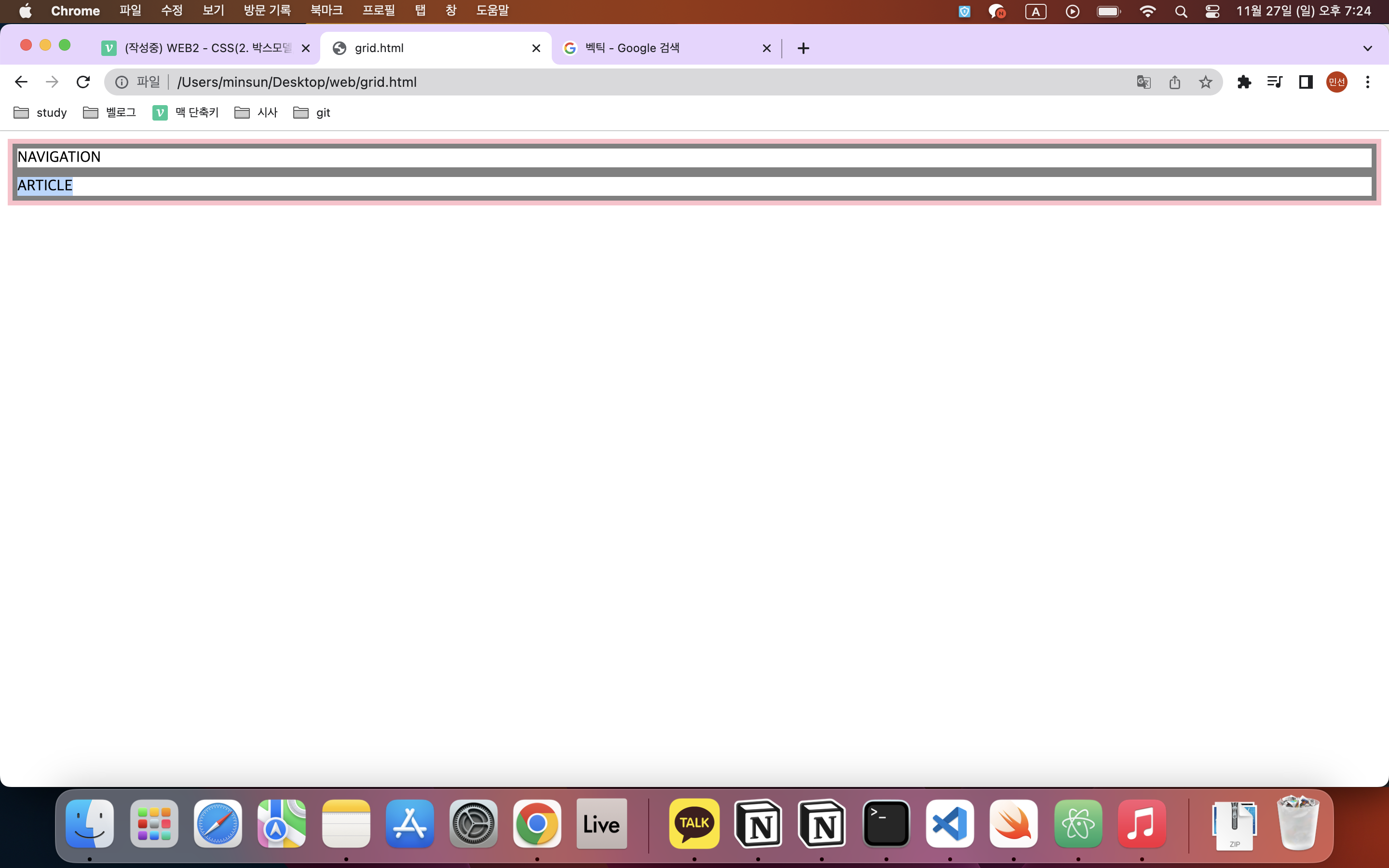
  <body>
    <div>NAVIGATION</div>
    <div>ARTICLE</div>
  </body>
NAVIGATION과 ARTICLE을 나란히 놓고 싶다면 어떻게 할까?
    <style>
      #grid{
        border:5px solid pink;
        display:grid;
        grid-template-columns: 150px 1fr;
      }
      div{
        border:5px solid gray;
      }
      </style>
  </head>
  <body>
    <div id="grid">
    <div>NAVIGATION</div>
    <div>ARTICLE</div>
    </div>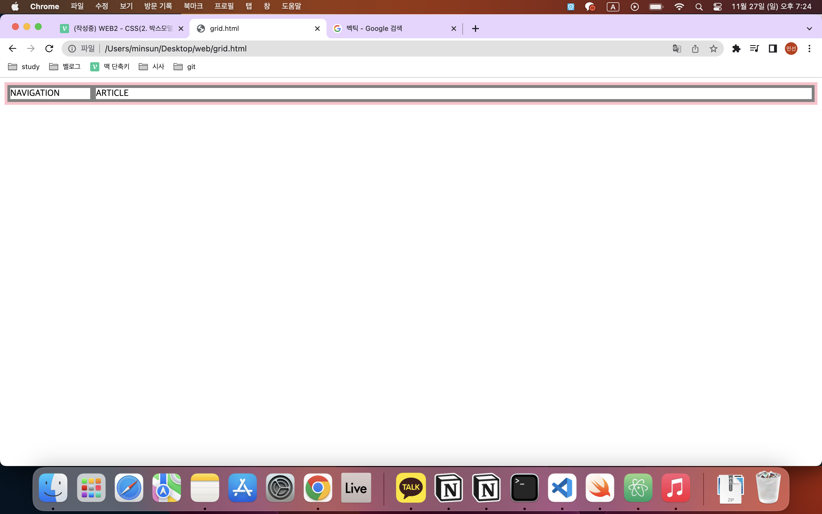
grid template에서 조정!
fr은 칸 크기의 상대적 비율을 나타냄.
예를 들어서 grid-template-columns: 2fr 1fr; 이렇게 쓰면 두 칸의 비율이 2:1로 조정된다.
px은 원하는 크기로 고정하고 싶을 때!
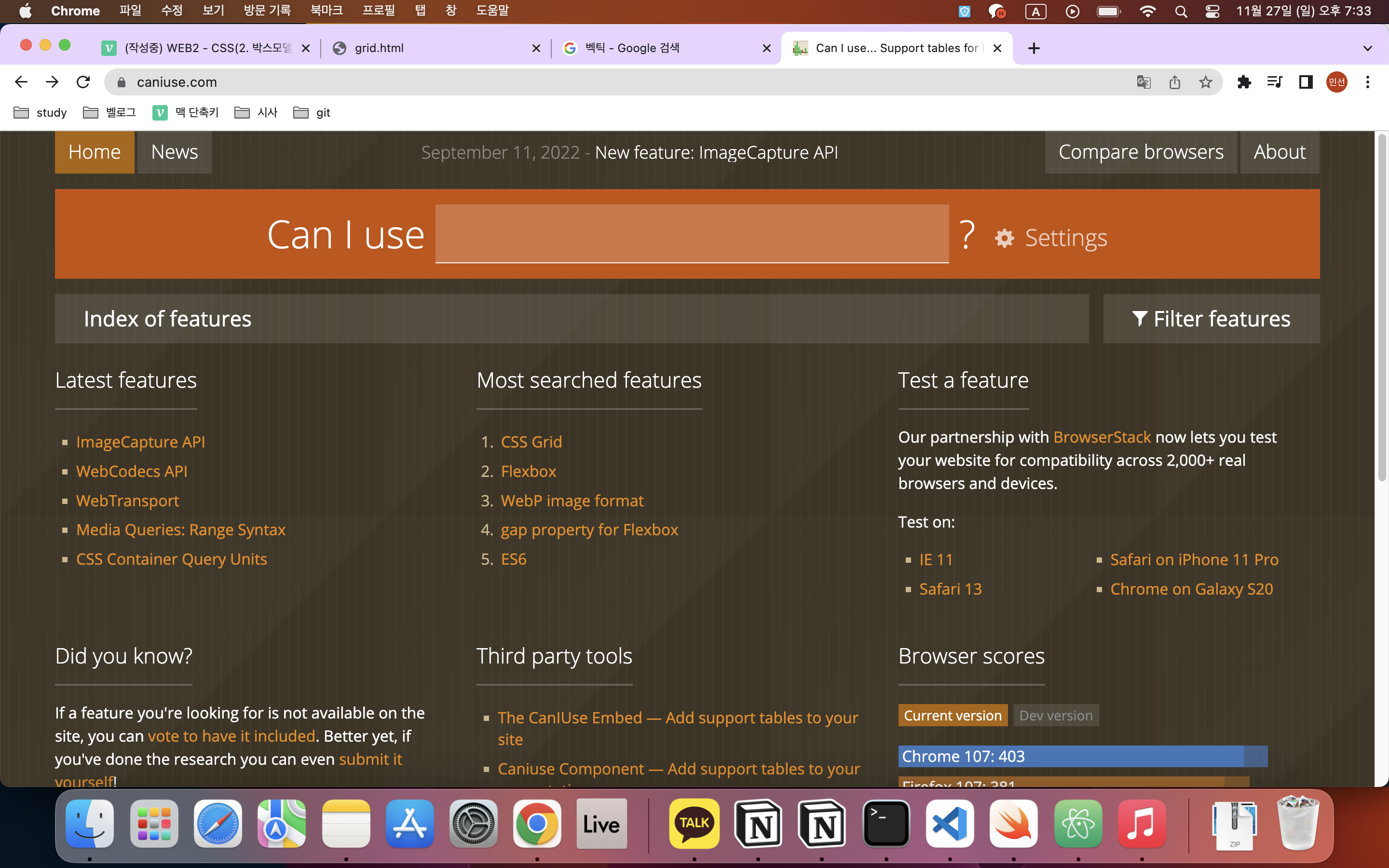
참고: https://caniuse.com
여러 CSS, HTML, Javascript의 기술들 중에서 현재 웹 브라우저들이 얼마나 그 기술을 채택하고 있는가에 대한 통계를 보여주는 서비스이다.
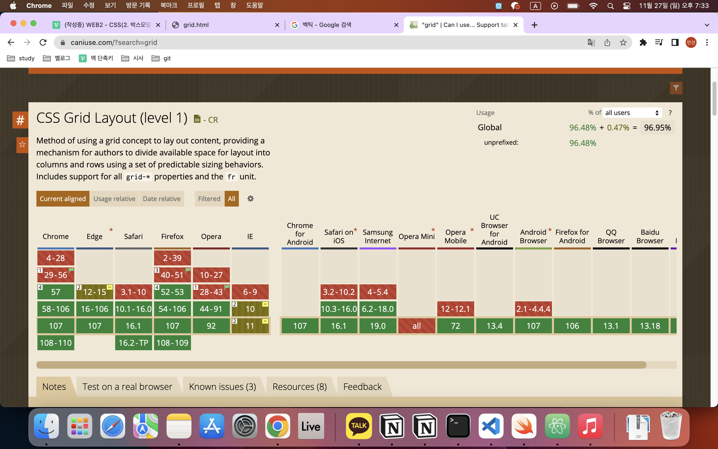
검색창에 grid를 입력하면 CSS Grid Layout이 나온다.
크롬 기준으로는 57이상부터 grid를 사용할 수 있고,
56이하로는 사용 불가능하다는 뜻이다.
그리고 풀색(?)은 부분적으로 지원가능하다는 뜻.
우측 상단의 96.95%는 grid를 사용했을 때 전 세계 인구 중 사용가능한 비중이다.
그럼 이제 지이이이이인짜로 적용해보자.
  <div>
<ol>
  <li><a href="1.html" class="saw">HTML</a></li>
  <li><a href="2.html" class="saw" id="active">CSS</a></li>
  <li><a href="3.html">Javascript</a></li>
</ol>
<div>
<h2>CSS</h2>
<p>CSS (Cascading Style Sheets) allows you to create great-looking web pages,
  but how does it work under the hood? This article explains what CSS is with
   a simple syntax example and also covers some key terms about the language.
 </p>
<p>
  In the Introduction to HTML module, we covered what HTML is and how it is used
   to mark up documents. These documents will be readable in a web browser.
   Headings will look larger than regular text, paragraphs break onto a new line
  and have space between them. Links are colored and underlined to distinguish
them from the rest of the text. What you are seeing are the browser's
      default styles — very basic styles — that the browser applies to HTML to
      make sure that the page will be basically readable even if no explicit
       styling is specified by the author of the page.
</p>
</div>
</div><div>태그로 h2와 본문을 묶고(자식 태그 div), 그 다음 ol과도 한번 더 묶었다(부모 태그 div).``
이렇게 하면 ol 부분의 조상이 #grid가 되므로 선택자 부분을 #grid ol로 바꿔준다.
  #grid ol{
    border-right: 1px solid gray;
    width:100px;
    margin:0px;
    padding:30px;
  }