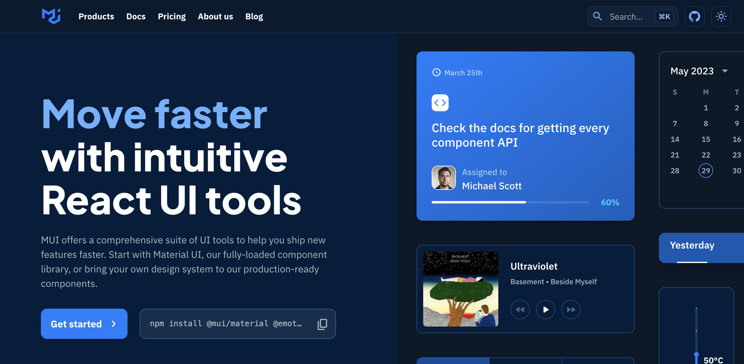
npm install @mui/material @emotion/react @emotion/styled자 버튼부터 한 번 SSG~ 살펴볼까?
[components]-[button]
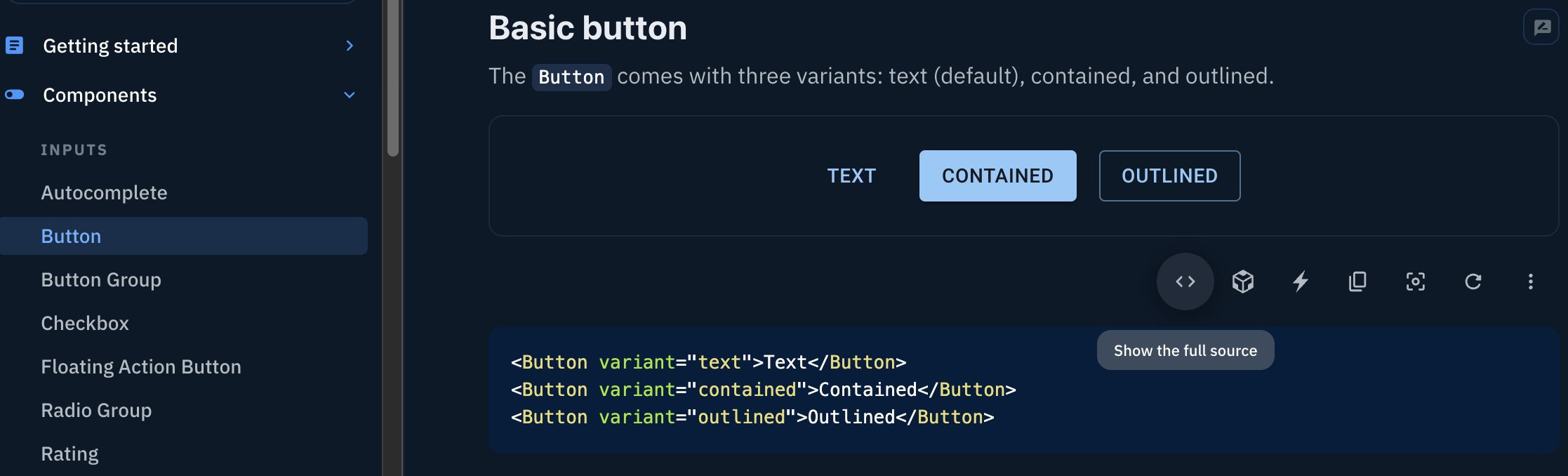
show the full source를 누르면
짜잔~ 와우!
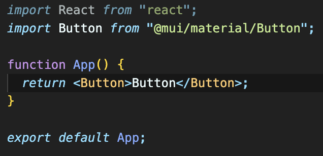
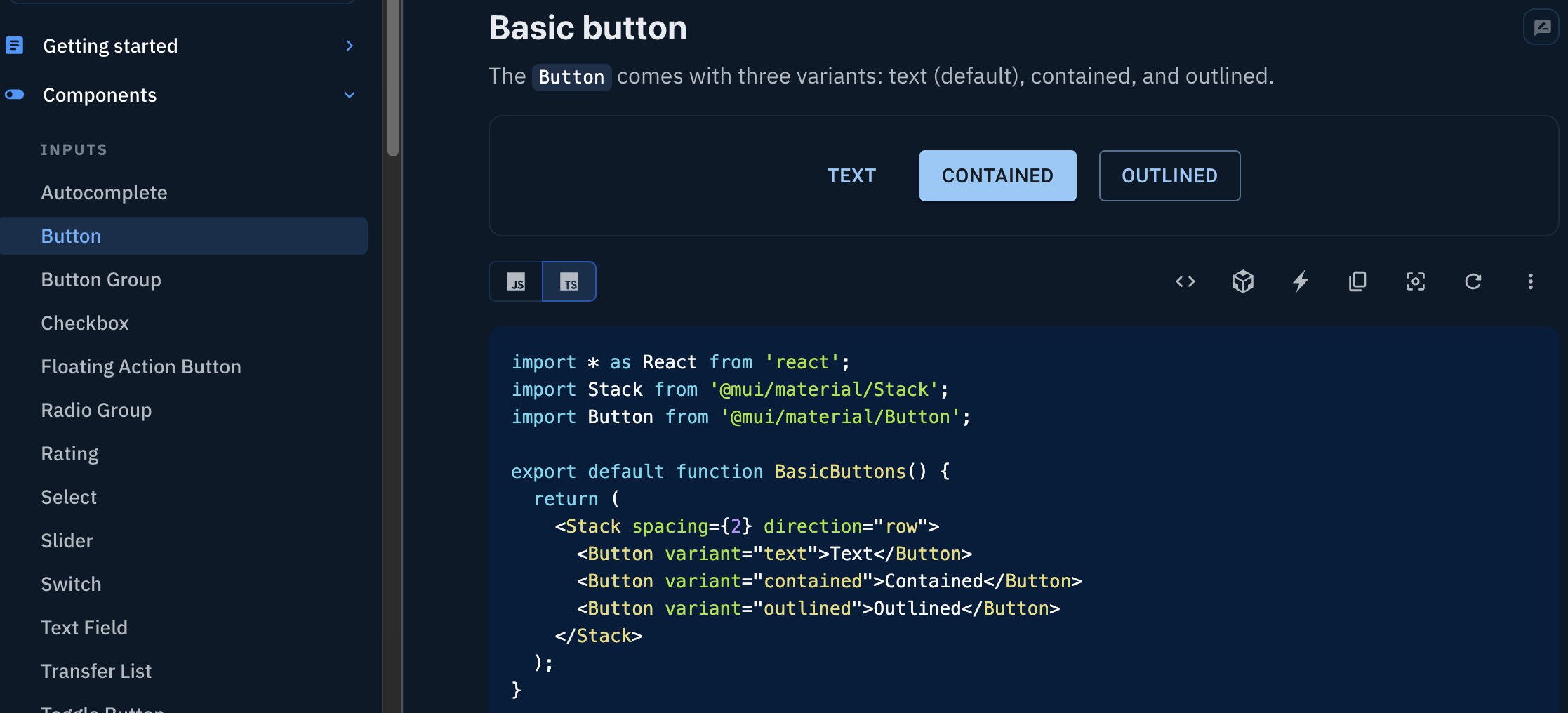
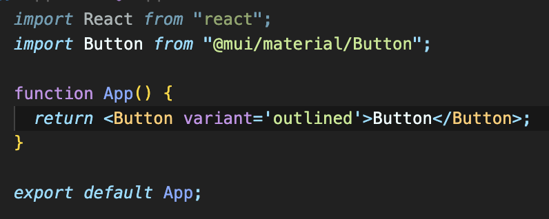
버튼 import문을 복붙해오면
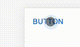
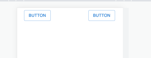
버튼 하나 뚝딱 완료!
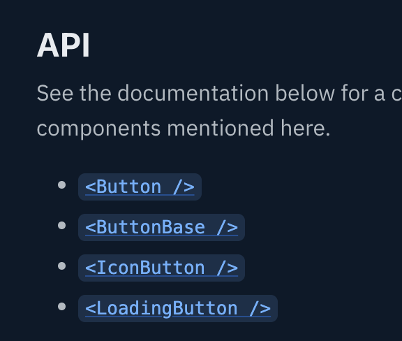
스크롤을 밑으로 쭉 내리면 API라는 곳이 있고, 여기서 Button을 클릭하면
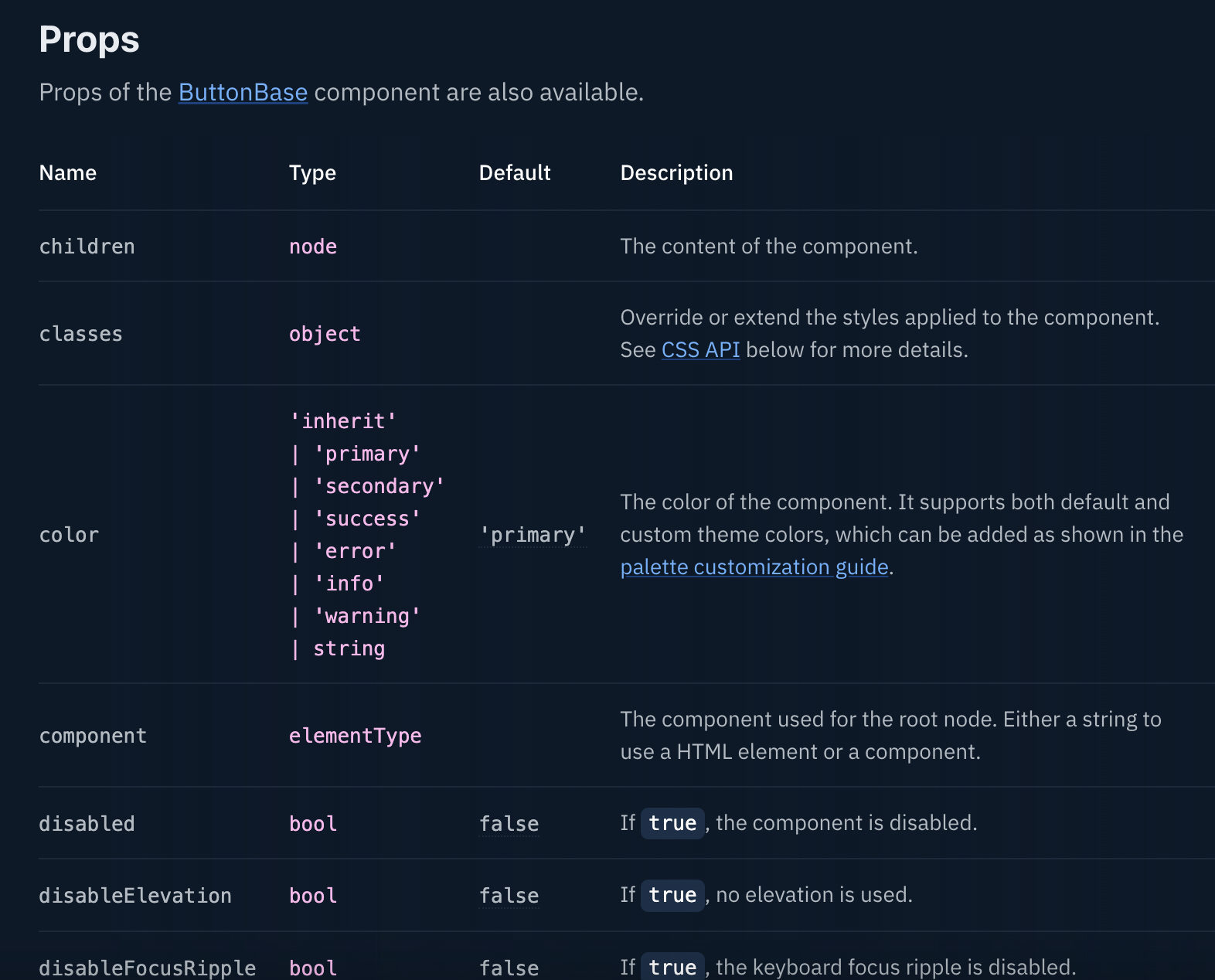
사용 가능한 Props들이 있다.
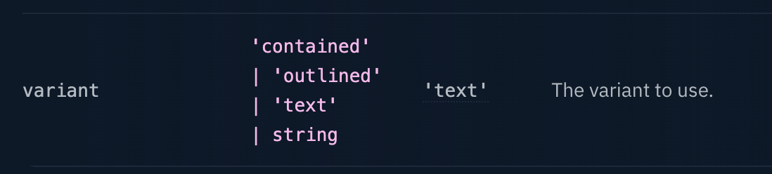
한번 variant라는 props를 사용해보자.
prop 지정. 값을 out-lined라고 지정해보겠다.
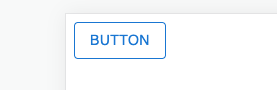
아웃라인이 생겼어!! 와우~~
++유용한 거 몇개 더
Button group
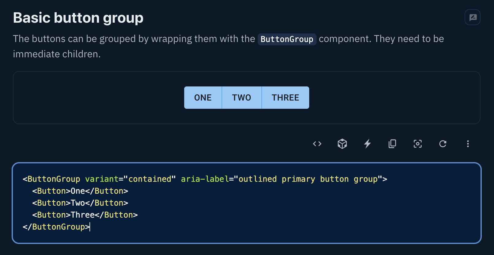
button group으로 묶으면 버튼들이 합쳐진다.
Container fixed
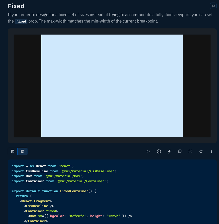
Container fixed를 사용하면
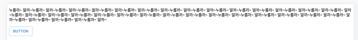
<시술 전>
<시술 후>
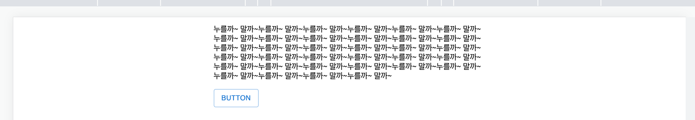
좌우에 간격이 생긴다. 와우~~~
반응형 고려 시 아주 유용하겠다.
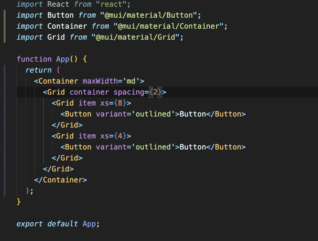
Grid
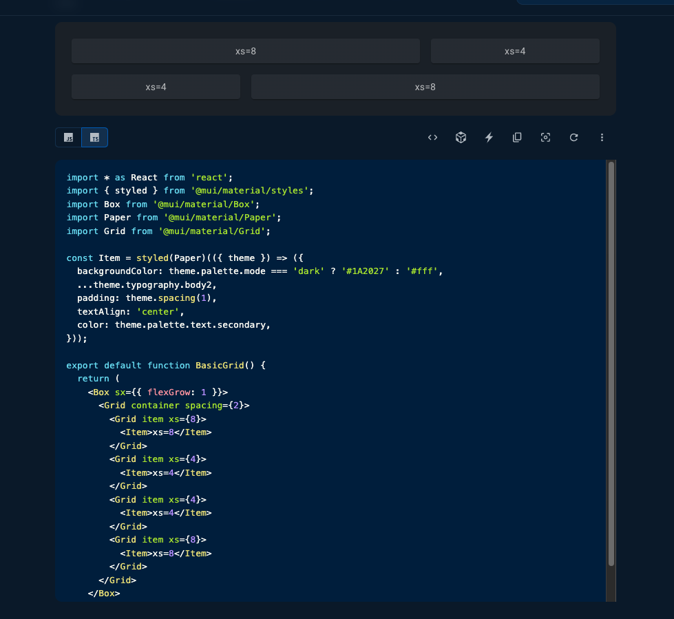
그리드까지 가넝?!!!!
xs 속성으로 간격을 조절 가능!
Dialog
모달창 만들기이다.
import React, { useState } from "react";
import Button from "@mui/material/Button";
import Container from "@mui/material/Container";
import Dialog from "@mui/material/Dialog";
import DialogActions from "@mui/material/DialogActions";
import DialogContent from "@mui/material/DialogContent";
import DialogContentText from "@mui/material/DialogContentText";
import DialogTitle from "@mui/material/DialogTitle";

function App() {
  const [isOpen, setIsOpen] = useState(false);
  return (
    <Container maxWidth='md'>
      <Button onClick={() => setIsOpen(true)} variant='outlined'>
        모달창을 뚝딱!
      </Button>
      <Dialog open={isOpen}>
        <DialogTitle>😱</DialogTitle>
        <DialogContent>
          <DialogContentText>삭제하시겠습니까?</DialogContentText>
        </DialogContent>
        <DialogActions>
          <Button variant='text' fullWidth={true}>
            삭제
          </Button>
          <Button
            variant='text'
            fullWidth={true}
            onClick={() => setIsOpen(false)}
          >
            취소
          </Button>
        </DialogActions>
      </Dialog>
    </Container>
  );
}

export default App;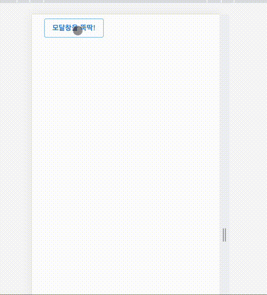
react modal 썼을 때보다 편한 것 같다. react-modal 썼을 때는 디자인하기가 좀 까다로웠는데, MUI로 디자인하면 styled-component로 조절하면 될테니 훨씬 편하겠다.
MUI 훑어본 후기:
이거슨 혁명이다. 혁명이야!!
디자인에 영 자신이 없어서 토이 프로젝트를 하려고 해도 피그마로 뭘 만들어내기가 힘 빠졌는데, 이제 자주 쓰는 컴포넌트들은 MUI 가서 부끄럽지 않은 디자인으로(?ㅋㅋㅋㅋㅋㅋㅋ) 뽑아낼 수 있겠다.

MUI 선생님 오늘 즐겨찾기 추가했습니다 딱 기다리십쇼

기록에 진심인 개발자 🌿