1) 학습한 내용
반응형 웹 : 모바일과 데스크탑에서 포맷에 맞는 css작성법
사실적 -> 단순한 아이콘, 평면적임과 색을 여러가지 사용하는 것이 유행이다.
레이아웃 계산을 정확히 해야한다!
display:none을 이용해 눈에 보이지 않는 것만 아니라 차지하는 자리까지 보이지 않게 할 수 있다. (visiblity와의 차이점)
참고사이트
https://mediaqueri.es/
https://flatuicolors.com/
https://design.google/library/material-design-awards-2017/
<!DOCTYPE html>
<html lang="en">
<head>
<meta charset="UTF-8">
<meta http-equiv="X-UA-Compatible" content="IE=edge">
<meta name="viewport" content="width=device-width, initial-scale=1.0">
<title>Document</title>
<link rel="stylesheet" href="style4.css">
</head>
<body>
<div id="container">
<div class="card">
<img src="https://via.placeholder.com/300x250" alt="">
<div class="words">
<h2>일 분 전만큼 먼 시간은 없다.</h2>
<h3>- jim Bistop</h3>
</div>
</div>
</div>
<div id="container">
<div class="card">
<img src="https://via.placeholder.com/300x250" alt="">
<div class="words">
<h2>웃음은 마음의 조깅이다.</h2>
<h3>- Norman Cosine</h3>
</div>
</div>
</div>
<div id="container">
<div class="card">
<img src="https://via.placeholder.com/300x250" alt="">
<div class="words">
<h2>일 분 전만큼 먼 시간은 없다.</h2>
<h3>/jim Bistop</h3>
</div>
</div>
</div>
</body>
</html>
@charset "utf-8";
/*초기화 작업*/
html, body{
margin: 0;
padding: 0;
/* width: 컨텐츠, 마진, 패딩 합쳐서 결정
card에서는 border 1px 포함되기 때문에 border까지 모두 너비로 계산하도록 설정*/
box-sizing: border-box;
}
body{
background-color: #0964a0;
}
/*기본 배치 : 세로*/
#container{
width: 320px;
margin: 50px auto;
}
.card{
position: relative;/*부모 쪽 positin:relative 지정하면 자식쪽에서 absolute 배치 시 기준이 되는 위치가 변경(브로우저 -> 부모 위치)*/
width: 300px;
height: 500px;
margin: 20px 10px;
border: 1xp solid #ccc;
background-color: #fff;
}
.words{
position: absolute;
left: 10px;
top: 300px;
padding: 10px;
text-align: center;
background-color: azure;
}
/*중복된 부분 작성 X*/
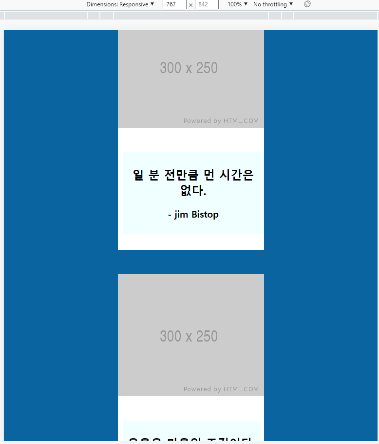
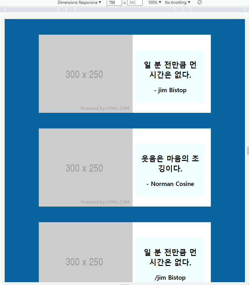
@media screen and (min-width:768px) {
#container{
width: 570px;
}
.card{
width: 550px;
height: 250px;
}
.words{
left: 310px;
top: 50px;
width: 200px;
}
}
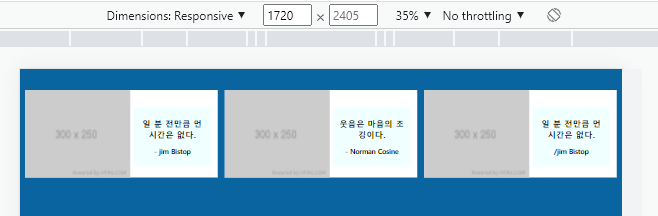
@media screen and (min-width:1720px){
#container{
width: 1710px;
}
.card{
width: 550px;
height: 250px;
margin: 10px;
float: left;
}
.words{
left: 310px;
top: 50px;
width: 200px;
}
}
2) 학습내용 중 어려웠던 점
X
3) 해결방법
X
4) 학습소감
반응형 웹을 작성 해보면서 모바일과 웹, 태블렛을 여러가지 모두 작성해 주어야 우리가 보통 보던 사이트를 작성할 수 있다는 것을 알았습니다.

JAMIHs