
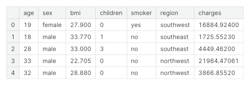
Data
Basic Scatter Plot
위 데이터 중 bmi와 charges를 scatter plot으로 시각화 해보자.
import seaborn as sns

sns.scatterplot(x=data['bmi'], y=data['charges'])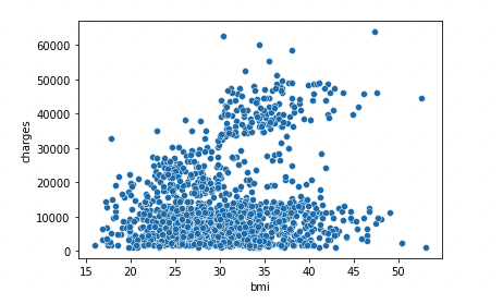
BMI와 Charges(보험금 청구료)는 어느정도 Positively Correlated 하다고 볼 수 있다. BMI가 높아질수록 Charges도 높아지기 때문.
확실하게 상관관계를 시각화하기 위해 Regression Line을 추가해보자.
회귀선을 추가하려면 regplot을 사용하면 된다.
sns.regplot(x=data['bmi'], y=data['charges'])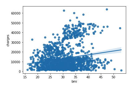
Color-coded Scatter Plot
bmi, charges, smoker 세 가지 변수를 한 번에 시각화하고 싶다면?
hue를 사용하면 됨.
sns.scatterplot(x=data['bmi'], \
				y=data['charges'], \
				hue=data['smoker'])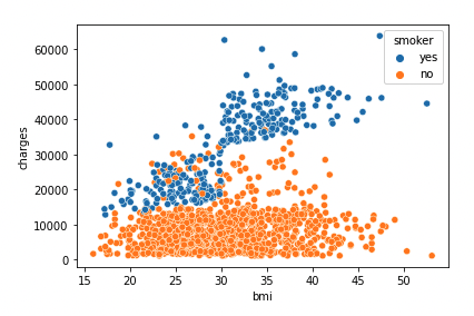
- 비흡연자보다 흡연자가 보험료를 더 많이 냄.
- BMI가 높고 흡연을 하는 사람들이 보험료를 가장 많이 냄.
2개의 Regression Line을 그리고 싶다면 lmplot을 사용하자.
sns.lmplot(x="bmi", y="charges", hue="smoker", data=data)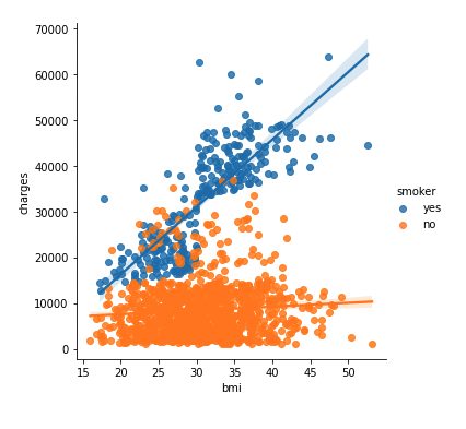
정리
일반적으로 scatter plot은 두 continuous variable 간의 관계를 보여주기 위해 사용한다(e.g. bmi & charges).
- sns.scatterplot
- x, y, hue
- sns.regplot (one reg line)
- lmplot (two reg lines)